Today I’m trying out the new Arrtx Colored Pencils for the first time, along with the Arrtx OROS and ALP Alcohol markers and some other supplies!
This video and article is sponsored by Arrtx. All information presented in this article and video are my opinions only. This post contains affiliate links and I may earn a commission if you click them (at no cost to you).
If you’d like to browse my favourite art tools and resources, head over to my Resources Page.
The Arrtx ALP & OROS Alcohol Markers
My First Impressions
I have never used the Arrtx alcohol markers so I have been eager to try these out for a while, and they’ve sent me some of the ALP and the OROS range today. And even just the packaging already really stands out as a great giftable option compared to other art supplies I’ve tried.


The ALP markers have a bullet and chisel nib, and the OROS markers have a chisel and brush nib – so for me personally, the OROS markers are far more exciting because I use a brush nib more than anything.

Color Range
Both sets of markers come in a range of over 200 colors that you can buy across multiple sets. If you want the full color range, the best option is to buy the 80 & 90 sets, and then the skin tone sets.
Or if you are someone who uses a specific set of colors more than the rest, you can buy one of these smaller sets of 24-40 colors from a particular color range like I’ve done today with the ALP markers.
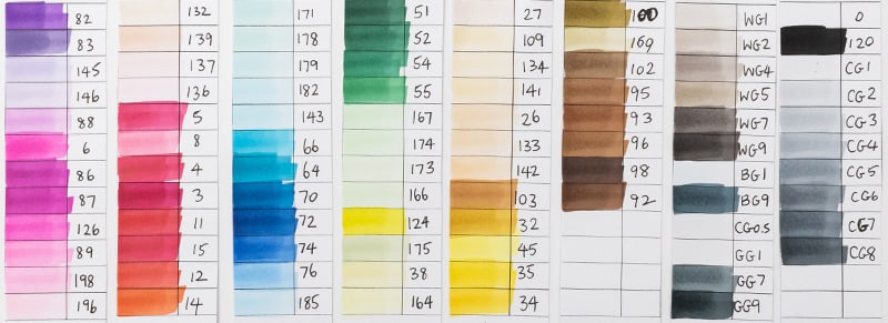

At first I wasn’t sure about the differences between the set of 80 and the set of 90 – but it turns out, these offer completely different colors. So you can buy both without duplicates, except the colorless blender, which I often use for other things like blending my pencils anyway, so I like having lots of spares.
And then, there’s the skin tone sets.
The skin tone set has NO duplicates again with the 80 or 90 markers, which is not always the case when buying markers at this price point.
I like that there are a good amount of really light tones that you can build up, but I do think this set lacks the darker skin tones completely. Although I’ve read in a review on the Frugal Crafter’s website that Arrtx are planning to release a range of darker skin colors in the future.
For now, pairing this skin tone set with the larger sets gives you a good overall range that makes up for a lot of these color gaps.

Using the Alcohol Markers
So I’m REALLY liking these OROS markers. They lay down so nicely, they have really good saturation, and the color range here in the set of 90 I’ve got is great.
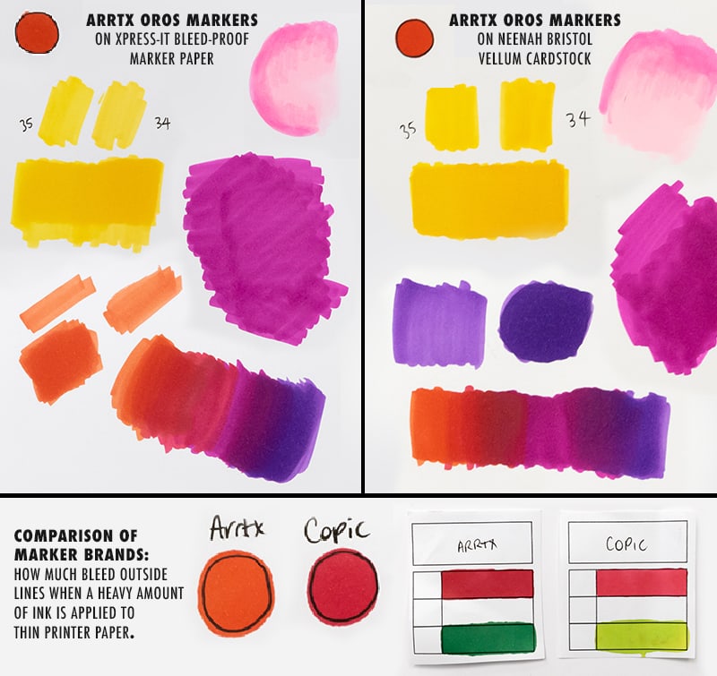
I tested the Oros alcohol markers on bleed proof marker paper, normal printer paper, and the Neenah Bristol vellum cardstock that I use for most of my artwork. And they performed similar to my other markers on all 3.
Personally, I’m finding that I prefer the results on the Neenah paper even more than the marker paper – although this does absorb a lot more ink. I just feel it offers a smoother final result and it will be much easier to layer pencils if I’m wanting to work with mixed media, which is something I do a lot in my coloring pages. (Find out more about my paper recommendations here!)
They also blend really well.
The NEW Arrtx Colored Pencils
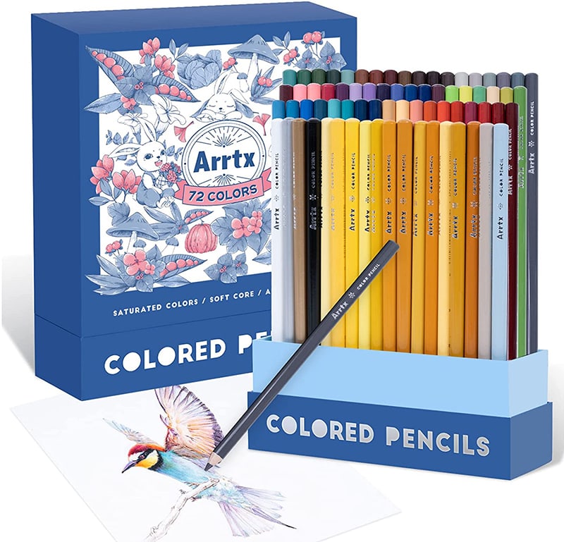
Arrtx have just released their first ever set of colored pencils. There are 72 pencils in this set, and they are advertised as artist-grade and light-resistant.

My First Impressions
At a first impression, these pencils feel really nice to hold. They have a good weight to them and feel high quality. The barrel color wraps around the base and just looks good. They have a 7.8mm body and a good size core.

The box itself is beautiful too. It’s something I can see people keeping on their desk to easily grab the pencils. There’s padding in the bottom so they are well protected.
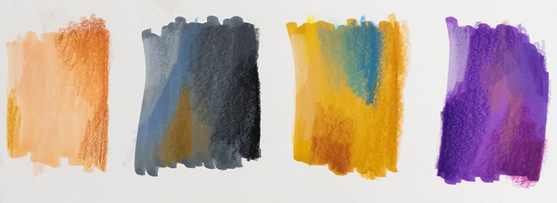
As I start swatching these pencils, I’m actually surprised at how nice they feel. I mean, it’s hard to judge a pencil just from swatching, so I’ll use them more thoroughly in a moment and color a page.
Color Range and Performance
I was not expecting these pencils to be so nice to use. They seem to layer really well, but also have that buttery feel, almost like a Prismacolor but not quite as soft or waxy.
As I continue swatching, I do think this set has a good color range overall, except that there are a LOT of yellows here. In a larger set, this would make sense, but in a set of 72, I would have preferred to see a few of these yellows swapped for some other colors to offer a bigger range. Maybe a lighter blue?
Other than that, they seem to have a pretty good variety of colors.
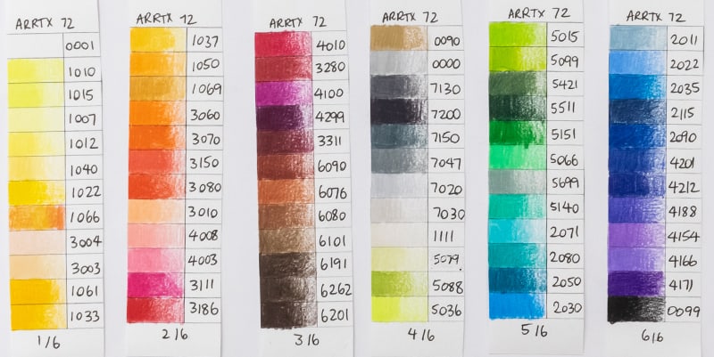
I wanted to see how these pencils blend so I’ve been making a lot of use of my swatch kit today! You can get a copy of all these swatch charts as an instant download to use for your own testing or pencil and marker practice. Find out more here.
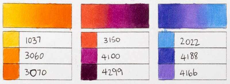
I’m really surprised at how many layers I seem to be able to build up with these pencils. So many mid-range or budget pencils don’t layer much at all, but these seem to be able to layer at least 5-6 layers. And interestingly, these don’t seem to have as much of a waxy build up as a Prismacolor pencil.
Even on the cheap printer paper that I usually avoid, I’m still able to layer and blend these pencils enough to create completely new colors.
And when it comes to layering over markers – These just WORK. They layer over markers better than many of my other pencils, and keep a really good opacity and vibrancy.
Pricing and Where to Buy Arrtx Colored Pencils
The Arrtx pencils currently come in a set of 72 and are available on the Arrtx website or on Amazon. At the time of writing this review, these pencils are cheaper than Prismacolor and are priced similar to a 72 set of Castle art or Arteza pencils at around $30-40 USD.
Using the Markers and Pencils Together

You can download this page for FREE if you’d like to color along with me! I’ve printed this page on Neenah Bristol Vellum for my coloring today.

I’ve chosen a sky color palette from The Color Catalog that I wouldn’t usually think to try – and I’ve found the pencils and markers to match.
Find out more about The Color Catalog here.
Coloring Steps
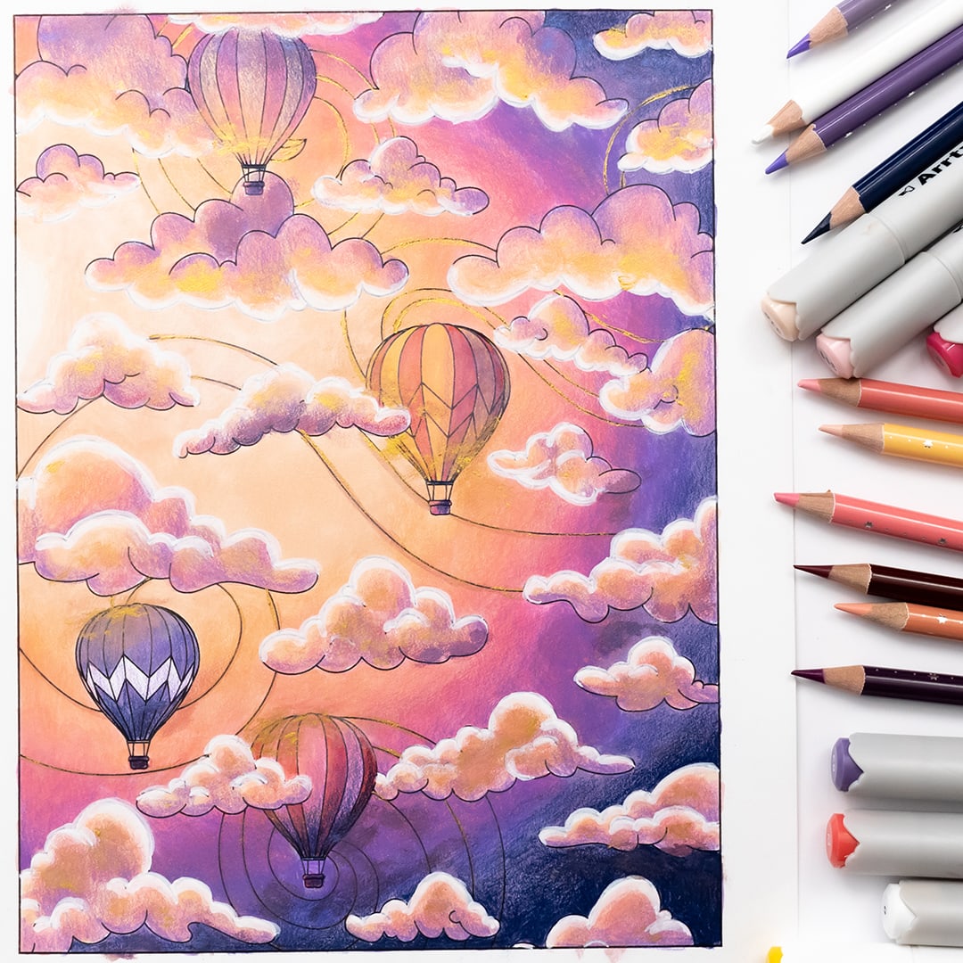
I started with the background of the page and used my color palette to create a gradient with the markers, working back and forth between colors to blend them together. The blending wasn’t perfect, but this is ok, because I planned to layer pencil over the top of these areas. Pencils can help to really fix any mistakes like this!
The markers blend quite well and might not even need the layer of pencils, but I enjoy working with these mediums together and do this often because the markers fill all the white gaps on the paper, are quick to use, and then the pencils can really get into the details and build up the lighting and shading – or fix any areas of the marker that didn’t blend well.

The clouds were an interesting challenge, so it helped a lot to determine my light direction first. I was originally planning on more of a sunset, with the light coming from the bottom of the scene. But because I’d already made a start on the two clouds in the middle, I had to make a change. I roughly sketched out some shadows on the edges of the clouds that are the furthest away from the light source on each cloud. For the clouds at the top, this is on the top side of the clouds. For the clouds at the bottom, this is on the bottom edge.
I was guessing a lot here, but these clouds were pretty forgiving. And because there were a lot of them, the overall effect worked even if I didn’t get every single one perfect.

As I came in with my pencils, I followed the same shading, but just built up the shading and midtones of each cloud further, leaving a highlighted edge that followed the curved shape of the cloud.
My main goal was to keep thinking in round shapes for each part of the cloud, and this seemed to work, no matter whether I chose to lighten or darken areas.

I wanted the hot air balloons to feel colorful, but I didn’t want to totally change my color palette. So this is where I really stretched these pencils. I started with a straight color layer of the marker, and relied on the pencils to bring this back into my color palette with lighting and shading that matched the rest of my scene. It worked better than I expected.

I decided to add a white highlight along the lightest edge of my clouds. I started with the Faber-Castell Pit Artist Pen, which is more opaque and has a large tip, so I’m not totally happy with how this looks. But for consistency sake, I did the whole page. And then, I came back with a finer point white paint pen to remove those black lines, which did help a little.

I wanted to try some of the metallic or pearlescent watercolor paints that Arrtx sent me to add some whimsical touches to this, but I wasn’t sure if it would ruin it or make it more interesting at this point. Spoiler alert – I did it anyway.
And I think I preferred it before the gold, but I’m still happy with the final result.
Watch me Color This Page!
If you’d like to watch me color this page more slowly than my video above, I’ve published the whole process on my 2nd YouTube channel, so you can color along at 2x speed from start to finish. There’s no commentary, just music! So grab a drink or snack, grab your markers and pencils, and let’s color together!
Final Thoughts & Improvements?
When it comes to mid-range colored pencils, I think these are the closest I’ve seen a pencil come to Prismacolor’s performance, BUT without Prismacolors breakage. From what I’ve heard, they have glued the pencil core along the entire barrel, making them far more resistant to breakage, while still keeping that soft blendability that makes them wonderful to use.
If I had some areas I’d like to see improved in these pencils, it would be the matching of the barrel color to the core. These aren’t matched very well, and so you’ll need to swatch them out to know what the colors are instead of relying on the color of the outside of the pencils.
And I would like to see the size of the font on the barrel made much bigger. It’s quite hard to read the numbers and names of the colors with the small font, especially since it’s written in silver.
I reached out to Arrtx to ask if they had any plans to make these changes in the future, and they were already onto it! They said they were planning to make the words on the pencils easier to read, improve the color matching of the cores AND check the range of yellows, which isn’t something I pointed out, so they ARE listening to the feedback from other customers and reviews.
They are also considering releasing a larger range of pencils and open stock options in the future. So this is all great news for what is a really enjoyable pencil to use.
For transparency, if you’d like to read some reviews from other artists who have NOT been sponsored by Arrtx, I’ve included some trusted sources below who have also reviewed these pencils. I have not personally read or watched these reviews from start to end, but I trust these creators to be unbiased in their views.
I’m really excited to add both these markers and these pencils to my collection and want to thank Arrtx again for sponsoring this video and sending me these supplies to try!








I am an avid coloring queen and have also tried these Arrtx pencils. They were on a fantastic sale when I purchased this set of 72 for less than $25 on Amazon. (And don’t worry, it was not the “Subscribe & Save” coupon either.) I fell in love with the way the dark colors lay down on any paper. However, when it came to the lighter colors, I feel like they lost that brilliance and softness that Prismacolors really shine with and hold onto with almost the entirety of their color ranges. But the Arrtx pencils do hold a point VERY WELL. But because most of this 72 set are, like you said, “yellows” or lighter colors I ended up returning mine in hopes of finding that color pencil more similar to the fabulous Prismacolors but hopefully a little more in my price range. I bought a pack of 120 Prismacolor Premier colored pencils and they are, of course, AMAZING! but I seem to run through them quickly because of how soft they are. I’m hoping you’ll help me find THE PENCIL, and will follow you during my endeavor to do so! Thank you so much for your trials and reviews.