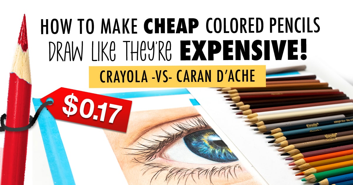
Today I’m comparing these cheap kids Crayola colored pencils with the very expensive, artist-grade Caran d’Ache Luminance, to show you exactly how to get the most out of your cheap colored pencils!
If you came here expecting me to tell you that I’m giving up my Caran d’Ache Luminance pencils for Crayola from now on… that’s not what this is about.
But there’s a secret that our favorite YouTubers have figured out, that allows them to get crazy good results out of these cheap pencils, to make them appear like a decent match for our luxury artist-grade pencils.
And I’ve finally figured out that secret.
Watch the full video below:
Note: This content is NOT sponsored or endorsed by any of the brands mentioned in this post or video. This post contains affiliate links and I may earn a commission if you click them (at no cost to you).
Let’s compare the sets I’m working with today:

Cheap Colored Pencils: Crayola
I’ve bought the biggest set of Crayola pencils I could find to give me a huge range of colors to work with.
At the time of this comparison, this set costs $28.42 USD on Amazon, which works out at $0.24 per pencil. Although if you buy a smaller set of 100, the price drops to only $0.17 per pencil… so that’s a much better deal!
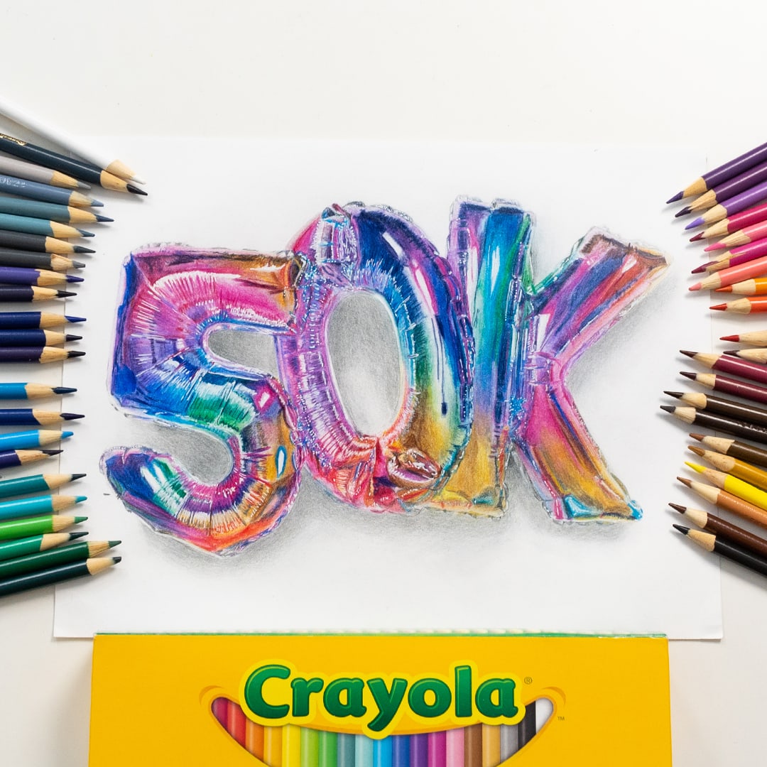
This isn’t the first time I’ve used Crayola to draw something realistic- you can see my first attempt at realism with Crayola pencils in this video where I drew some balloons to celebrate reaching 50k subscribers on my YouTube channel. I was really surprised at how well they performed, although it wasn’t an easy project.
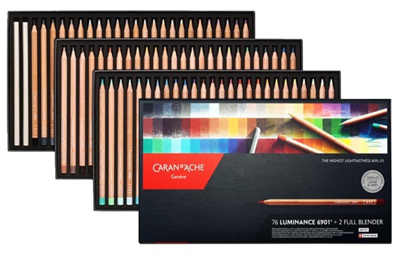
Expensive Colored Pencils: Caran d’Ache Luminance
The Caran d’Ache Luminance colored pencils cost me around 10x the price of the 120 Crayolas! So the question is… are they actually 10 times as good?
When I asked my YouTube community, the majority agreed that the Caran d’Ache Luminance were still a better choice than the Crayolas – even at different quantities. Side thought – I wonder why so many people still buy so many sets of cheap pencils if this is the case?
These are easily some of my favorite colored pencils and are one of only a few brands that I’ve ever bought replacements for, because I used my original set so often.
I’ve used them in many of my drawings in the past, both for drawing from a reference photo or for coloring pages.
Watch me draw Jazza as Thor in this video here.
My experience with the Caran d’Ache Luminance pencils is that they are easy to blend and layer and they are very enjoyable to work with. They aren’t buttery or super soft like Prismacolor. In fact, they are almost slightly chalky in comparison, which means they work on some paper better than others. The colors are bold and they are really easy to lay down – it takes almost no effort to get color on the page, and they just feel nice to hold.
You can buy them on Amazon here: 20 | 40 | 76 | 100
Or at Blick online here: 12
Should You Buy the Biggest Set of Colored Pencils?
It’s NOT necessary to have such a big set of colors.
You can mix pencil colors together by layering to make other colors, like I showed you in this post.
But since cheaper pencils generally don’t blend or layer quite as easily as higher quality pencils, I like to spend a little more to get the bigger range. Especially since smaller sets tend to include more of the brighter colors and less of the muted or pale colors that are ideal for realism or detailed drawings.
When you choose to buy quality pencils, you won’t need the biggest set right away. A set of 30-40 pencils is ideal! But even 12 pencils is enough to create a huge range of colors.
How to Use Color Swatches
One common issue with cheaper pencils is that the color of the barrel doesn’t always match the color of the actual pencil pigment.
So when you’re wanting to match a color exactly, you’ll need SWATCHES.
I create swatches for every brand I use, even the quality brands that match the pencil barrels (like the Caran d’Ache Luminance pencils) because having these on paper swatches makes them so much easier to match up the colors to a reference photo for realistic drawing.
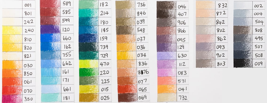
76 Caran d’Ache Luminance Pencil Color Swatches

120 Crayola Pencil Color Swatches
For my Luminance swatches, I’ve done more of a gradient because these are swatches I’ll use over and over again, and it’s really helpful to see the different shades of each color. But for the Crayola, I’m just keeping it simple. I don’t expect to use these often and frankly, swatching them isn’t as enjoyable. Plus, I wanted the extra space to write out the color names because they don’t have any numbers on the pencils like most brands do.
You can find both of these templates in my Swatch Kit, along with a range of other gradient practice sheets, blending charts and other helpful templates. Get it here.
How to Get the Most Out of Your Crayola Colored Pencils
Crayola pencils are wax-based – but they don’t offer the same buttery blendable feeling like many other wax-based pencils do. They are firm, and they don’t really blend at all – so we have to work more carefully with our layers instead.
So here are some tips to help you get better results with your Crayola pencils – and you can use these tips with ANY cheaper pencils you use!
1. Keep a Sharp Point
First, always keep them as sharp as possible.
Crayolas can keep a sharper point than most, so use this to your advantage!
The sharper point gets much better color out of these pencils. It also makes them smoother to use, helps them to lay down more even color, and they just feel nicer overall to use.
The Crayolas are quite hard to sharpen because of their hard wood casing, so I prefer to use a cheaper sharpener instead of one of my higher-quality sharpeners that I use on my other pencils. (I don’t want the wood to damage my other sharpeners over time)
I have been using one of my Apsara Long Point Sharpeners from my huge sharpener comparison to give my Crayolas an extremely sharp point.

2. Use blending tools and solvents
If you want to HELP your pencils blend, you can use things like solvents, blending pencils, and even certain household items like I tested in my previous post here.
But please. TEST THEM FIRST.
Unfortunately for me, I ruined my Crayola 50k artwork because the blending product I chose wasn’t the artist-grade blending product I thought it was. It yellowed after a few months and has ruined the art completely.
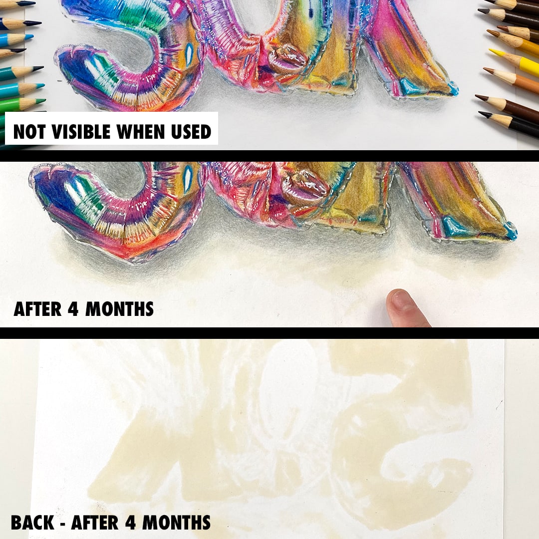
So, I recommend leaving your tests for a few months if you can see how they perform over time before using them on your best work.
From my other testing, I’d also recommend staying away from baby oil – which I hear recommended all the time! This didn’t seem to ever dry and was the only other product I tried that has left a noticeable stain after all this time.
Today, I’m using isopropyl alcohol. And I’ve loaded it into an empty alcohol marker to make a DIY alcohol pen.
This basically breaks down some of the binders in the pencil, which spreads out the color into the page and removes the white underneath. After it dries, you can color again over the top to build up even more color.
In my picture today, I used this on the iris of the Crayola side but chose not to use any solvents on the skin, so that the paper texture would add to the natural look of the texture of the skin anyway.

3. Work in light layers
If you watch my process in the above video, you’ll notice that I’m working in lots of layers of colors with BOTH the cheap and expensive colored pencils.
But this especially important with cheaper pencils.
Where the more expensive pencils can be a little more forgiving and can be worked with on the upper layers, cheaper pencils tend to be harder to work with – so EVERY layer counts.
If you make a mistake on a lower layer, it’s more likely it will show through on the cheaper pencils. And if you’re impatient, press to hard, or don’t create smooth strokes – it will have an impact on the end result.
So if you want to create professional results with cheaper pencils, you’re going to have to be more patient. It’s going to take more layers, more time, and you’ll need to learn to have a lighter hand.
4. Use better quality paper
This is possibly the most underrated tip when it comes to getting better results with your colored pencils.
Unfortunately, if you want to get good results with cheap pencils, you can’t rely on cheap paper too.
Paper is so important, and it was the key for me today in being able to layer these Crayolas so well that they actually held up against the Caran d’Ache Luminance.
Quality paper has more texture and thickness to allow you to layer more pigment from the pencils. Cheaper paper won’t take as much pencil, so you will be far more limited in what you can achieve.
In this example, I was using Fabriano Hot-Pressed Watercolor Paper (Buy on Blick | Amazon) but there are plenty of other quality papers available that will be a huge step up from standard printer paper.
I’ve got a whole article here about my favorite paper recommendations for colored pencils and what you should consider, along with some great budget-friendly options that will still give great results.
Crayola vs Caran d’Ache?
You don’t need expensive supplies to create art. You can create art with ANYTHING. And as you can see, even Crayola can create something close to Caran d’Ache with patience and practice.
If you want to see the full video of this drawing coming to life, you can watch it HERE.

But using the right tools can be rewarding, more enjoyable, and can help you to focus more on creating the art instead of trying to work against your supplies.
For me, this was my experience with the Caran d’Ache range of pencils. They unlocked my joy for drawing in a completely new way. But for many, these are a luxury, and probably unnecessary. There are a LOT of mid-range pencils that come in at a much cheaper price than these and will give you a lot of these features, so don’t panic if these are out of the budget for you right now. You can see my favorite mid-range and budget colored pencils in this list (This is updated regularly!)
But if you’re looking for something special to add to your collection that’s a step up from a Prismacolor and different to a Polychromos, the Caran d’Ache Luminance would be my top choice.





Massive PROPS, thanks, and congratulations to you for this amazing resource! This kind of generosity is rare in the current mixed media world. You have potentially saved MILLIONS of people, collectively, HUNDREDS of millions of dollars on ineffective products, PLUS you have given us a way to use less expensive products EFFECTIVELY! THAT is SERIOUSLY generous.
The other videos that you have done, also reflect your massively generous spirit and FORTITUDE! These videos represent HUNDREDS—if not THOUSANDS— of hours of time invested to learn about art techniques and products. That is AMAZING all by itself, but then you SHARED the knowledge with the entire world!!
So THANK YOU, SRC!! May your generosity be returned to you in very special ways!