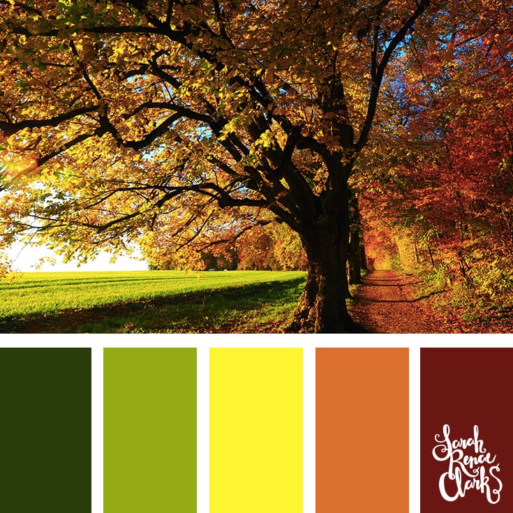
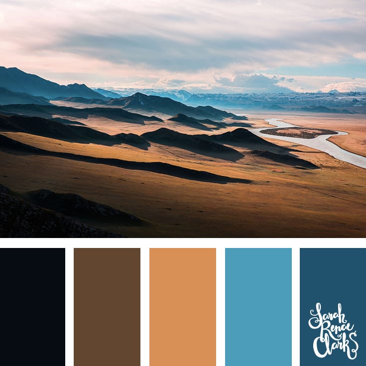
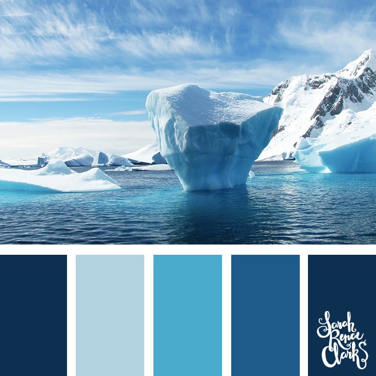
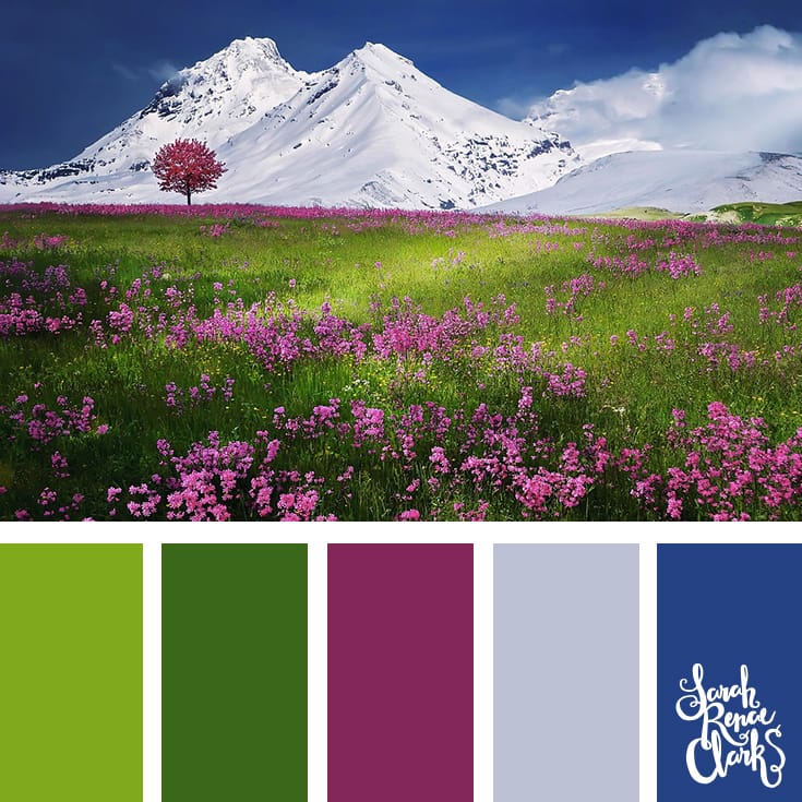
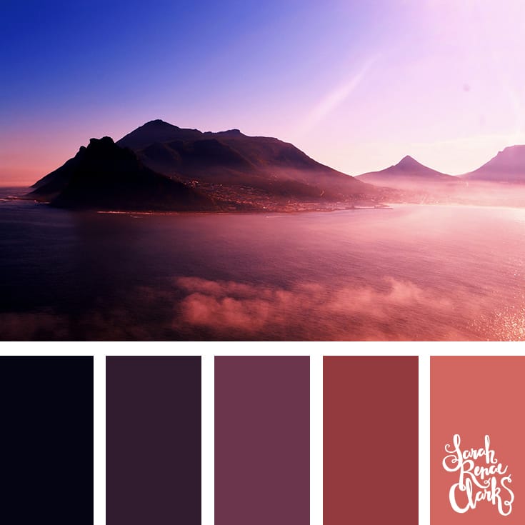
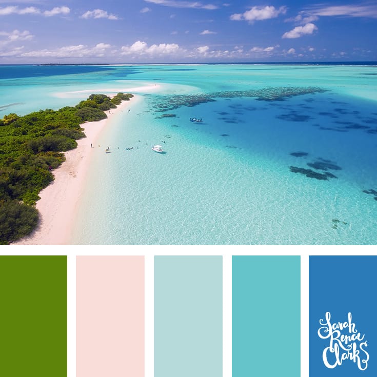
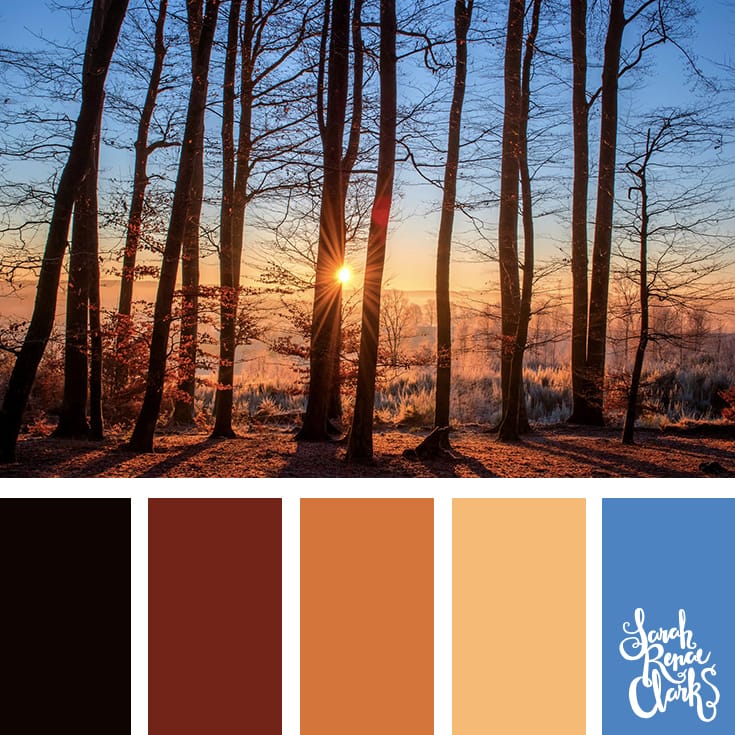
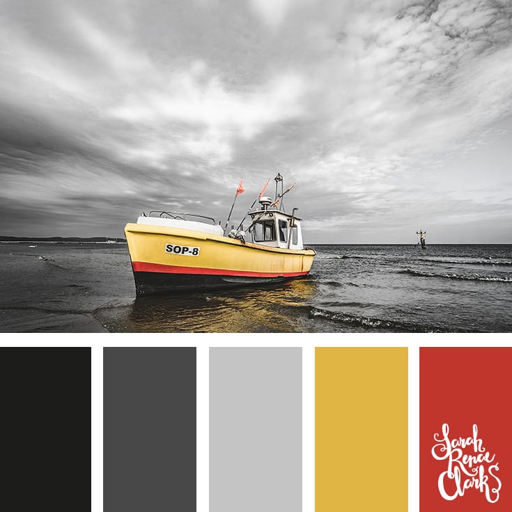
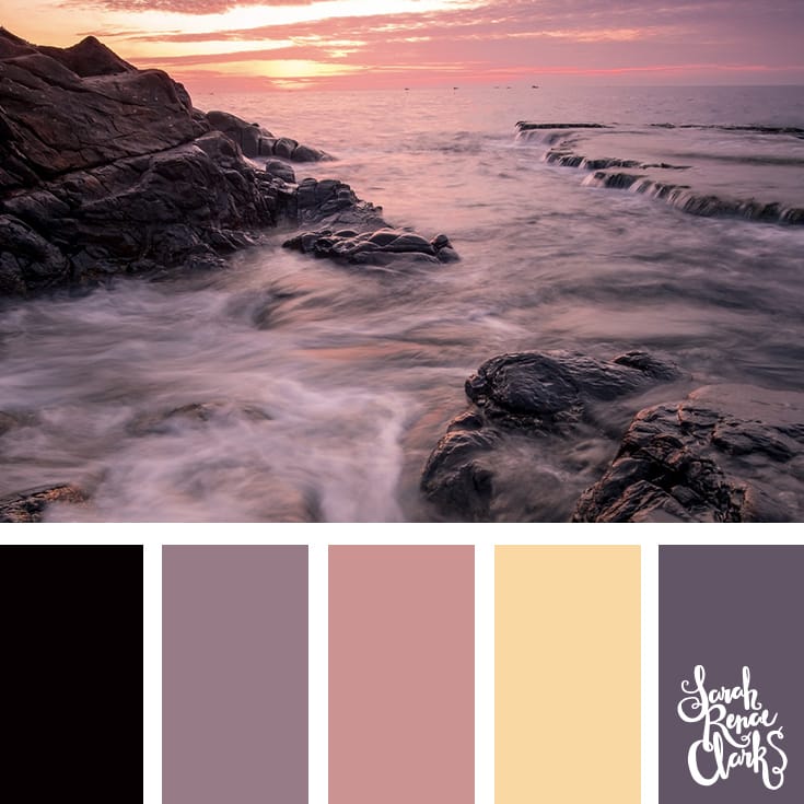
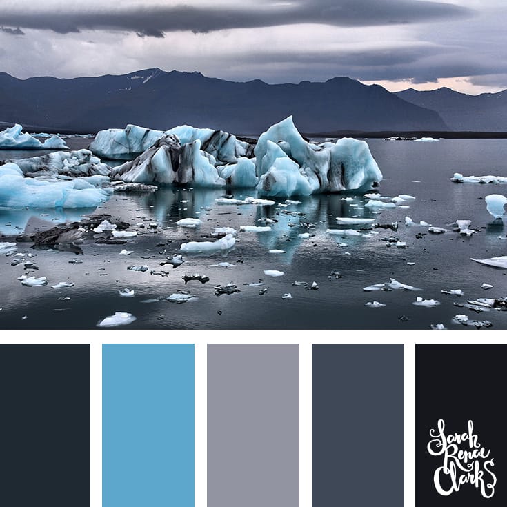
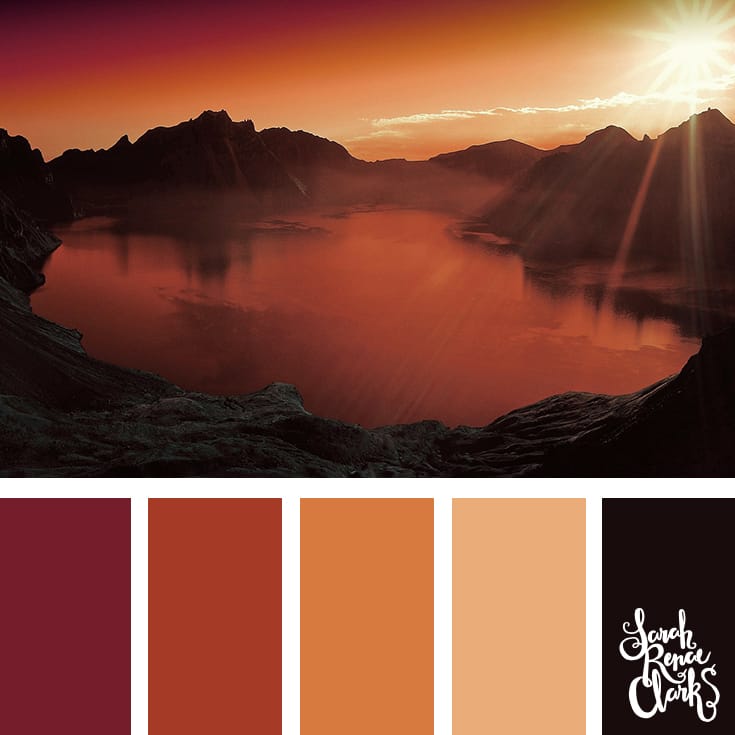
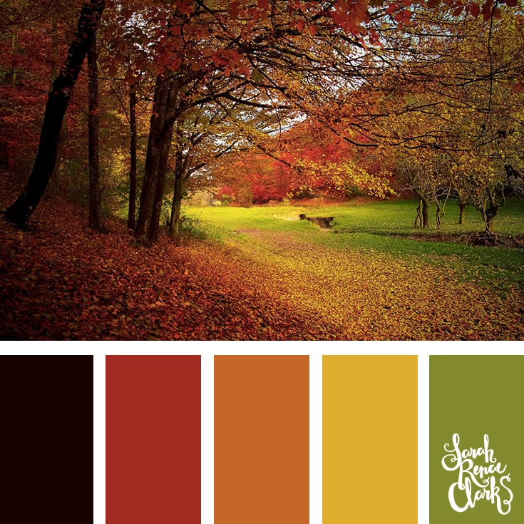
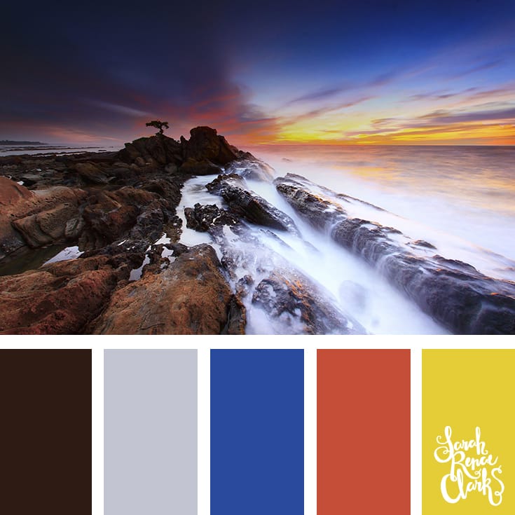
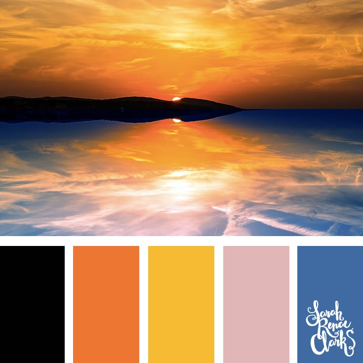
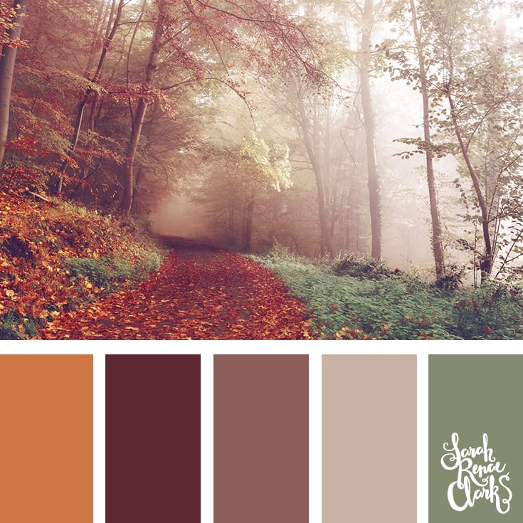
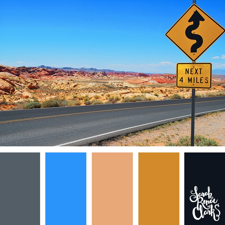
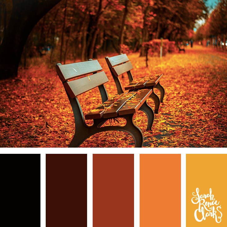
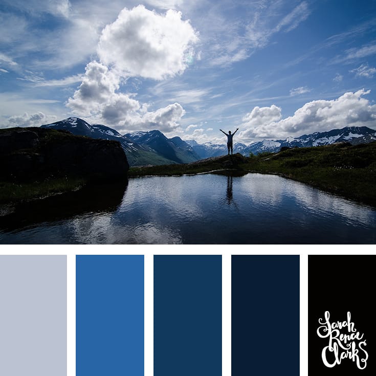
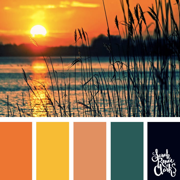
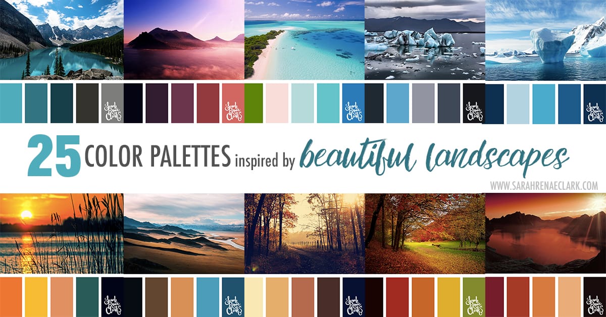
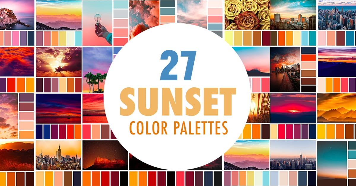
These 25 color palettes have been taken from beautiful landscape photography from around the world.
I absolutely love travelling the world, and there are some amazing places that I’ve never been but can only dream of visiting. These photos capture the amazing colors that can be found in nature, some in awe-inspiring locations that I’ll never see with my own eyes, and others in scenery that I’ve seen before but have taken for granted.
These colors are some of my favorites… I love the vibrant teals, blues and oranges that are found in these amazing views! I hope you like them too.
Please feel free to share them or use them on your own website, as long as you provide a link back.





Thanks for these palettes, well done and very inspiring!
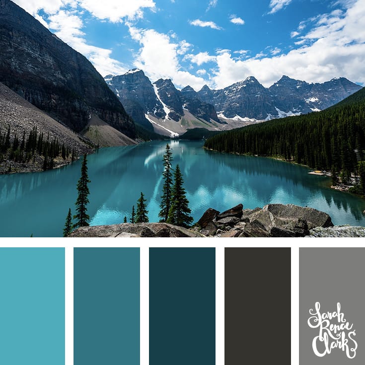
Thank you. The First is Moraine Lake in Banff, Canada
hi Sarah, amazing images, is it possible to use some in my mood boards?
Hi Reem!
Please feel free to use them, as long as you provide credit on social media (@sarahrenaeclark) or a link back to this blog post if you post them online.
Great, Thanks Sarah
I love your palettes – is it possible to find out the RGB values under the pictures?
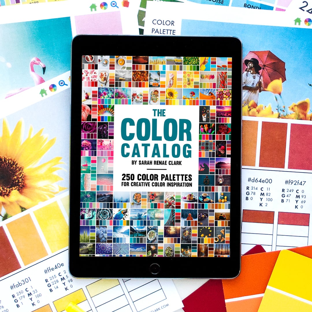
Hi Kim! You can now purchase the e-book that includes all 25 color palettes from this post and their RGB values (CMYK and HEX values are also included). Enjoy!
All of these are lovely.. Thank you so much.
These color palettes are awesome! I love the beach scene and colors!
Thank you! I like the beach scenes too.
ilove these palettes! Totally useful resource, thank you!
Thanks Rachel!
These are a great collection of palettes. I always refer to these before starting to color. It can really make a difference in the feel of the artwork. Thank you for making these!
Thanks Cristin! I never used to use palettes, but now I love them!
awesome and beautiful pictures and Palettes… wonderful and very inspirational !
Thanks Maria!
So pretty I love them all will definitely use some of these when colouring
Thanks Christina!
Color Palettes are great for mandalas and patterns! I never start a mandala without one :D.
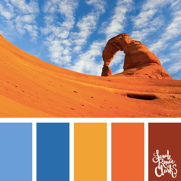
Out of these I have to say I like the desert the best. It has complimentary colors which will cause a design to pop, and it’s nice and bright. The other ones are nice but they seem too soft for me. I like bold and loud color schemes :D.
I like the bold color schemes too :)
Stunning Colors! Thank you for sharing!
Hi Sarah! I just now discovered you! Have been drooling over your color palettes. That’s where I learned about you in the first place. Someone had posted their favorite one on Facebook along with a link back to you. Just one problem – as far as I can tell, there is simply no way I could pick just one! I seriously am going to save them for future reference.
Thanks so much.
Madeleine
Hi Madeleine! Thanks for your lovely comment and for getting in touch! I’m glad you like the palettes. I started making a few earlier this year and I’m a bit addicted now :)
You can follow my Pinterest board if you’d like to see all my palettes in one place (and you can easily repin your favorites) – https://au.pinterest.com/sarahrenaeclark/color-palettes-sarah-renae-clark/
Wow.. it’s so beautiful
My favorite palettes are blues and purples! The one of the Utah sandstone arch, I’ve hiked there with my husband and son! We used to live in upper Utah and we visited most of the national parks in the lower part of the state. They’re so much more beautiful in person.
I love Color Palettes. These are beautiful!
Thanks Emma!