
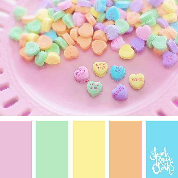
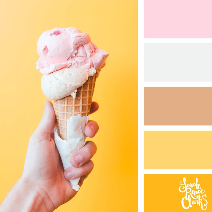
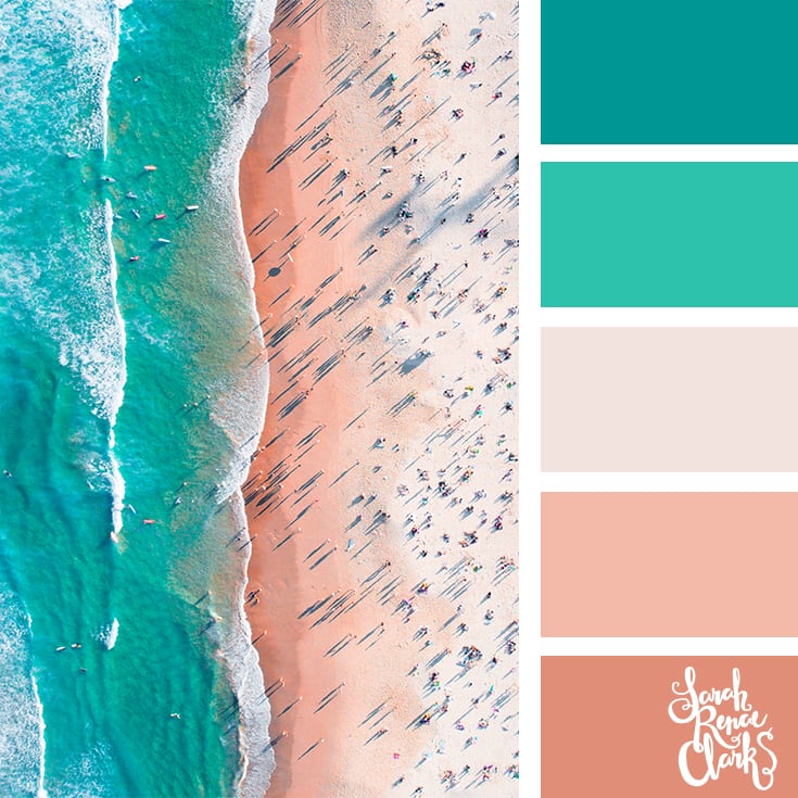
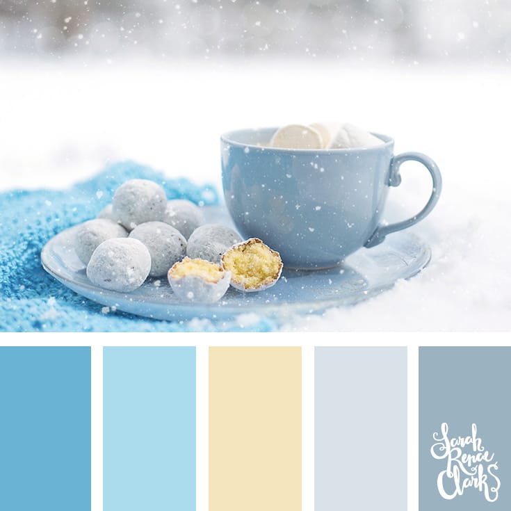
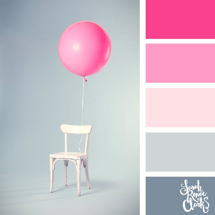
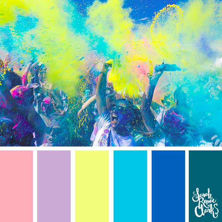
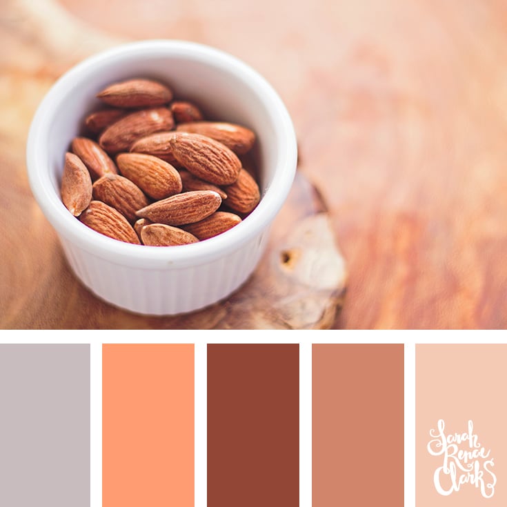
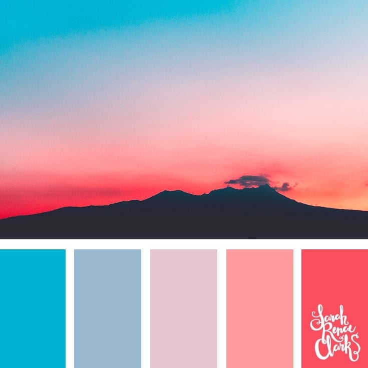
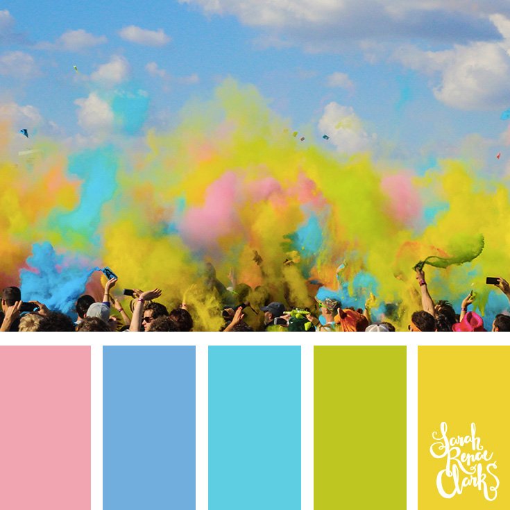
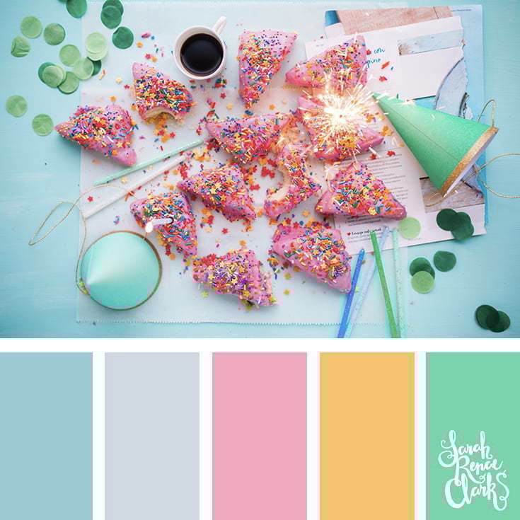
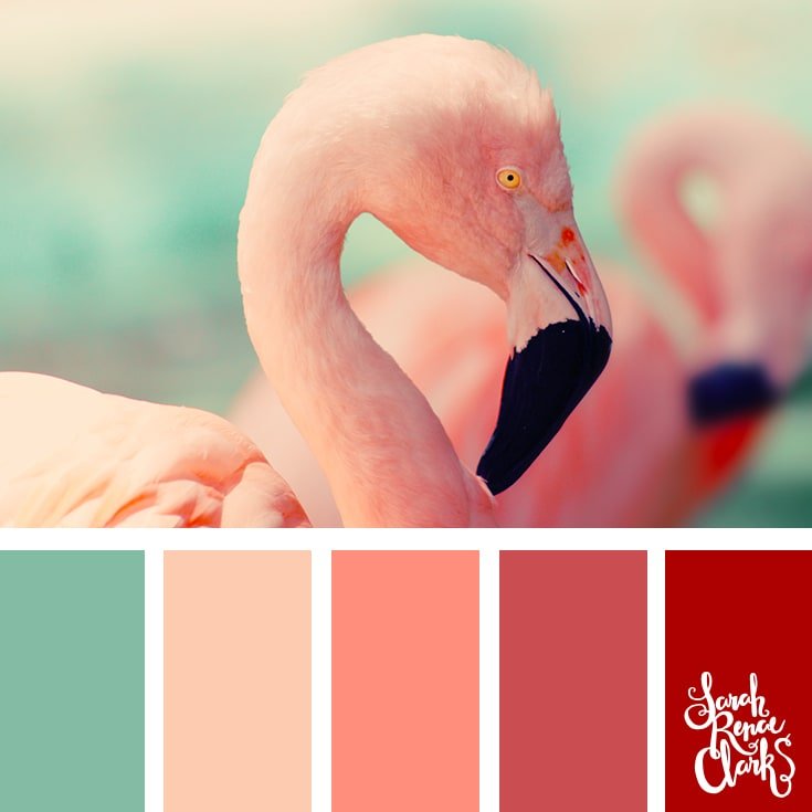
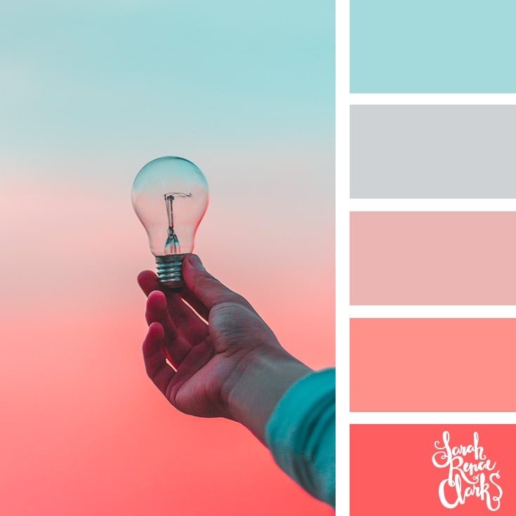
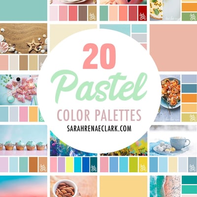
Pastel colors are perfect for a sweet or muted color scheme. They are pale in color, usually much less saturated than their bolder base colors, making them a great choice for art styles like Kawaii drawings, and a popular home color palette for a baby nursery!
Pastel colors are named after the art medium, also known as pastels. Pastels are similar to crayons, and come in wax, oil or chalk form. These were created by grinding the original pigments into a paste with water and a gum binder, then turned into their stick form. The name “pastel” is derived from the latin word for “paste” (pastellus). Because these sticks were often less saturated than paints, the word “pastel” became a great way to describe pale colors as well.
Rather than red, most pastel “reds” fall into either a pale pink or pale orange category. But you will find baby blues, pale pinks, creamy yellows, minty greens and light purples.
It used to be tricky to find pastel colored pencils (not to be confused with pastel pencils as a medium), but now there are a variety of brands that offer specialty pastel tone sets. I compared a few sets recently in my huge pencil comparison, and also share some ways to find Holbein pastel alternatives in your other sets in this article.
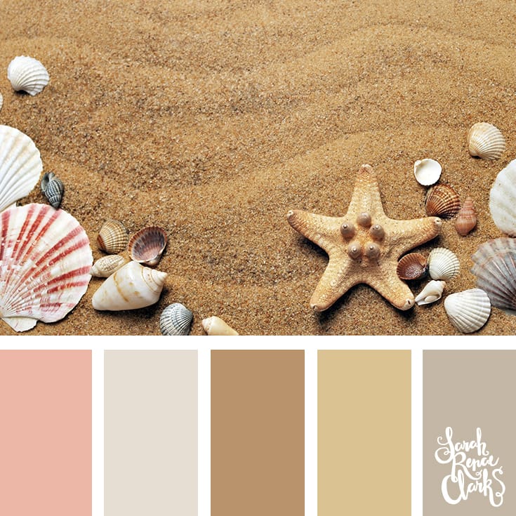
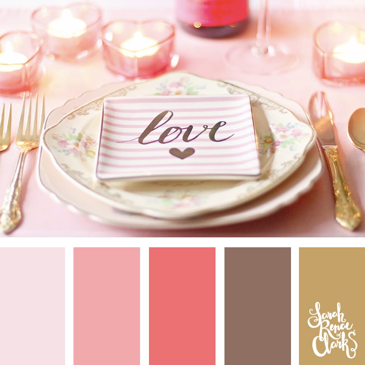
All of the color palettes below are included in The Color Cube!
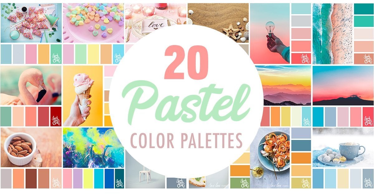
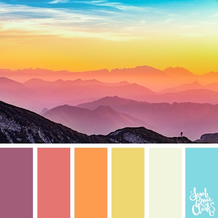
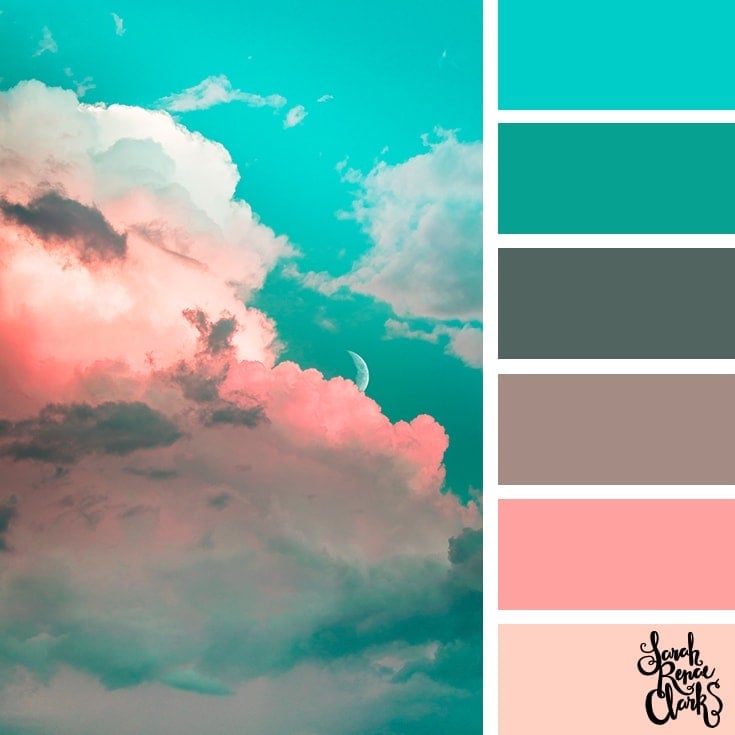
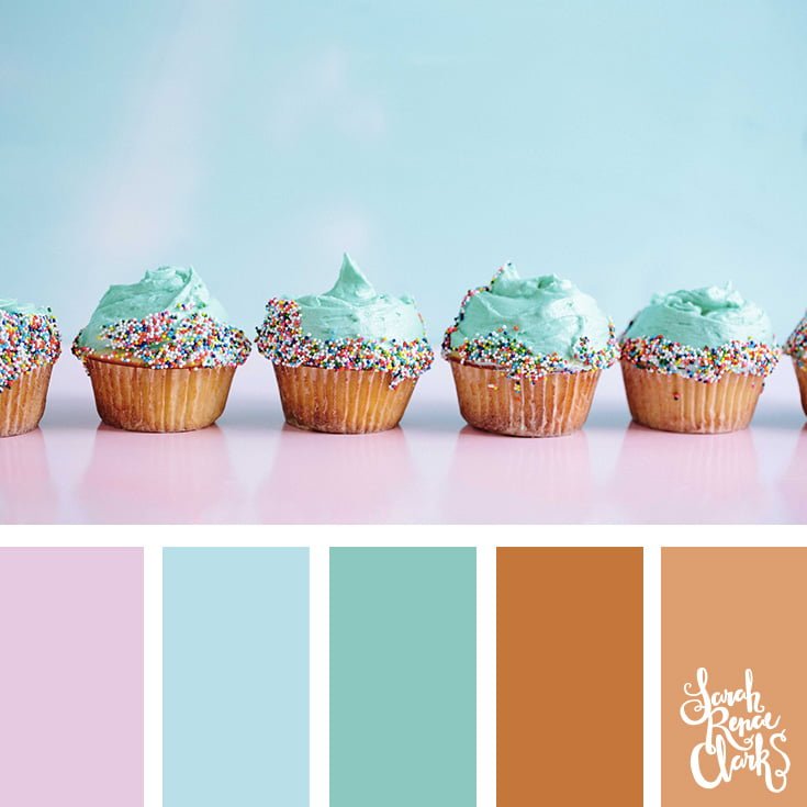
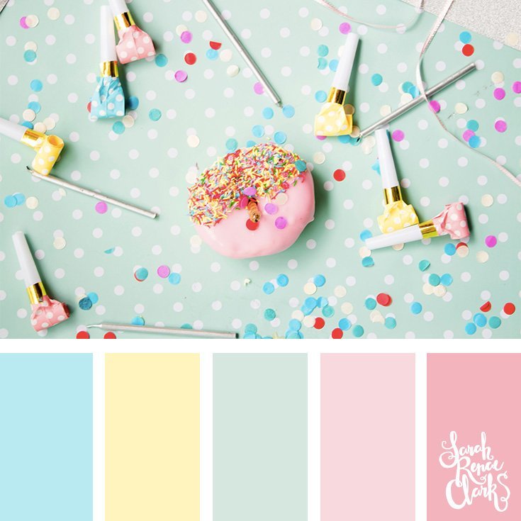
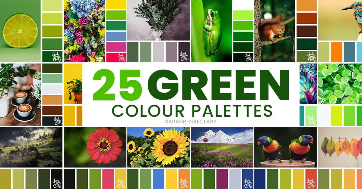
20 Pastel Color Palettes
Please feel free to share these color palettes or use them on your own website or social media, as long as you provide attribution and a link back to this article. You can also share any of these color palettes to Pinterest, but please do not upload to Pinterest directly.
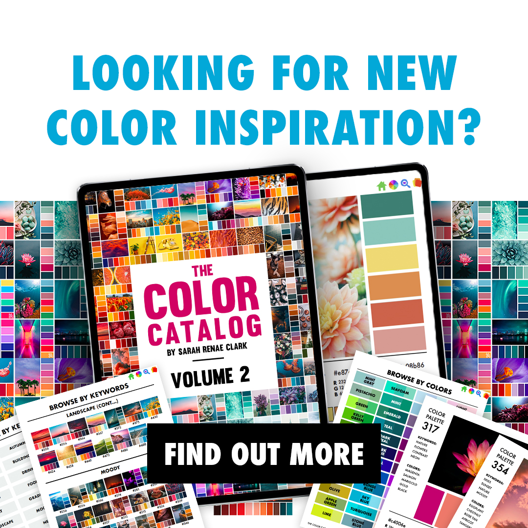
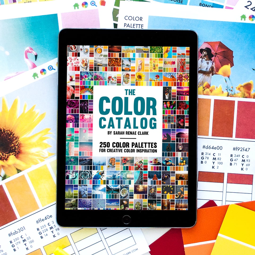
Get 250 color palettes in an interactive format that you can use on your tablet or mobile device for instant access to a library of color inspiration with The Color Catalog.
Browse by color, keyword or collection and find the perfect color palette in just a few taps.
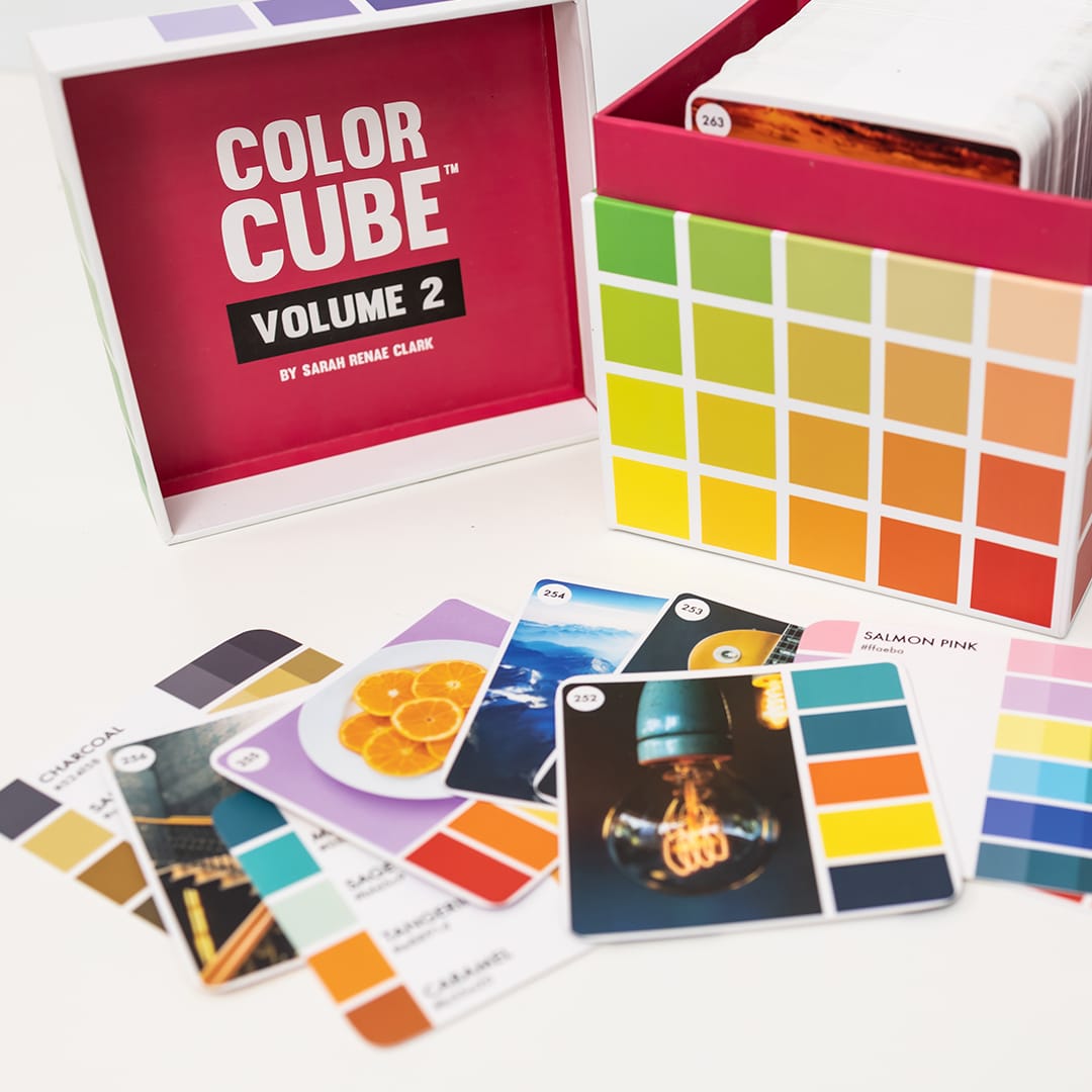
The Color Cube makes color selection easy and fun! With 250 color palettes as handy cards to help build your confidence in choosing colors that look good.
Grab your favorite color palettes to compare, match the colors right up against whatever you are working on, or even clip them to your project to come back to later.
Each card features the image and colors on the front for inspiration, and then the colors again on the back, right up to the edge of the card. The back also includes the hex codes for digital artists, as well as darker and lighter shades of each color.
I’ve saved these 20 pastel color palettes (and more) to my Color Palettes board on Pinterest so you can follow, save and repin your favorites!
What are your thoughts on pastel palettes and how do these ones inspire you to create your next art project?
If you love these colors but need help choosing pencils to match, check out The Best Holbein Alternatives to see my recommendations for pastel colored pencils and grab my free color comparison chart to find them in the brands you already own.
Please share your thoughts in the comments below and repin your favorites to Pinterest!
Could you give the number of the cards so I can find these easier! Pretty please!
I have the colors cubes! Is there you way you could put the number of the cards so we don’t have to go thru all 500 cards to find these!
Hi Sarah,
Do you ship to Europe (Belgium) or can we buy the cubes in Europe ?
Thanks you Sarah! You are amazing
Are these pastels are in the cube set which i just received!!!
They certainly are. Enjoy! Kristen (Team Sarah)