
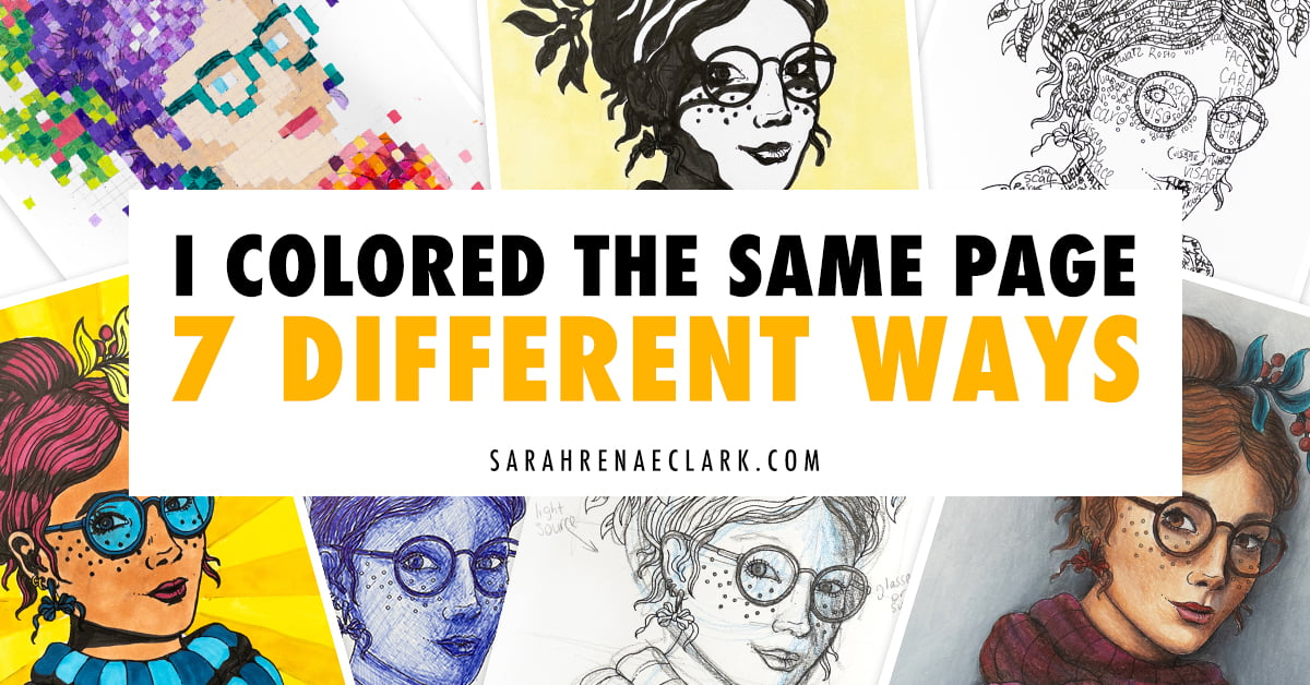
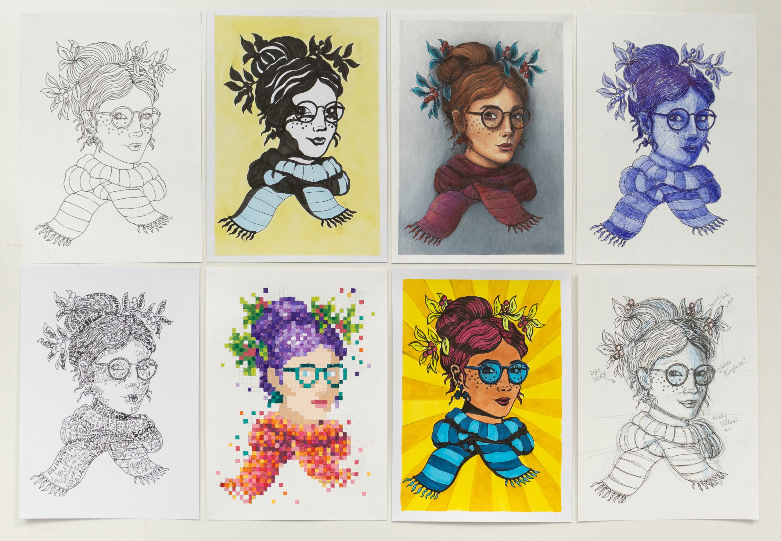
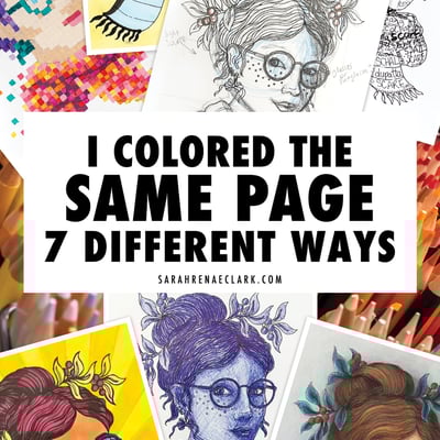
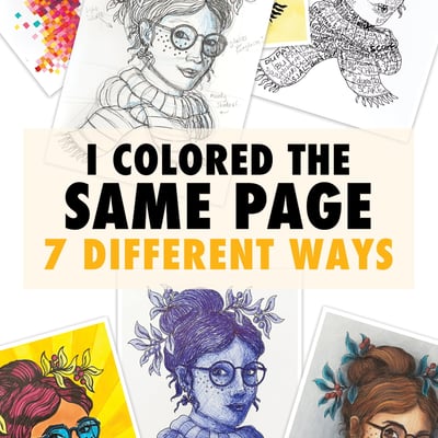
Have you ever colored the same coloring page twice? What about three times? Or maybe even…. seven?
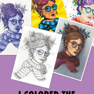
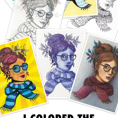
I decided it would be fun to try different art styles on the same coloring page to really push myself out of my creative comfort zone and I was really surprised by some of the results. In this blog, I’ll take you through the seven different art styles that I used to color the same page again and again … and again! If you haven’t caught the video of me tackling this challenge, check it out on my YouTube Channel now.
This video and article is not sponsored by any brand or artist. All information presented in this article and video are my opinions only. This post contains affiliate links and I may earn a commission if you click them (at no cost to you).
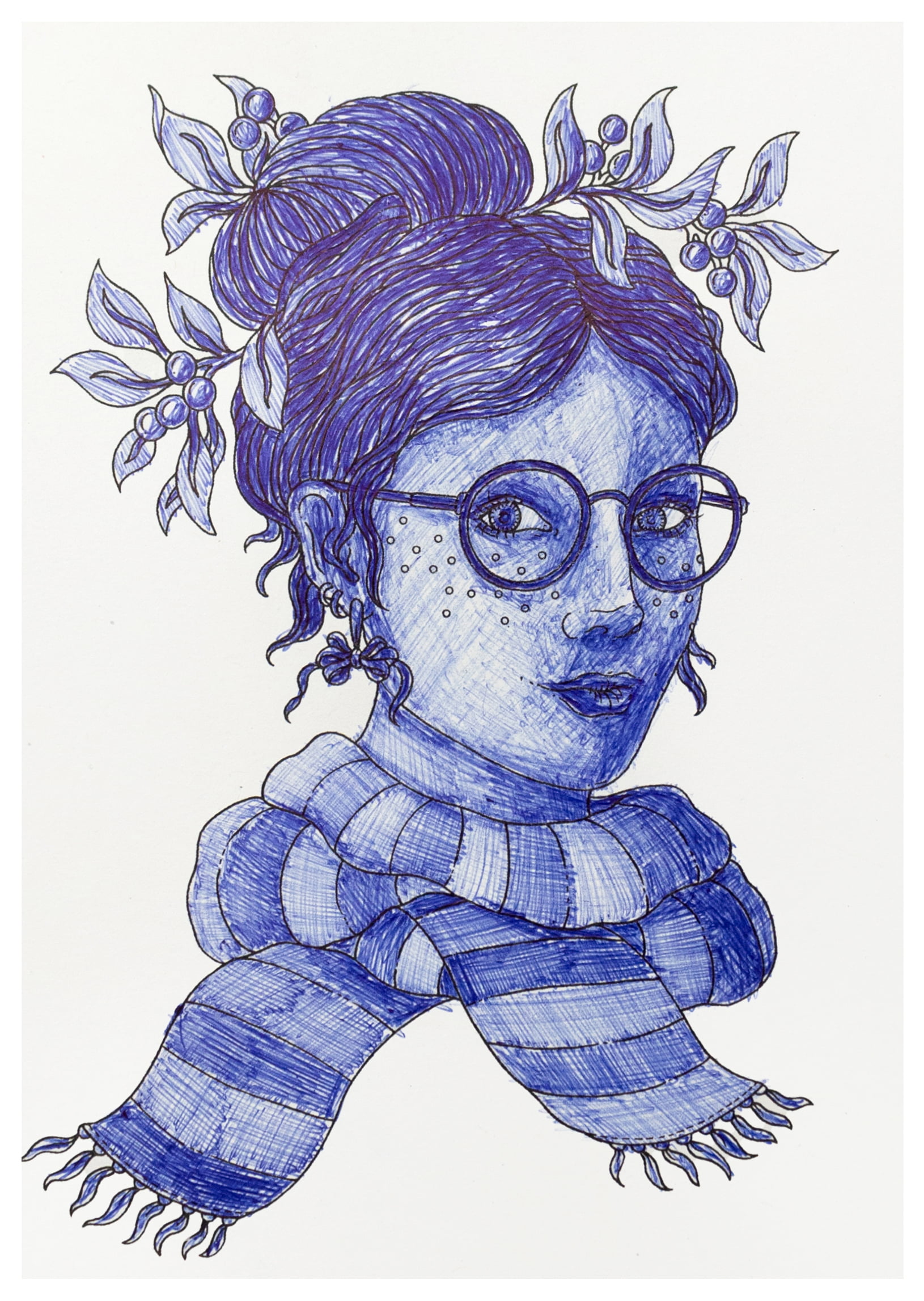
Technique 1 – Ballpoint Pen
You’ve heard of the one-color challenge right? How about a one-pen challenge!
I decided that the first art style I wanted to try was coloring the whole page with just a ballpoint pen and it was much harder than I expected it to be. I tried keeping my hand in a very specific grip to control the flow of the ink but that just resulted in my hand cramping!
I kept going though, with light pen strokes and cross-hatching the areas where I wanted the shadows to be, and I felt happy enough with the result. I might have to try this technique again with a better pen… or a worse pen? I’m not too sure at this point!
Supplies I Used in This Challenge:
- A ballpoint pen – Easy!
Tips for This Style
- Try different pens to see which pen works best for you. Different pens will give different consistency, thickness and lay down so experiment before you start
- Start with light strokes and gradually add more lines and pressure as you get used to the technique
- Use cross-hatching, stippling or heavy pressure to create shading
- Don’t rush this one. Build up your layers over time so you can see where you want your shadows and highlights to be
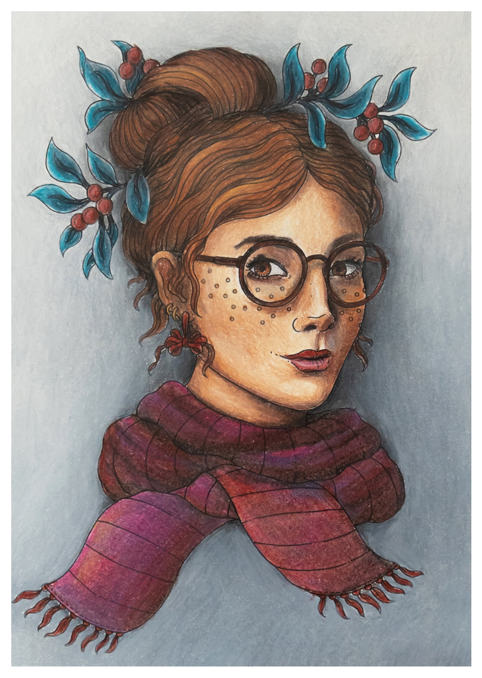
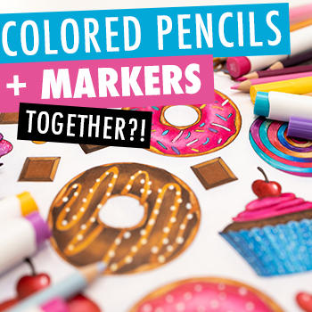
Technique 2 – Colored Pencils
I wanted to include a challenge with Caran d’Ache Luminance, my ultimate favorite colored pencils. Pencils are my go-to medium, so I put a lot of effort into this one. I went for a realism approach with this picture, so it took me longer than most of the other art styles, even though it is the one I’m most confident with.
I started with the face first and used a few colors that I thought would work well for skin tone. I then blocked out where I wanted the shadows to be with the darker colors, to help give me a feel for the structure of what I was drawing. The face alone took me two hours!
For the hair, I used some of the same colors that I used on the face and added some darker tones, keeping the palette simple and letting me focus on the technique. I didn’t color every strand of hair here, instead I focused on big blocks of shadows and highlights and the overall shape.
For the background, I used a range of grey tones from the palette I had chosen and focused on creating subtle shadows behind the portrait.
This is definitely a technique that anyone can try; all you need to do is choose a faded color as your base, then choose a darker version of the same color. Keep your pressure light by holding the pencil back further and work in small circular motions, creating light layers. Pick an area where your light source might be and leave this area a little lighter than the rest of the page.
Doing this creates a slight gradient across the whole background that looks natural; kind of light a white wall with a light cast over it.
I moved on from the completed background to the details in her hair and face, her glasses and then finally the scarf. I wanted this to look a little more realistic so I added extra fabric creases for more interest.
This style took me a whopping five hours, but I was extremely happy with how it turned out.
Supplies I Used in This Challenge:
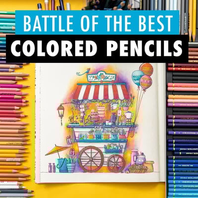
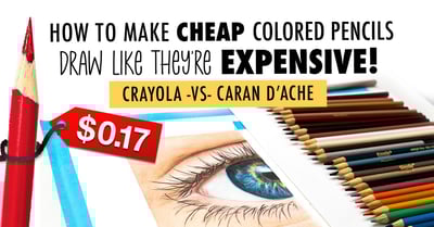
- My favorite set of colored pencils, the Caran d’Ache Luminance which I determined in my Battle of the Best Colored Pencils blog.
- The Caran d’Ache Full Blender for the final touches to any coloring page.
Tips for this Style:
- If you want to try this or any specific angles for your shadows and highlights, reference images can really help!
- Keep your pressure light by holding the pencil back further and work in small circular motions, creating light layers.
- Keeping your color palette simple can really help you focus on technique. You don’t need a heap of different colors; just focus on using a few well chosen ones really well.
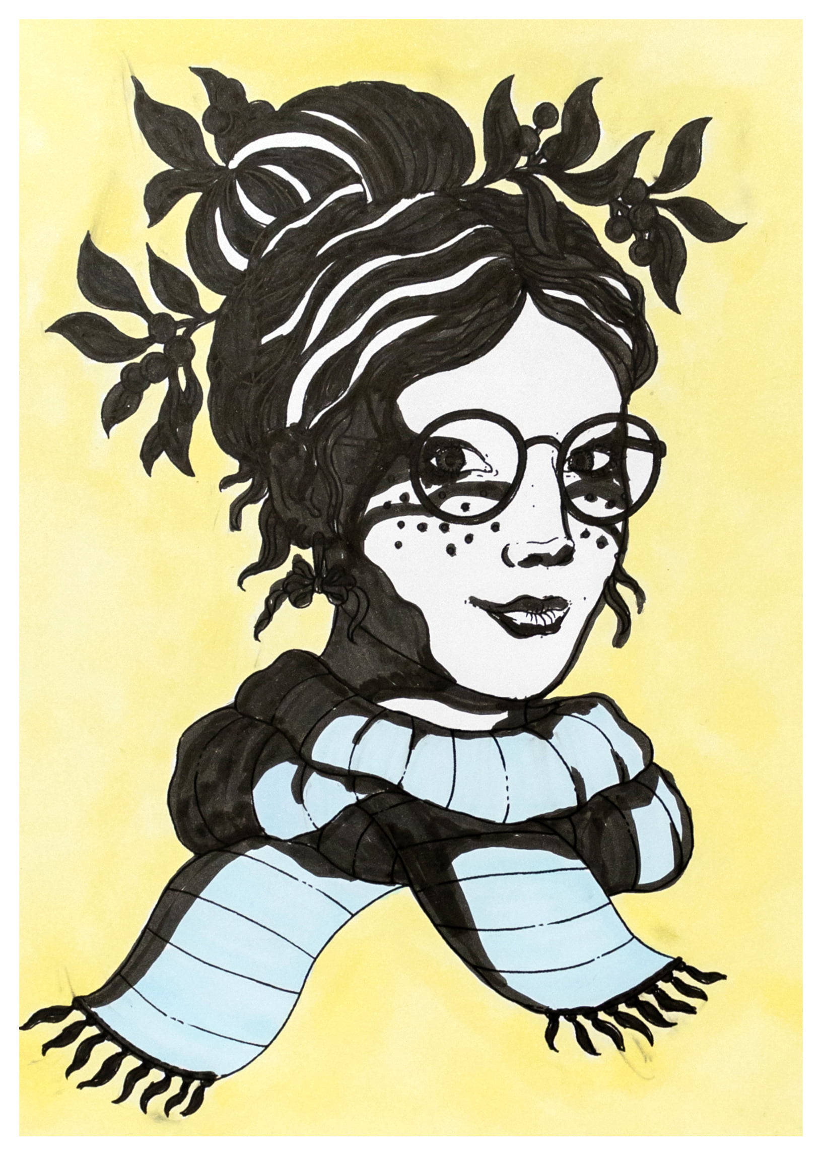
Technique #3 – Stencil Style
While I’m not completely settled on the name ‘stencil style’ for this, I wasn’t sure what else to call it, so this is what I went with! I was inspired by the work of the famous and anonymous artist, Banksy. Creative and controversial, Banksy’s art is known for highlighting social and political issues; and while I’m not going quite there with this style, I wanted the bold, heavy shadows that are reminiscent of Banksy’s style. Cue the black markers!
Once I had the bold shadows the way I wanted them, I just needed 1 – 2 colors in a muted or pastel palette and left quite a lot of the picture white. I ran into some trouble when the black marker bled into my colored markers, so I had to slow down and color this one really carefully! Overall I was happy with the result here, even if it wasn’t as quick as I had hoped.
Supplies I Used in This Challenge:
- A heavy black marker
- A few flat muted colored Alcohol Markers. I used Ohuhu Brush Markers
Tips for this Style:
- Do your best to find a waterproof black marker for your shadow work or you may have bleeds occur when it comes to laying down color.
- To make the shadows and big bold lines pop, use your color sparingly. Just one or two muted or pastel tones should be enough!
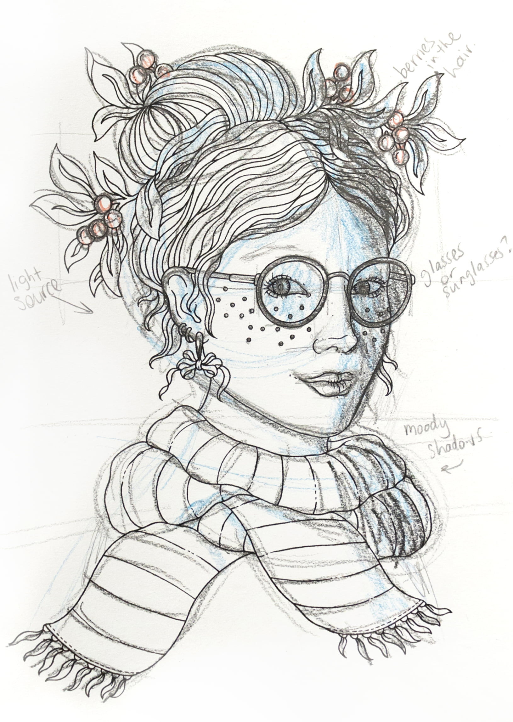
Technique 4 – Sketchy Look
My goal for this technique was to create the illusion that this piece was an original sketch and not a final coloring page. I added some loose, structural lines around her face and measurements by the eyes and glasses and then added some blue to mark out shadows.
It was feeling a little unfinished at this point so I added some notes about the work, like I would if I were sketching it out for the first time… and voila!
Supplies I Used in This Challenge:
- I used the Mechanical Pencil from Jazza’s Pro Sketch Pack – this isn’t essential but it’s filled with amazing quality piece that every sketch artist needs.
- Kneadable Erasers – I love this one by Faber Castell
Tips for this Style:
- Blue is a common color used by sketch artists and design artists because while it’s visible to the naked eye, it disappears in the copier or scanner!
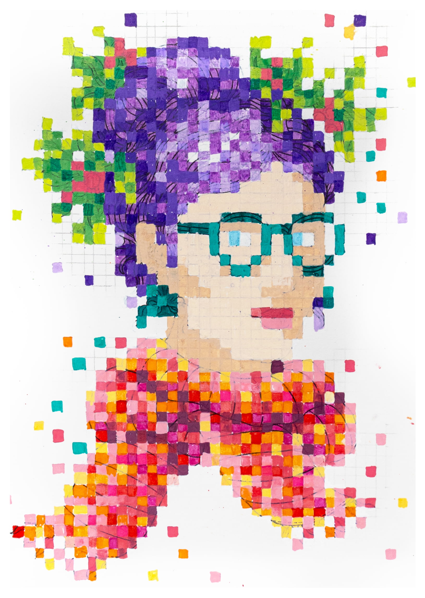
Technique 5 – Pixel Art
I have really been looking forward to this style because pixel art feels like a technique that just never goes out of style.
If you’re familiar with the incredible murals people create in Minecraft or the very popular diamond art painting trend, then you know exactly what I’m talking about.
Square by square art has been around for so long but we often associate it with the 8-bit video games of the 1980s. But think back to the technique of mosaics and cross stitch art and you quickly realize that this is a technique that has been around since the Middle Ages!
I had never tried pixel art and I didn’t know if this style was going to work with the image I had chosen – but I was excited to try it out. I chose paint pens but also some fine liner pens to help with the vivid color palette I had chosen and having the limited color palette was a good choice because this is pretty common to this style. The paint pens also helped to cover up the original line work with just one or two coats.
I made sure I had a lighter and darker tone of my main colors to help create interest in this piece, and it also helped to make the process feel a little less repetitive. After all, I was just coloring a bunch of little squares!
The squares determine the shape of the image, so I had to be really strategic in some areas, like the glasses. I also felt challenged by the lack of skin tone colors in the palette but working within the limitations pushed me to really make the most out of what was available to me.
I finished off by leaving some parts of the grid marks still visible and I really like how this one turned out!
Supplies I Used in This Challenge:
- I used Artistro Paint Pens for a really bright and opaque effect.
Tips for this Style:
- Use a limited color palette for this style but don’t be afraid to incorporate a light tone and a dark tone so you can vary up the depth a little.
- Be strategic with certain shapes. While most of the pixel were a solid color, some weren’t and I had to choose very carefully what color to use where.
- Consider leaving part of your original drawing grid on the page for an added effect.
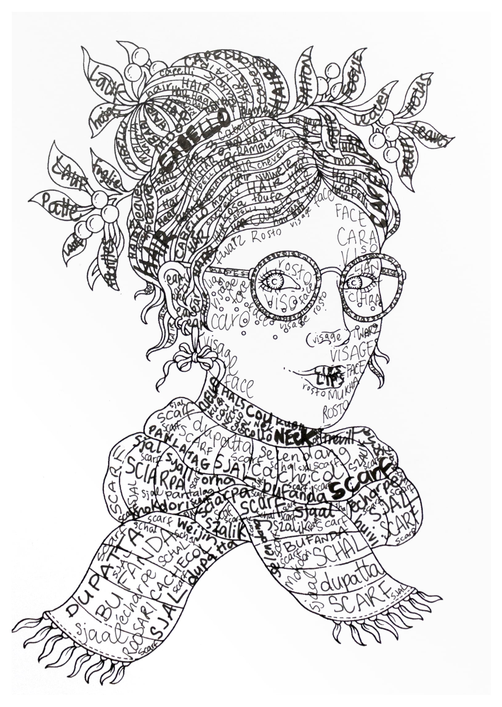
Technique 6 – Typography
So this technique was not nearly as easy as I thought it was going to be! The plan was to color this style in, in only one color, and using words to create the shading… the idea being that thicker, bigger words will look darker and thinner, smaller words will look lighter – right?
I didn’t want the create just a silhouette and I didn’t want the words to overlap so this was a big challenge!
I chose to use the words of the thing I was coloring (so I colored the scarf, using the word scarf!) but for variation, I used different languages too. Ultimately if you’re going to try this challenge, you can use any words that work for you!
I was challenged by the small details on this page, and I couldn’t see the variation in light and dark that I was hoping to so my advice is to seek out some examples if you want to try this style. Then you can see how others approach the different thicknesses, overlapping words or sizes of the typography.
Ultimately, I was happy with this piece, but I definitely want to try it again one day.
Supplies I Used in This Challenge:
Tips for this Style:
- Don’t over think the words! You can literally use any words you like to make this style work. From song lyrics, to names, to poetry. Anything that works for you will be great. You don’t even have to stick to one language!
- Consider the page before you start. If there are a lot of smaller details on the page, the shadowing effect might be harder to achieve.
- Be prepared to take a risk! I was really unsure about shading in the face on this page but I leaned into the style and I was happy with the result.
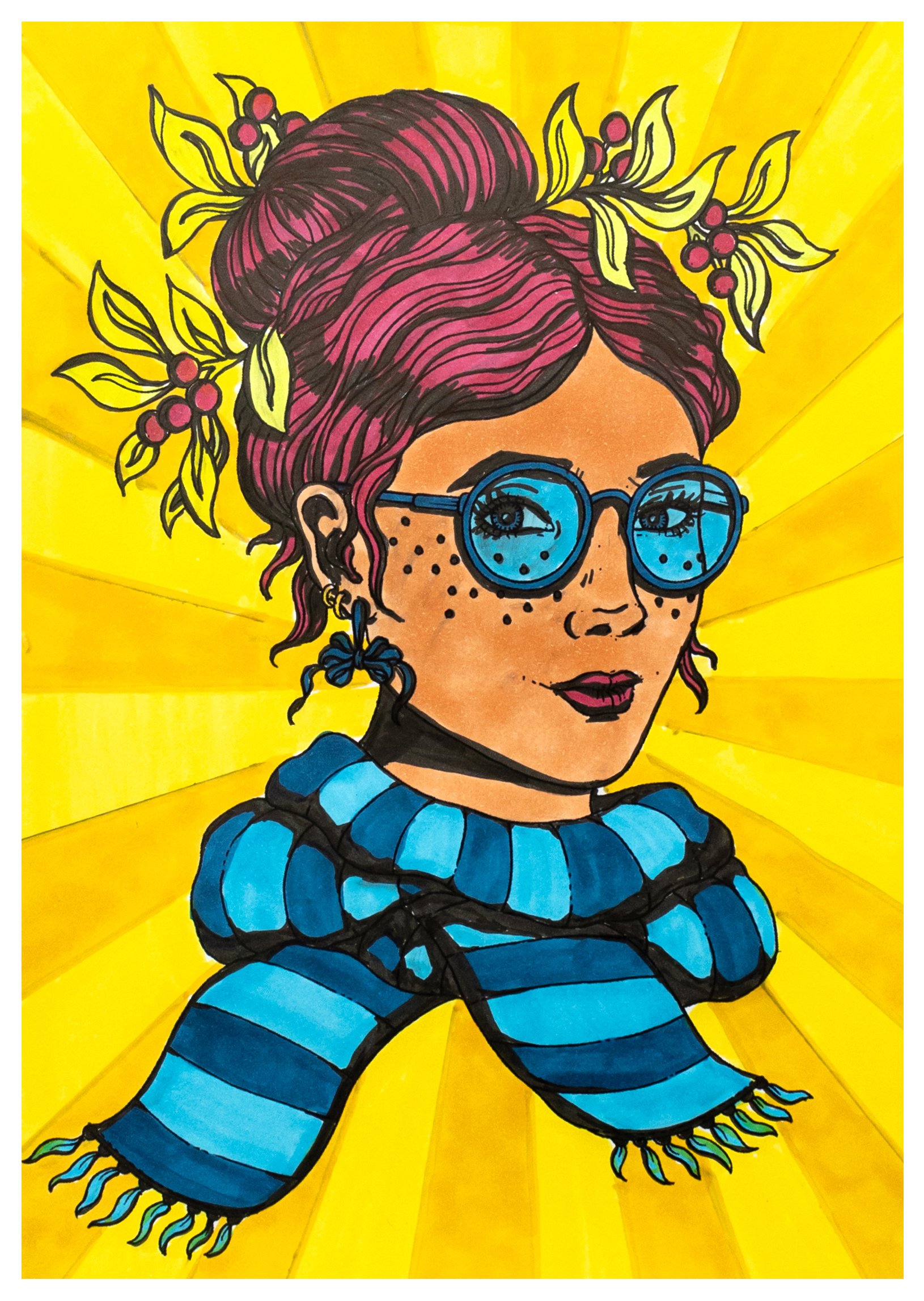
Technique 7 – Pop Art
With one style left to go, I really wanted to try pop art. Now when you hear pop art, your first thoughts might be Andy Warhol but I wanted to go in a different direction; the art style of Roy Lichtenstein. His work in pop art helped redefine this art movement and was inspired by comic books!
One of the biggest keys to this style is the varying widths of the lines in the initial drawing, so that’s where I started.
I thickened some of the original line art at points where I thought they would naturally be thicker, hoping to give it a more organic look. This is a really fun challenge for me, because even in my own coloring pages, I only use one thickness in the lines that I draw.
When it came to coloring in, pop art tends to lean towards bright and vivid, but limited in its palette. This was in large part due to the limitations of the printing processes back in the 50s when the art style really took off. My color approach was probably a bit more modern than Roy Lichtenstein would have used and I avoided doing the ‘dot printing’ effect that was also quite traditional, because it just felt like it would take forever! But I loved how it turned out once I added a bright background it was complete! I did have some more trouble with my black marker bleeding again.
Supplies I Used in This Challenge:
Tips for this Style:
- One of the key elements to this style is the varying widths of the line art so don’t be afraid to get in there and change up the image with thick black lines.
- Keep your color palette limited but bright, reminiscent of the comic color palettes of the 50s.
- Consider incorporating the dot print effect that is so iconic in Lichtenstein’s work. I ran out of time but you should go for it!
Should I try this coloring challenge again?
So which one was your favourite? I had such fun with this challenge, and it pushed me to really get creative in a couple of different ways, so I hope it’s something you’ll try too. Let me know in the comments what other styles you’d like to see me try?
For more coloring techniques and art challenges, check out these blogs next!
I am a middle school art teacher. I loved this challenge. My favorites were the colored pencil, pixel and pop art. I might ask my students to do a similar challenge. Maybe not all 7 but 2-3 of their own choice. Have you tried some of the trending styles such as glitch, drip, and neon glow? These would be cool to see you do.