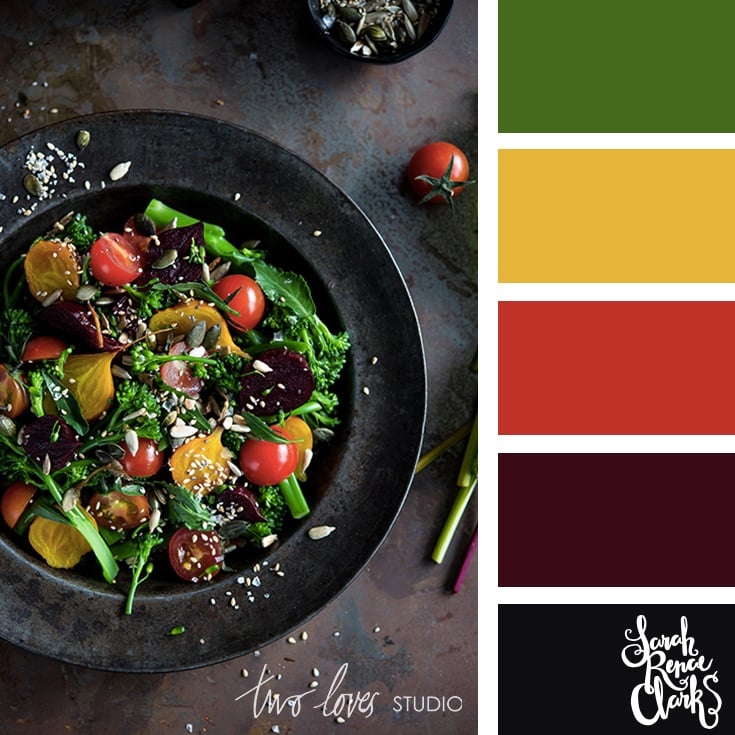
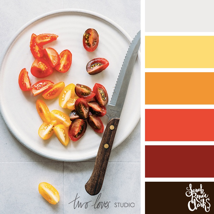
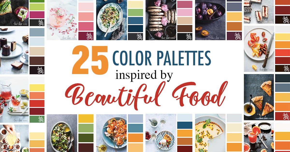
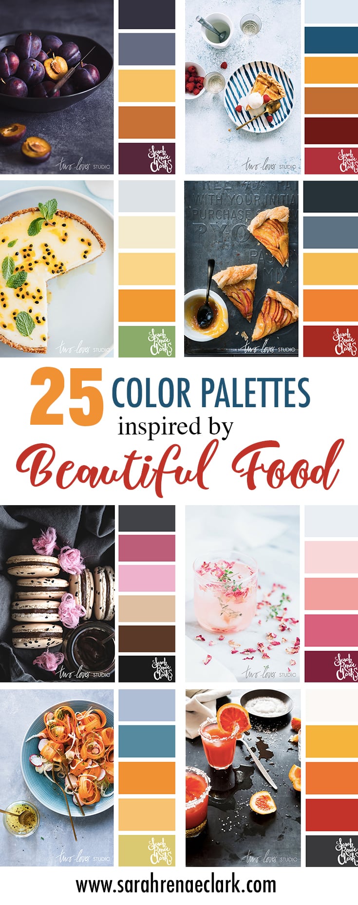
These 25 color palettes have been inspired by the beautiful food photography from Rachel Korinek at Two Loves Studio.
Rachel’s work has been featured in a range of magazines and publications all over the world including Bride Magazine, Woolworths, Huffington Post, West Elm, Nourish Magazine, Robert Gordon, Decor8, Aldi and more. You can read more about her photography and training resources for food photographers at the bottom of this article.
If you’re looking for RGB, CMYK and HEX codes, please check out the printable PDF color guide, which includes all 25 color palettes and the codes for each color.
Are you on Instagram? Follow @dailycolorpalettes for daily color combinations in your feed!
Enjoy :)
Terms of use:
Please feel free to use these palettes for personal use. If you’d like to post them on social media, please provide a link to this blog post.
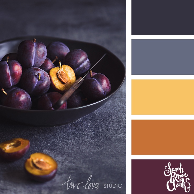
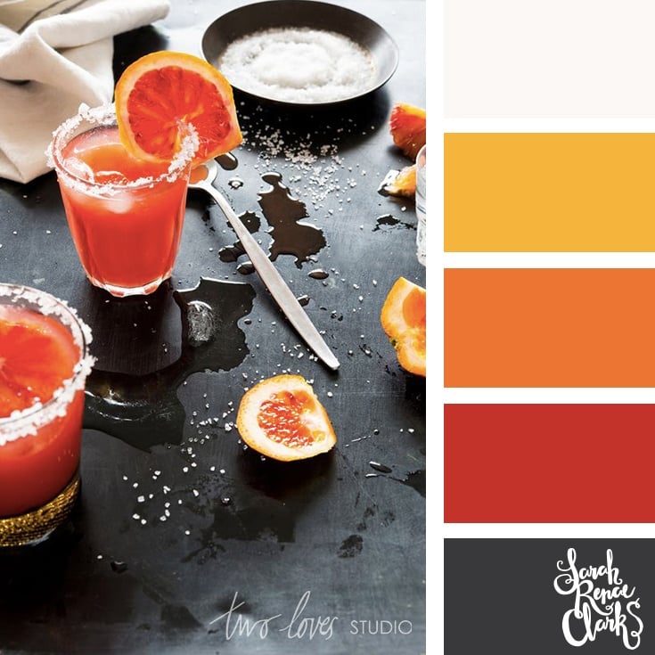
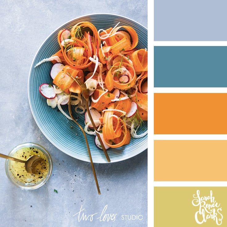

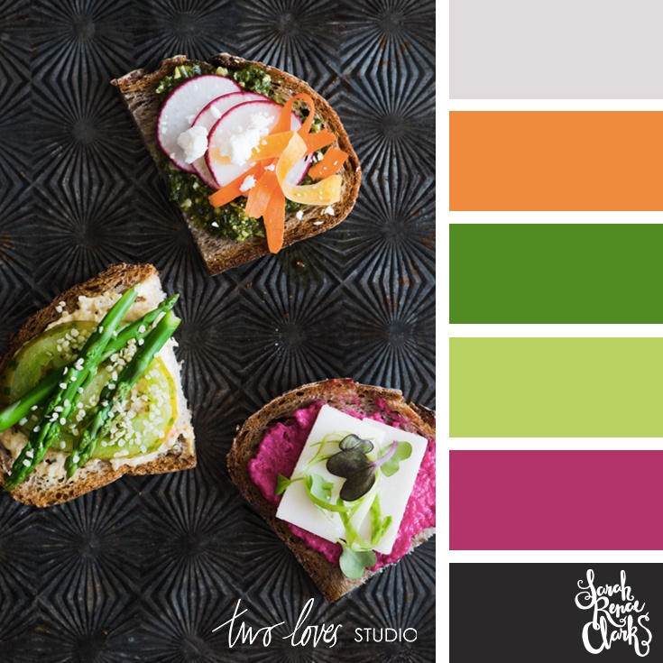
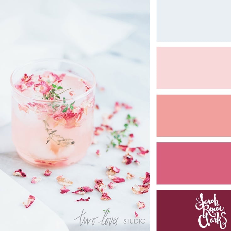
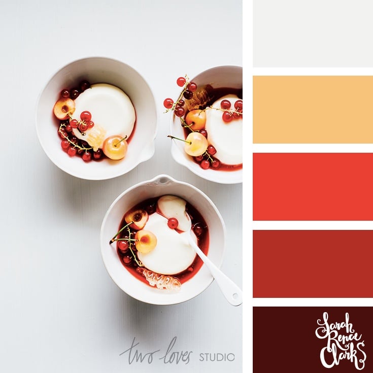

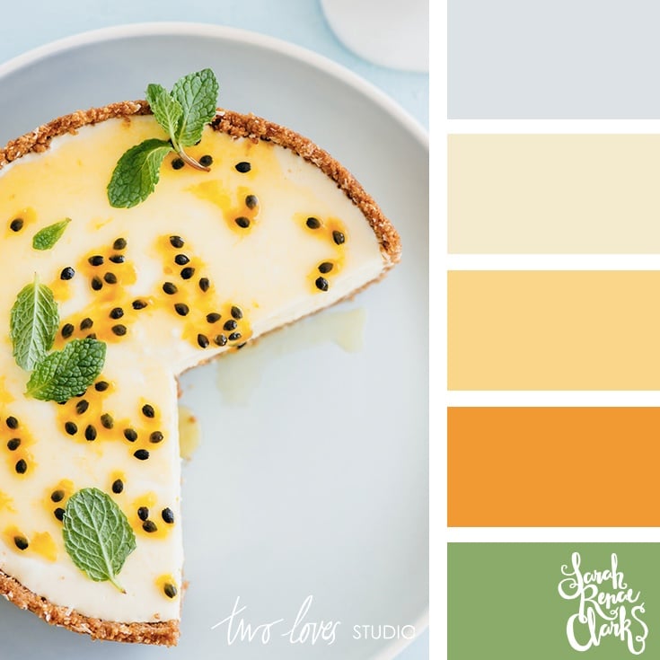
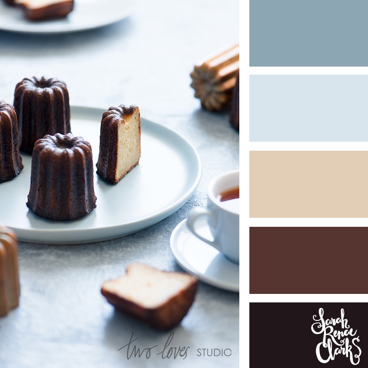
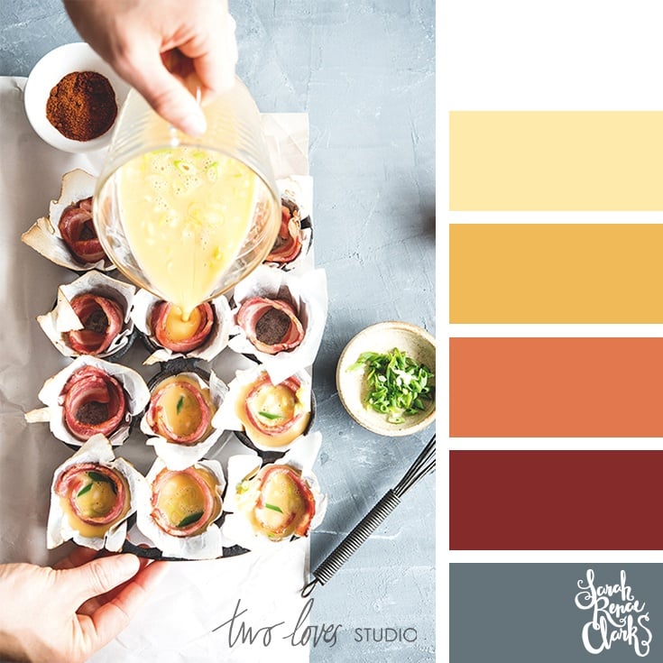
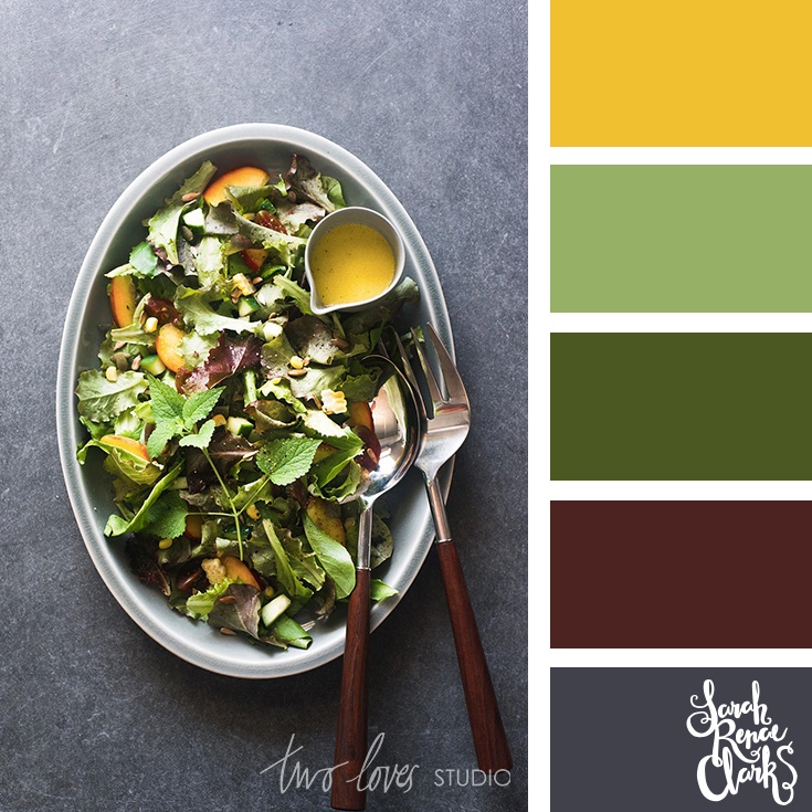
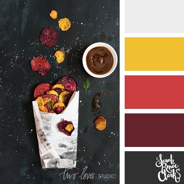
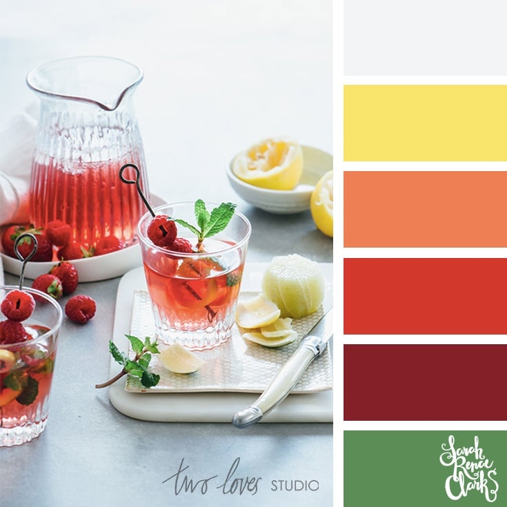
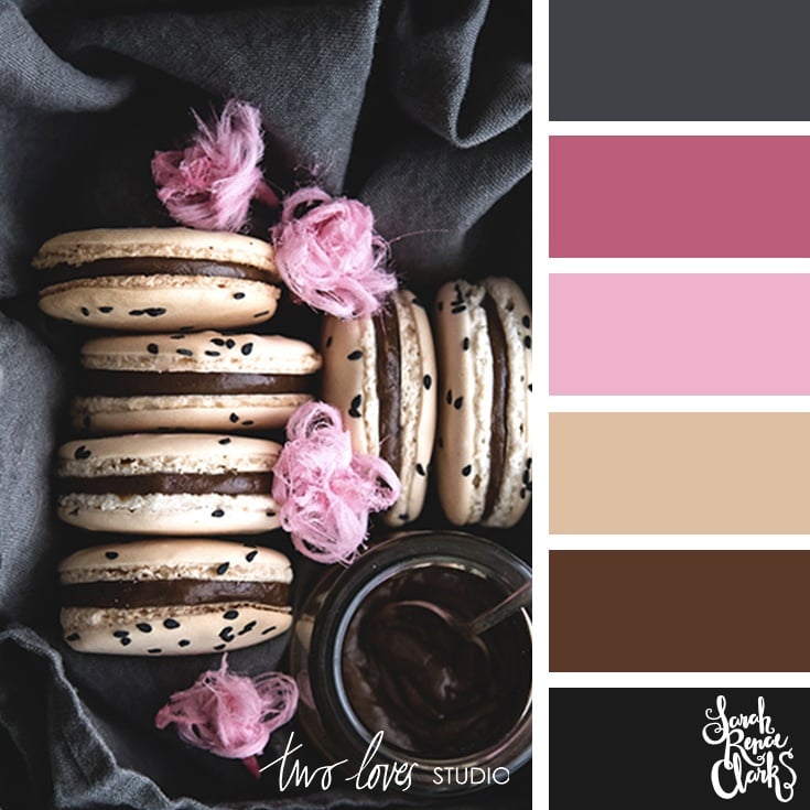
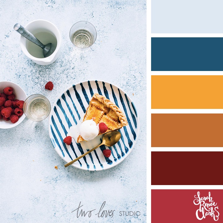
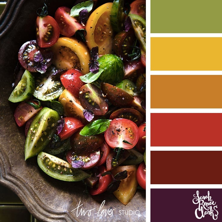
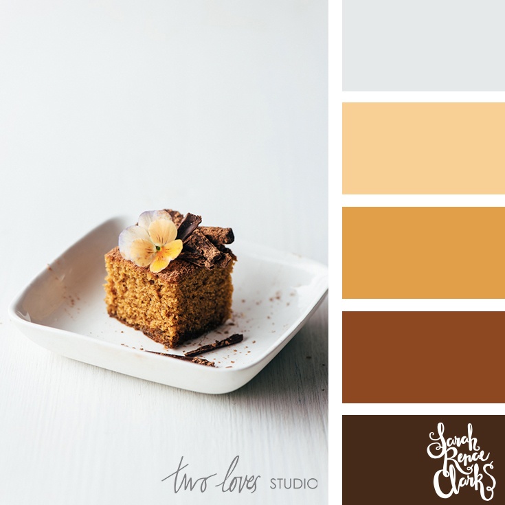
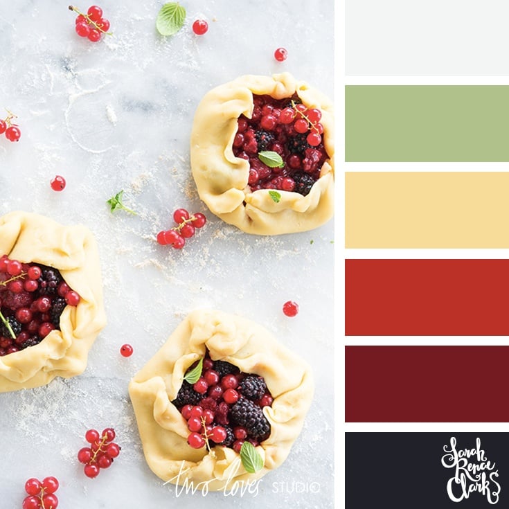
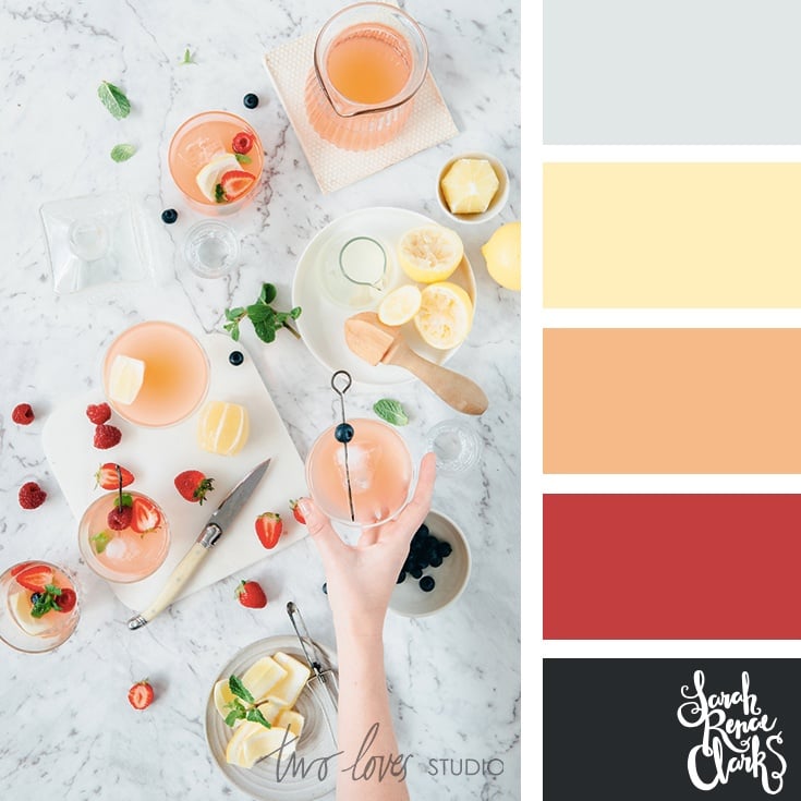
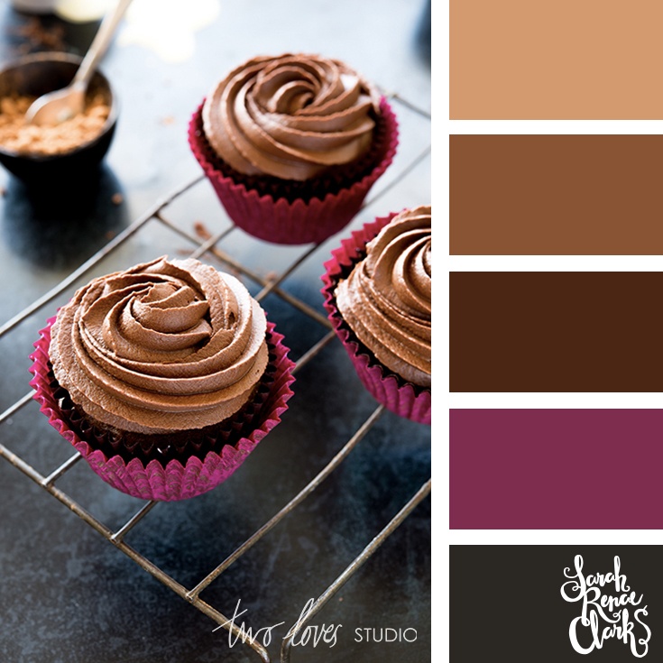

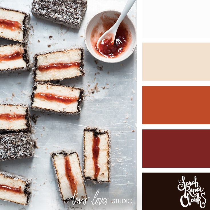
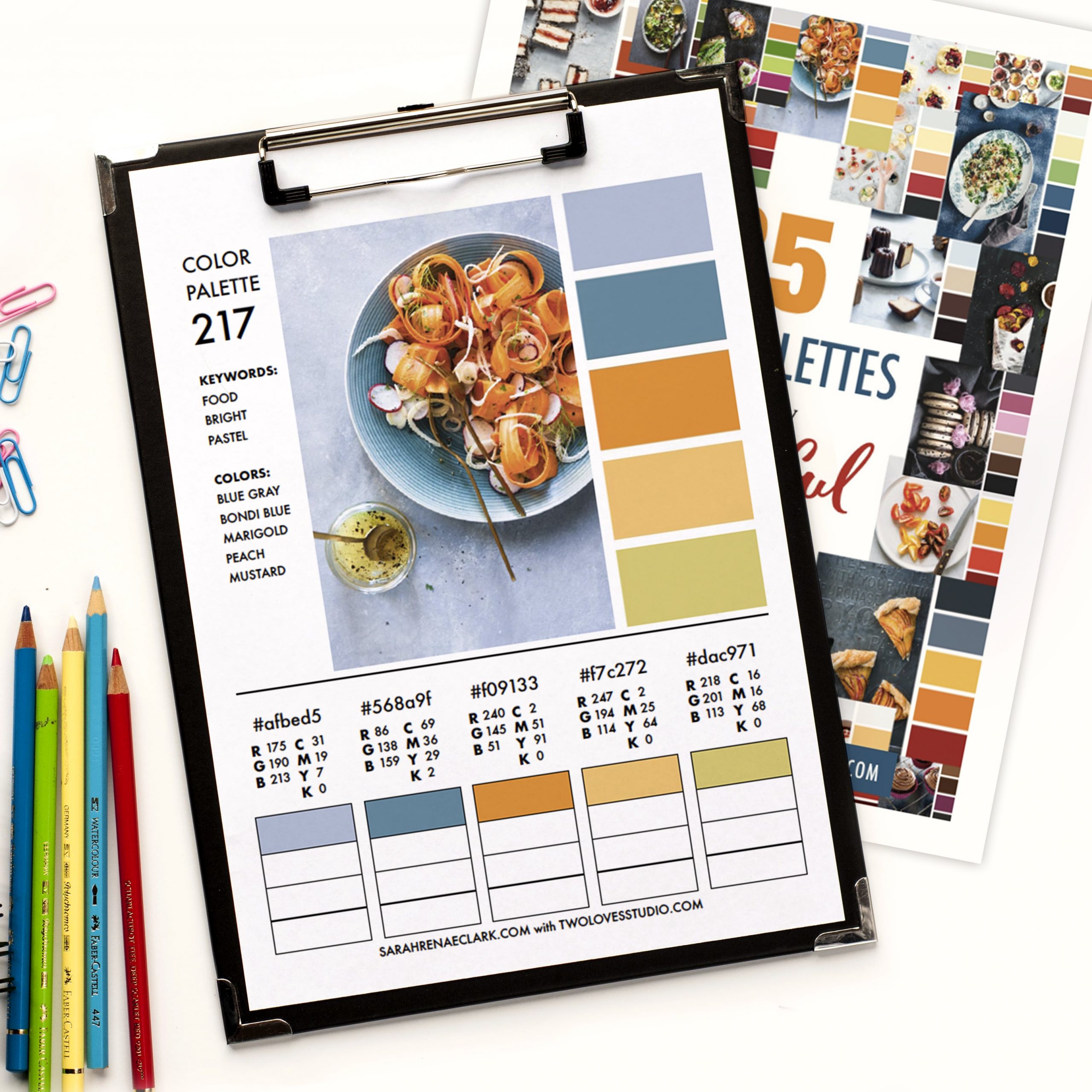
I’ve created a PDF version of these palettes that you can download from my store. It includes keywords and color suggestions to help you find the right palette for your project. It also includes the RGB, CMYK and HEX codes to help you match the colors on your own computer. There’s space to test your own pencils, paints or markers against each color at the bottom.
I’ve saved all 25 food color palettes (and more) to my Color Palettes Pinterest board so you can follow, save and repin your favorites.
You can also follow @dailycolorpalettes on Instagram to see a color palette every day from my collection.
What’s your favorite color from these food color palettes? Please tell me in the comments below.
About the Photographer

All of the photos in this collection of color palettes were taken by Rachel Korinek from Two Loves Studio.
Rachel is an Aussie food photographer, currently in Vancouver. She loves capturing visual stories and adores bright, clean and uplifting imagery that emphasizes the beauty of real food. Her work has been featured in a range of magazines and publications all over the world including Bride Magazine, Woolworths, Huffington Post, West Elm, Nourish Magazine, Robert Gordon, Decor8, Aldi and more.
She LOVES teaching and empowering others to find joy and inspiration in their photography and creative life. Rachel has taught photography masterclasses all other the world and online with her signature course, Lightroom Magic (affiliate link). Rachel teaches the technical aspects in a way that’s accessible, without using confusing ideas or jargon.






I love the concept of color palettes. The ones I’ve seen are just beautiful. I’m having a hard time translating the palette on a screen (digital) to a coloring medium or product like Copics or watercolor pencils. How to you take the image on the screen and get the right pencil/marker?
Hi Loreen!
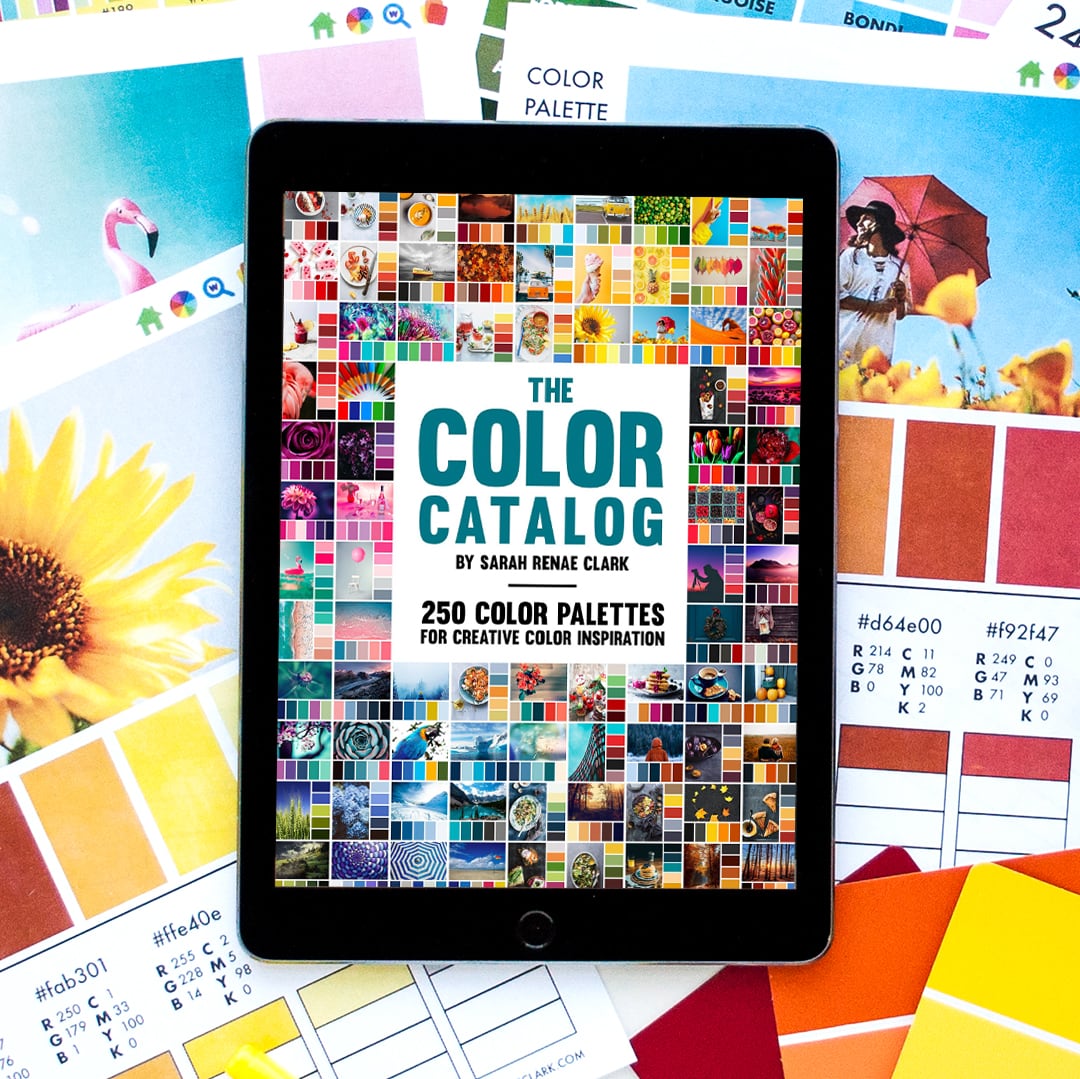
I’ve actually created The Color Catalog to help with this. It includes a printable version so you can test the pencils and markers underneath and get the closest visual match.
Otherwise, an app like “Arty” on your tablet or mobile can recommend certain color pencils (limited to 3-4 brands on their app) based on a screenshot.
Here’s a video showing both methods: https://sarahrenaeclark.com/find-perfect-color-palette-color-catalog/