
This post is a collaborative article from Danelle Smart Schaefer (text) and Sarah Renae Clark (images). Check out Danelle’s blog at www.swordandsparrowdesign.com

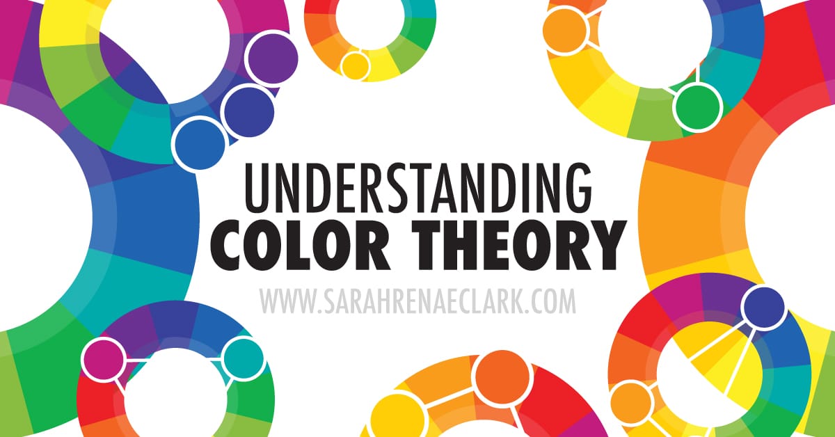
Basic Color Theory
When it comes to using color, the basic color theory rules are the same no matter what medium you’re using. Here I’m going to describe some basic color theory principles so that you can understand how colors work together and take your drawing and painting to the next level.
Learning these principles will not only give you a better understanding of color, but will enable you to create more realistic and visually pleasing drawings and paintings.
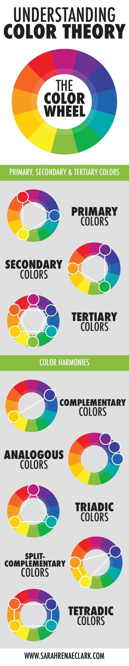
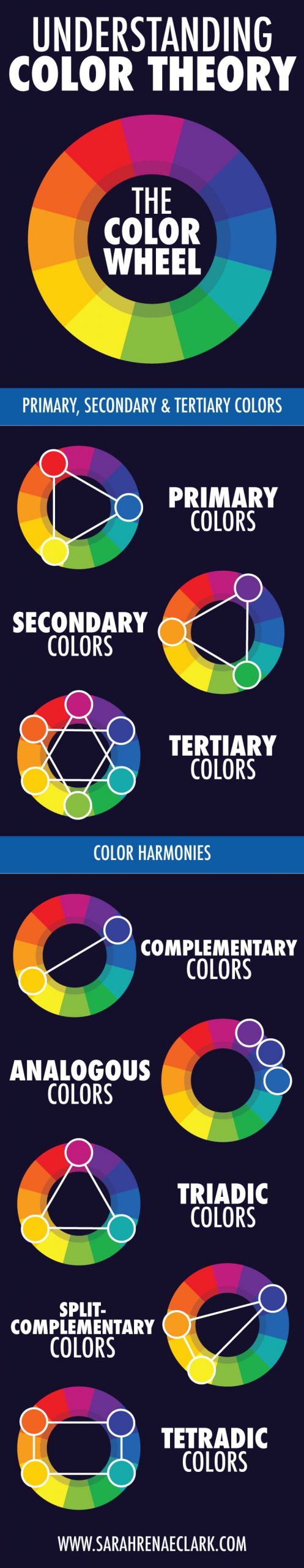
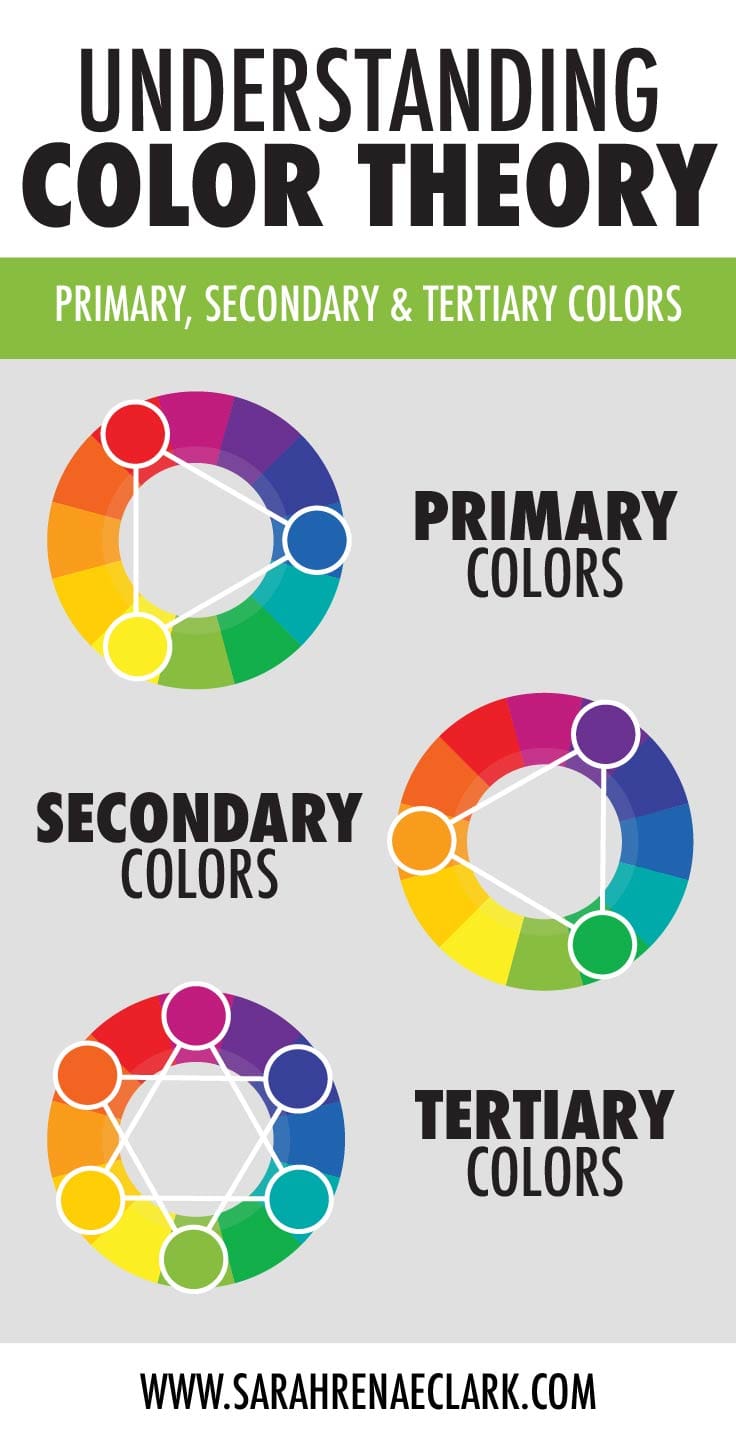
The color wheel is a staple in the art world. Sir Isaac Newton first developed the circular diagram of colors in 1666, and it has been in use ever since. Let’s take a look at what makes up the color wheel to find out why it’s so important.


The main colors on the color wheel are red, blue, and yellow. These are called primary colors. They cannot be formed by mixing any other combination of colors. All other colors are derived from these 3 hues.

When you mix two primary colors together, you end up with the secondary colors. Orange, green, and purple are the secondary colors.

And finally, tertiary colors are the colors you see between the primary and secondary colors, and they are formed by mixing the primary and secondary colors together, hence their names. Yellow-green is formed by mixing yellow and green, red-orange is formed by mixed red and orange, and so on.
Color Harmony
Now that we’ve gone over the fundamentals of the color wheel, let’s talk about color harmonies.
Color harmony is basically a fancy term for what colors are going to look good together, and there is an actual science behind figuring this out. Here are some options when choosing your colors:

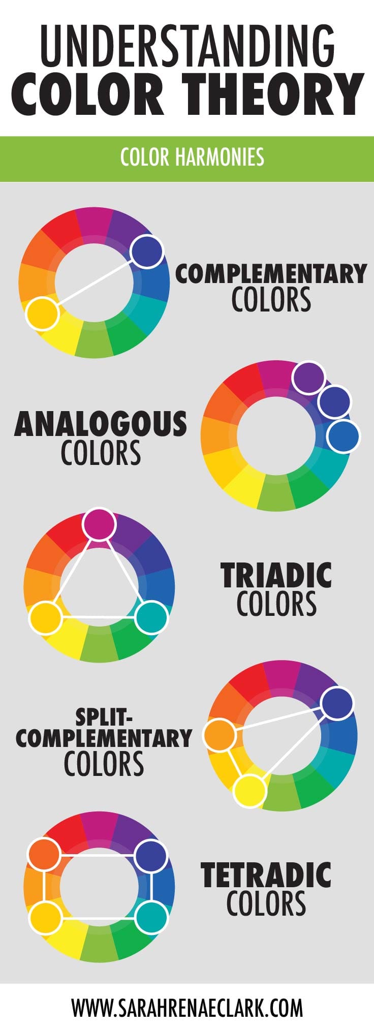
Complementary colors are found across from each other on the color wheel. So red and green go well together, yellow and purple, etc. The harmony is found in the contrast that they have from one another.

Analogous colors are groups of three colors found next to each other on the color wheel. When using an analogous color scheme, choose one color as your dominant color and the other two to support it.

A triadic color scheme uses colors that are evenly spaced on the color wheel. They tend to be bright, and like analogous schemes, it is recommended that you use one color as your dominant color and the other two to support it.

A split-complementary color scheme is a variation of the complementary color scheme. Choose one color on the wheel for your base color, and then instead of choosing its complementary opposite, choose the two colors adjacent to the complementary color. This color scheme is strong and good for beginners.

And finally, the tetradic colors, which are a set of two complimentary pairs combined to form a rectangle on the wheel.
Of course, as with anything in art, these are just guidelines so feel free to play around with it and see what color schemes you can come up with.
How to mix your colors using neutrals
Neutrals are found throughout nature and can really add a realistic touch to your artwork, however, you don’t just want to add black or brown when shading. Here are some tips on mixing and using neutrals.
Mixing your own neutrals:
Browns are actually made from mixing complementary colors on the color wheel. Mixing different amounts of complementary colors can create either a cool or warm brown, and gives the artwork a much richer feel that just plain pre-packaged browns don’t have.
Grays are obviously created by mixing white and black, but can also either be on the cooler or warmer side by mixing additional colors in.
Shading with neutrals:
A big mistake that beginners make is shading with black. This gives the shadow unrealistic emphasis. Instead, try shading with a neutral in the same color range as the object you’re coloring. For instance, when coloring a red flower, try mixing red and green to create a red-tinted brown for the shadow.
So there you have it – the basic principles and tips for using color in your artwork.
I really suggest just playing around with color and experimenting though, seeing what color schemes and techniques you can come up with. After all, art is about experimentation. Once you work through this, for a more in-depth look you can check out this article by Hubpages. And if you have any other questions or tips you’d like to share, be sure to let us know in the comments!
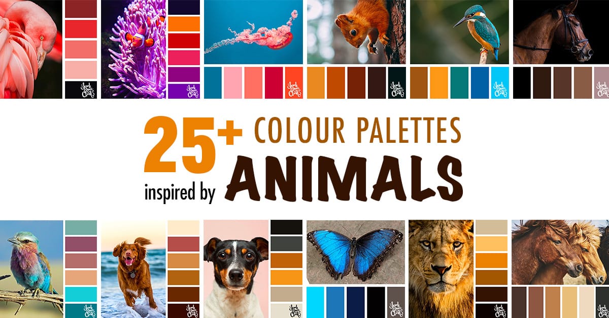
If you need some color ideas to copy, please check out my color palettes in my color inspiration section!
About the Author

Danelle is a graphic designer at Sword & Sparrow, a company she started with the desire to help mindful small business owners craft their one-of-a-kind brand, so they could stand out in a sea of competitors and truly embrace their awesomeness. Her Bachelor’s Degree from the Art Institute of Indianapolis, plus several years of experience as an in-house designer have taught her priceless lessons about branding, marketing, and of course design.
Visit Danelle’s website: swordandsparrowdesign.com
Or follow Danelle: Facebook | Instagram | Pinterest |Twitter
I wanted to inform you that the primary colors are magenta, yellow and cyan FYI
You are correct- cyan, magenta and yellow (CMYK) are the colors used for printer pigment – so they are used for graphic design and printing. However, the primary colors for mixing paints, pencils or art supplies has always been red, yellow and blue.
They are actually 2 different color systems – just like red, green and blue (RGB) are the primary colors for light.
You’d probably still get good results working with cyan, magenta and yellow in paints or pencils, but it’s much easier to get a full array of colors using the traditional color wheel that we’ve talked about in this article. If your paints are thick, you’ll need to mix them rather than layer them, so the CMYK system isn’t as effective.
If you’re interested in exploring the differences further, head to google and type “CMYK vs red, yellow, blue” and you’ll find plenty of articles on the differences and the best use for each system.
Hope that helps clarify!
I’m not sure we can get this in the uk. Shame x
Hi Stacie! I’m not sure exactly what you’re referring to, but you can get all of my printables regardless of where you are located :)
Wow ty for this.
I am looking for autumn colors in my house. we are remodeling a second home. a lot of land, trees outside, quiet. We have a brick wall in the living room. I want to do a burnt orange or Rich red…the flooring with be a light gray, living room and bathroom (next to each other) The bathroom has a deep dark gray tile for the oversized shower. No vanity or counter top picked yet. Don’t want peach or pink in bathroom. HELP, I have found so many colors I like, but then can’t find the color that wont clash with brick color. Open to any advice, opinion, HELP HELP I hate picking paints!
Hi Barbara!
I’ve actually got another article with some color palette suggestions for an Autumn theme. It might help you to get started with some paint color ideas – there’s a few color palettes that include burnt orange or rich red so you can see how the other colors work together.
Here it is: https://sarahrenaeclark.com/25-autumn-color-palettes/
These color palettes are intended for design in general – they aren’t specific to house colors, so make sure you consider how the bright/dark or high contrast colors will look in the context of your furniture and how they will affect the size of the room as well.
I hope this helps to get the ideas rolling!
How do you go about choosing a background color? Do you use a pale shade of the dominant color?
(I am really bad for trying to decide things. The color charts are great)
What a great question!
You can do a pale shade if you’d like something subtle, or you can save one of your secondary colors and use that on the background to create a high-contrast effect. As an example, if you follow the example in my post of the split-complementary colors, you could use the yellow and oranges as your main colors, and use the dark blue as your background.
There’s not really a right or wrong answer when choosing colors, and it will vary depending on the mood of your picture and the amount of background that is visible. So I recommend grabbing a scrap piece of paper, drawing a section or square of each of your main colors together in the middle, then surrounding that with the color you’d like to use on the background and see how they look together.
I hope that helps!