
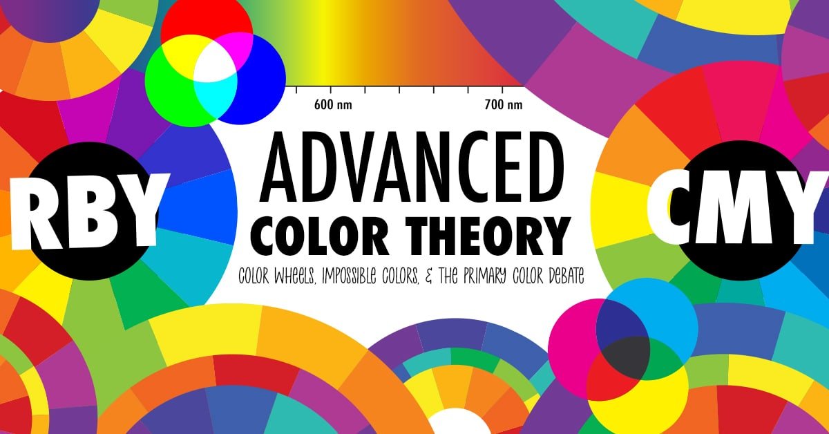
Who knew that COLOR could create so much controversy?
When it comes to mixing bright colors, many artists are coming to realize that traditional color theory doesn’t work.
Red, blue and yellow are NOT the best primary colors to make every other color.
So in today’s video, we are talking all things color theory and answering the question – which color wheel is correct and which is the right one to use?
Watch the video below, then scroll down for an even more in-depth guide and sources to all things color theory and this color wheel controversy!
Have I been using the wrong color wheel?
I LOVE color, and if you’ve seen my previous videos, I often talk about choosing colors that work well together and using the color wheel to find the best color harmonies. You can watch my beginner’s video on the left or read the full article here.
But as I expected, my video did NOT come without critisicm almost immediately – because I was apparently using the wrong color wheel.
Before filming that video, I did some research, and I uncovered a huge controversy in the art world that I knew I would have to address as more people watched my video – the red-blue-yellow vs cyan-yellow-magenta debate.
And IN that video, I promised that I would talk more about the other color wheels in a future video, so here we are.
Because here’s the thing.
You cannot create a bright pink or magenta with red. You cannot create a vibrant green by mixing traditional yellow and blue. And Red, blue and yellow are NOT the best primary colors to make every other color.

You might be wondering why I still teach using this color wheel and this color theory for color harmonies and color combinations – and I’ll get into all of that throughout this video and blog post.
There’s a little bit of science and history to get into, so I’ve kept the video above as simple as possible, and I’ll dive a little deeper in this written blog post, with more resources at the bottom if you’d like to learn more and continue learning about color theory at a more advanced level.

What are the purposes of the color wheel and color theories?
The purpose of any of these color wheels is to:
- To help us choose colors that work well together in color schemes and color palettes for design, patterns, painting, etc.
- To help us understand relationships between colors
- To help us understand how colors mix together to create new colors
- In short, to help us make better art.
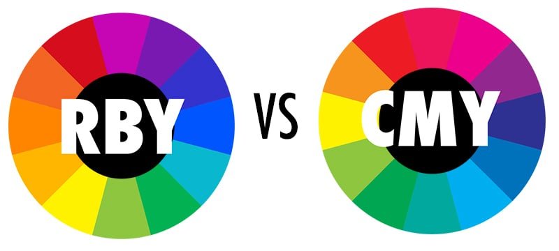
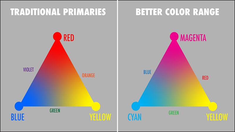
The main argument that arises in this debate usual comes down to the difference between 2 color wheels in particular – the traditional red-blue-yellow color wheel vs the modern cyan-magenta-yellow color wheel.
But it is just NOT that simple, and that’s why I wanted to take this chance to go a little more in-depth with you in the history of these wheels and why they are both important and relevant.
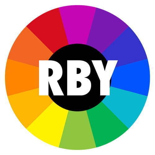
Let’s start by looking at the traditional color wheel, the one that you’re probably already familiar with from school, and that I used in my previous video about choosing colors that work well together.
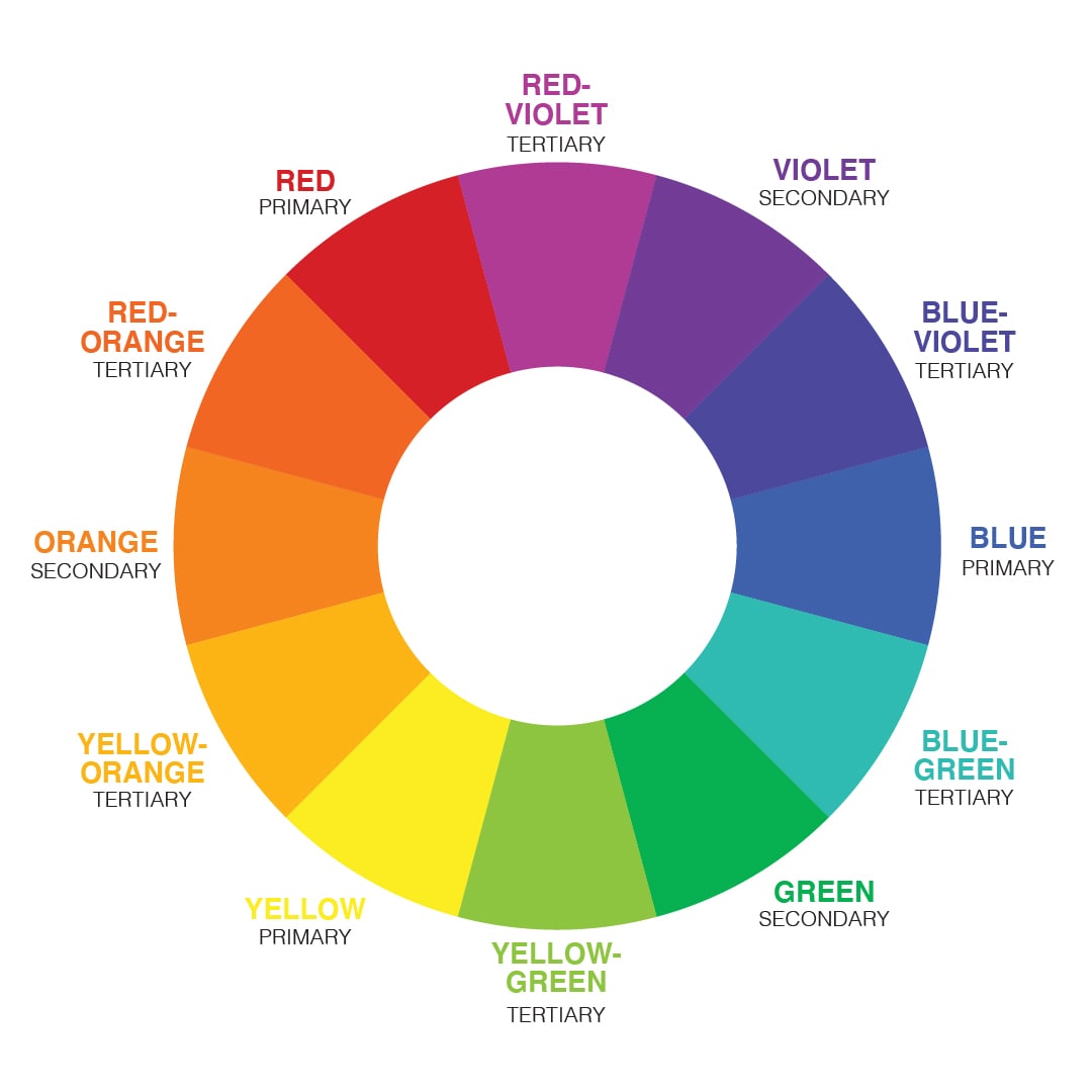
We are taught that the primary colors are red, blue and yellow.
When mixed together, these make the secondary colors – green, orange, and purple (or violet).
Take it a step further, and you’ll get the tertiary colors – yellow-green, red-orange, and so on.
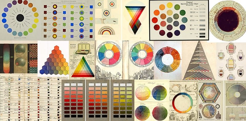
People have been trying to make sense of color for hundreds of years.
When Isaac Newton first released his theories about color and light in the 1700s, it wasn’t completely scientifically accurate to what we know today. But it was the first time someone had taken such a big step in color theory.
It was his groundbreaking experiments that showed us that prisms could disassemble and reassemble white light into a full spectrum of colors.
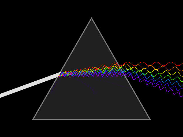
Newton’s color wheel was actually originally based on light, not paint. But it was adapted by the art world and became an incredibly popular tool by artists and teachers in helping us to understand how colors work together.
Our understanding of color has changed a lot over history. With the inventions of television, photography, color printing and more scientific research into color, red yellow and blue are no longer considered the best primary colors to create the largest range of colors in light, paint or ink, and yet, they are still the main primary colors taught in just about every school worldwide.
So let’s look at this for ourselves.
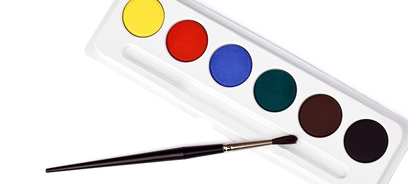
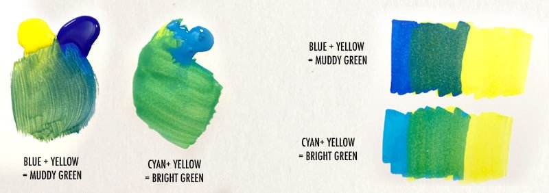
Have you ever tried using a set of paints that only included these primary colors, plus black and white? It’s impossible to create a bright green or hot pink. In fact, many kids sets include green as an extra paint color because it’s impossible to mix a nice green with the blue and yellow included.
This is not a new concept, by the way. Back in the 1900s, Albert Munsell, an American painter and the creator of the Munsell Color System, said that the notion of red, yellow and blue as primary colors was “a widely accepted error” in his book A Color Notation first published in 1905.
It’s OK – your childhood education was NOT a lie. It just wasn’t the complete picture.
Let me explain in a moment, but first, let’s look at the alternative color wheels that have entered the color theory debate.
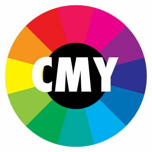
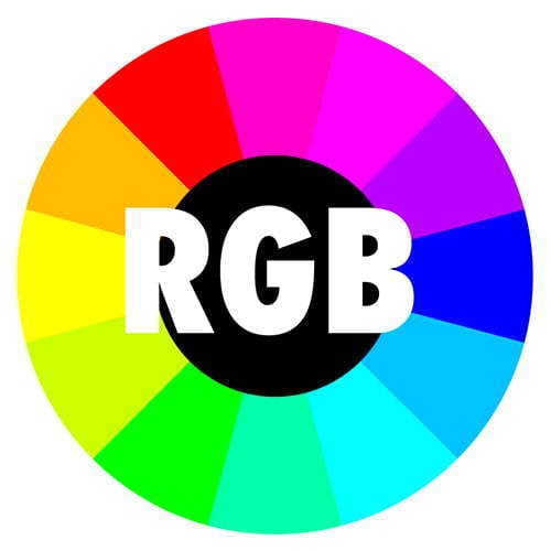
The RGB and CMY Color Wheels
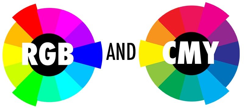
These 2 color wheels work hand-in-hand. RGB is an additive color model used to mix light, whereas CMY is a subtractive color model used to mix pigments or dyes. They are essentially opposites – the primary colors of one wheel are the secondary colors of the other.
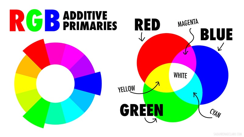
RGB Additive Primary Colors
The additive primary colors are red, green and blue. Mixing these lights together can make a huge range of colors.
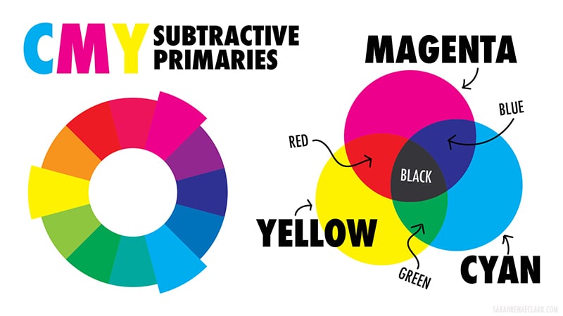
CMY Subtractive Primary Colors
The subtractive primary color are cyan, magenta and yellow. Mixing these pigments together can make an even bigger and brighter range of colors than the traditional red, yellow and blue primary colors.
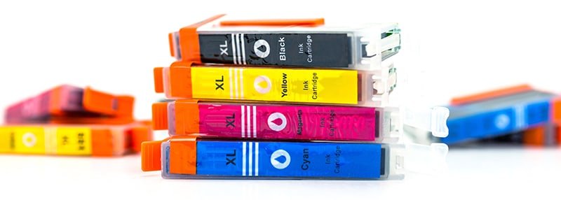
If the terms RGB and CMY (or CMYK) seem familiar, it’s probably because computers and TVs use red, green and blue lights to display the colors on your screen, and your printer uses cyan, magenta and yellow ink to print colors, along with a black toner, which is the “K’ in CMYK. (K stands for key printing plate)
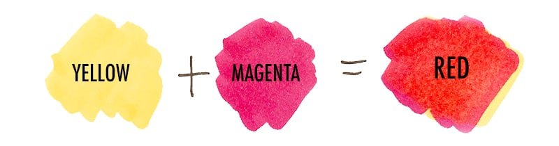
Red, yellow, and blue cannot make nearly as many colors as cyan, magenta and yellow. You can’t make cyan or magenta with any combination of red, yellow and blue. But you CAN make red, yellow and blue with cyan, yellow and magenta.
Other Color Models
These are not the only color theories and color systems that exist. For the sake of keeping this article short, I’ve linked each of the below to Wikipedia if you are curious to learn more about these:
There are actually more…. But let’s leave it there, shall we?
And all of these theories come with different approaches, different diagrams and many have different primary colors.
The thing about the different color wheels is just because there are multiple color wheels doesn’t necessarily mean that one is strictly right and one is strictly wrong.
I’ve been told that red, yellow and blue can’t possibly be correct because “red is not a primary color because you can make red from yellow and magenta” – which is true, by the way, you can.
What is a primary color?
A lot of fuss is caused because people define a primary color as being unable to be made from any other color – but this is not how the dictionary defines a primary color – at least not anymore.

The dictionary defines a primary color as “any of a group of colors from which all other colors can be obtained by mixing.”
So can red, blue and yellow (along with black and white) make every color? Well, yes… sort of… but not really very well.
Red, yellow, and blue cannot make nearly as many colors as cyan, magenta and yellow.
But CMY isn’t the perfect solution either.
The CMY + K that your printer uses was designed as the most economical way to produce a wide range of colors for printing. But it still can’t produce every color. It is not the best at vibrant purples and you can actually produce a better orange with the Red-yellow-blue model.
In fact, Pantone created a Hexachrome printing ink system that could print brighter and clearer pictures by adding orange and green inks to make CMYKOG. This produced far better skin tones and pastels and was able to better recreate the colors that you could see on your screen. It was discontinued in 2008.
![]()
There are similar 6-color processes already used by other printers, and I wouldn’t be surprised if we start seeing more of these in mainstream printers as technology improves and costs come down.
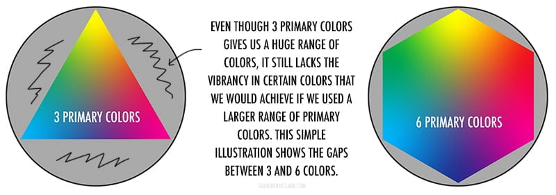
As you can see from the below image, using 6 primaries instead of 3 gives us a much bigger range of vibrant colors to work with, before even introducing black and white. Some of the other color theories above work from 4 or more primaries for the same reason – they’ve identified that 3 primary colors is just not sufficient to fully cover the range of vibrant colors we see and want to use in art.
Imaginary Primary Colors
Then, we have imaginary primaries…
This is what happens when we let mathematicians get involved in art. (I googled this and the Wikipedia page was literally titled “impossible color”)
In simple terms, imaginary primaries are hypothetical colors that humans are incapable of seeing.
The CIE 1931 Color System was created to capture the full gamut of colors that humans can see. And because this range of colors actually ranges on a curve rather than a flat edge (don’t even ask me the maths here), it’s impossible to choose any number of primary colors within the gamut of colors that would mix to create every color that we can see.
This diagram below is something I’ve drawn to help you understand this concept, and it might make more sense as you keep reading – the graph itself is the CIE 1931 Color System and the colors reflect all of the colors that we can see. (Back to that shortly!)
I have drawn out 2 (approximate) areas showing how much of this color range can be reproduced with the current CMYK and RGB standards. Note there are other new RGB technologies available to expand this range already.
The point being that any 3 primaries would mathematically be like drawing a basic triangle or polygon on this graph. No matter which colors you choose, there will always be colors outside of the gamut (the range of your shape) because the lines of your shape will always have a straight edge, and the spectrum itself is curved.
So, the only solution, as displayed in my rough drawing below, is to choose these hypothetical colors outside the visible color range. Impossible colors, imaginary primaries… that exist only in the hypothetical.
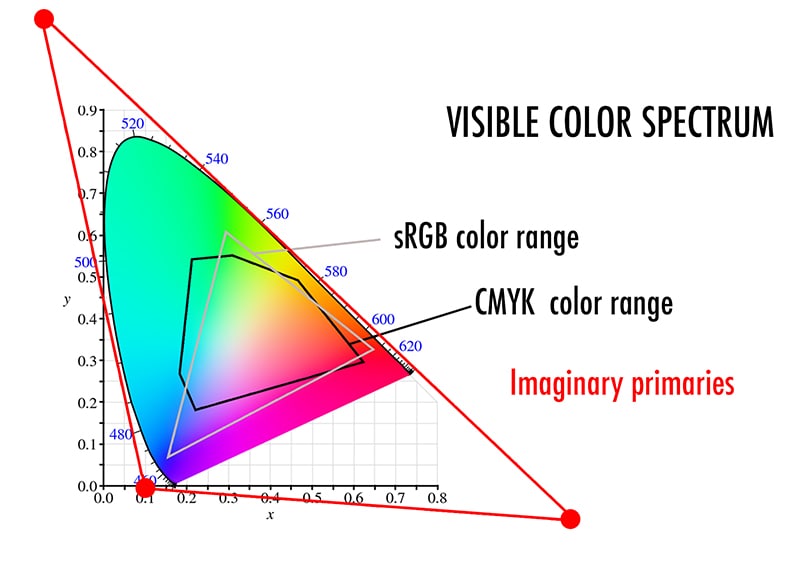
Mathematically, choosing colors outside the gamut is the only way to choose colors that would actually mix to create all the colors in the middle. And those colors just don’t exist.
I’ll come back to the CIE color spectrum curve itself shortly, because some of what I’m about to talk about might help you to understand this in a bit more detail.
Maybe.
Hopefully.
Color Wavelengths
In a brief effort to explain how the color spectrum has been designed in the CIE space above, it’s important to know a bit more about the science behind color itself. I promise to keep this as simple as possible… I’m definitely not a scientist!
Color isn’t actually a wheel. The color wheels you know are a human construct, and our way of trying to understand and organise color in a way that makes it accessible and practical to us.
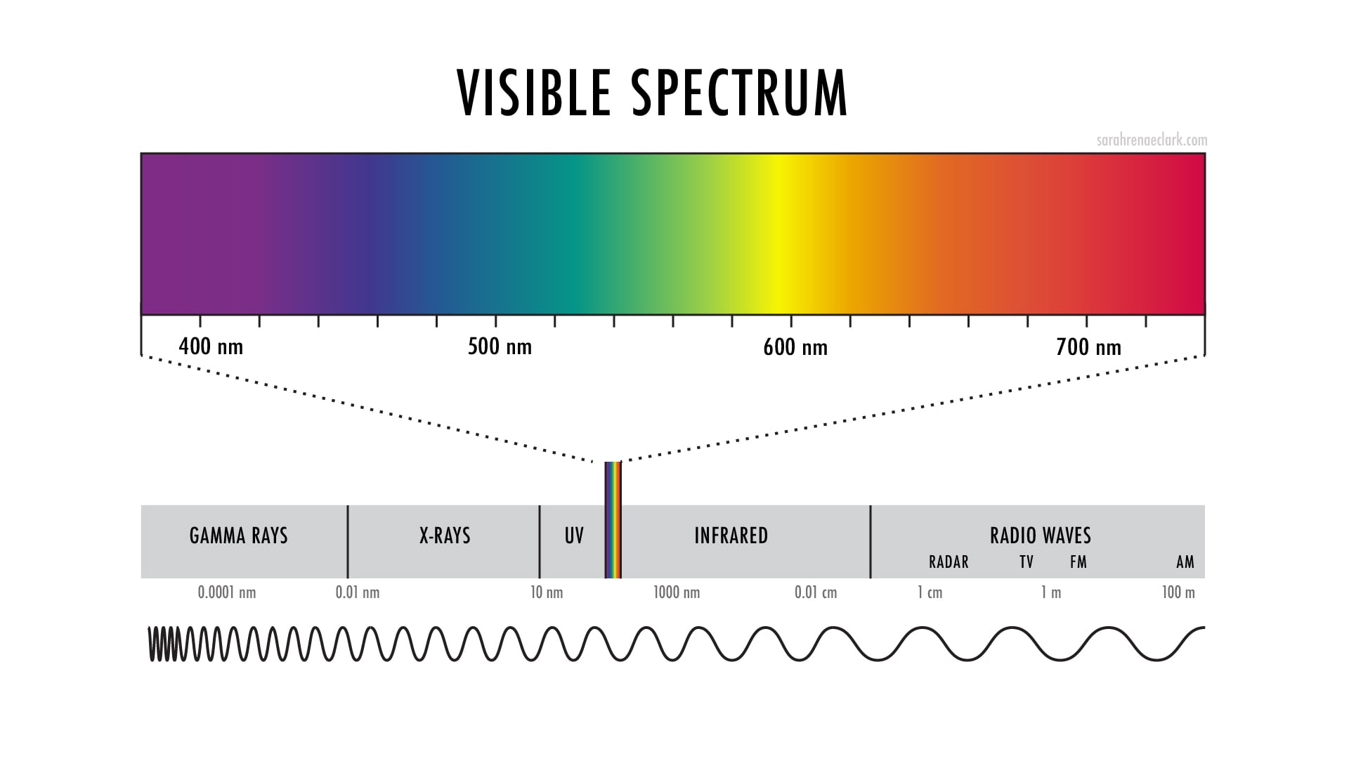
Color is actually wavelengths of light.
And although the human eye can distinguish around 10 million different colors, the colors we see only make up a very small section of the wavelengths that exist in the world. The wavelengths we see are called the “Visible Light Spectrum” and each color has a different wavelength, as you can see in the picture below.
Magenta Doesn’t Exist
Did you know that magenta doesn’t actually have a wavelength at all? So technically, it doesn’t exist?
As you can see from the pictures above, the hues from red to violet are included in the visible spectrum. These are known as spectral colors.
But we can see other colors as well, including grayscale colors (created by light intensity), shades of these hues (created by mixing grayscale colors with spectral colors)…
And then there’s magenta. And the entire range of colors between violet and red. These colors don’t have a wavelength and are NOT spectral colors.
So where does magenta come from?
We have 3 types of cones in our eyes – known as LMS (long, medium, short) which are each sensitive to different wavelengths, and therefore affect how we see color.
Scientists used to believe these cones were literally connected to blue, green and red colors, which connects with the RGB theories of light. They now know it’s a little more complex and refer to the long, medium, and short wavelength inputs of each cone, but for the sake of simplicity, we are going to refer back to the RGB cones to explain this example.
When our eyes see a color, our brain tries to work out the average color based on the wavelengths and the cones that are responding in our eyes. And it does a bit of color mixing on our behalf.
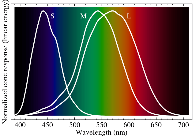
So if the red and green cones are receiving input, then the color must been and orange or yellow. If only the blue cone is receiving input, the color must be blue.
But what happens when both the blue and red cones are receiving input?
Our brain tries to find a logical average color on the spectrum – which would be green, right? Except that the green cone isn’t receiving any input. So our brain creates an alternative color between blue and red – and that is MAGENTA.
So technically, magenta isn’t real. Your eyes are making it up. It’s a figment of your imagination.
A pigment of your imagination.

So to put this into context back with our CIE Color Space – take a look at both the visible spectrum and the CIE space side-by-side and you might start to understand how it has been designed. From my non-scientific understanding, the CIE color space takes the visible spectrum and basically wraps it around a curve so that it also accomodates the “imaginary” colors that our brain makes up by mixing these other colors, such as magenta. So this becomes a better visual representation of our full color perception than any circle or spectrum has previously.
But let’s not throw away those color wheels just yet…
Making Sense of All This Color Theory
It’s beyond comprehension that we’ve been able to create any kind of system or theory to recreate and organize these colors in lights and inks, in paints and pencils that are accessible to us to use and create art with – and that somehow we can actually recreate what we see on the paper in front of use – honestly, it’s mind-boggling and humbling that we even have the tools to unlock such creativity.
But before we get lost down a whole different rabbit hole, let’s come back to the main point of this video:
Which color wheel should you use?
And should we be teaching kids cyan, yellow, magenta instead of red, blue, yellow?
The whole point of any color system is to make these colors more accessible. Color is complicated beyond what we can possibly comprehend, but creating these color wheels and color systems can help us to make sense of how colors work, to a point that we can even learn to mix and make our own colors in our art.
For this purpose, we shouldn’t discard any of these color systems. Instead, we should use them as a guide to experiment and create.
Let’s think about our CMY vs RYB debate when it comes to first teaching kids the different colors.
Magenta and cyan are very specific colors. (In fact, it’s quite hard to find them in many craft or general stationery shops, because even products labelled “cyan” or “magenta” aren’t necessarily the specific cyan or magenta required for proper color mixing in the CMY model.)
Whereas red and blue can be conceptual colors. By that, I mean they can refer to a broader category of colors that are easily taught and understood in society. We can teach kids that the sky is blue, the grass is green, the dog is brown – without getting into specific shades or hues.
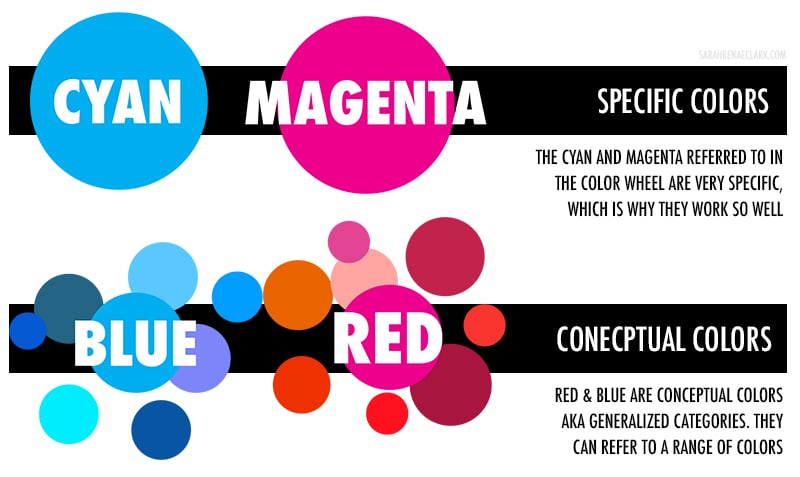
The word “Blue” can include cerulean, navy blue, azure, indigo, ultramarine, baby blue, royal blue, and the list goes on.
We don’t teach kids how to identify these individual colors. In fact, many adults wouldn’t be able to identify half of these colors as even falling in the blue category unless they were interested in art. Most companies don’t even use the same names for colors anymore, in fact, I had quite the challenge trying to identify some strange color names in one of my older videos (watch it here for a laugh and a challenge!).
When it comes to teaching color to kids, it makes sense to teach in general color groups, not specifics.
It also makes sense that we would use a simplified color wheel instead of a color wheel that relies on specific colors like magenta and cyan, and the traditional color wheel still meets the basic needs to teach kids how to mix colors and how colors work together.
While it won’t produce the best green, yellow and blue DO make green. And teaching kids to try different blues to get different results can be a great starting point for a conversation about color mixing in general, and maybe a good way to eventually introduce cyan.
But maybe the CMY subtractive wheel should be taught earlier in school – it’s a shame that some art students aren’t even learning this better method for mixing colors in university. I never even realized it was an alternative wheel until recently – and it makes a lot of sense to use cyan and magenta instead of red and blue if you really want to mix a bigger and brighter range of colors – after all, that’s what our printers use.
But then, we’re not teaching kids about mixing light either, and kids are using screens far more than traditional mediums now. So at what age should we introduce them to RGB?
Psychological Primaries
I only briefly mentioned the Psychological Primaries in my video, so I wanted to expand on it slightly further here, because I believe it also plays a role in our choice to teach kids the traditional color wheel over the CMY color wheel.
The Psychological Primaries come from the “Opponent Color Theory” – and while this may sound like something you’ve never heard of, you’ll be surprised at how familiar these colors actually are and how often they seem to be portrayed as primary colors in the world around us: Red, Blue, Yellow and Green.
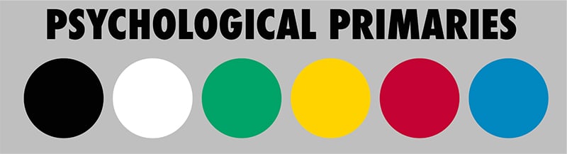
German physiologist Ewald Hering proposed the opponent theory in 1892, suggesting that every hue we see is a combination of adjacent pairs of the 4 psychological primaries – red, yellow, green and blue – but that NO hues are combinations of the opposite primaries, being yellow and blue, or red and green.
The theory also helps to explain some types of color blindness (red and green or blue and yellow) and focuses heavily on how we experience color. It has inspired many other color systems and studies, such as the natural color system.
It doesn’t fit in with the theories we’ve already discussed, and doesn’t help our CMY vs RYB debate much at all – except to remind us that there are many different ways to understand and organise color. And if there’s a psychological reason we are attracted to red, blue, yellow and green, then it makes sense to keep this in consideration with whatever color models we choose to work with.
In fact, some artists prefer to use a color wheel based on 4 primary colors instead of 3! Just food for thought!
Which Color Wheel Should You Use?
I really don’t think this is a “right or wrong” answer. Each color wheel has value, and can serve a purpose. The goal is to find the right color wheel for what you need and that you find the easiest to understand. There’s no point in retraining yourself to use CMY if you are completely happy with RYB and are happy with the colors you are mixing. And ultimately, I would recommend working from more than 3 paints where possible, unless you are REALLY trying to keep a low budget, so this is all about learning and experimenting and understanding color better. And the best way to understand color is to USE it.
But here are my general thoughts on each wheel and when I would recommend them:
The best color wheel for mixing paints: CMY
When it comes to mixing paints or pencils, the CMY wheel does produce a better range of colors.
The best color wheel for mixing lights: RGB
If you’re working on a screen, computer, or with light, the RGB is the right color wheel.
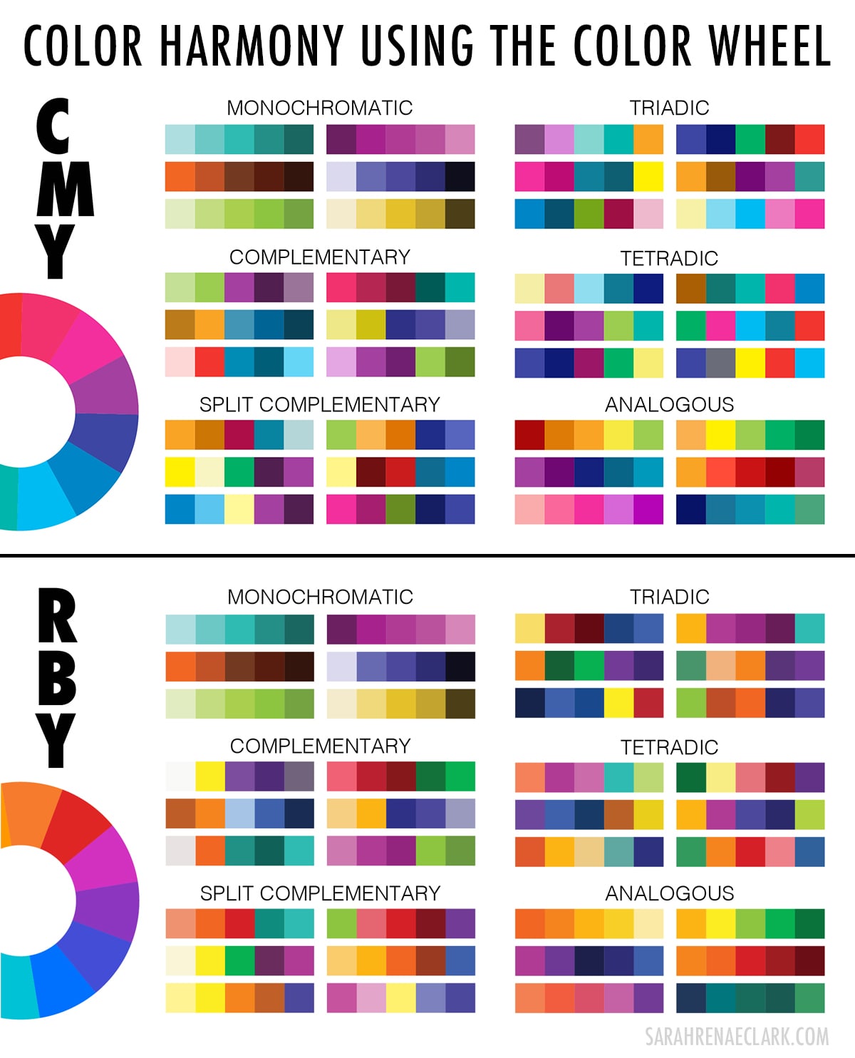
The best color wheel for color harmony (and for beginners): RYB
When it comes to choosing colors that work well together, or if you’re a beginner and trying to just find somewhere to start, personally, I still prefer the traditional color wheel.
I’ve looked at each of the color harmony rules when applied to the CMY wheel – and they still work, but the results just aren’t as appealing to me. I see a lot of websites use this color wheel to be “technically” correct, but I feel that throwing the traditional wheel out the window is a mistake here. The color harmonies still work on the CMY wheel, but I just feel the harmonies on the traditional wheel look better and more cohesive.
But here’s the thing about art – it’s all about perception, experience, and improvisation. Art is ultimately an expression of freedom and there are no rules that say you have to follow or agree with any particular color theory or system in order to be an artist.
Colors are FASCINATING. And the science behind them blows my mind.
But instead of letting these theories dictate the rules of creativity, we can use all of this as a starting point and a guide, to answer our questions about color and give us a framework to understanding how colors work well together.
The true primary colors have been a debate between artists, scientists, philosophers and professors for centuries. So we can get caught up in the debate, or we can choose to use what we already know and love color for what it is.
All of these theories, all of these ideas – are supposed to help us EXPERIENCE color. So let’s do that, and let’s just CREATE.
Obviously, this is all just a small piece of the massive puzzle that scientists, philosophers, artists and mathematicians have been trying to understand for years, so I am certainly not going to have presented the whole story in perfect accuracy.
It just takes a few minutes on Wikipedia or Google to unravel a Pandora’s box of articles about color science, color physics, color space, psychology, philosophy, color dimensions, color schemes, color perception and more… who knew there was SO much to explore about color?!
So I would love to hear your thoughts in the comments, and please check out my other resources while you’re here!
References and Additional Resources on Color Theory:
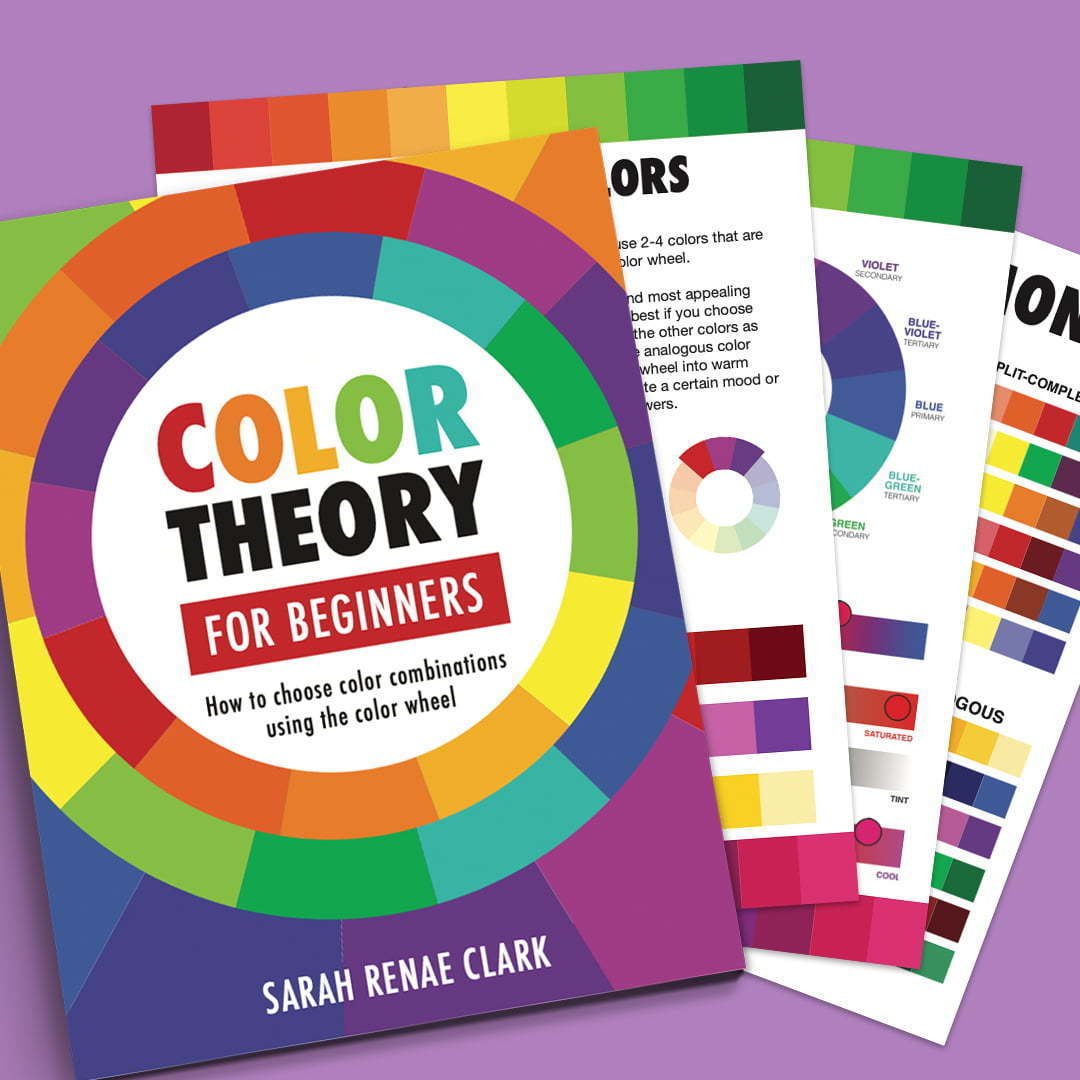
If you’re looking for a simpler guide to color theory, I also have a beginner’s guide here that you can read. It uses the traditional color wheel and teaches you about color harmonies and how to choose colors that work well together.
Color Theory for Beginners E-Book
This E-Book will take you through everything from my Basic Color Theory Lesson and includes extra worksheets that are perfect for practicing color harmonies or using in a classroom. It is based on the traditional RYB color wheel.

The Color Catalog
If you’re looking for an easier way to pick colors that work well together, the Color Catalog is full of color inspiration, with 500 color palettes across 2 volumes that you can use for any creative project. It’s quickly become a must-have for artists and crafters, and is the most popular product on my website!
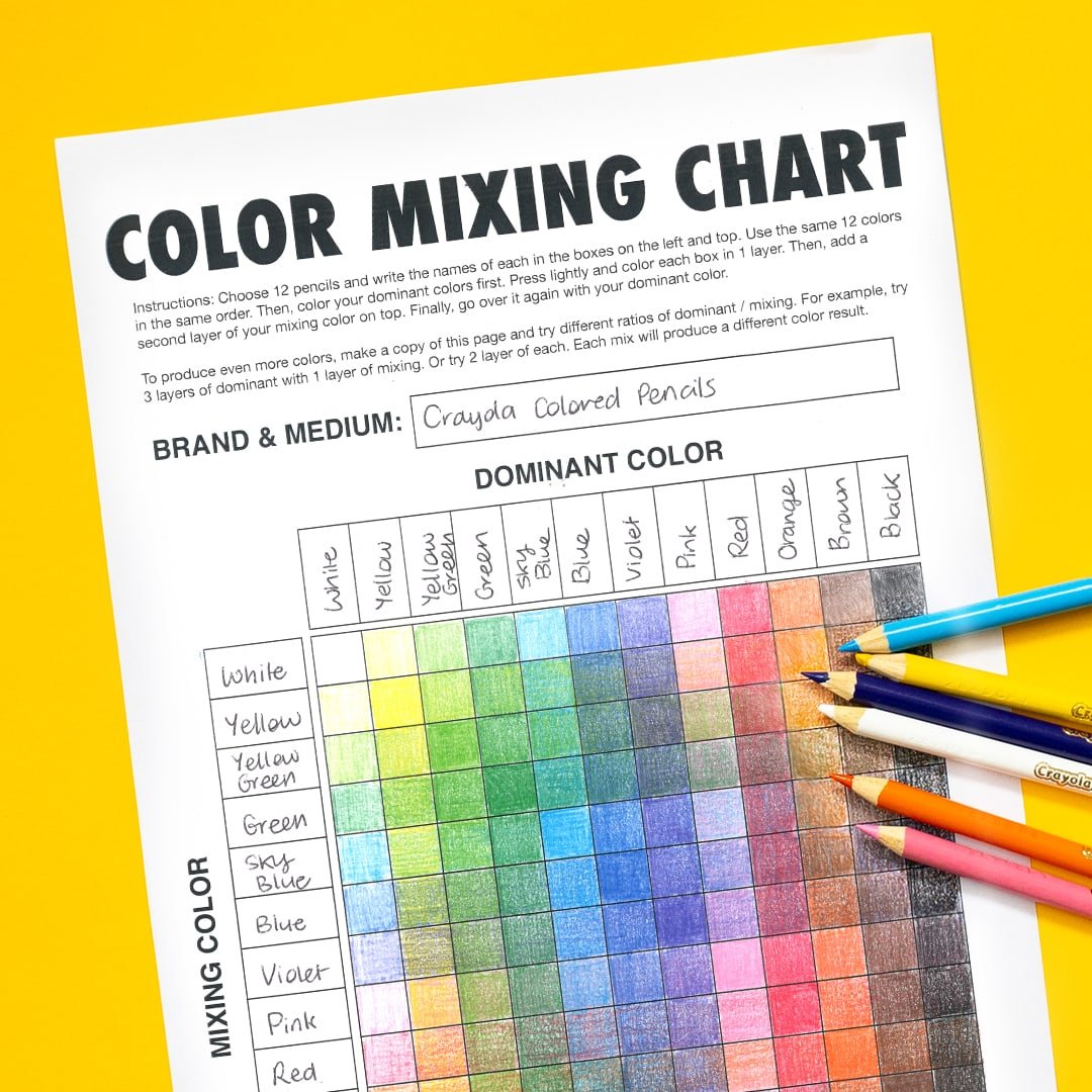
Free Color Mixing Chart
This free mixing chart is a fun way to see just how many colors you can make from your set of pencils or markers. I’ve included a full tutorial and video on how to make 1000+ colors from just 12 pencils here on the blog!
Here are some of the fantastic resources I used to learn about color theory in preparing this video and blog post. They cover so much more about color theory, color science and how color works than I can even comprehend! I encourage you to check them out if you’re interested in learning more.
The Dimensions of Colour – David Briggs, huevaluechroma.com
The Visible Spectrum – Britannica.com
Modern Color Theory Concepts – handprint.com
RYB vs RGB vs CMY: What are the “real” primary colors? – YouTube.com
The Visible Spectrum – Wikipedia.org
Primary Color – Wikipedia.org
CMYK Color Model – Wikipedia.org
RGB Color Model – Wikipedia.org
About Color – Adobe.com


Angilyn Watson – I have just connected the ink colour theory to painting, I think I will try CMY for a minute, but if that does not work out, I’ll throw in Crimson, Ultramaine Blue & Phthalo green
I have been painting red dresses, and could not get any vibrant colours associated with those dresses. I am going to use CMY to paint and I can see already that the colours can be more vibrant and less muddy/black!
Wow. As a color nerd, this is fascinating. I knew we used RGB for digital and CM&K for printing and the reason, but never connected all the dots. Colors in decorating my home over the decades came a lot easier. When painting, I just mix to get my colors.
On the screen creating art, I struggle sometimes. I tend to fall into mid tones in analogous colors. Markers I could blend more.
Colored pencils are a totally different animal. I’ m just now trying to learn how to really use colored pencils as an artist. So, I’ve been researching tutorials, products reviews, and color theory.
Thank you for creating your blogs, videos, and free downloadable. I also purchased your Color Theory e-book. They are helping!
Thank you for the fantastic explanations! Really enjoyed this.
I would just add to the conversation on magenta- no colors “exist” outside of our brains. Wavelengths of light exist. Magenta, as a subjective experience of color, is exactly as real as our subjective experience of red or green or any other color!
Interesting stuff. As a painter, I have always relied upon the double primary palette which includes a warm and cool or each primary. This feels like a combination of the RYB representing the warm and more opaque colors and the CMY representing the cool and transparent pigments. CMY works as a theory, but their transparency (which is necessary for printing, since the white of the paper is essential) is problematic to the acrylic/oil painter. Having to add multiple layers or add white for opacity desaturates the color and it loses its vibrancy. Another issue is to obtain the single pigment color in a paint. What exactly is CYAN? Is it the no longer available Manganese PB16 or is it PThalo Blue green shade PB15 with added white? And what of magenta? Quinacridone perhaps. And isn’t that just a cool red while cyan is simply a cool blue?
I guess it is child’s play to try to fit God’s creation into our limited understanding of it.
Thank you for sharing your experience of paint here with regards to opacity. It is very useful too. Paint pigments can be frustrating, ‘second-class’ mediums to, as you say, to capture the exquisite beauty of nature and the gift our eyes grant us to perceive it.
I have just this year discovered that I had always been taught outmoded and over-simplified RYB colour theory in my multiple and varied design courses and classes. CMY seemed to be closer to my sensibility and perception. I struggled to find suitable colours by mixing the tubes of cool and warm primary RYB, then finally surrendered and bought a clean green and magenta. I now realise it was not necessarily my own failings thanks to what I can find and read on the net these days and the knowledge generated through the comparative additive colour field of modern times and the digital realm !
Netflix had a documentary where they discussed and visually represented colour perception by different animals. That was also fascinating. I’d include the name of the show if I could remember it. It illustrated how jungle birds see in more technicolor than us (can you imagine, if that’s how they appear to us!) while dogs see less colour than us. It makes me ponder the visual spectrum and how magenta might fit into this grand mystery.
Thank you for this article and generously including your references.
I leave you the blog of Dr David J.C Briggs, professor of drawing and painter, who talks about the subject in an article on his blog http://web.archive.org/web/20071211120907/http://huevaluechroma.com/062.php
Hey!
Thanks a lot for this amazing blog (and incredible work!). I love how precise, accurate and still simple your explanations are.
I’ve opened the Pandora box a few years ago, and color is truly a fascinating world!
As a photographer, I know how to create an RGB color wheel.
But how have you created your CMYK and RYB color wheels?
Did you had a methodology? Or used specific hex? Or «just» feeling?
How should I proceed to create similar color wheels as shown in your article (how to choose my primary hex, and «mix» them in the digital world)? Thanks in advance!
Would like you to test best metallic color pencils if you haven’t already but didn’t see any you tube videos on it also love the all glitter gel pens too ohhh theres an ideal for you. Love your videos been an artist for a long time but looking for inspiration to get started back up to what I love is art.
I think there might be more to magenta then just anti-green. You can’t see it in every cone sensitivity chart, but there is a bump in the L cone sensitivity in the violet section of the spectrum, so violet is already registered as a mix of L and S cones. Notice that magenta looks like a brighter, redder violet. I think your brain is going, “it’s like violet, but with more red.”
It’s really quite silly to limit yourself to one or the other. I’ve always found that using ALL your available resources (or colors) produces the best results. But artists the world around can be, simply put, snobby gatekeepers over their favored methods, and in the end, that keeps them from achieving their full potentials. That’s really just sad. So I’ll keep to my own method – which includes using ALL color wheels and guides. It gives me a versatility with color that someone who limits themselves won’t have. I’m not all that talented, so I’ll take what I can get, lol.