
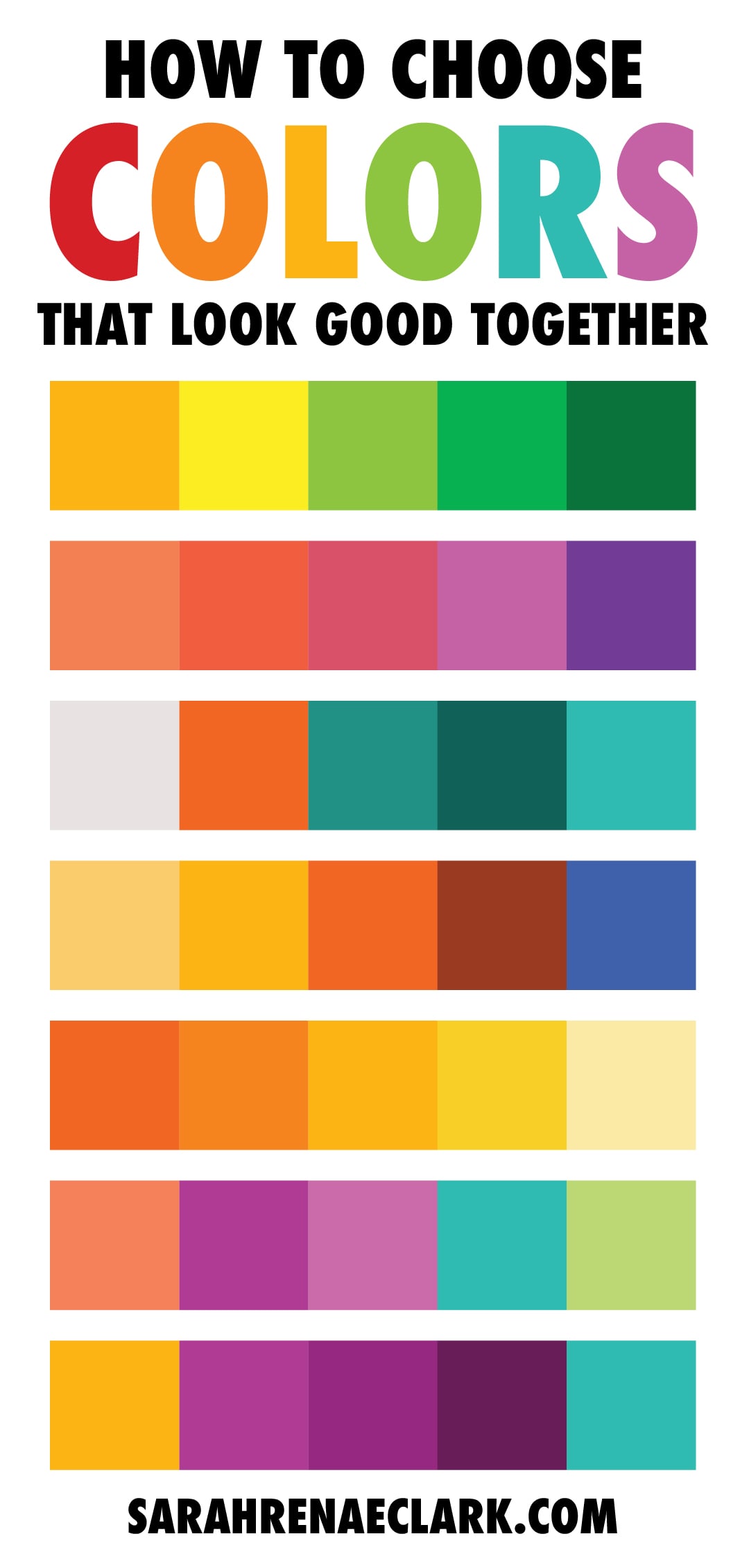
Have you ever wondered how some artists are able to find perfect color combinations that just seem to work, every time?
It’s not just art – it’s science.
And in this video and blog post, I’m going to show you how to use the color wheel and some basic formulas known as “Color Harmonies” to choose color combinations that are appealing, cohesive and just look GOOD.
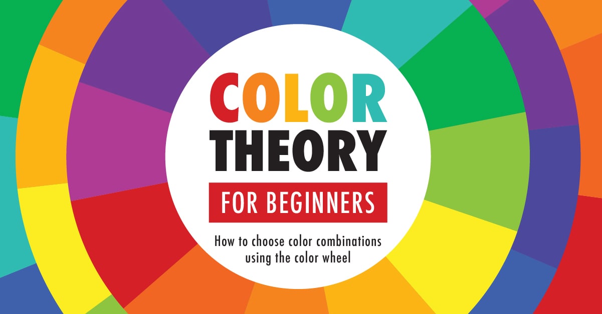
Using The Color Wheel and Color Harmonies to Choose Good Color Combinations
Watch the video below to learn the basics of color theory and how to use the traditional color wheel to choose colors that work well together.

Why are color harmonies important?
Using color harmonies, you can evoke certain emotions, create a mood, or add context to an image.
When you don’t use color harmony, your art can appear bland and boring, or so chaotic that your brain can’t process it properly.
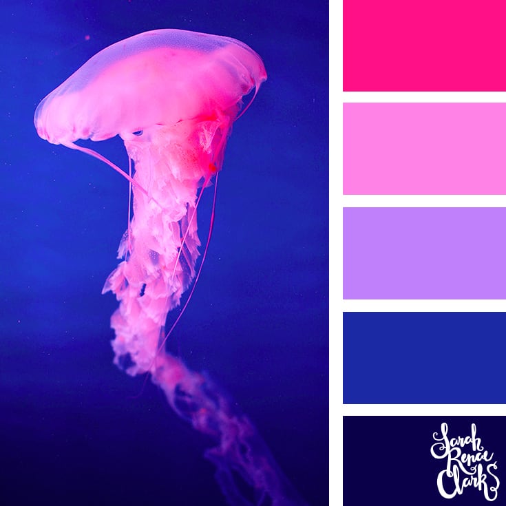
 This picture is bland because there isn’t enough variety of colors in the image.
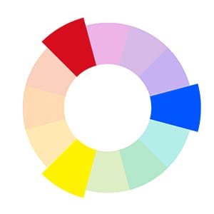
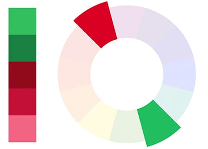
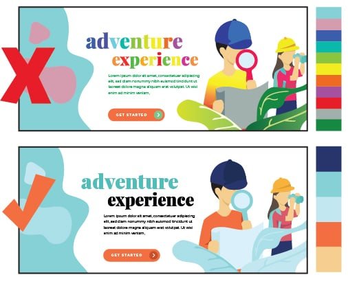
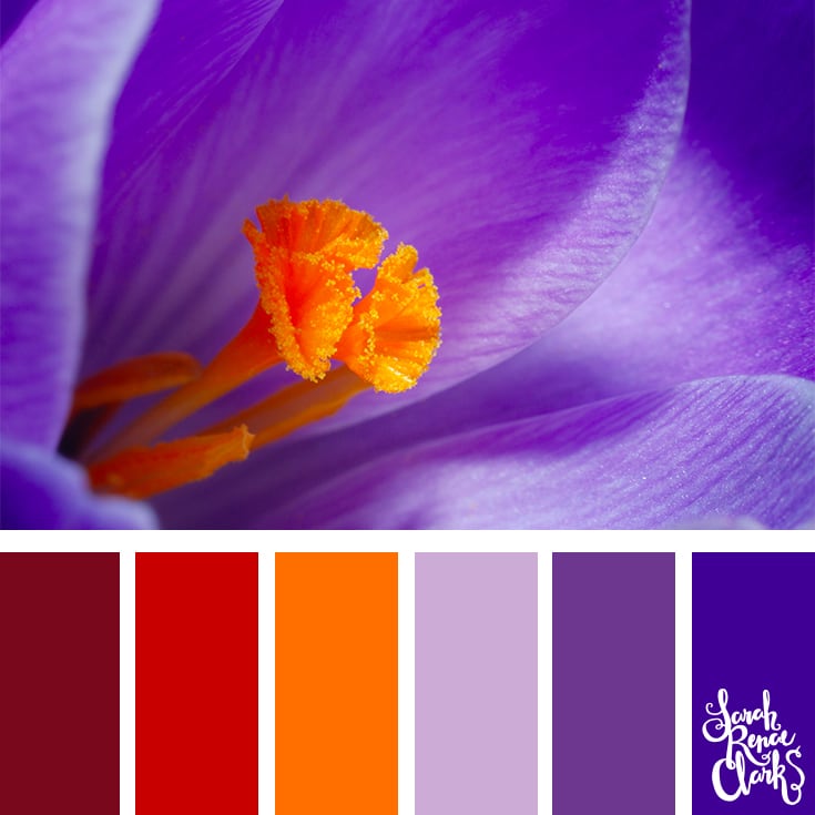
 This picture appears too chaotic because there are too many colors in the image.
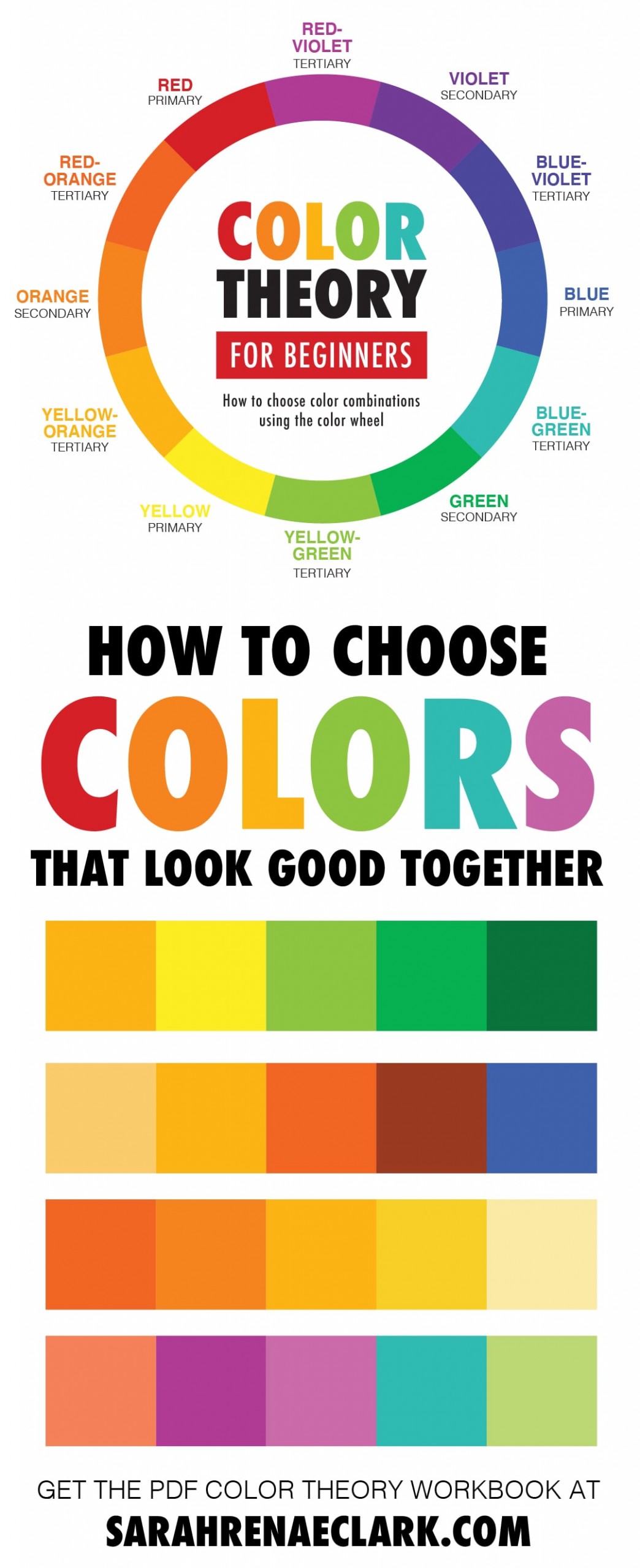
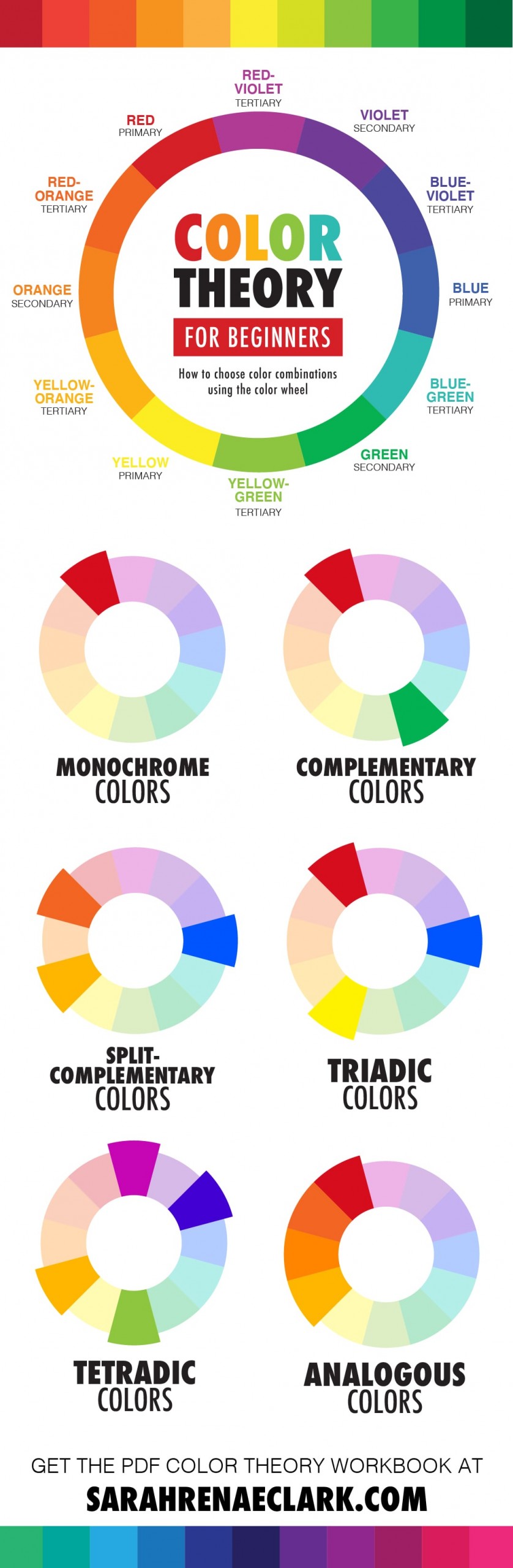
Primary, secondary and tertiary colors
So let’s start at the beginning.
You may remember back to school where you learned about primary, secondary and tertiary colors.
We are taught that the primary colors are red, blue and yellow.
When mixed together, these make the secondary colors – green, orange, and purple.
Take it a step further, and you’ll get the tertiary colors – yellow-green, red-orange, and so on.
 The primary colors – red, blue and yellow.
 The secondary colors – green, orange and purple
 The tertiary colors – yellow-green, red-orange and blue-purple.
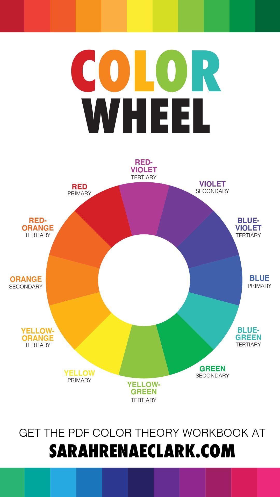
These make up the traditional color wheel, that was created by Sir Isaac Newton and helps us to understand how different colors work together.
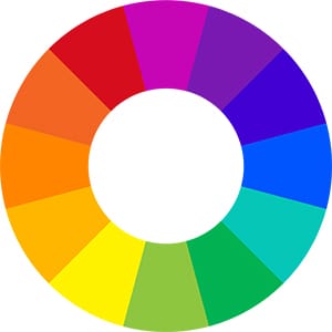 The traditional color wheel.
The traditional wheel is no longer the only color wheel that exists – there are other color wheels and methods that are used by artists and designers to create a bigger range of colors when mixed together (you can see the other ones in the video).
These color wheels are important, and I’ve gone into depth in each of them in my post here, but when it comes to choosing color combinations, the traditional color wheel is still our best resource for understanding color harmony and how colors work together to create beautiful art.
What is the color wheel made up of?
There are 4 main “qualities” of each color on our wheel.
The first is the HUE. This is simply the color position around the wheel – and the brightest, purest version of each color. Our wheel uses 12 main colors, but we can also work with all of the hues in between.

Second, we have SATURATION. This can also be known as INTENSITY or CHROMA. This tells us how vibrant a color is. A desaturated color is greyed out and dull, while a SATURATED color is vibrant and strong.

Then, we have VALUE. This tells us how dark or light a color is. We can create SHADES of our color by adding black, or TINTS of our color by adding white. We can also add TONE by adding grey.

And finally, we have TEMPERATURE.

The color wheel can be split into 2 main groups – warm colors and cool colors.
But individual colors can also change in temperature as we move around our wheel. A warm red includes more yellow, and a cool red includes more blue.
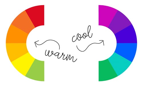 The colors on the left-hand side of the wheel are described as ‘warm’ colors, and the colors on the right-hand side as ‘cool’.
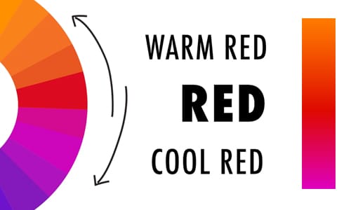 A ‘warm’ red includes more yellow, whereas a ‘cool’ red includes more blue.
When we combine HUE, SATURATION, VALUE and TEMPERATURE, we find ourselves with a myriad of variations of each of our 12 main colors.
How do we use color harmonies?
So how do we use all these colors together?
We can use our 12 basic hues on the color wheel along with some easy-to-use formulas to create an endless collection of color combinations that look balanced, appealing, and just ‘work’.
These formulas are known as ‘color harmonies’.
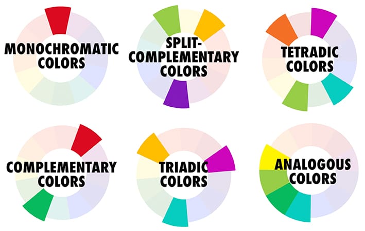

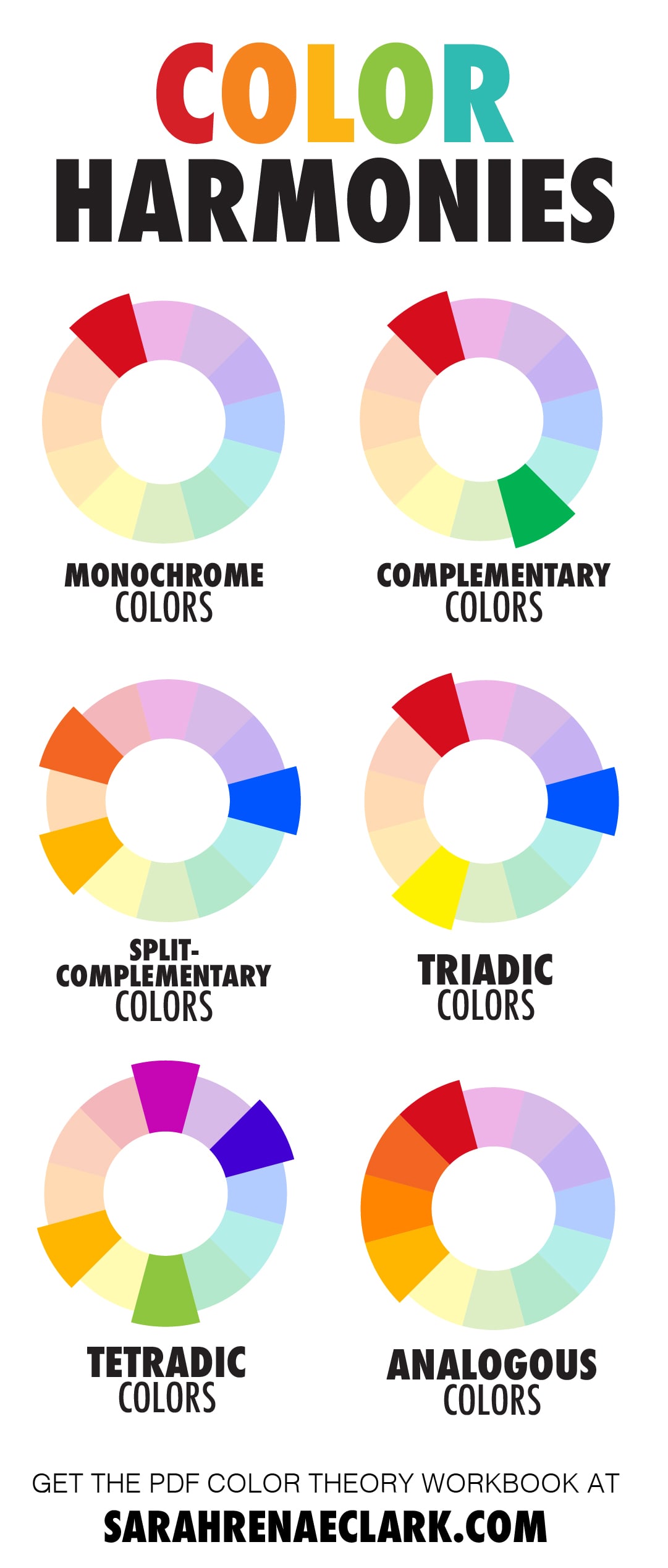
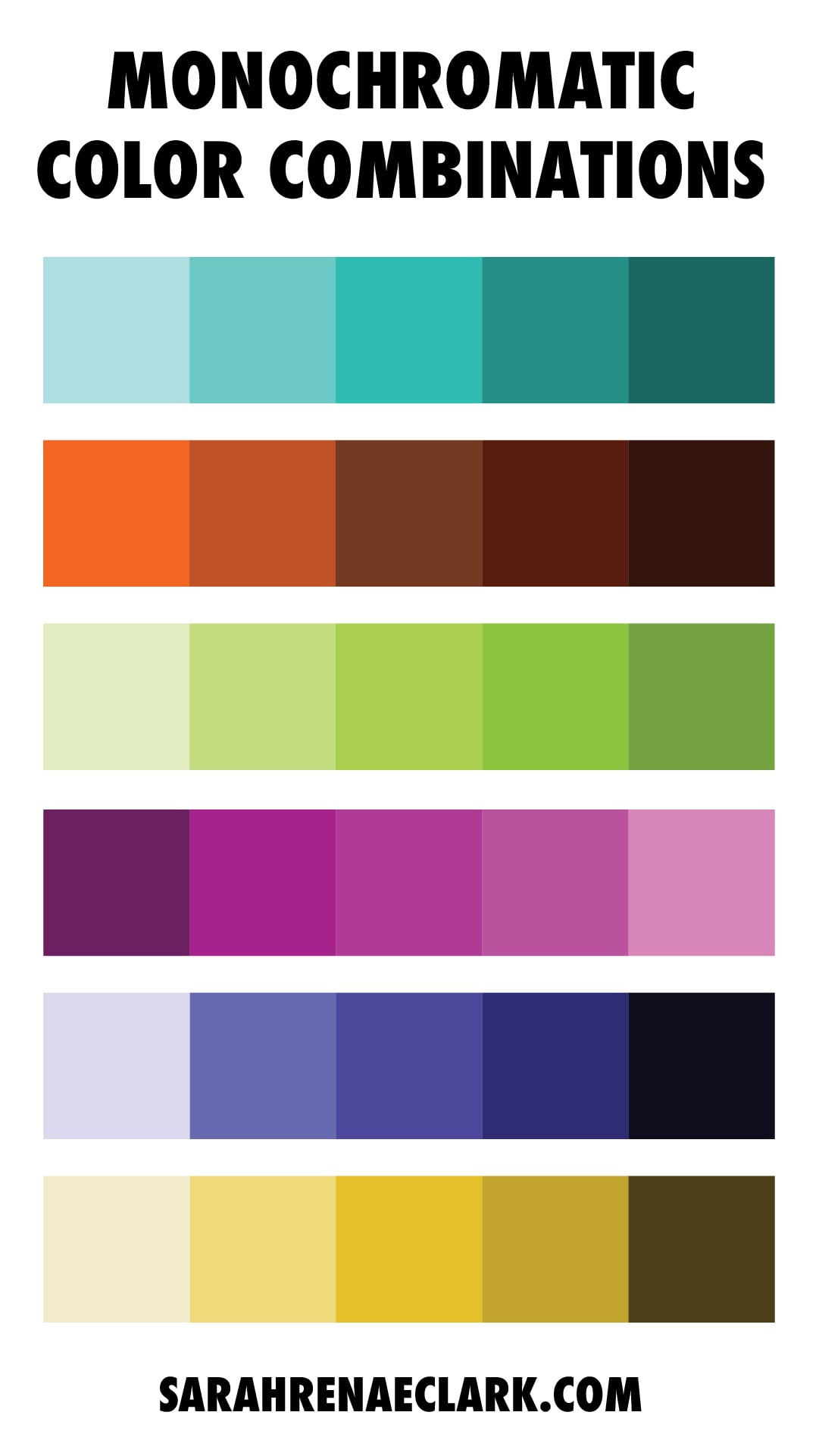
Monochromatic Color Scheme
The first and easiest is a MONOCHROMATIC color harmony. This takes just one base color (or hue) from our wheel and uses different shades, tones or tints to create a group of colors. It’s one of the easiest color harmonies to create and looks simple, cohesive and organized.
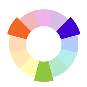
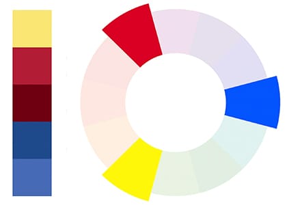
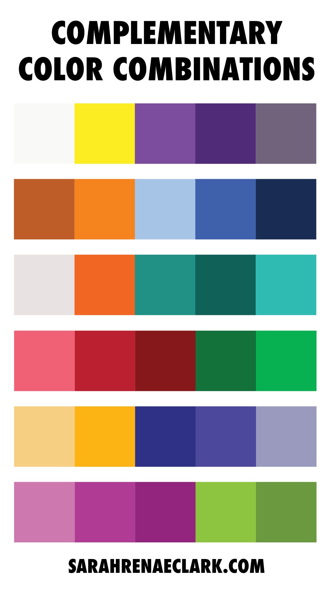
Complementary Color Scheme
A COMPLEMENTARY color scheme takes 2 colors from opposite sides of the color wheel, such as red and green or blue and orange. This type of color scheme is great for creating strong contrast in your image.
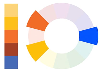
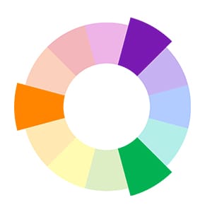
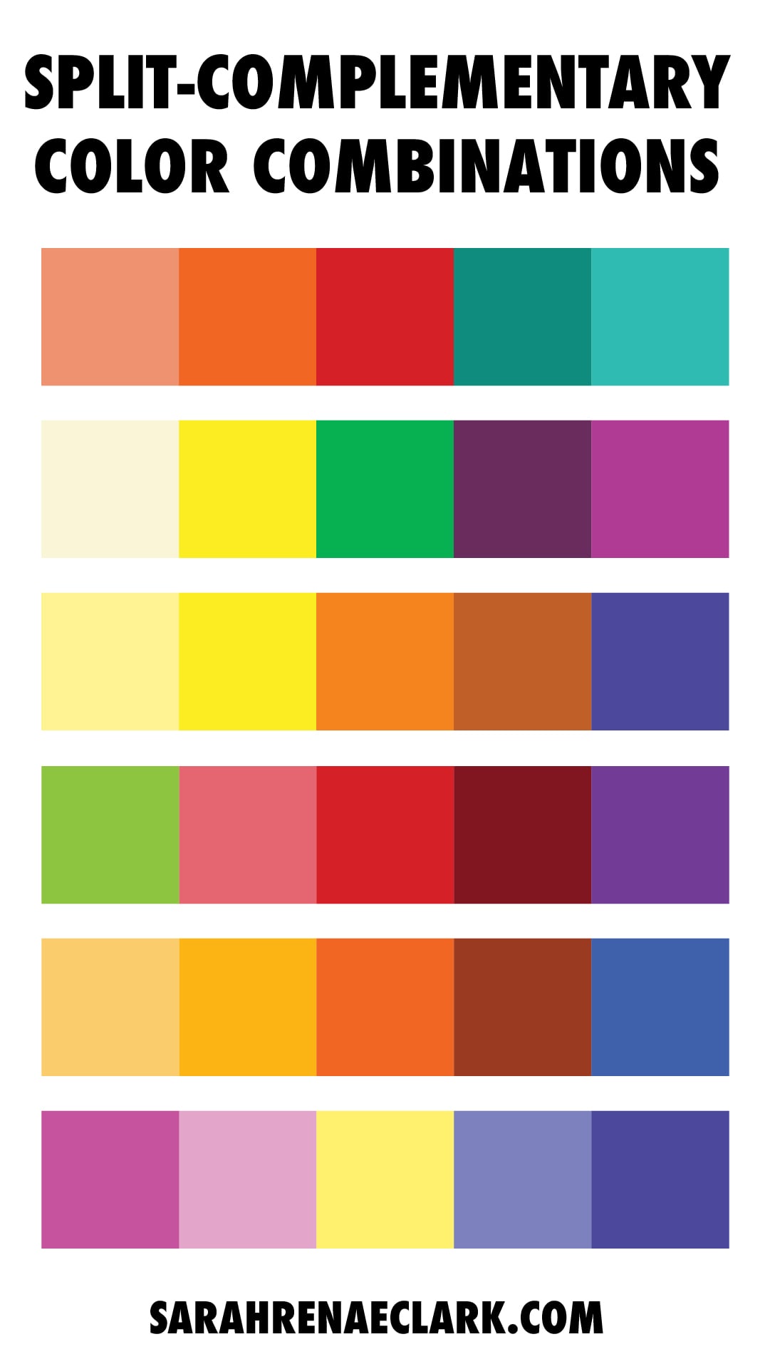
Split Complementary Color Scheme
A SPLIT COMPLEMENTARY color scheme is similar to a complementary color scheme, except one of the colors is split into two nearby colors.
This keeps the high contrast of the complementary color scheme, but also adds more variety.
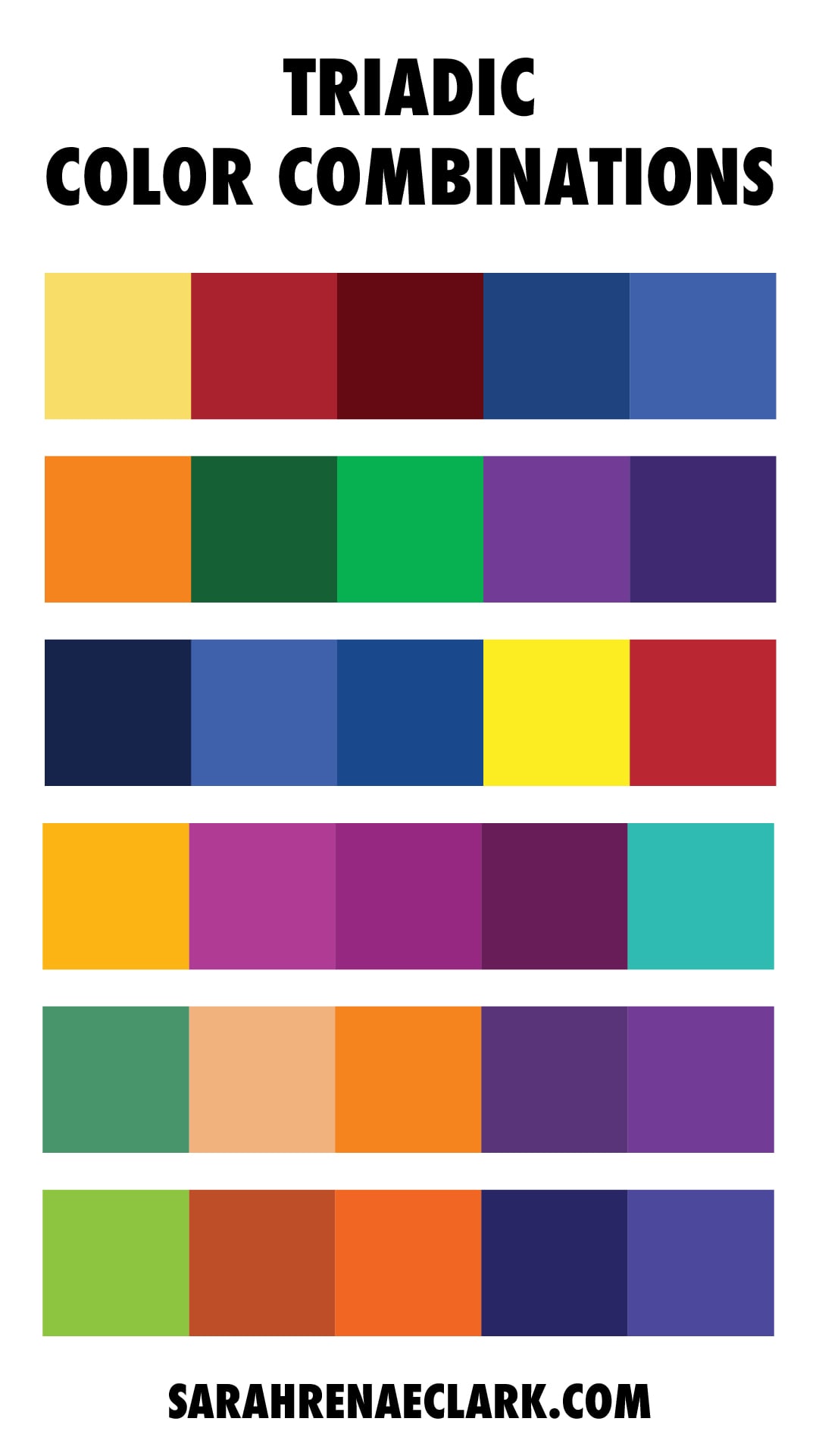
Triadic Color Scheme
A TRIADIC color scheme uses 3 colors that are evenly spaced around the color wheel like a triangle. These color combinations are often bold and vibrant.
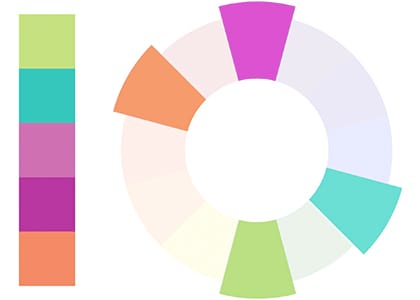
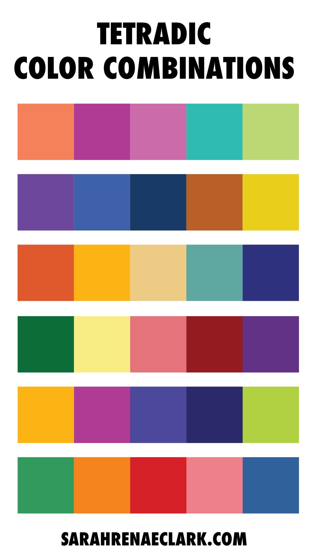
Tetradic Color Scheme
TETRADIC colors are 4 colors in a rectangle shape- made up of 2 sets of complementary colors together as one palette. These palettes work best when you focus on one main color and use the other colors as contrasting accents.
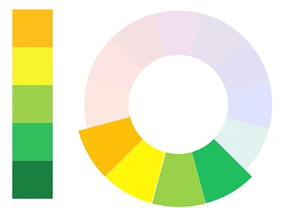
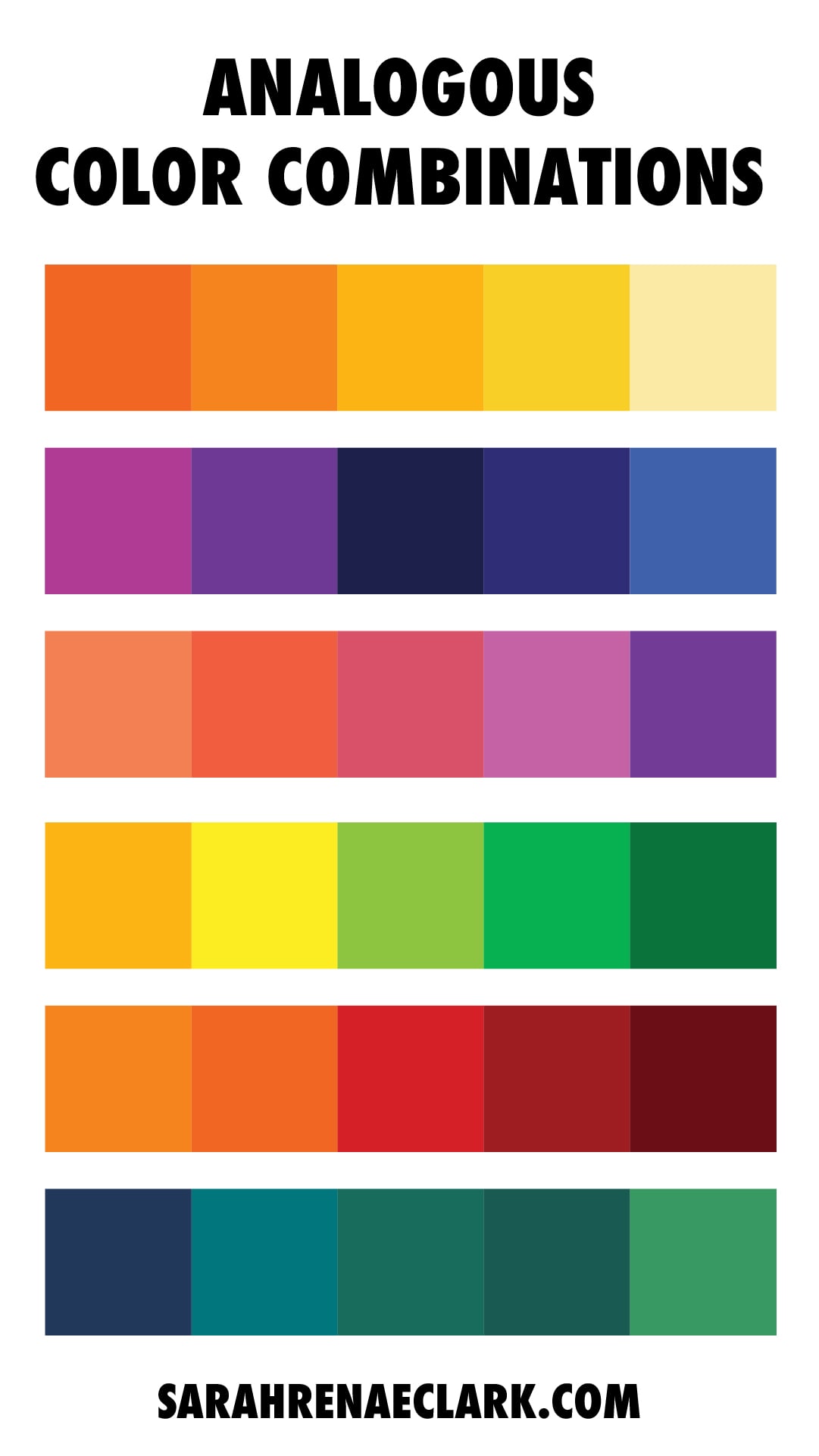
Analogous Color Scheme
An ANALOGOUS color scheme uses 2-4 colors that are next to each other on the color wheel. This is one of the simplest and most appealing color harmonies, and works best if you choose one dominant color and use the other colors as accents.
Tips for using color harmonies effectively
These different color harmonies are a great guide to create colors that work well together. You can create more variety by changing the shades, tones and tints within each color palette, giving you endless ways to mix and match colors that look great.
This can all be a bit overwhelming – but don’t worry, after you’ve started applying these methods, you’ll start to pick up an intuition and confidence for which colors work well together, and which colors don’t.
Here are some general tips to help you:
Tip 1: Pick one dominant color
Whichever color harmony you choose, using ONE dominant color will create a sense of balance in your design. You can choose one main color and use the rules of color harmonies to find other colors that work as accents or smaller details in your design.

Tip 2: Use just a few colors
Simple is best. Adding too many colors in your design can quickly become overwhelming or chaotic to the viewer. Choosing just a few colors and applying these color rules can create art that is bold, simple, and yet still interesting.
Tip 3: Use color palettes for inspiration
Learning the rules of color theory can help you know what works well together, but it doesn’t mean you have to start from scratch every time.
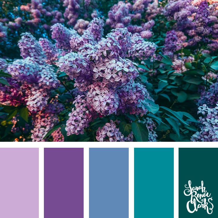
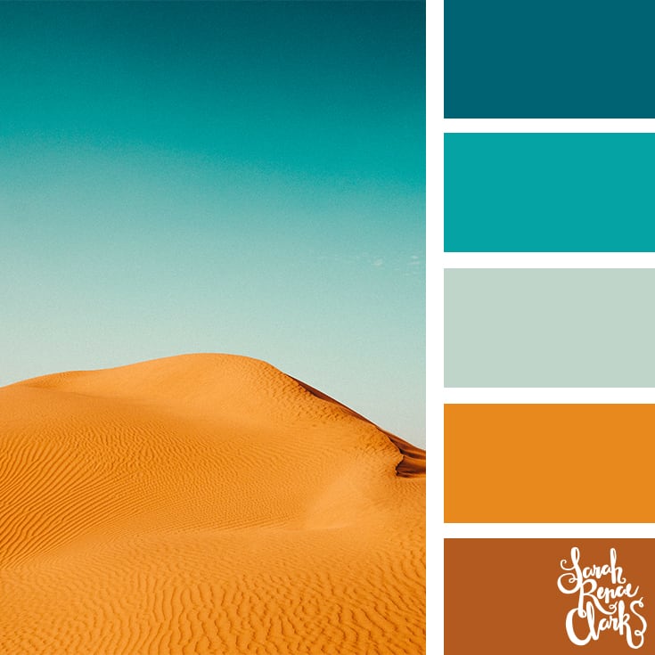
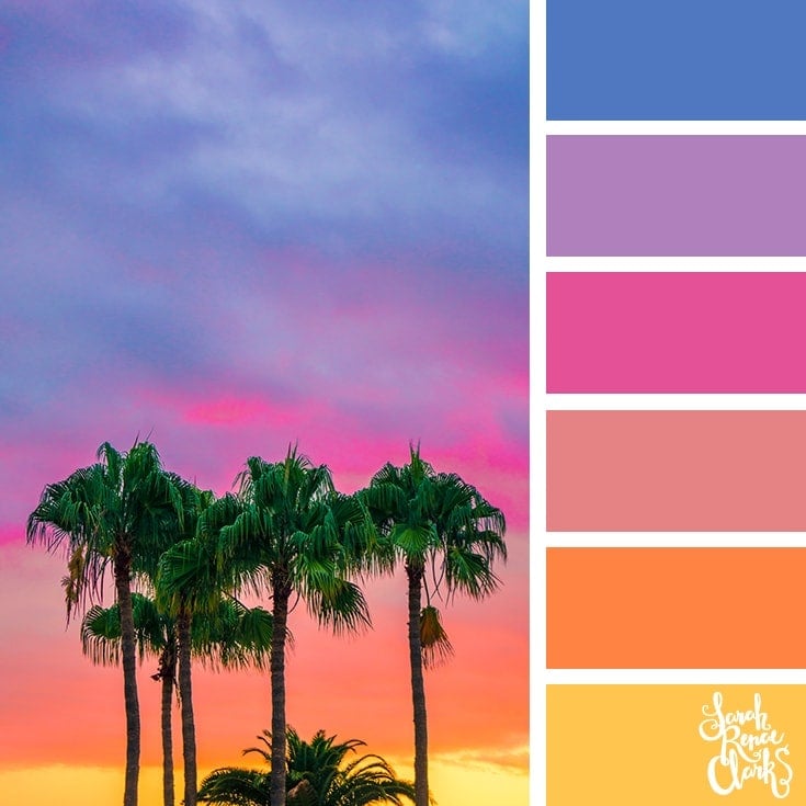
You can find color palettes like those I’ve included in the Color Catalog, that are inspired by nature or existing designs and naturally incorporate colors that look good together.


Choosing good color combinations doesn’t have to be hard. And challenging yourself to using some of these tools and formulas can expand your skills and help you to be creative in a whole new way.
Watch the follow up to this article here, where I take a deep dive into the color theory debate and the history behind the color wheel!


Thx so much for all your help! I love drawing and I follow you on YouTube!
Brilliant resource! I love it so much.
May I use this post in my blog please?
You can embed the video – there’s an embed code on YouTube 🙂
I’m making a copy of some of this info to display on my crafts room wall. Thank you so much!
I love that idea!!!
Just ordered the book. I love the idea. I would love to see a spiral bound version that I could leave open as I work. It seems, with the PDF I will have to keep my device open as I work because I do not have the capacity to print these pages with the proper colors since my printer is not a robust one with multiple colored inks. Therefore, when I print a page to work on it will print out in shades of grey. Also, PDF 1 is the blog post directly. It would be nice to just buy the worksheets under separate cover and use them with the blog. I found this website quite by accident and have been enjoying it very much so I do not mind supporting it. I have downloaded a few free items and this was my first purchase. I downloaded the color mixing sheet and surprisingly found the activity to be very soothing. I am hoping the color theory activities will be the same.
I’m Tammie and I have no idea about combining colors and I have a room of clowns that I want to paint and the funtiure starts with a red couch like palette colors I’m hoping I learn a little bit to go on over to the kitchen with dark lime green wish me luck thanks
Very helpful and good work…
I’ve tried to buy the book, but it’s not available anymore. put in the card information, but it does not go through.
Simple, informative, and well clarified. Thank you.