Choosing color combinations is not always as fun as it seems like it should be.
I don’t know about you, but when I look at my set of pencils I find that I always go back to the same few colors every time I color in. I have subconsciously created a safety net in the few colors that I know look good together and a rarely experiment with new color combinations unless I really challenge myself to try something new.
And we’ve all been there.
Choosing good color combinations doesn’t come naturally to most of us. Just because you’ve learnt basic color theory in school doesn’t mean you automatically know what colors work well together and why certain colors seem to clash.
In my beginner’s guide to color theory, I covered all the basics about how colors work together and how you can use a color wheel to learn the science behind why some color combinations look good and others don’t – But if you’re looking for an easier option and just want to color without learning all that color sciency stuff, then this post is for you!
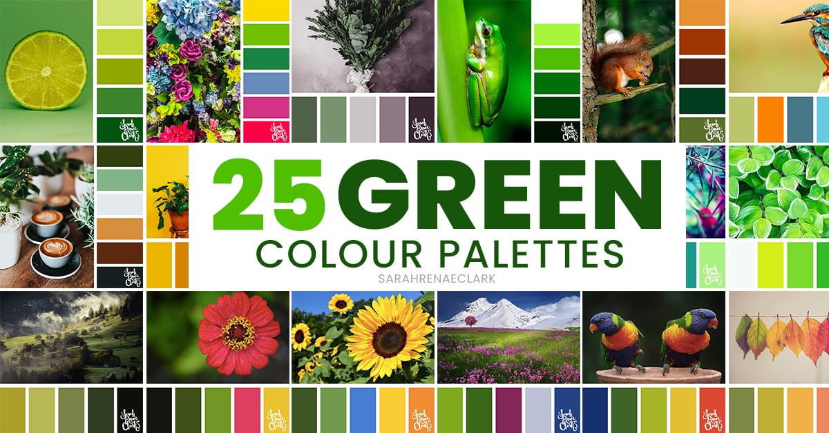
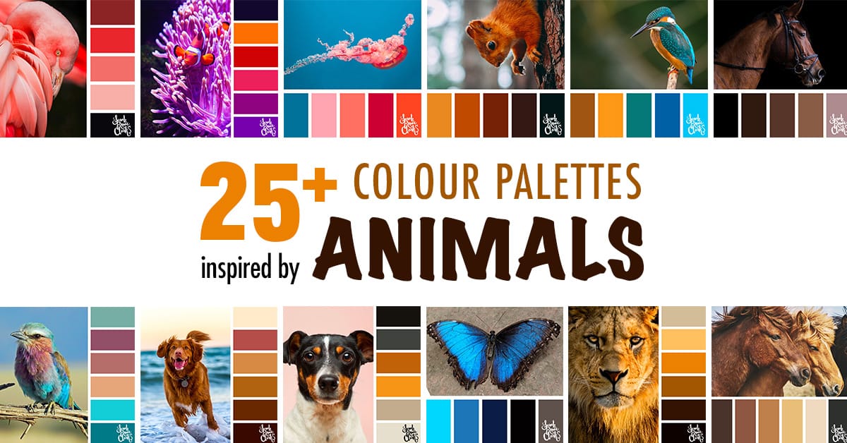
So here’s the secret that many colorists use to choose their colors, and if you’ve already been following me for a while then you probably already know what I’m about to say… and that’s to use a COLOR PALETTE.
Note: This post contains Amazon affiliate links and I may earn a commission if you click them and make a purchase (at no cost to you).
Why do artists use color palettes?
- Using a color palette can help you to create a certain look or mood, whether it’s something fun and vibrant, or dark and emotional.
- It can serve as a great source of inspiration, to help you break through creative block and give you a starting point when you’re stuck for ideas or not sure where to begin. Browing color palettes in something like The Color Catalog can become a really fun part of your process, and exploring new color combinations can be exciting and rewarding.
- It can help you think of new and unique ways to look at something, like using different colors that you wouldn’t usually consider using.
- In the same way, it can give you so much more variety. There are so many different colors that make up similar scenes, and yet produce such different moods and results.
- And above all else, it can give you confidence in choosing your colors, because you can see how they come together before you begin. And over time, you’ll naturally develop an eye for what colors look good together, and build your own skills in choosing colors.
Where can I find good color palettes?
Here are some of my favorite places to find good color palettes. (Each of these links take you to my own collections, but you can also find more by searching)
- The Color Catalog (featured in the video below)
Other color palettes without reference images:
How to use a color palette
Now let me walk you through exactly how you can use a color palette in your coloring. You can also use color palettes in other art, design, crafts, cooking, interior design, makeup, and so much more. Coloring books are just ONE of SO many uses for these.
When it comes to actually using a palette, there’s no right or wrong approach. You can use it as general inspiration, or use it as strictly or loosly as you want.
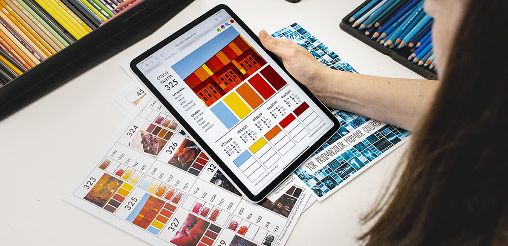
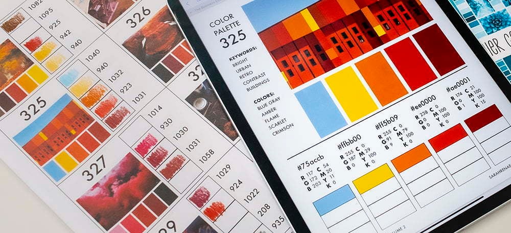
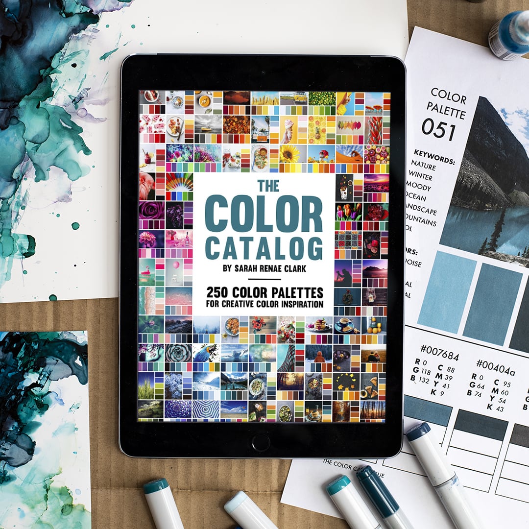
If you’re using the Color Catalog, it comes as a digital version that you can navigate and easily find whatever palette you are looking for by keyword, color or collection – and from there, you can either just match the colors by eye, or you can print out the page you want to work from and actually swatch your pencils out on the page for a more accurate match.
Not all printers will print the colors the same, so you will find that your printer colors are not as bright as the colors on the screen, but this doesn’t matter as much as you’d think. In the same way, not every set of pencils or markers is going to have a perfect match for every color in your palette, and that’s ok! You can either try to mix your colors to get a closer match, or just pick something that’s close and has the same general hue as the colors in the palette.
In the video below, I’ll run you through an example of how I choose the colors of my pencils from a palette from The Color Catalog.
In the video, I’m using the Black Widow Monarch Colored Pencils 48 set that were generously given to me by Black Widow to try. I hadn’t previously tried any of the Black Widow range, so I was very excited to try these! The color range of these are beautiful pastels, which are quite different to anything else I own.
It was a challenge to match my colors to my palette perfectly using only this set, so I’ll talk you through my process of that in the video and the different options you have if you find yourself in this position.
Tips when matching colors to a color palette:
- Use the color palette as a guide. Don’t worry if you can’t find a perfect match.
- Try mixing colors to get a closer match. Use my color mixing guide if you need help.
- Use a scrap piece of paper so you can test multiple colors and mixes before matching them on the page you are working on.
- Write down your pencil or marker numbers for quick reference later.
- You can remove colors if you want a simpler palette.
- If you want to add colors, add darker or lighter shades/tints of the colors in the palette. (Try to keep them similar to what is already in the palette instead of adding something totally different)
- Remember that screens and printers show colors differently, and that’s ok! It doesn’t have to be perfect.
- It’s ok to mix brands and mediums to find all the colors you need for a project.
Aggh! It’s still too hard!!
Take a breath, I have good news. I’ve done all this hard pencil-matching work for you for ALL 500 color palettes in The Color Catalog Volumes 1 & 2, so you can print them out and get on with coloring.
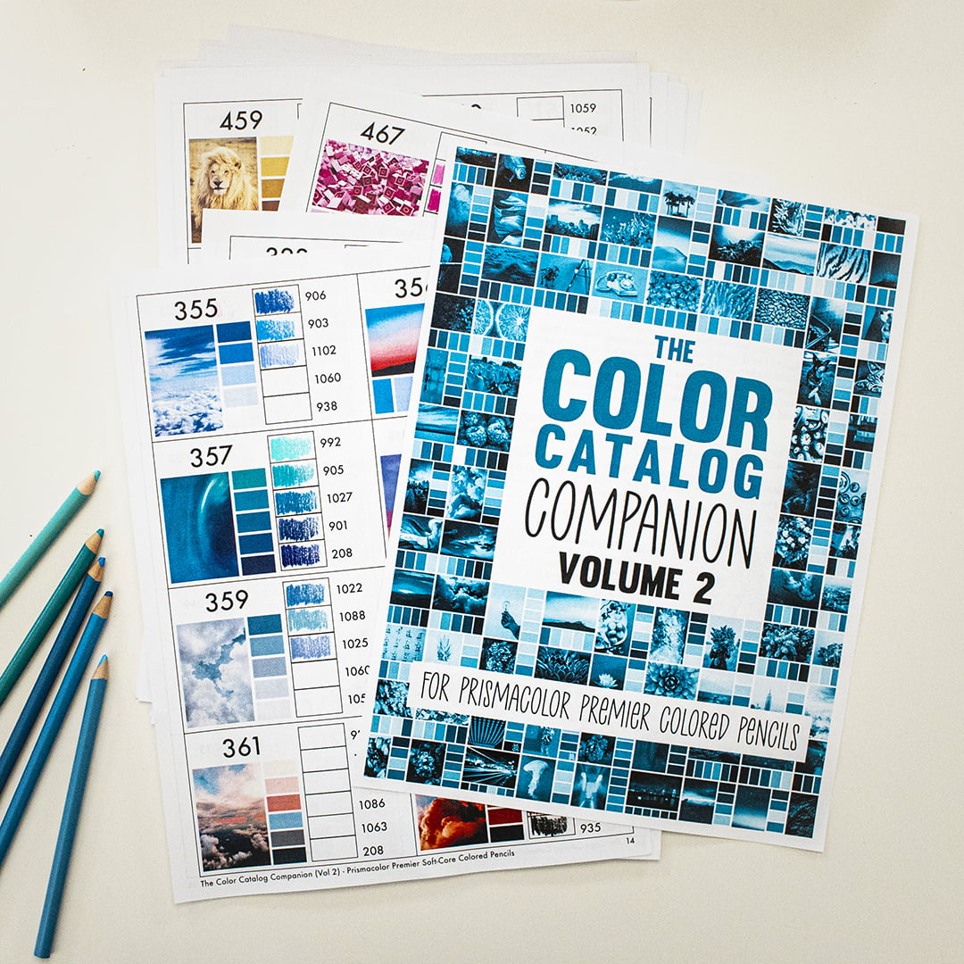
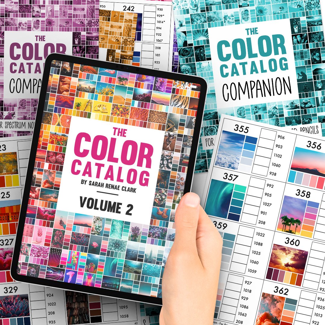
Introducing the new Color Catalog Companion!
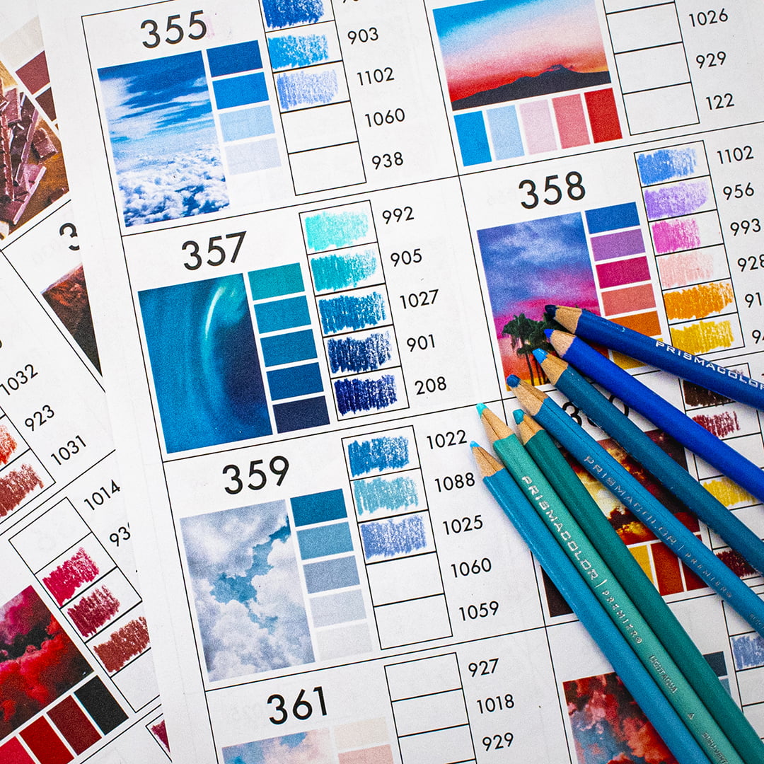
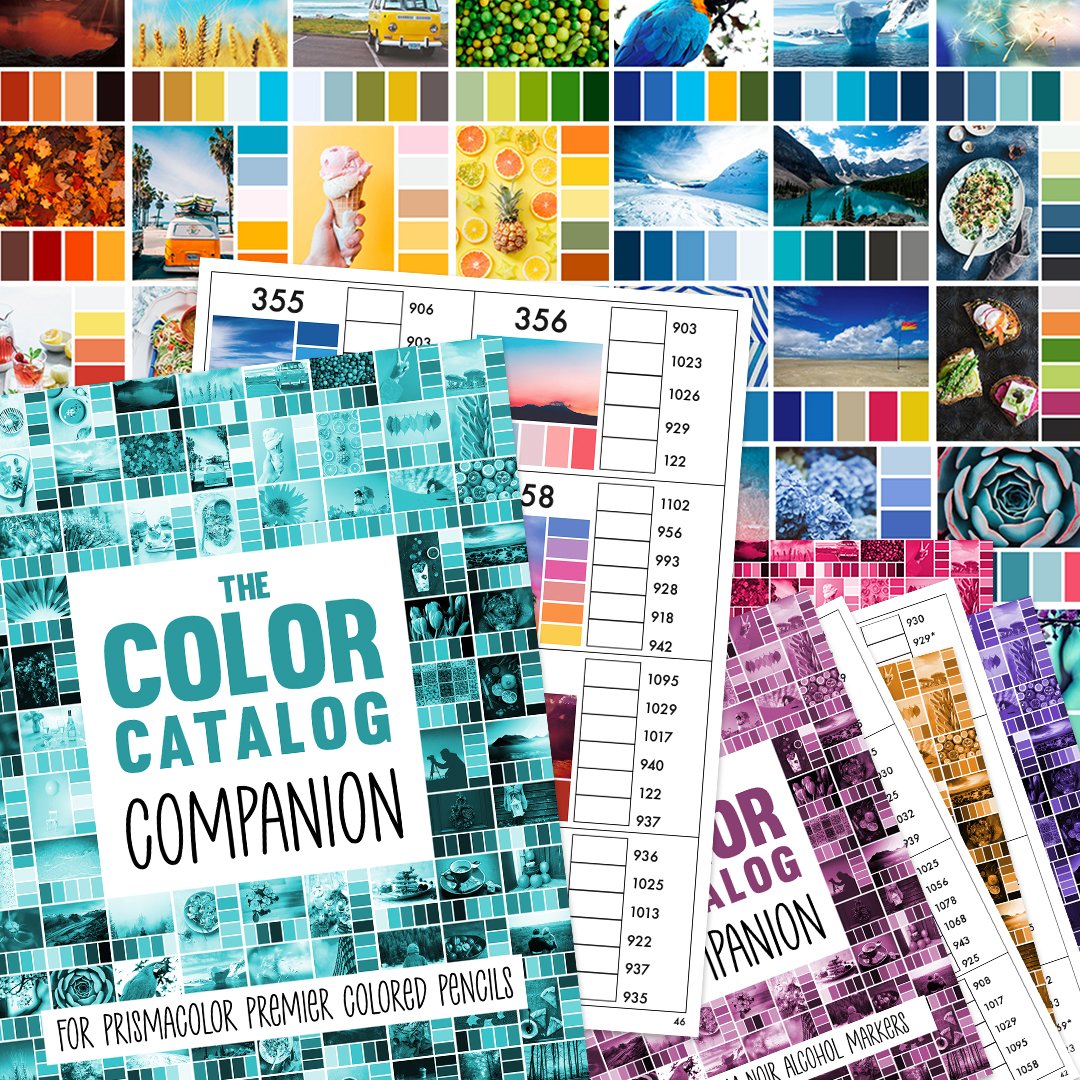
It is a new printable guide with every color palette from the Color Catalog where I have pre-filled every pencil color for you for some of the most popular pencil brands so that you don’t have to go to the effort of finding the best match.
Each Companion fits 8 color palettes to a page, so it’s a far more printer-friendly option if you’ve been wanting to hold The Color Catalog in your hands – with the added functionality of having your entire pencil swatch library ready to go whenever you want to color.
What brands will be supported in The Color Catalog Companion?
- Prismacolor Premier Soft-Core Colored Pencils
- Faber-Castell Polychromos Colored Pencils
- Caran D’Ache Luminance Colored Pencils
- Black Widow Colored Pencils
- Derwent Colorsoft Colored Pencils
- Derwent Inktense Pencils
- Derwent Artists Colored Pencils
- Copic Sketch Alcohol Markers
- Ohuhu Alcohol Brush Markers
- Spectrum Noir Alcohol Markers
- Tombow Dual Brush Pens
There’s a blank set included too, so if your brand isn’t included, you can still match your colors and keep an easy record, without having to print all 500 pages from both Color Catalogs.
Please Note: Prismacolor Premier and Spectrum Noir are available NOW, the other brands will be available by Feb 2021 (due to the time involved in manually swatching each color). But please don’t wait – purchase NOW and I will send you the full set when they become available. The price will be going up in February.
How can I get The Color Catalog Companion?
You can purchase The Color Catalog Companion 2 ways. Both come as a printable format you can download and print from home.
1: On it’s own for $45 – Check it out here.
2. With the Color Catalog Volumes 1 & 2, at 85% off (just $7 when added to your order!). You can order the Complete Bundle here.
If you purchase right now, you’ll get the Prismacolor and Spectrum Noir Companions right away, and you’ll be emailed the rest of the included brands by the end of February 2021 at the latest, along with any future brands I add for free. When I release the rest in February, the price will be going up, so it’s worth getting in early now.
If you don’t think you need help matching your pencils, then you might not need the companion at all! Because the Color Catalog does come with a printable version already included. You can even use an app like Goodnotes to make notes in the digital PDF version if you’d like to record your favorite pencils and markers and still navigate using the buttons. check out The Color Catalog Bundle here.
The Color Catalog has found it’s match.
Get the Complete Color Catalog Bundle, with both volumes of The Color Catalog AND the new Color Catalog Companion in this complete bundle!
The Color Catalog Companion tells you exactly which pencil in your collection will give you the color you’re looking for, for every color palette in The Color Catalog. Together, they make the perfect couple. And they bring a world of inspiration to your hands, so you can focus on the fun part of coloring.
If choosing color combinations wasn’t hard enough, we’re presented with 20+ different kinds of blues that hardly match the pencil casings and expected to know which is the “right” one for the blue sky in our coloring page.
But that’s yesterday’s problem. Because the Color Catalog Companion tells you exactly which pencil in your collection will give you the color you’re looking for, for every color palette in The Color Catalog.
We’ve painstakingly matched every colored pencil over hours, days and weeks so that you don’t have to – and it’s all in a super easy printable booklet so you can grab your pencils or markers and get on with coloring!
If you’d prefer to stick with the digital version you can take with you everywhere, The original Color Catalog is the most popular product in my shop, with over 4500 downloads and hundreds of raving reviews!
Store the PDF on your mobile or tablet to find a color combination by color, keyword or collection in just a few taps. Or use the printable version to test out your own pencils or markers against each palette.
You’ll never be stuck for colors again.
I’d love to hear from you! Have you ever used a color palette before and do you find them helpful? Please tell me in the comments!







Un trabajo excelente, muchisimas gracias!!
When I first stumbled over the Color Cube and Color Palette I was hesitant. But finally, I gave it a try and started to use it. As I am working with acrylics and my canvas are 3d miniatures (yeah tiny) this was an additional level. I have to say it was an interesting experience that I have to repeat. I still have to learn how to map the palette and example pictures to my models. And although I first sticked strictly to palette’s colors, I started to deviate: just like you say in your blog and the video. So thanks for your work, for your inspiration. The color cube is on my wishlist.
Hi, I just came across your blog and youtube videos. It’s very helpful. I’m AuDHD so I always use a color-by-number adult coloring book to color because I find it so stressful to pick colors. This companion will help so much. I’ve been researching the last two weeks trying to find what color pencils to buy. I don’t like Prismacolor pencils. I do like Arrtx but I find them a bit soft. I’m also a beginner colorist. I love art and after I learn more about mixing and blending colors I would like to learn to draw later. The problem is I’m heavy-handed and have a death grip on pencils. It’s not something I can fix because my body does this due to poor fine motor skills and the need for sensory feedback.
Hi. Can someone tell me what the asterisk is for on some of the color numbers please? Thank you.
Thank you for reaching out, we’re thrilled to hear that you’re enjoying Sarah’s work!
In the front of each companion, Sarah provides the following explanation for the Asterix:
What does the * mean?
In the case where I believe the closest color matching color is not a good match at all, I’ve included an Asterix* so you can consider whether you may want to mix a color or find an alternative on a scrap piece of paper before swatching this color on your palette. In this pictured example, the colors in 282 have a pink undertone, so I chose to recommend a pink instead of a red in the swatch. However, because the 0700 pink is quite different, I’ve included an * to indicate that this isn’t an exact match, so you can make the decision for yourself. You’ll see this more often in smaller sets where it’s harder to produce the large range of colors required for every palette.
Remember that these color palettes are just a guide: There’s no right or wrong way to use them. You can use as few or as many of the colors from these palettes as you like, and you can explore your own combinations with other colors as well. Have a great day – Kristen (Team Sarah)
Well, I am really really confused. I have an iPad Pro and bought the downloadable catalogs and companion.
I tried to save these on my Home Screen, NOPE
how in gods name do you save this on an iPad Pro…..
I am really upset. I bought the cards also but really wanted these online.
HELP!!!
Hi Tena, please feel free to reach out the the team at [email protected] at any time for assistance. :)
Hello! I purchased the bundle and downloaded the pdfs. However, I only downloaded the companion files for the brands of pencils I had at the time. I have since expanded my collection and would like to download the remaining pdfs, but I cannot figure out how to do that.
Hi Shelly, I’ll investigate and send you a message – Kristen (Team Sarah)
How to Use a Color Palette this information is very useful for me! Thank you so much for sharing all information. I found some information about color blindness, many people has color blindness problem if anyone wants to check your eyes then visit here and check by screening test.
Hi Sarah I love the colour catalogue I’ve just purchased but I have a question. If I pick a palette for colourig a picture of a person do I use a separate one for the skin as I can’t find many that have people in to try?
I’m confused, where do I find the corresponding prismacolor pencil color numbers? I bought the whole bundle and all I see are the standard references for RGB &CMYK. Thanks Priscilla
Nevermind, I found it. Sorry about that. This is a great digital color pallette tool. I’m happy I bought it! Cheers Sarah!
Looking in how to use the color companion
Where do I find this video
In the color companion for Copic sketch markers, some of the colors have an * to the right, (example: BV29*). What does the asterisk refer to / represent / mean? Thanks so much.
The * means the color isn’t a perfect match. I’ve chosen the closest color, or a color I feel fits the rest of the palette. It’s my way of saying “This isn’t perfect, so you might choose something different, but give it a go”
They are more common in the brands that had smaller sets, especially with markers because they are less versatile than pencils.
Phew–found the answer! You might want to post this asterisk explanation somewhere else on your site; I couldn’t find it even with your site search and finally stumbled on it here after deciding to comb through the comments of the different companion-related posts and shop items .
I came here for the same reason. That asterisk was going to keep me up at night lol.
Same for me, I am used to looking at the bottom of the page or at the beginning/end of a document when I’m not sure what an * (asterisk) means. I’d love you (Sarah) to add the explanation of the asterisk to the color-companion pdf’s ;), but thanks for the explanation here.
I am so glad I bought this!!! Thank you for all your hard work. It is worth every penny!!!