Do your Etsy product photos need improvement?
Today’s post is a guest article from photographer and teacher, Rachel Korinek. Check out her resources at twolovesstudio.com
If you don’t already have an Etsy shop, please check out my in-depth guide to getting started on Etsy.
This post contains affiliate links and I may earn a commission if you click them and make a purchase. This is at no cost to you and I only recommend products that I love.
So you’ve got a killer product that you’ve poured your heart into and you just know your audience can’t wait to get their hands on it. All you’ve got to do now is show them just how beautiful that product is.
But how do you stand out in a busy marketplace like Etsy?
You need images that will make them fall in love with your wares. Perhaps photography isn’t your strong suit, or you think you don’t have the best camera.
Well, let me tell you this – you don’t need to be the best photographer to really show off those gorgeous products of yours. All you need is a little TLC and a few tips that will really make the photos for your Etsy shop stand out and make your store competitive.
1. Use Clean Bright Backgrounds
Backgrounds are a hot topic in the still life photography world. Everyone is always itching to know where I source my backgrounds.
Backgrounds are the backbone of most of still life images, but when taking photos for your Etsy shop, you want your customers to see your products first, not the background.
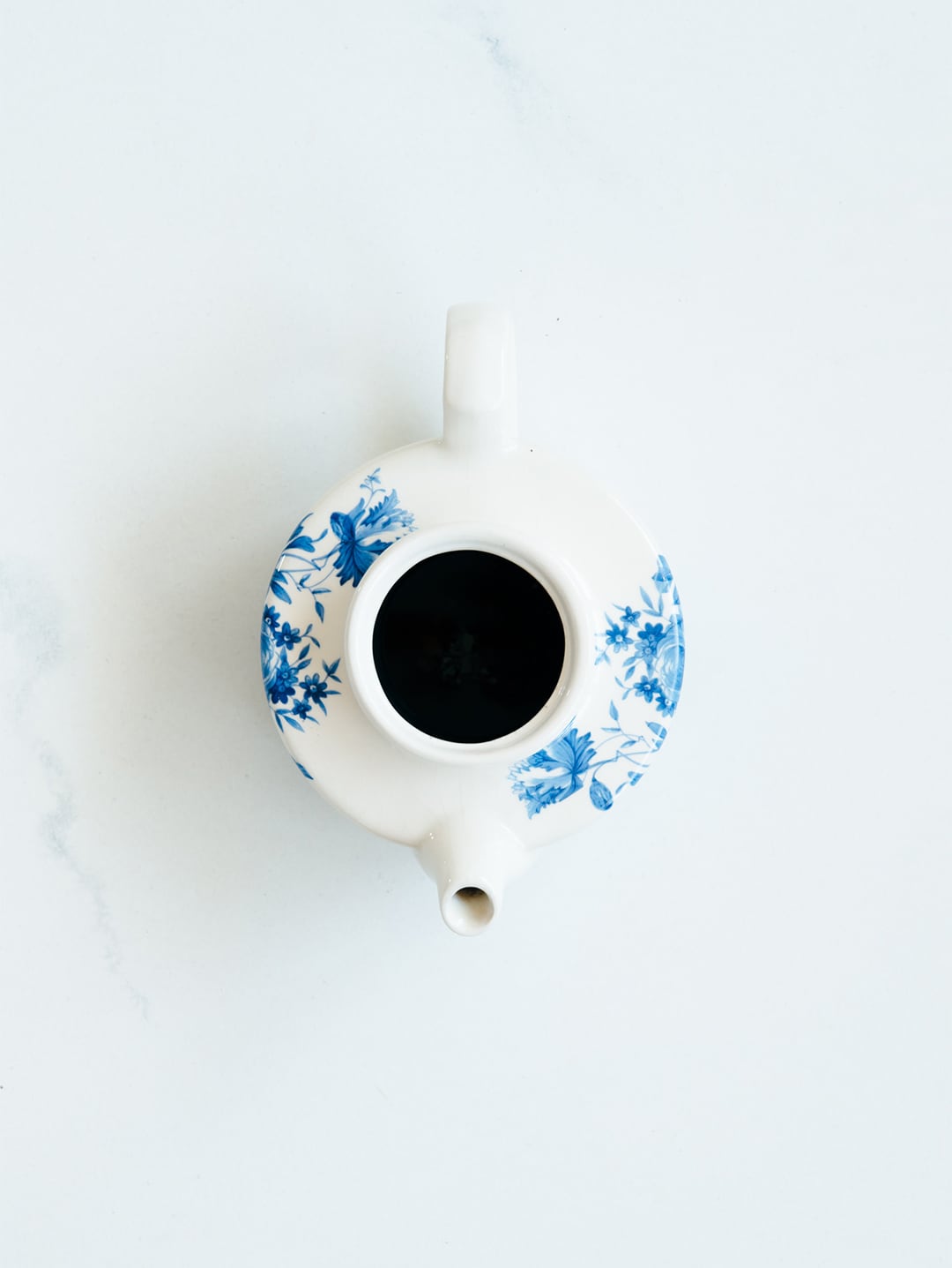
To really make your products stand out, you’ll want to use a background that is clean and bright. The key here is to not make your background distracting by using too many colors, textures or patterns. For sure, you can use these features, but you’ll want to make them subtle and complementary.
My tip is to use bright whites, and they can even have hints of greys and blues. Even a subtle marble will scream ‘luxury’ to your customers.
2. Flatlays For Easy + Flattering Composition
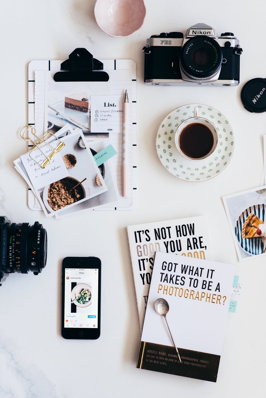
Flatlays are all the rage right now and that’s no surprise. They give a great bird’s-eye view of your product’s features, are so complementary to styling and you can incorporate so many fun elements that help you tell your brand story.
If you are bored of taking flat product shots on a white background and want to make your Etsy store look a little more premium, then flatlays are a simple way to kick it up a notch. With just a simple tweak to how you compose shots, your photos for your Etsy shop can be instantly transformed.
With flatlays, you’re taking an overhead shot and so don’t need to worry about how and what you place in the foreground, middle-ground, and background. You can add flowers, home decor, plants, hot drinks, journals, ribbon – you name it to help tell a story about your products. Just remember to keep your props relevant to your topic (more on that shortly).
Plus Instagram loves flatlays, so you can use your product photos easily on your social profile and get access to a variety of hashtags that’ll get your products seen. Flatlays are also more likely to be shared on social media – it’s a win-win!
Want to step-up your styling and compose better photos for your Etsy shop? Check out Rachel’s e-Masterclass that’ll help you create next-level images.
3. Avoid Taking Wonky Photos
Remember in the first point, I said that it was super important that your customers see your products first? Well, first impressions are important. Your goal for photos for your Etsy shop is to showcase your products in their best light
If you’re going to be creating flatlays for your product shots, then you want to make sure that you are precisely overhead. If your camera is angled funny then you might risk your products not looking their best.
All you need to do is make sure when your camera is on a tripod that it’s at exactly 90 degrees. But you might be thinking, ‘well don’t I need fancy equipment for that?’
If you’ve got an iPhone, then you already have a free tool that is going to help you every time.
Just head into the ‘Compass’ on your phone and swipe to the right. Bang, you’ve got a spirit level to tell you when you’re perfectly overhead. When it goes green – you’re spot on! No more wonky photos.
(And when I say wonky, I’m not referring to the Dutch Angle. That’s an artistic angle that’s totally ok to shoot if you want).

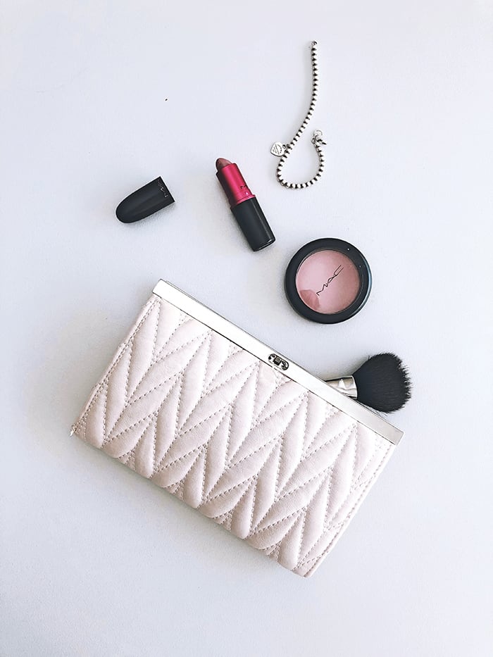
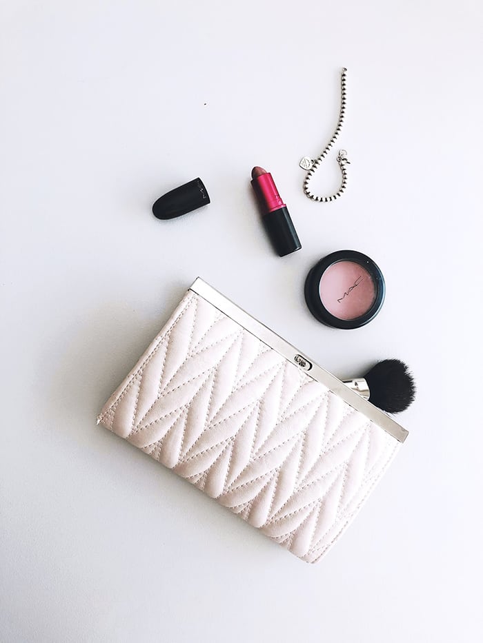
See how the image on the right feels like it’s slightly ‘falling off’ the background? Like it’s about to side right out of the image? That’s because I am not right overhead like in the image on the left.
4. Avoid Distracting Colors + Shapes
Think product, product, product. That’s your first and foremost goal of photos for your Etsy shop is to showcase your gorgeous products.
When considering what you want to include in your product shot, it’s easy to get carried away adding props and trinkets that you love. I know, I’ve been there. I know what it feels like to really want to use something because it’s ‘cute’.
In order to make your products really stand out, any secondary prop that you add to your shot – including your background – should be free from distracting colors and shapes.
Always think complementary. Use props that add to your overall brand story, rather than distract.
5. Use Nice Soft Light
I’m sure it’s no surprise to you that light is everything in photography. Without light, we’d have no image. We’d just have a black space.
Now there are two types of light – soft light and hard light.Soft light has beautiful soft shadows that transition from dark to light, just like a gradient. Think of this type of light that’s created by beauty mirrors that we use when applying makeup.
Hard light, on the other hand, has shadows that have a hard edge. There is no transition. This Is the type of light and shadows that you get on a blue sky day around midday. (Take a look at your shadows next time you’re walking outside on a sunny day at lunchtime).
Neither light is right or wrong, good or bad. However, generally when you’re shooting products, unless you’re getting super arty and retro, you’ll want to use soft light. Soft light also transcends multiple concepts, and so can be a good type of light use to make sure all of your products look consistent and on brand.
You can achieve soft lighting with either natural or artificial light by using a diffuser in between your subject and the light source, such as a white sheet, t-shirt or cloth, even baking paper can work a treat. We’ll cover this in more detail in later in point 10.
6. Don’t Use Style Filters To Edit Your Product Photos
Now I realize that this is a blanket statement and there are always exceptions. But let’s get something straight before I dive into this point
Filters and presets aren’t necessarily the same thing. Sometimes we use these names interchangeably, but that can be a trap when shooting food or products. There are two types of ‘editing presets’. The first type are ‘adjustment’ presets and the second is ‘style’ presets. Without getting too technical, what I want you to get from this tip is that style filters can be dangerous to use with products and food.
The reason is that style filters are generally used to replicate a film-like look, to render colors back to the days when we all shot film. These filters are nostalgic and beautiful, don’t get me wrong – BUT you want your customer’s expectations to be matched when they get their product.
Especially if you’re supplying clothing, linens or anything that is really reliant on color. Style presets alter the hues and tones of color to get those artistic effects.
In product photography, photos for your Etsy shop should show their true colors.
In my Lightroom Magic e-Masterclass I teach how to edit for and alter color, so that you get perfect colors on food and products every time!
7. Avoid Large Aperture and Shallow Depth of Field
This one hits hard, I know. This is the whole reason that we get into photography with a DSLR. But here is the good news, because you don’t need to shoot at large apertures (e.g. f1.8 or f2.8) with product photography, you don’t need super expensive or fancy lenses (and camera for that matter). You can totally use your smartphone!
The reason that we don’t want to shoot super shallow depth of field, (which btw is when most of your shot has that nice blur to it, with just a small portion in focus), is that your customer wants to see what they are getting. They want to see all those juicy details. Those reasons why they should buy your product over another shop owner.
If however, shallow depth of field is your thing, then don’t let me stop you, but make sure you include at least one image where they can see all the detail in your products.
Aim for an aperture of around f4.5 – f5.6 and see what how that feels!
8. Choose Focal Lengths That Flatter Your Products
What lens to shoot with is also another hot topic, and your lens choice has a lot to do with the success of your image. Now because we’re looking for quick wins here with our tips, I am going to give you the top two you need to know for photos for your Etsy shop.
If you want to get a lot of products in and have a large flatlay, then you will want to shoot with a wide-angle lens. Like a 35mm or a 50mm.
If you’re going for a tight close-up, then you will want to shoot with a narrow-angle lens. Like an 85mm or a 100mm. Even a 100mm/105mm macro.
These focal lengths will flatter your products the best with the amount of space you want to capture. Now, I know lenses are an investment so we don’t’ always have as many as we like. If you don’t have a narrow focal length like an 85mm, 100mm or 105mm macro – then don’t fret. There is a simple way you can still capture flattering angles for free!
Simple use your wide angle length to capture space around your product, so don’t get too close with your camera and crop in when you edit.
9. Create Consistency in your shop
When customers buy your products, they are also buying into your brand, your message, your values – a community.
This in term lets your customers know that once they buy one product from your Etsy shop, they know what to expect from you. They know the buying experience and the quality of the products. In terms of photography, one of the easiest ways to do that is to create consistency between all product and shop images.
And the best part about this is that you don’t have to come up with hundreds of different photo shoot ideas. If you have a beautiful white background, use it over and over again. It’s almost like a set-and-forget type setup.
To create consistency use the same:
- Backgrounds
- Colors
- Editing process
- Props
- Space for text
- Composition, i.e flatlays
- Angles, ( you might choose to shot overhead and 45 for all products)
- Light
Now that might sound like a lot, but once you’ve worked out what that means for your brand, you’re done! You can use this over and over and put more time into engaging with your audience and customers that’ll translate into sales.
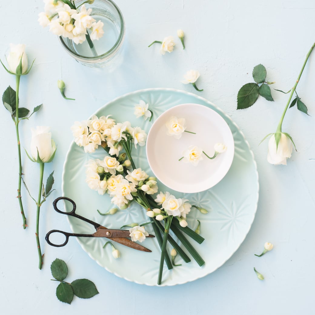
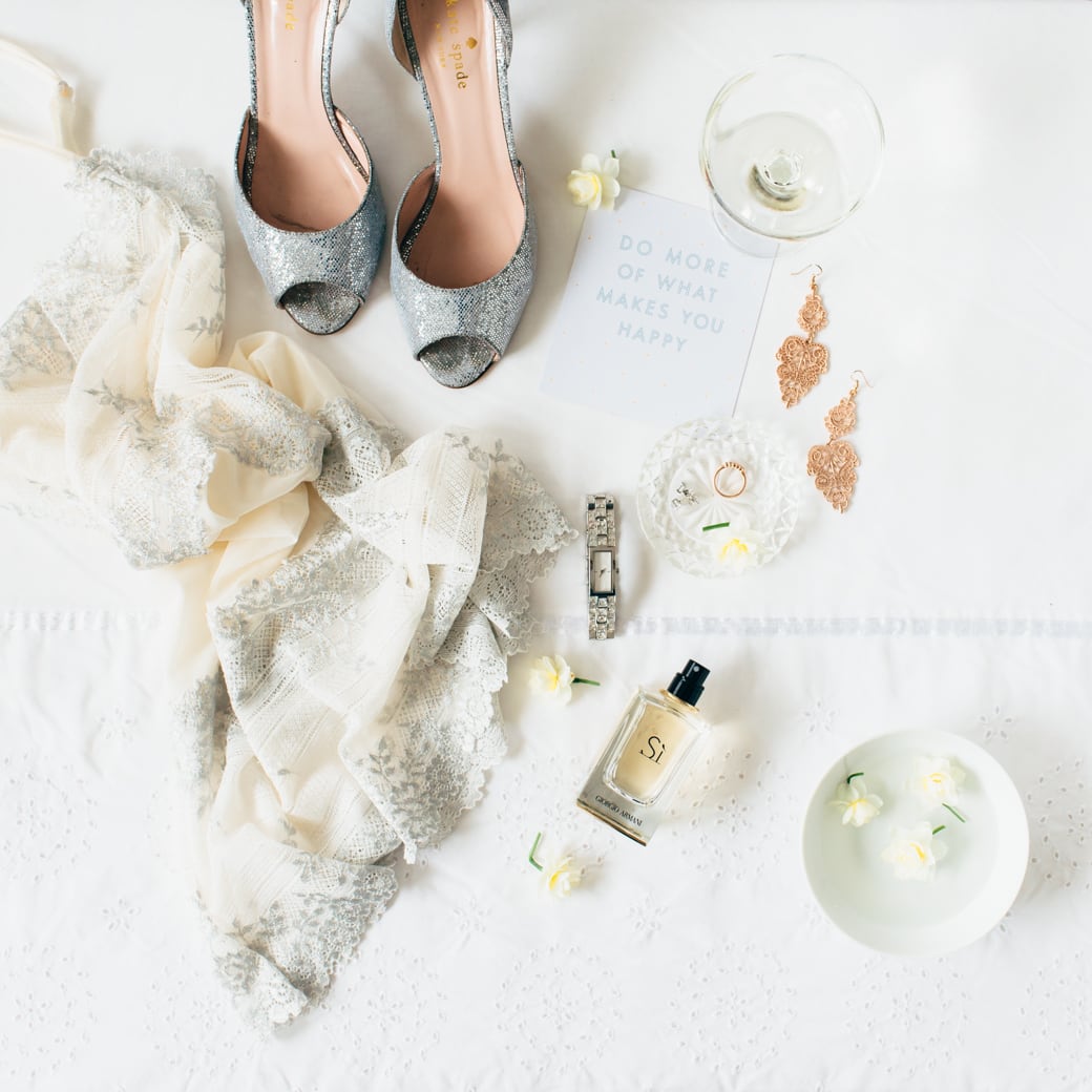

Examples of consistent images despite different subjects and colors.
10. Increase Fill Light For Softer Shadows
In Tip #5 we talked about how using nice soft light flatters most products, and that the best way to get soft light is to place a diffuser in between the subject and the light source.
The tricky thing about light is that it can’t really be pigeon-holed so easily. Soft light can still have shadows that are dark, (dark shadows and defined shadows aren’t the same things). So if you want to reduce the depth of the shadows, make them less dark then you will want to use what we call ‘fill light’.
Fill light is light was is used to ‘fill’ in the shadows. Put simply, we want to use a reflector to bounce light back onto our subjects and fill those shadows.
A reflector can be anything that will reflect light back onto your subject. It is best to stick with white or silver reflectors as anything colored will also reflect color back onto your subject. And we don’t want that!
You can easily find things around your home to act as reflectors, white foam boards are the most popular and only cost a few dollars. Car windshield reflectors work as well, paper, tin foil, large white walls, even bed sheets! It’s a DIY dream.
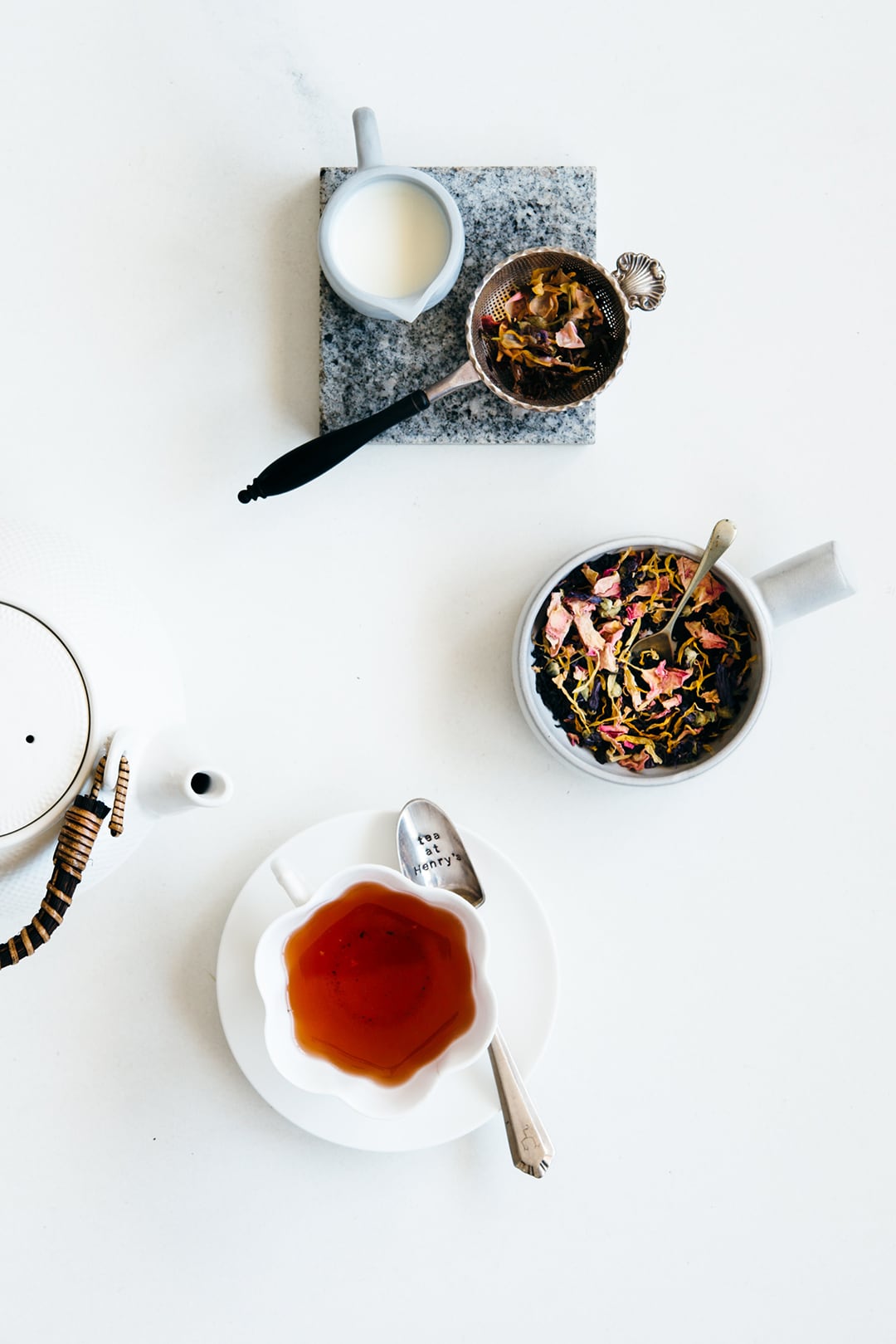
Increased fill for soft shadows. Product shot for Tea at Henry’s: https://www.teaathenrys.com/
I know as a business owner that there is a lot to do! We actually do work miracles sometimes. So if you feel like 10 tips are too much to digest right now, then focus on light first; so Tips #5 and #10. If you have light under your belt, then focus on composition Tip #2.
Your customers are just a couple of clicks away from seeing your Etsy store transform into a brand they know and love. So which tips are you excited to get started with and take better photos for your Etsy shop? Please tell me in the comments below!
About the Author

Rachel Korinek is an Aussie food photographer who currently resides in North America. She loves capturing visual stories and adores bright, clean and uplifting imagery that emphasizes the beauty of real food. Focusing on the honest details and intricacies that connect us emotionally to food. Her work has been featured in publications all over the world and she currently shares her knowledge through her signature online masterclasses.
Visit Rachel’s website: TwoLovesStudio.com
Rachel’s courses: Composition Essentials | Lightroom Magic
Follow Rachel: Instagram | Pinterest | Twitter
Special offer:
If you want to learn more about taking great photos, check out Rachel’s Lightroom Magic course. As an added bonus, if you sign up through my affiliate link, you’ll also be given complimentary access to the Lightroom Magic Bonuses valued at $223. Find out more about Lightroom Magic here. Thanks Rachel!
You may also like: How to Start an Etsy Shop: A Beginner’s Guide to Selling on Etsy










I’ve never used the compass app in the ten years I’ve had an iPhone. Now I have a reason to! What a good tip for shooting photos! In the past I’ve always had to correct any wonkiness in the editing stage. Thanks for this little trick!
You’re super welcome Cristin! I use it all the time. It’s such a great little hack.