
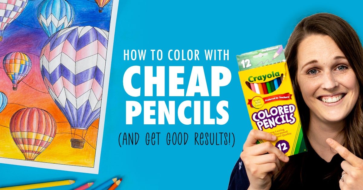
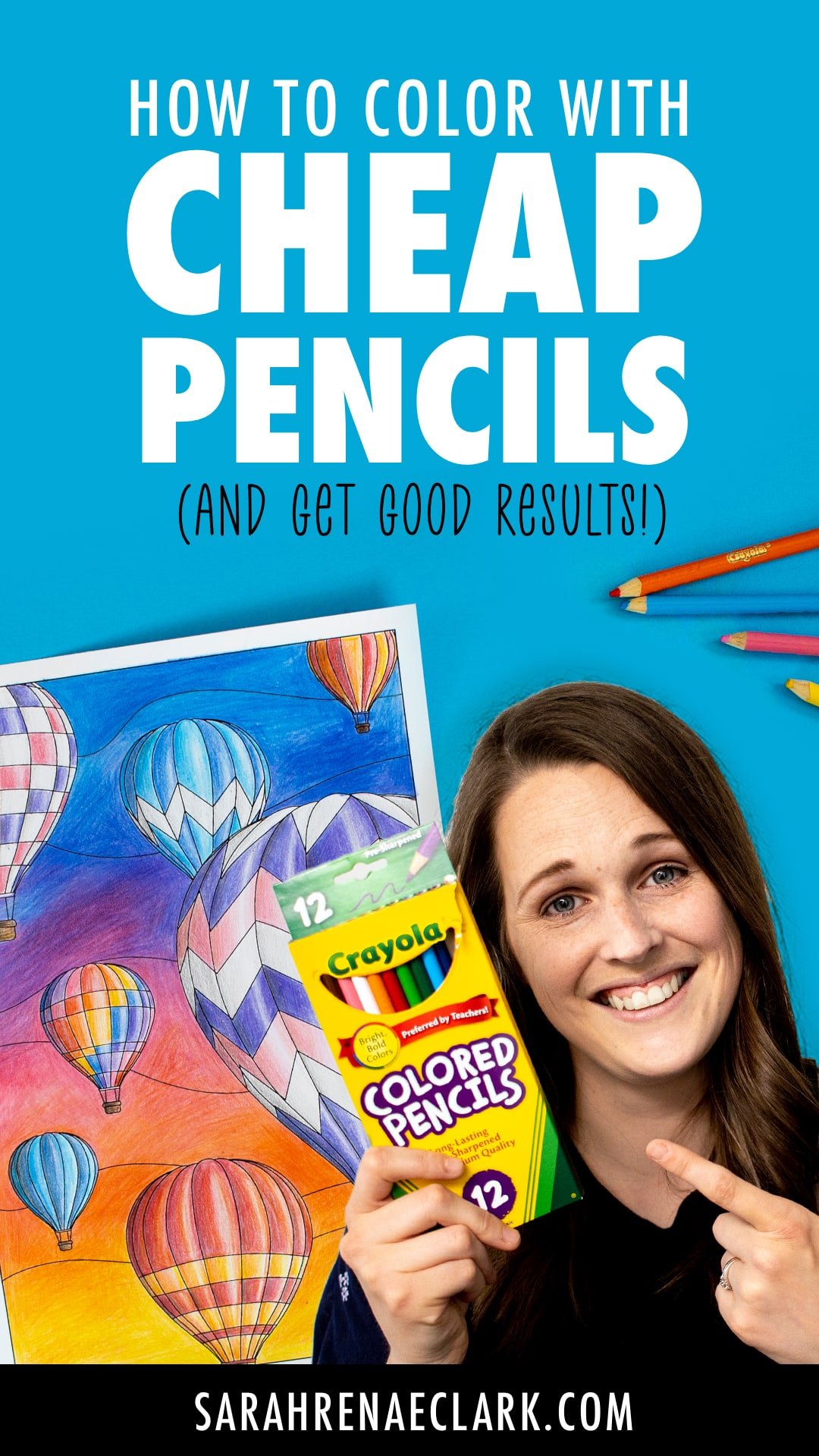
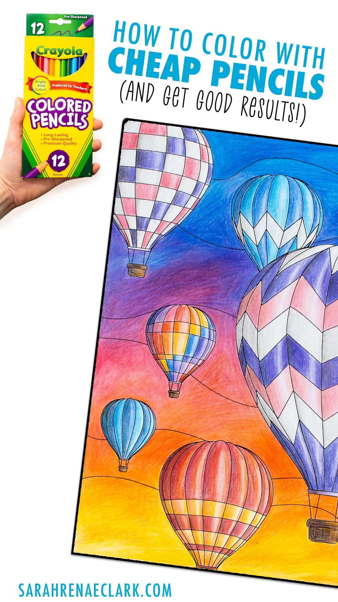
One of the biggest questions I get asked is “What are the best affordable colored pencils for adult coloring books?”
Personally, I invested early in a set of Prismacolor Premier Soft-Core Colored Pencils, but I know these are out of the budget for many beginners. So I’m on the hunt for the most affordable, most expensive and best quality colored pencils on the market. I’ve started buying small sets from the most popular brands, including Staedtler, Prismacolor, Derwent, Caran D’Ache, Faber-Castell, Arteza, Crayola and more… and I’ll be doing a full side-by-side comparison soon.
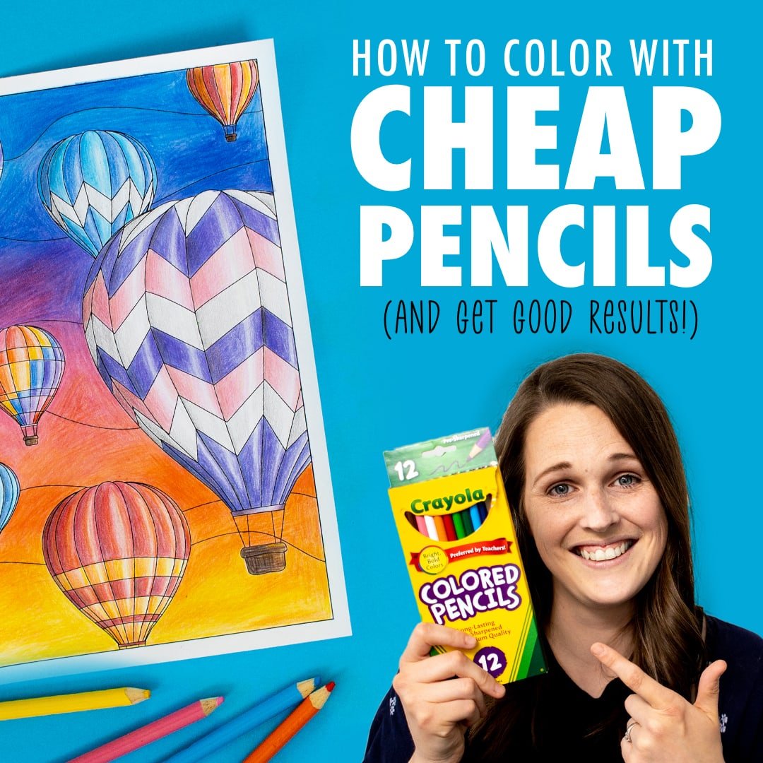
But for now, I wanted to see just how well my simple set of CRAYOLA colored pencils performed against some of these more expensive artist-grade pencils. After all – Crayola colored pencils are easily the most affordable – and are readily available everywhere.
Crayola makes art products primarily for kids, so I wanted to see if their pencils could perform like the better quality pencils with some of the beginner adult coloring techniques that anyone can learn.
So I’ve bought a small set of 12 Crayola pencils, and I’m taking on the Cheap Art Supplies Challenge in the below video!
This challenge is two-fold:
- Using cheap Crayola colored pencils instead of the artist-grade colored pencils I usually use.
- Only using 12 colors to make all the colors I want for this coloring page.
In my last blog post, I showed you how to make 1000+ colors from 12 using my color mixing chart – and today, I’m putting it to the test with an actual coloring page.
My goal is to determine if Crayola stands up to the artist-grade pencils, and if it’s a good option for beginner adult coloring with a small budget.
Check out the video below, then scroll down to see my top tips for coloring with cheap colored pencils!
I compared the Crayola Pencils to Caran d’Ache Luminance again recently and you can check that blog out HERE.
Note: This post contains Amazon affiliate links and I may earn a commission if you click them and make a purchase (at no cost to you).
Taking on the Crayola Cheap Colored Pencil Challenge
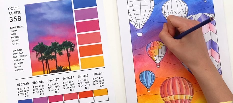
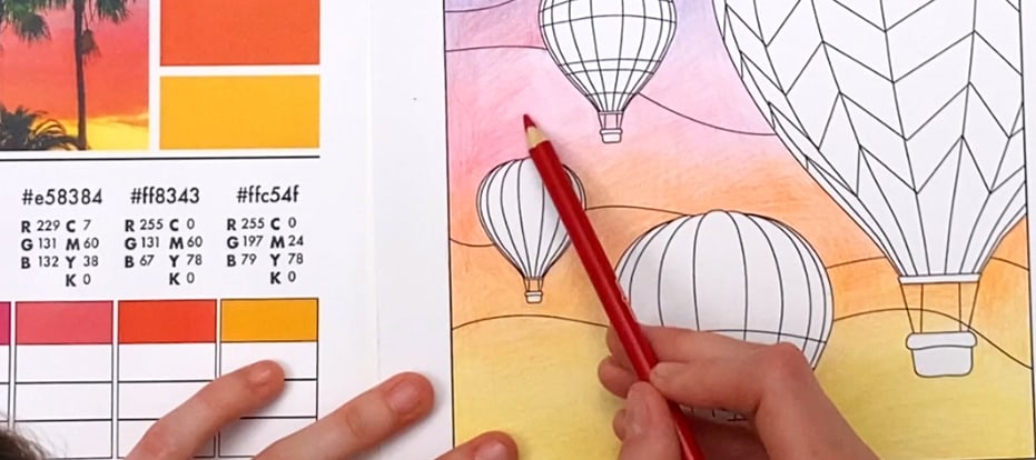
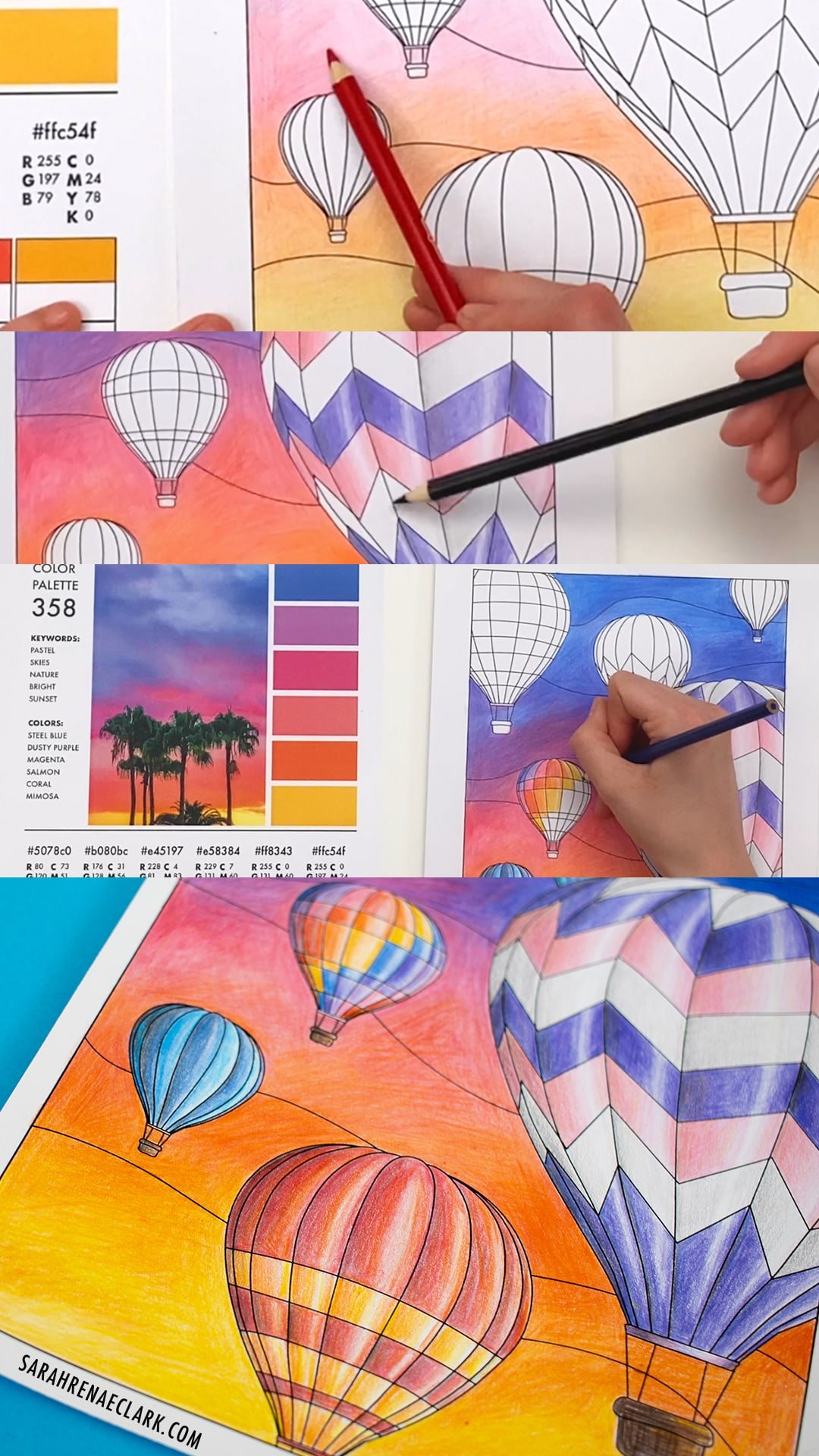
I started by choosing a color palette from The Color Catalog. I always love to choose my colors first, and using a color palette helps me to think outside the box and find colors that work well together that I wouldn’t normally think to try. And because I was only working with 12 colors, I had to layer them using the mixing techniques from to my previous post to replicate the colors that I wanted. You can download the swatch chart here to try it for yourself.
Other supplies I used (optional):
- The Color Catalog
- Hot Air Balloon Coloring Page
- Crayola Colored Pencils
- Tombow Mono Zero Eraser
- Quill 200 GSM Premium Paper
- Nail Polish Remover (for blending)

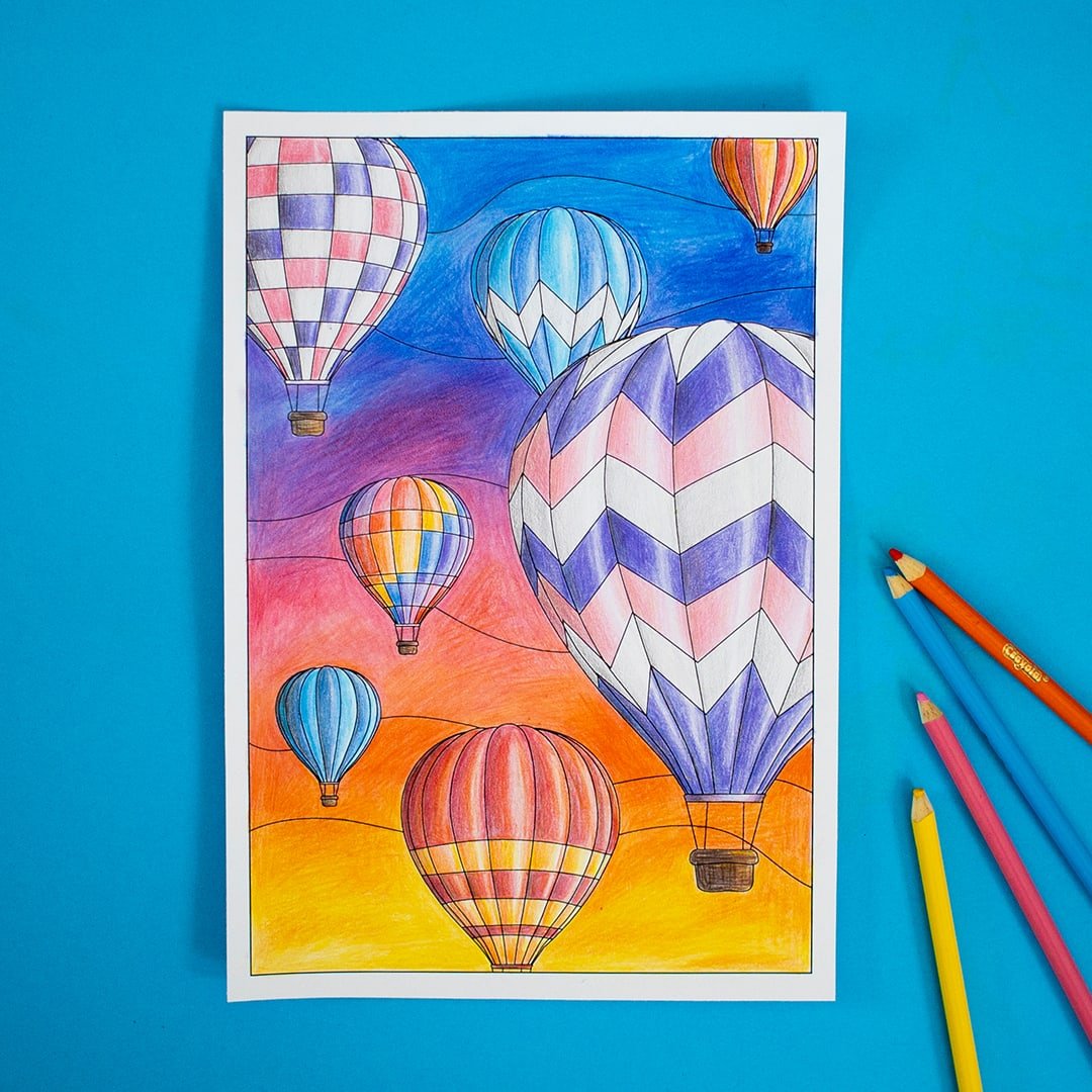
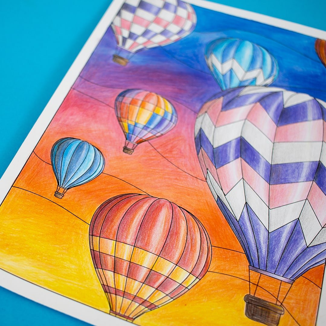
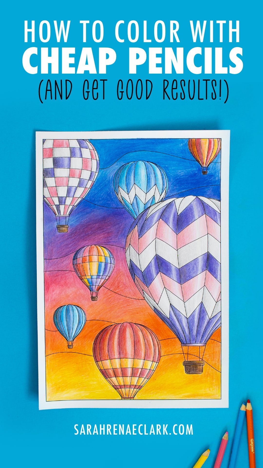
As you’ll see from my end result, you can still produce great results with cheap pencils. My picture definitely took longer than expected, and probably twice as long as it would have taken with better quality pencils, but I’m really happy with how it turned out.
Despite all my layering, you can still see the pencil lines on my background, and I think that’s less about the pencils and more about the silly paper mixup you’ll learn about from the video above – I’ll make some paper recommendations below!
There’s a big difference between cheap pencils like Crayola and artist-grade pencils like Derwent, Prismacolor or Faber-Castell – but that doesn’t mean you can’t still use them to create beautiful art. This challenge helped me to make the most of my small set of Crayolas, and it stretched my color-mixing skills because I couldn’t just grab the color I wanted – I had to mix them from the 12 colors in my set. It was definitely a fun challenge and worth a try for yourself!
Tips for getting the most out of your colored pencils, even if they are cheap
Tip 1: Use light pressure
My number one tip to get the most out of cheaper pencils, is to use light pressure and work in layers.
This is important even with high-quality pencils, because it gives you more control over your gradients and reduces the visible lines. But with cheaper pencils, it becomes even more important, because the pencils won’t be as forgiving if you are heavy-handed.
If you’re finding your layers are still too hard and you’re struggling to press lightly, try moving your hand further toward the back of the pencil. Holding your pencil further back and on an angle, like you can see I’m doing, will make it much easier to use light pressure and keep your coloring smooth.
Tip 2: Work in layers
As I move between colors, I’m overlapping the layers and trying to make the pencil the lightest at the edge of each color. Instead of starting the next color where the last one ends, I’m layering it over the top. This is how you can create a smooth transition between each color.
With higher quality artist pencils, you’ll be able to achieve these kinds of transitions and blends more easily. But it’s not impossible with cheap pencils – the key is to keep that pressure light, and work in layers.
In this case, I’ve gone a little overboard with how light I’m pressing – it means this picture took far longer than I intended – but I wanted to make sure that I didn’t press too hard and ruin my gradient. Every time I added a bit more pressure, I found that my pencil lines were more visible, and that’s not what I’m going for. I really want to replicate the smooth finish that I love when I’m using my Prismacolor pencils. And let’s not forget – these 12 colors aren’t exactly the colors I want from the color palette, so layering is also allowing me to adjust each color to be closer to the colors I want.
Tip 3: Keep your pencils sharp
Sharp pencils are easier to work with. You have more control over the pressure and you can get into tighter areas for small details. Especially with cheaper pencils, you want to have as much control as possible, so a sharp pencil is essential!
Tip 4: Choose the right paper
If you’re going to buy cheap pencils, don’t expect great results with cheap paper too. As I discovered in my challenge, the different paper made a much bigger impact when I wasn’t using quality pencils. With my Prismacolor pencils, I often just use printer paper – so it’s not essential to buy specialty paper- but just like the pencils, it makes the coloring process easier, more enjoyable, and produces better results.
After this challenge, I’ve decided that I’m going to stop using cheap paper, and start using my better quality paper more often. It gives me much more control with what I’m doing, allows for greater detail, and allows for smoother blending.
When it comes to adult coloring pages, it’s important to find a paper that you can print on, because not all printers can print on thicker paper or some of the specialty drawing papers. Generally, I recommend finding a paper that’s thicker than printer paper, with a matte/textured surface. Avoid anything glossy, or you won’t be able to layer your pencils. I’m going to be testing some different papers in the near future to offer some more detailed recommendations!
Canson and Strathmore are both popular brands that offer Bristol paper, suitable for colored pencils. I haven’t tried these for myself (yet!) but they come highly recommended by many colored pencil artists. Personally, I’ve been using Quill 200GSM cardstock, which is available in Australia at Officeworks. It’s not specifically designed for colored pencil, but it has a nice ‘tooth’ that allows me to add multiple layers of pencil on top of each other for smooth gradients between colors.
Update: I’ve now tried these brands and more, and no longer recommend the Quill cardstock for colored pencils. Here are my other suggestions, including a few affordable options that work well in printers!
Tip 5: Try adding shadows and highlights
Adding shadows and highlights is a great way to quickly make any page look more interesting.
Even if you’re not familiar with how light sources work, that’s ok! Just be consistent and add the shadows or highlights on the same side of whatever you are coloring, and it will still look good.
In my picture, I used a black pencil very lightly to shade the white sections of my balloon. But for my colored sections, I chose to use other colors for my shadows to make them less intense. If you remember back to my previous post, we can we can mix complementary colors to create blacks and greys, like red and green, or blue and brown. So I used my green pencil to darken some of my red and orange areas, to make them more grey without being too heavy.
I’m also using the orange to darken the yellow, because that feels more natural than a straight black.
For the highlights, you can either leave the areas blank when coloring, or come back over the pencil with an eraser. I recommend a Tombow eraser – it seems to work great with the colored pencils! If you’re interested in grabbing on, you can find it here.
Tip 6: Use stronger pressure at the end to burnish
Paper has a texture, otherwise known as “tooth” that allows you to put down multiple layers of your pencil. That’s why light pencil work often shows the texture of the white paper underneath – because light pressure stops your pencils going into the deep valleys of the tooth.
When you press harder with your pencil on the paper, you flatten this texture and get the color pigment into ALL the lowest parts of the paper. It creates a bolder color, removes the white, but also makes it much harder to add more pencil layers on top, and therefore impossible to create nice gradients and blends.
This is what we call “burnishing” – it’s often the final step in a drawing, where you press harder to remove any further white and make the colors bolder. We do it last so that you can do all your blending and gradients in the layers underneath.
This final layer of color is definitely helping the colors to finally pop – and I’m really happy with how close they are to the colors in the palette I was going for.
Tip 7: Try different blending methods to get brighter colors
Burnishing is usually my go-to method for blending my colors, but it’s not the only way to get bold, vibrant, smooth blends from colored pencils. There are many suggestions online on how to use oils, mineral spirits or blending solution to get better results from your colored pencils.
Since this was a bit of a challenge already, I decided to try a new method – nail polish remover! This has the benefit of smoothing out the pencil slightly (but not too much) so it fills to the tooth of the paper, but still keeps the texture so I can add more layers of color on top, unlike some other blending methods.
I recommend trying your blending on a test piece of paper first, just in case it totally ruins your artwork – that would be devastating on your actual drawing!
Are Crayola colored pencils as good as Prismacolor Premier colored pencils?
These Crayola colored pencils were better than I expected. But even so, I don’t think they compare to the artist-grade pencils like Prismacolor – and they shouldn’t, because they are SO much cheaper.
They are a very good pencil for the price. I’ve tried even cheaper pencils in the past, and they were a total waste of money. At least the Crayolas are still nice to use and have great colors.
There are much bigger sets available than the 12 set I purchased for this challenge, and I think they are a great starting point for beginner colorists- especially kids! In fact, I ONLY buy Crayola pencils for my kids now – I don’t waste my time on other cheap pencils anymore.
So don’t be embarrased if all you can afford is Crayola right now. But when you are ready to get a bit more serious about coloring, I definitely recommend investing in a set of student-grade or artist-grade colored pencils like some of these ones. Using better quality pencils is frankly, more enjoyable. The results are better, and it’s actually EASIER to create amazing artwork and beautiful color gradients.

What are the best colored pencils for adult coloring?
My current go-to pencils for adult coloring books are Prismacolor Premier Soft-Core Colored Pencils and Faber-Castell Polychromos Pencils.
I’ll be trying some of the other top recommended affordable pencils in the coming months, so if you’d like to see how they compare and find the best pencils for your budget, please subscribe to my email newsletter and I’ll let you know when I post my comparison! Update: Read it now!
And if there’s a particular brand you’d like me to try, please tell me in the comments! I’m on the hunt for the best, the most expensive, but also the most affordable and the best beginner sets… because there are a LOT of pencil brands out there and I want to take the guesswork out of it for you so you can confidently buy a really good set of pencils for your coloring pages without breaking your budget.
In the meantime, you can check out the brands I’ve got my eye on in this list on Amazon.
Other Resources Mentioned in This Tutorial
The coloring page from this tutorial is from my 2021 Coloring Planner, but I’ve also made it available as a separate download for just $1 so you can color along with this tutorial or try your own different sky gradients!
If you want to try mixing your own colors, I’ve created this free mixing chart where you can turn 12 colors into 144. Check out the blog post (video included!) to see my further tips on how to make even more colors.
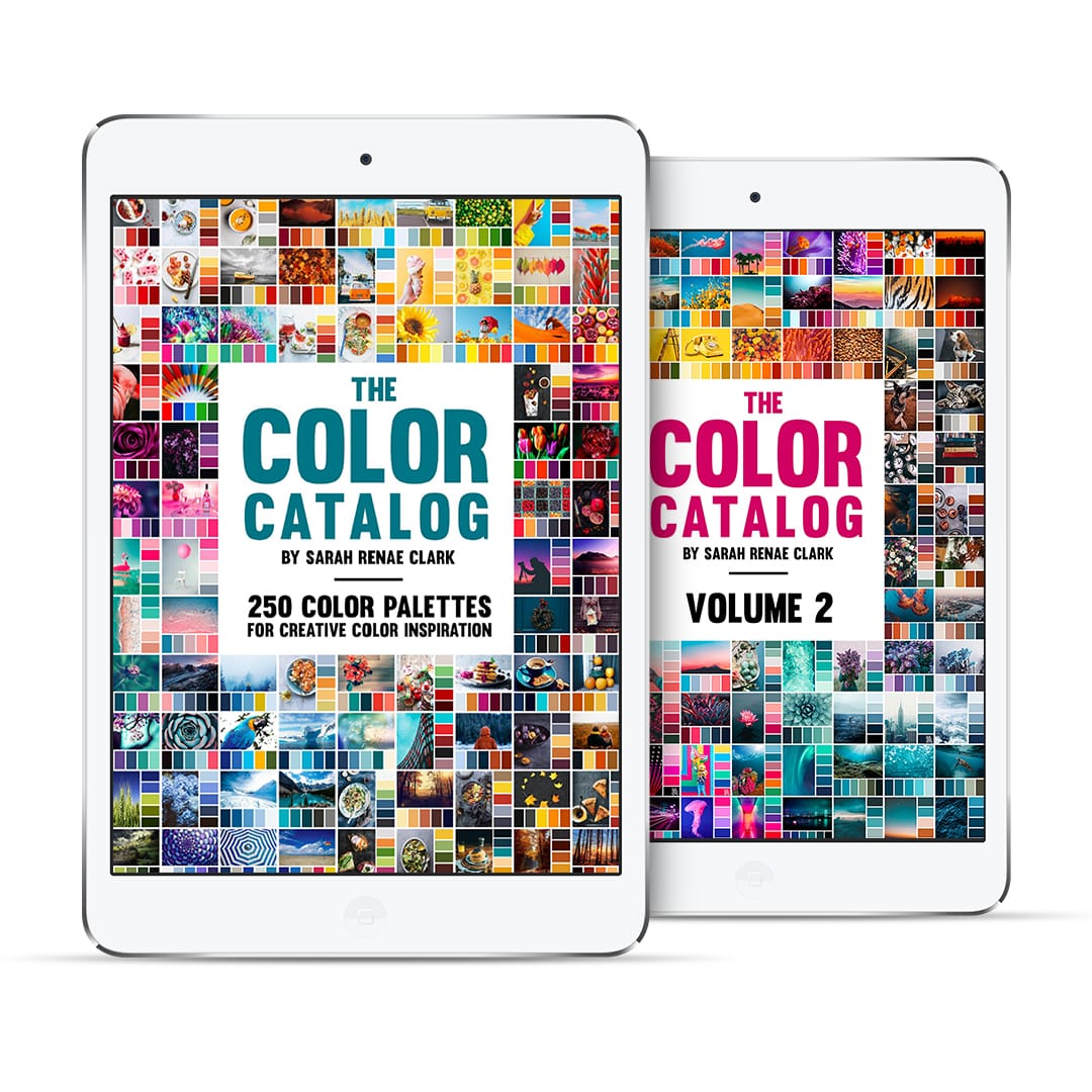
The Color Catalog has quickly become the most downloaded product on my website – and for good reason. It is such a helpful tool, and artists from all kinds of niches are using it for color inspiration in their creative projects. Check it out!
I keep findingmyself very discouraged amd these emails help a tonne thanks foe your content !
I only have 12 pencil set of prismacolors and I can’t find skin tones. Help me Sarah
Hi Sarah,
I am very new to colouring + just received your Colour cubes + journal, for which I have already started colouring using new Derwent Chromaflow to do so.
Despite using light circular motion, I still have lots of white appearing : perhaps I need to be more patient + keep layering….
I am in Melbourne + wonder do you do actual physical workshops….?
Thanks heaps : love you work