
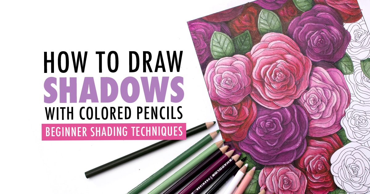
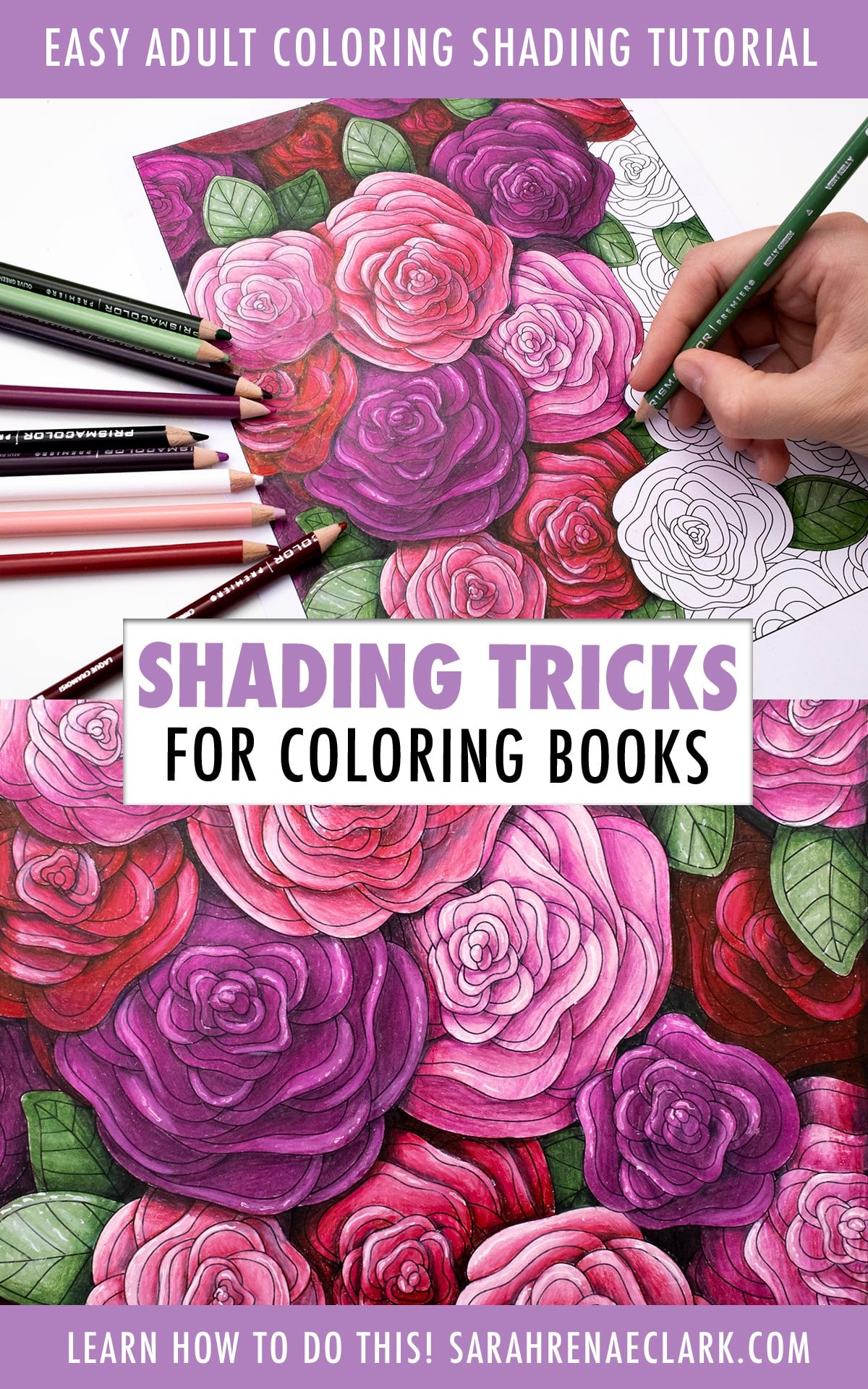
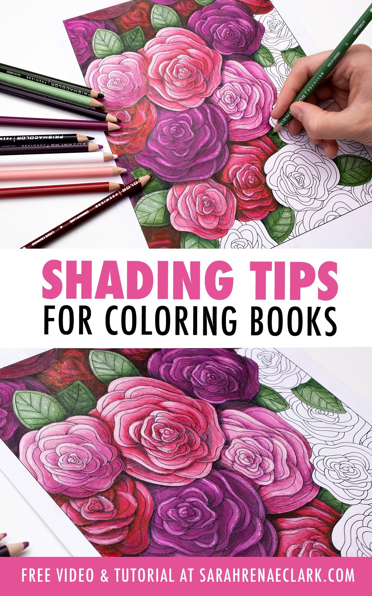
Simple shading can turn a flat drawing or coloring page into 3D art that stands out and looks amazing.
In this first video of 2, I’m going to give you a few super simple methods you can use to give any flat coloring page some depth quickly and easily with shading. If you’re just starting out with adult coloring, this video will help you take your coloring to the next level.
And then, in my next video, I’m going to go into a little more detail and teach you how to use light and shading to bring life to your pages and get even more creative. We’ll explore the basics of shadows and light sources and I’ll give you some resources to help you learn to create some really cool effects on your coloring pages with a bit of practice, even if you’re still a beginner.
Disclaimer: This post contains affiliate links for Amazon and Blick and I may earn a commission if you click them and make a purchase (at no cost to you).
Resources mentioned in this video
- Get the coloring page used in this tutorial
- The Color Catalog + Color Catalog Companion
- Color Theory Basics Workbook
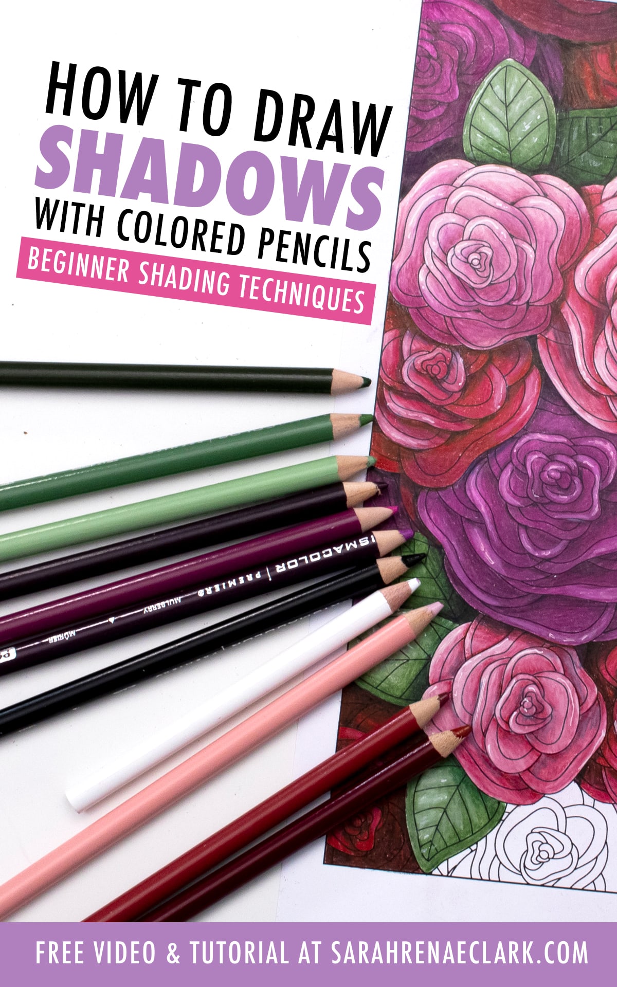
- Prismacolor Premier Soft-Core Colored Pencils (Amazon | Blick)
- White pen I used: Sakura Decorese (Amazon) – Check out my other favorite white pens here!
Adding shading to adult coloring pages
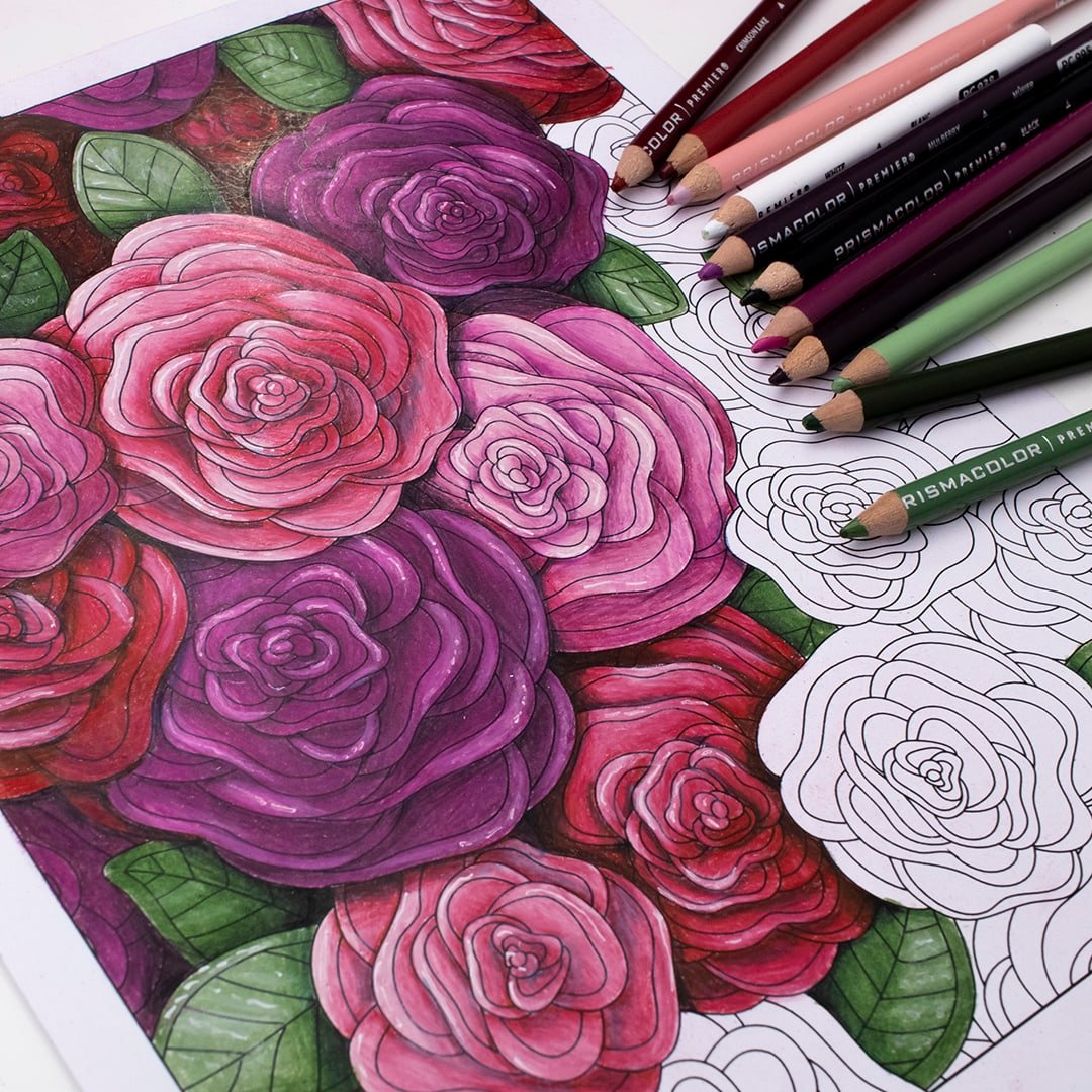
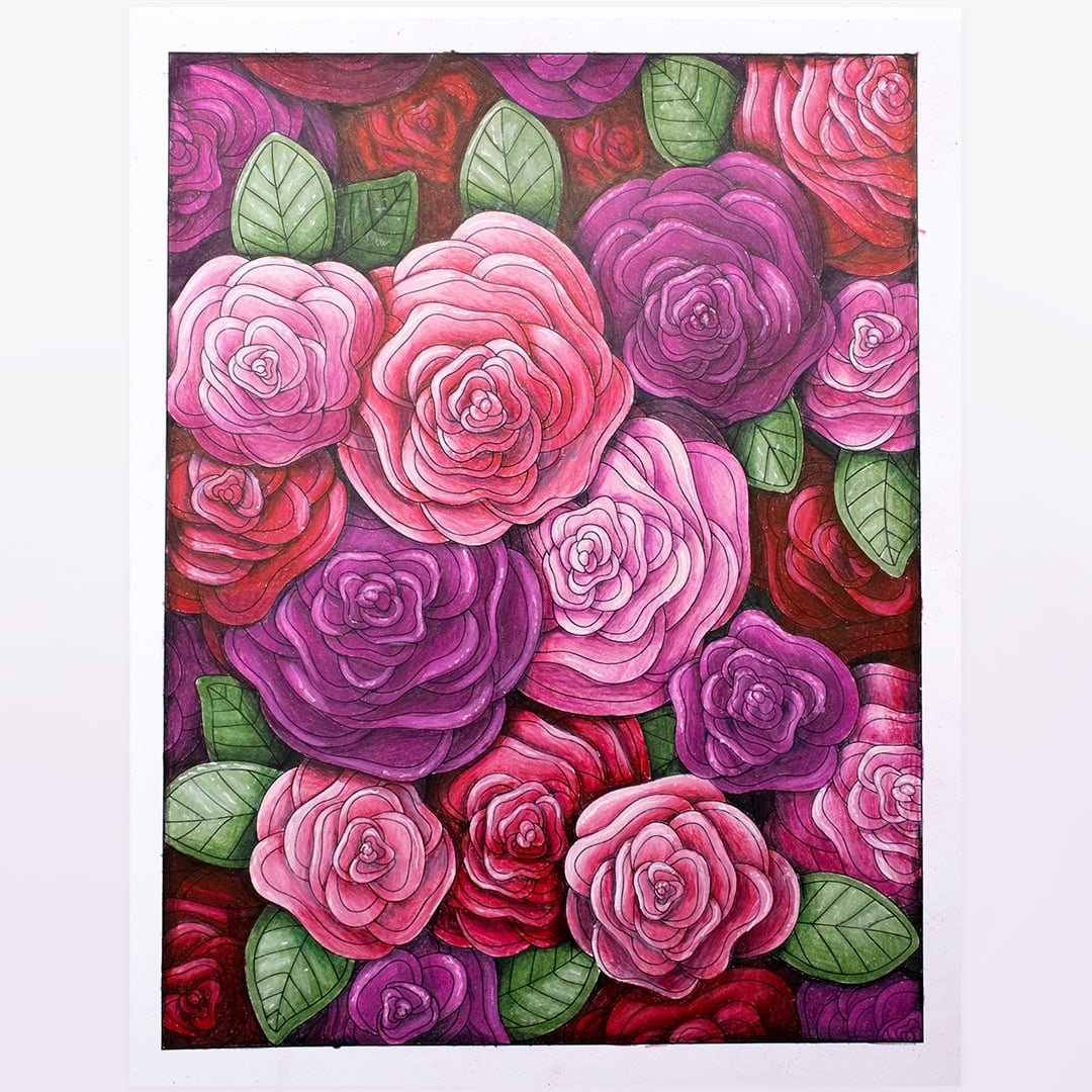
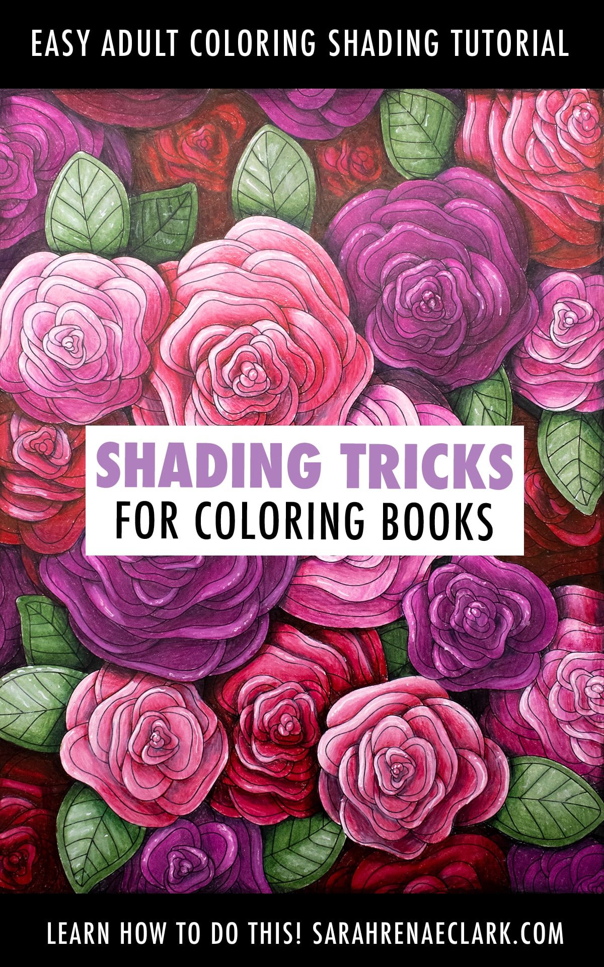
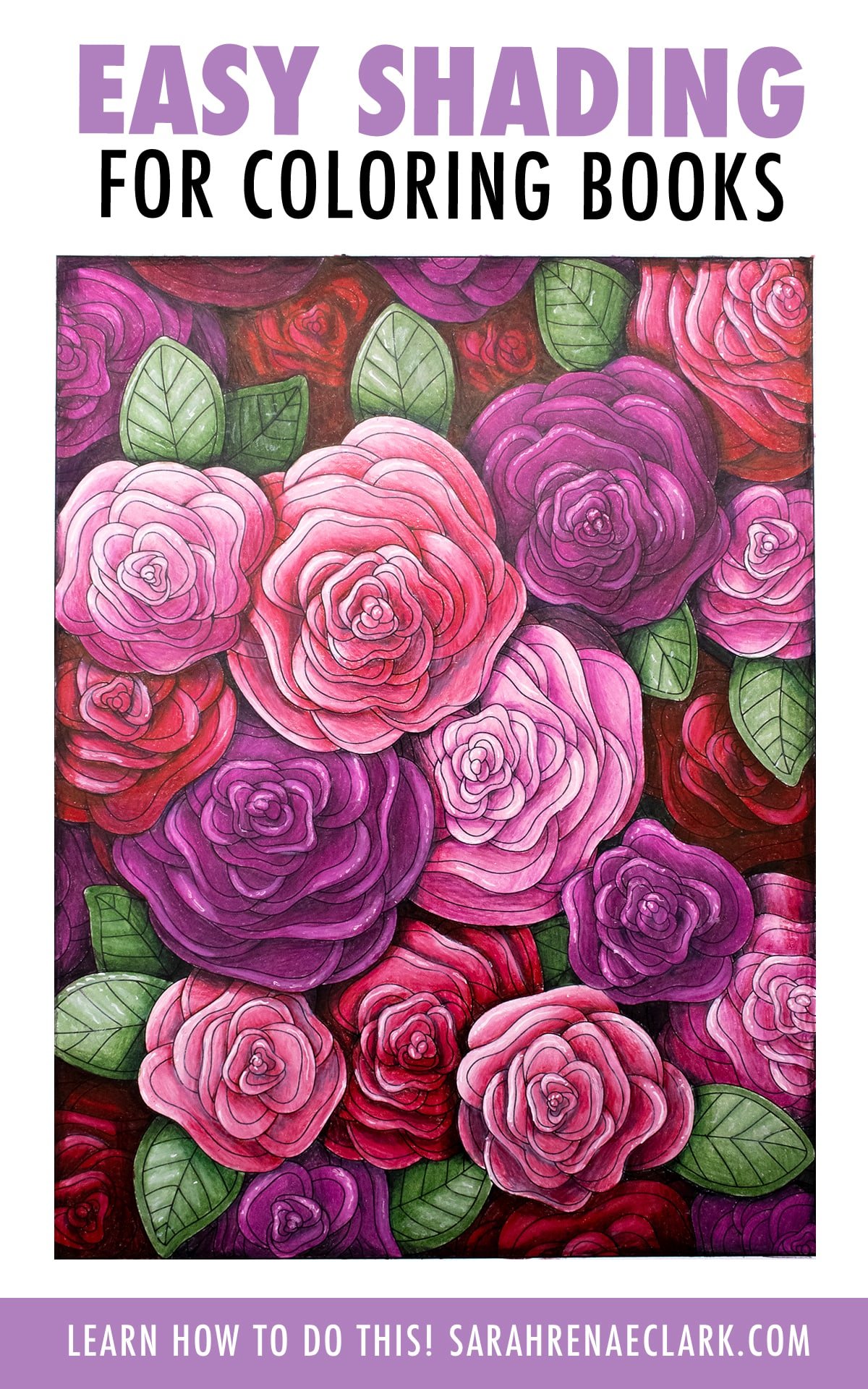
You can apply shading to ANY coloring page. It makes any coloring page instantly more interesting, and you can do it with any color, any medium, and almost any style page, like these examples below.
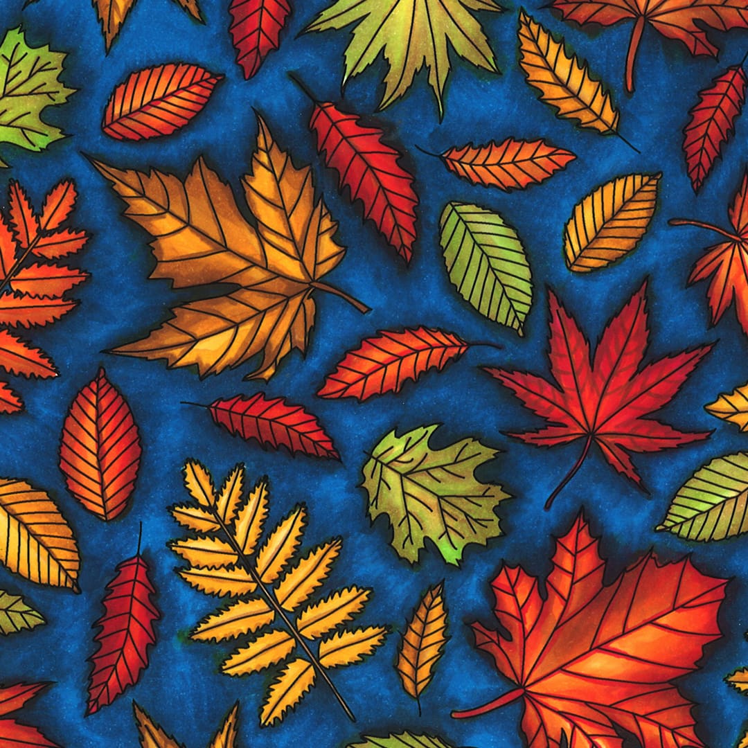
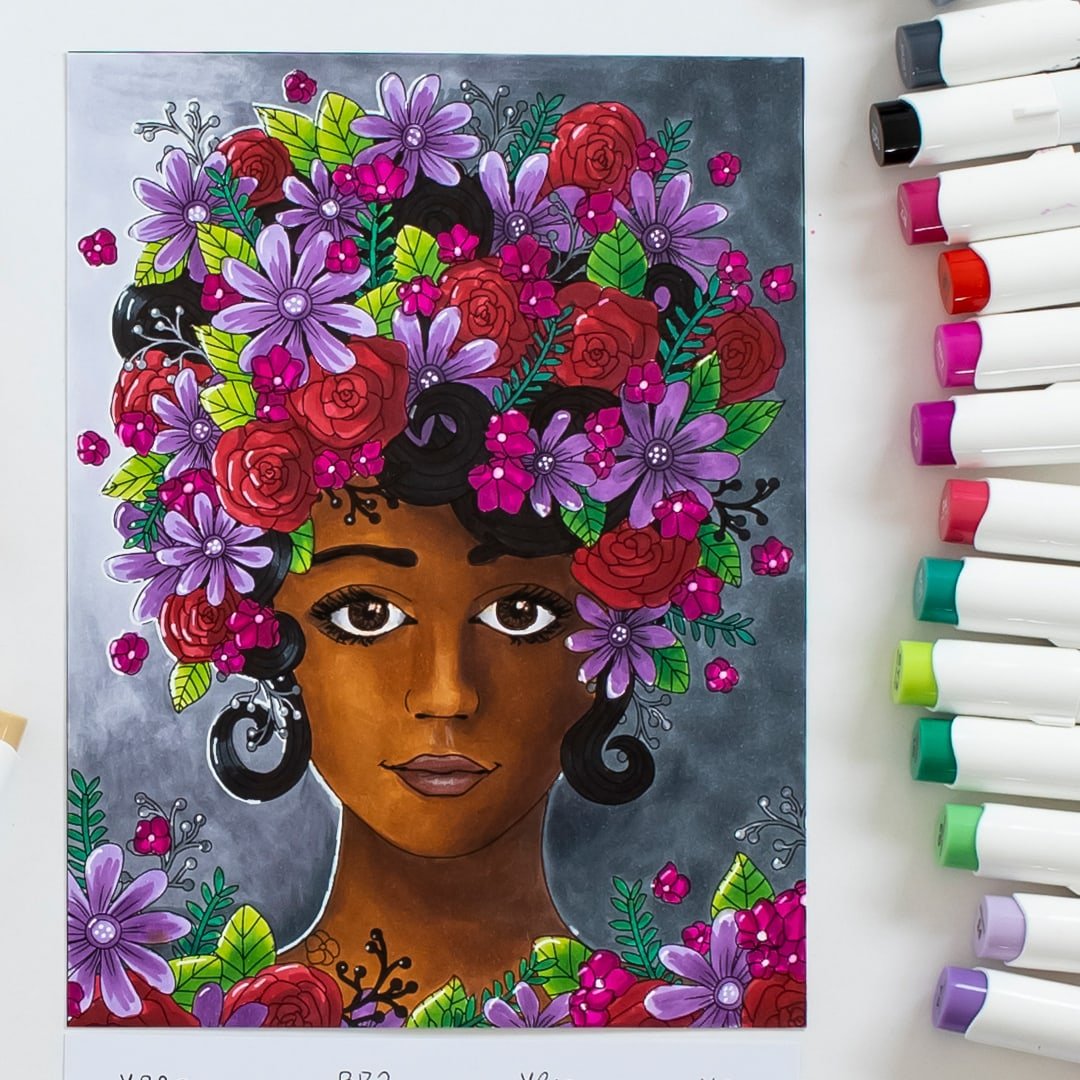
Each of these examples uses simple shading and basic shadows like what I’ll teach you today.
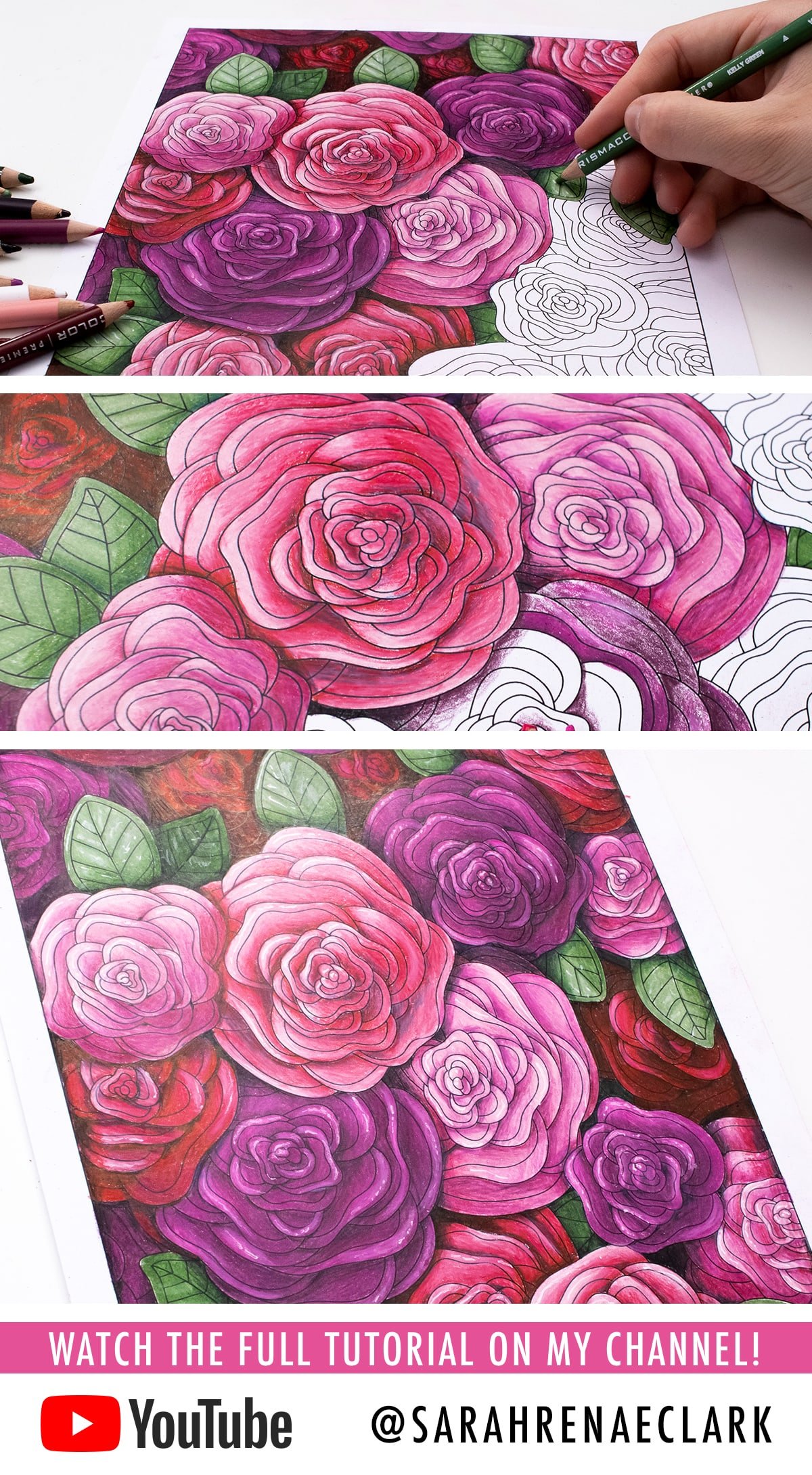
Shading with color values
Shading is done by changing the VALUE of the color. VALUE is how light or dark a color is, which is something I talked through in my short color theory basics video and workbook.

So instead of just coloring with a straight color, shading using different values of the same color in a gradient will instantly give the illusion of depth in our coloring.
Now, we can do this two ways, either by varying our pressure, or by using different colors that we blend together.
Because we are using colored pencils and not just drawing in black and white, I much prefer to use different colors and blend them together using the blending and shading techniques I showed you in my previous tutorial, where I created this rainbow gradient.
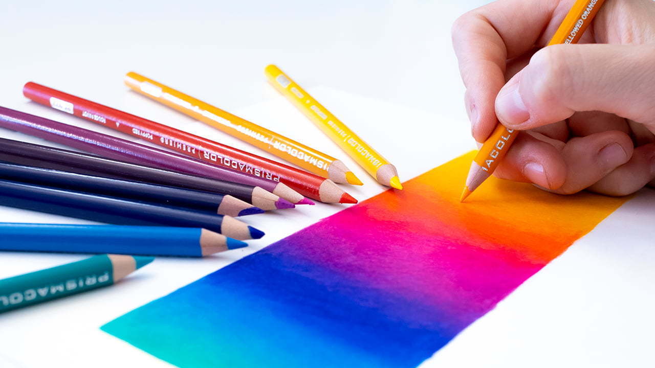
I still want to aim for colors that are roughly the same HUE but have a different value – for example, a light and dark green, or a light and dark blue. You can do this with as few as two pencils, or as many as you want for a smoother transition.
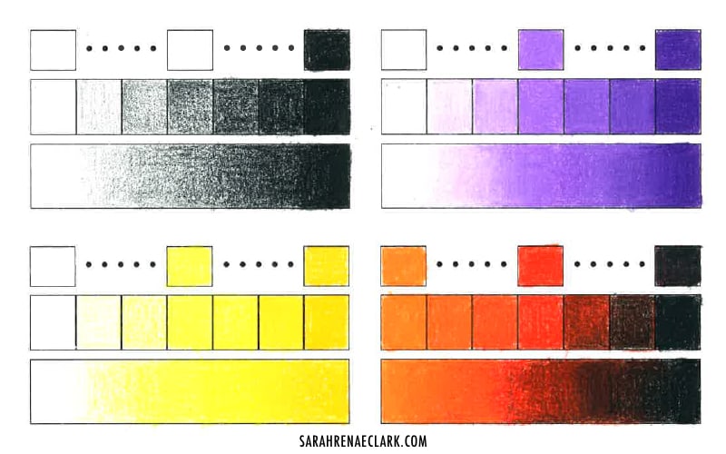
Something to keep in mind is that these values can go as light or as dark as you want – so you can go all the way to white, or all the way to black. And the more contrast you have, the more impact your shading will make. I recommend starting out with colors that are closer together for a more subtle look, but there’s nothing wrong with experimenting and trying some different effects!
I’ll be including the above page in a huge swatch and color chart collection I’ve been putting together and will make available on my website in the coming months, because practicing your blending and testing your values first is a great way to build your confidence and get better at shading before you start coloring. If you’re a subscriber, I’ll keep you updated when that becomes available!

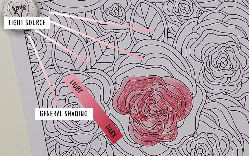
Light and shadows: how to create the illusion of depth
The goal of our shading is to create the illusion of light. Because if we can create the illusion of light in our image, our image will begin to look slightly 3-Dimensional.
Light can come from one source, like the sun, or many sources. And each source of light is going to cast shadows. It can also reflect off objects or cast different types of shadows – which we’ll cover in more depth in my next post and video.
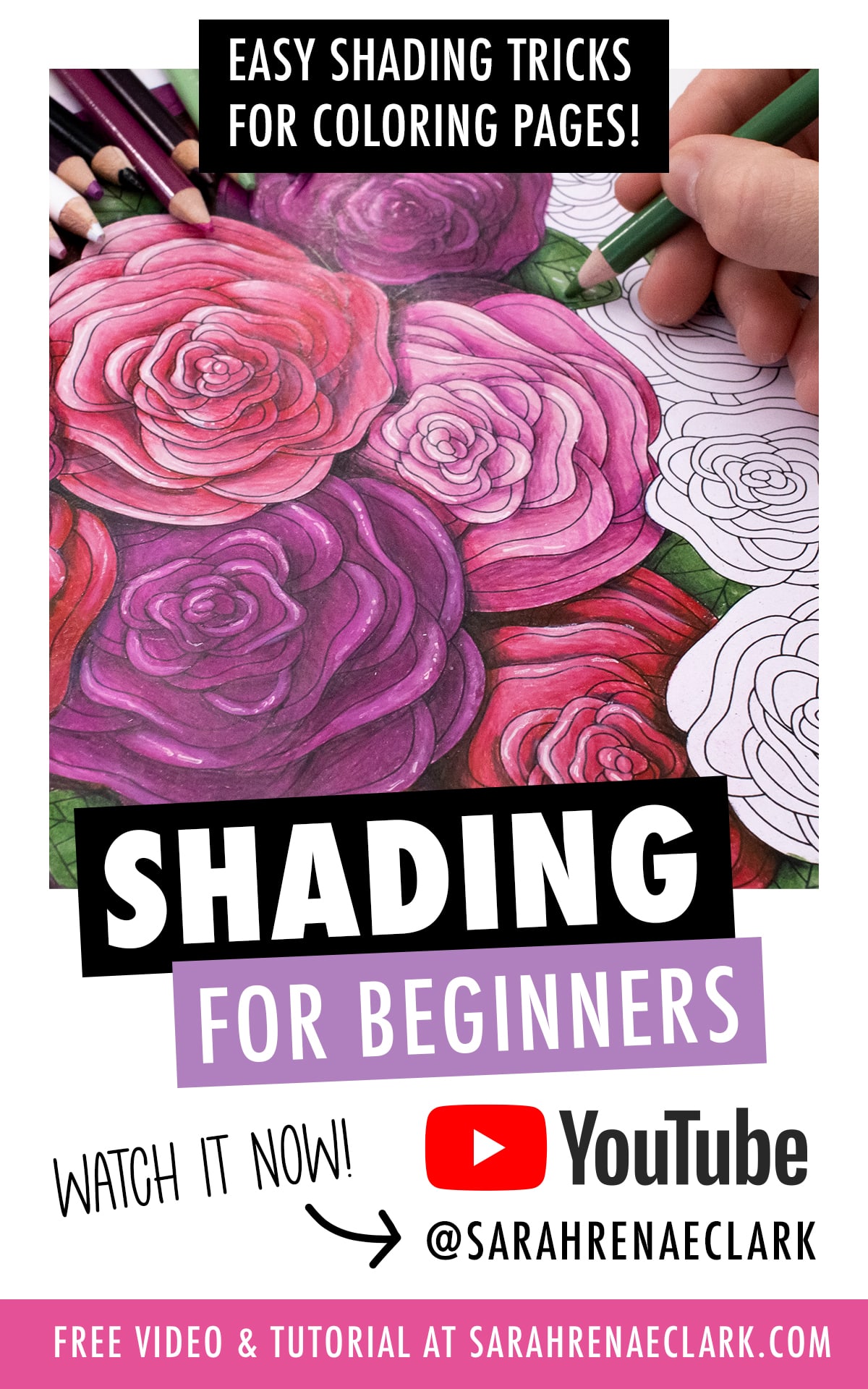
Shading techniques for adult coloring pages
Now, it’s time to apply this to our coloring pages. In this example, we are going to assume there is only ONE source of light in our image.
Now we can use this point of light to tell us which direction our gradients will go. As a basic guide, our lightest values will be closer to the light source, and our darkest values will be further away. So we can start coloring different objects and keep this in mind.
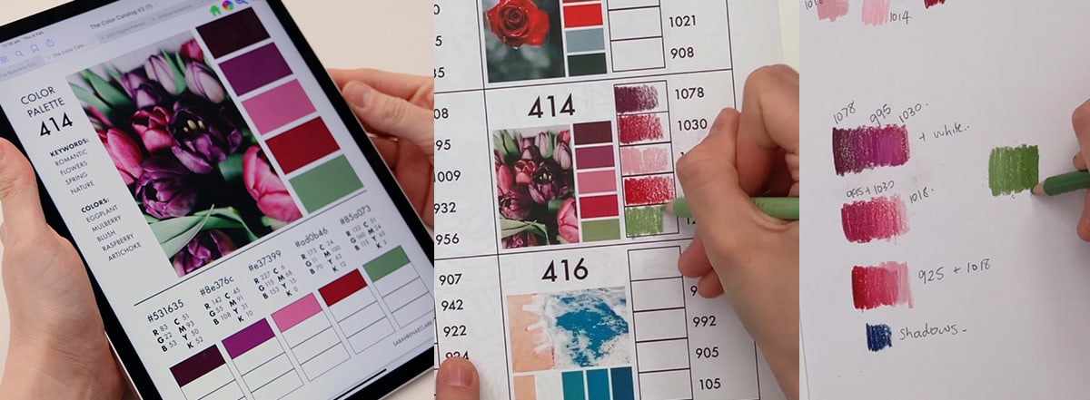
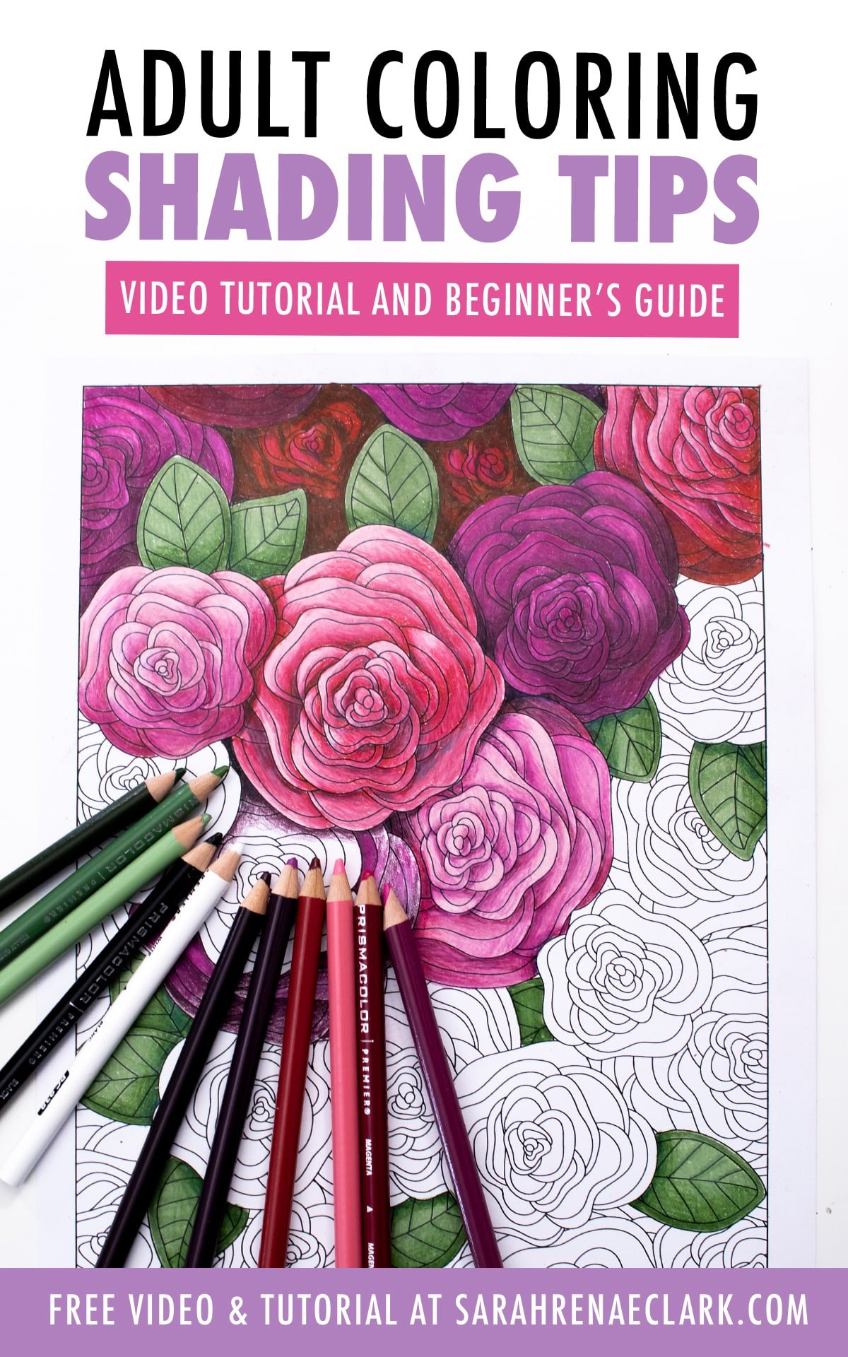
Choose colors with varying values
To work through the rest of this page, I want to start by choosing my colors, so I’ve chosen this color palette from The Color Catalog and printed out my Prismacolor Color Companion, which gives me the corresponding colors from the Prismacolor set. Then, I’ve chosen a darker version of each color, and I’ll use these, along with the process we just talked about, to work on the rest of this coloring page.
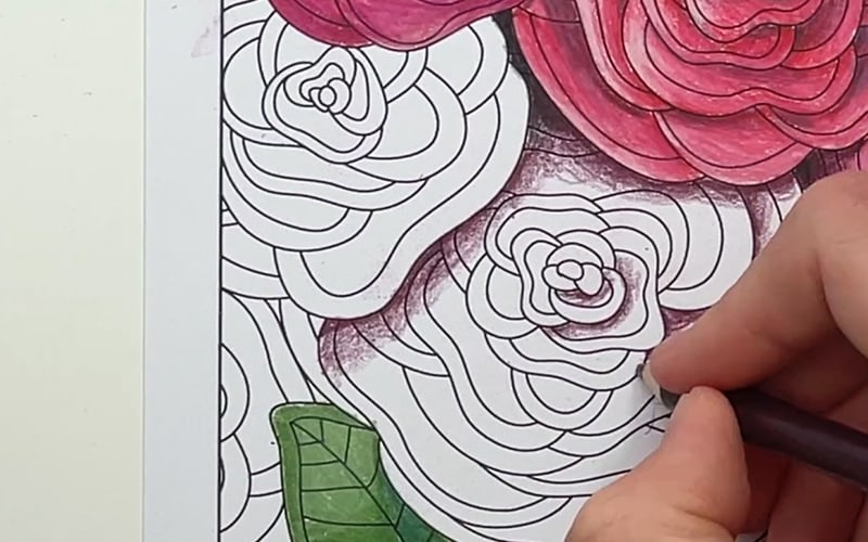
The first shading that we’ve talked about is just based on the direct light and shading from our light source.

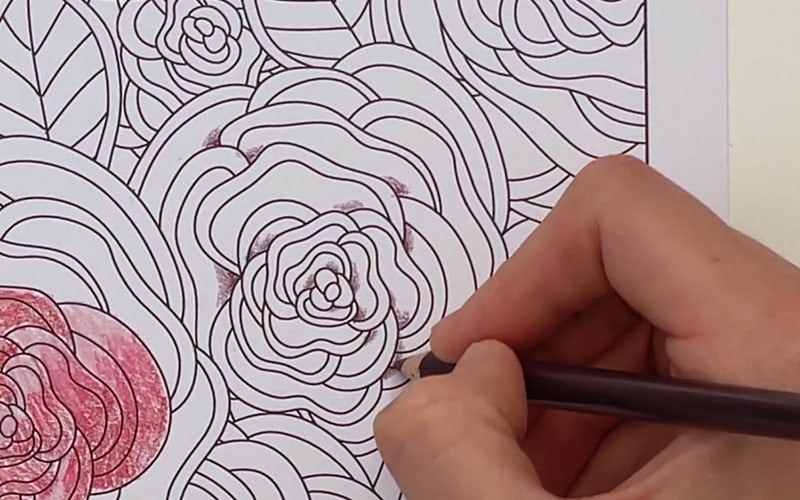
Occlusion Shadows
Some other easy shadows we can add are called occlusion shadows. These are areas of your image that light probably won’t reach, no matter where the light source is.
Some examples in our image include areas between leaves, tight corners, and areas deep underneath the flowers.
You can add these with your darker color from your gradient, and sometimes add some black as well if they are in particularly dark areas.
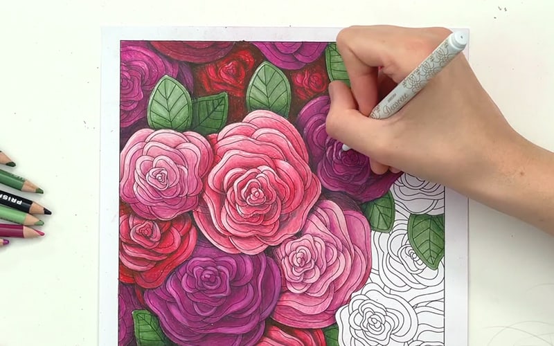
Cast Shadows
And the final type of shadows I want to add in this example are called cast shadows.
These are the shadows created from objects in front of other objects that are blocking the light from reaching the object behind them. Quite literally, they cast a shadow.
The easiest approach with this is to think about where our light source is, and think of every object in our image as if it were 3D or literally cut out of paper. Where would each shadow fall? Which objects are in front of each other? Because I’m working on a coloring page, I usually like to imagine a lamp on my desk casting a shadow on the patterns on my page.
I focus on looking at objects or patterns that overlap each other, and almost think of them like paper cut outs with a torch being shone down from above. So I create a small shadow behind each object, using either the black pencil or the darker color of the object behind them that the shadow falls onto, to create a slight 3D effect that makes them stand out from the page.
Using a light source from a different angle within the picture itself, or behind the main subjects would create a completely different look, which we’ll cover in more detail in my next post. If you’re just starting out, this is a fun, simple approach that’s fairly straight forward and looks good even if you don’t get it perfect.
Adding highlights with a white pencil or white pen
And if you want to add some extra impact, you can use a white pen or white pencil to add some extra highlights in those lightest areas that will get the most light from your light source. This is something I really love doing and I’ve included some of my top tips for white pens in my previous tutorial here.
As you can see, these simple shading tricks make a huge difference to the final coloring page. And this is just the beginning of what you can do with light and shadows.
Advanced shading techniques with colored pencils
In my next video, we’ll explore lighting and shadows even further to create dramatic effects and moody scenes. I promise to keep things as simple as possible, and give you my shortcuts to creating amazing art without needing to learn too much science behind how it all works – although if that’s something you’d enjoy doing, it would definitely help you to improve your drawing skills in the long run.
Good luck, and please let me know how you go in the comments or in my Facebook group!
Resources used in this video
![]()
Field of flowers coloring page
This is the coloring page I used in this video, and you can get it for just $1 from my website if you’d like to color along! I recommend printing on paper slightly thicker than printer paper if you want better blending with your pencils (I used Quill 220 GSM paper, nothing fancy!) and you can print as many copies as you need to practice different techniques, different color schemes and different mediums! I look forward to seeing your beautiful pages in my Facebook group!
Get the page here or check out my range of other printable coloring pages and coloring books.
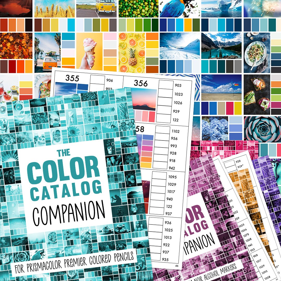
The Color Catalog + Companion
With over 7000+ downloads combined, the Color Catalogs Volumes 1 & 2 have become a go-to resource for many artists and colorists around the world. They are the perfect tool to give you the head-start and inspiration to start coloring without getting stuck at the color-selection phase, and can be a fun way to challenge yourself to try new colors you might otherwise never consider.
The Companion is the perfect new side-kick, with the answer to the question I’ve been asked over and over – “How do I find the right pencil to match each color in the Color Catalog?”
It includes the pencil and marker numbers for a number of popular brands, including Prismacolor, Derwent, Faber-Castell, Copic, Ohuhu, Tombow and more.
Find out more about the Color Catalog here or get the complete bundle (including the Companion) at a significant discount here.
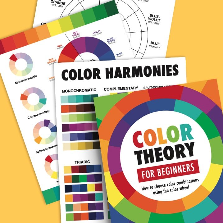
Color Theory Basics Workbook
I previously created a video and blog post teaching the basics of color theory – you can watch that all here.
But if you’re interested in taking it a step further, practicing those skills or using it in your classroom, this workbook is a great tool that you can print off and use over and over again – with all the details from the video included, plus worksheets and activity sheets.
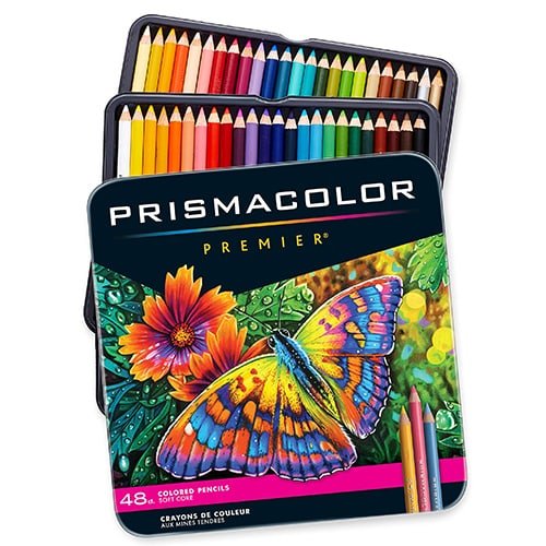
Prismacolor Premier Soft-Core Pencils
I chose to use my set of Prismacolor pencils in this tutorial because they blend well and have a wonderful range of colors. I find them to be a great colored pencil for adult coloring books and not too expensive compared to other artist-grade pencils.
If you’d like to see them in more detail, here are some videos on my YouTube channel where I have reviewed them against other pencils:
- The BEST PENCILS for adult coloring, professional art, drawing skin + more
- The BEST Prismacolor ALTERNATIVES: I put 7 affordable colored pencil sets to the test
- Testing ALL the BEST COLORED PENCILS for adult coloring: 26 Brands
You can purchase them online from Amazon or from Blick – they are also available in many other craft stores.


Leave A Comment