Gold seems so hard to draw – so today, I’m simplifying it for you.
I’m about to show you the easiest way to draw gold with colored pencils – although you can actually do this markers or other mediums too!
We’re going to start by looking at the basic colors you’ll need, and some simple pattern methods to create the shiny gold appearance – then I’ll show you a few different ways to use this in your actual art or coloring books and some bonus tips if you really want to create something realistic.
You can also apply this technique to create other shiny surfaces like silver, metal, rose gold or silk, simply by changing the colors you are using.
Check out the video below, and scroll down for all my resources to start practicing your gold drawings!
Disclaimer: This post contains affiliate links and I may earn a commission if you click them and make a purchase (at no cost to you).
Step 1: What colors make gold?
First, take out your gold and silver pencils, and put them away. You do NOT need to use gold pencils to draw gold. In fact, I don’t think these pencils should be included in any set of pencils… ever. Happy to be proven wrong.
Instead, the pencils you need to draw realistic gold are already included in your set.
To capture the appearance of gold in a photo, in a drawing, or on our computer, we don’t always have access to metallic colors or reflective features, but that doesn’t limit our ability to create realistic gold.
So let’s take a look at some photos and see what colors we really need to make gold.
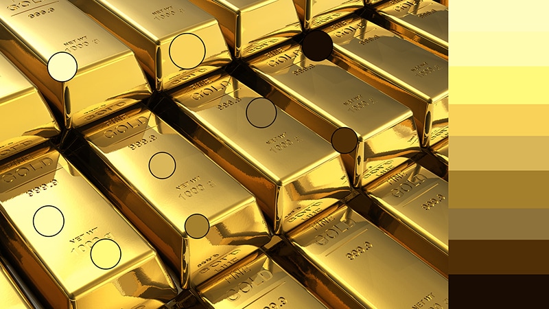
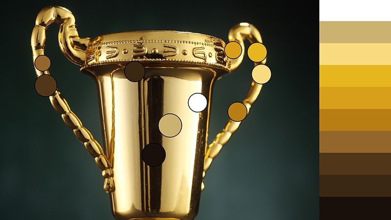
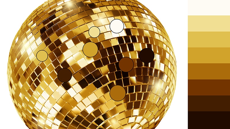
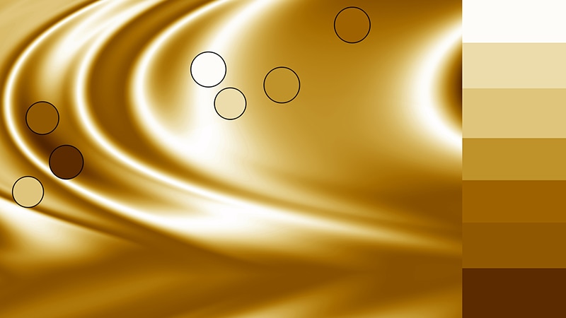
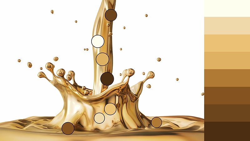
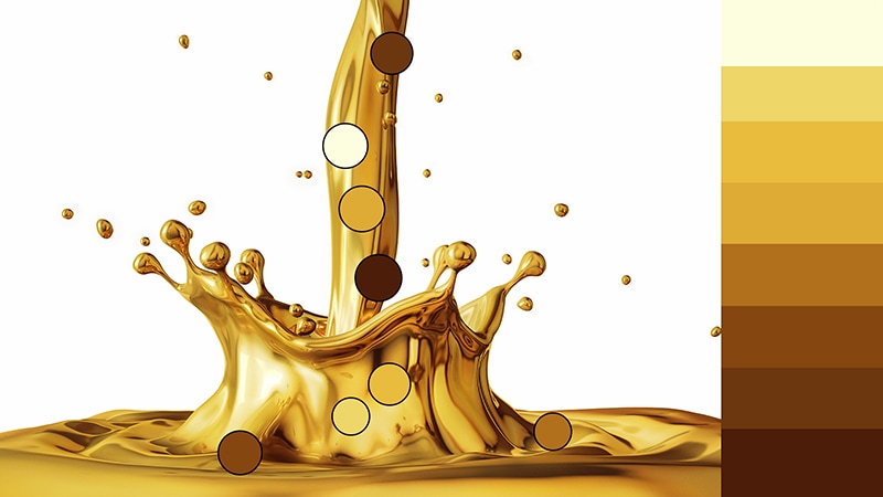
Are you seeing the pattern here?
White, yellow, brown and black are all the colors you need to make a realistic gold.

We can vary these colors and use different browns, different yellows or different quantities of each to create dull golds, bright golds, or different tones of gold with different lighting – but essentially, this is our starting point.
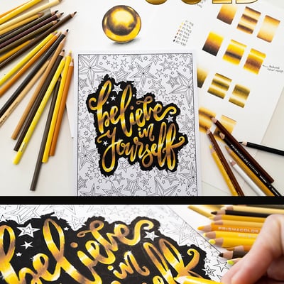
Here are a few different combinations of yellows, browns, along with black and white from my set of Prismacolor pencils, along with some practice gold gradients you can try to recreate. I also encourage you to experiment and try adding your own yellows or browns or create your own patterns.
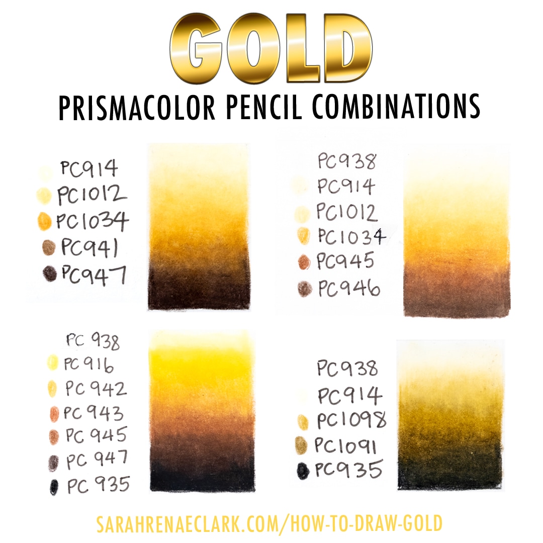
At this point, I’m just creating a smooth gradient between each of the colors. In reality, gold would have a lot more midtones – being the yellows and browns, and I’d recommend using the darkest browns and blacks sparingly until you get more practice. If you want to know more about my technique here, I’m following the same process to create this gradient that I used in my previous tutorial about blending colored pencils.
As you can see, the appearance changes a lot with a slight change of color, and while these are the right colors, they aren’t really looking like a shiny gold yet.
Recommended Tutorial: How to Blend Colored Pencils
Simply using these colors in your drawing and applying the shading techniques I’ve taught in my previous shading for beginners video will help you to create a matte gold appearance, but if you really want that shiny gold look, there are a few extra steps we can take.
Step 2: How to Draw Gold Texture (Easy Pattern Method)
One of the reasons it’s so hard to draw super realistic gold is that it’s so reflective. It reflects both light and shadows from everything around it, bringing in a lot of extra highlights and shadows.
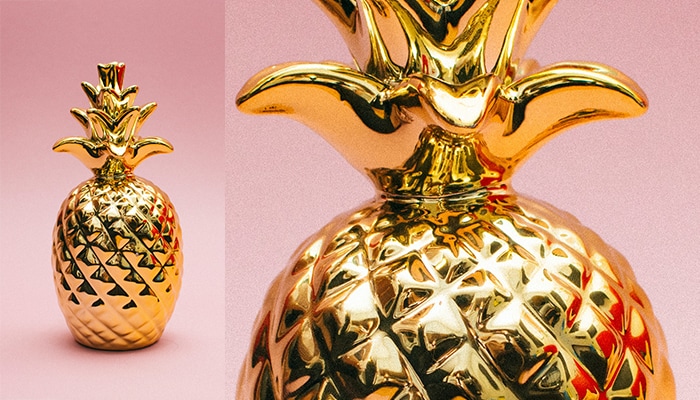
Using a reference photo is by far the most accurate and realistic approach, which I’ll talk more about shortly. But we can also use some patterns to cheat a little and create a semi-realistic shiny gold with a lot less effort.
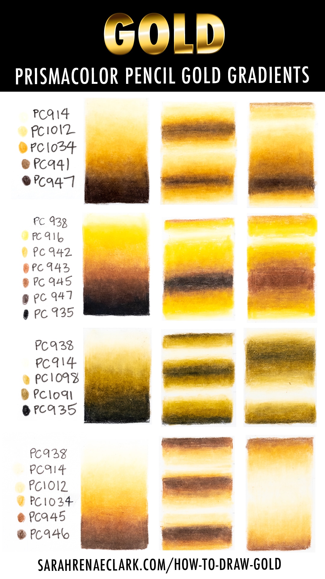
If you’ve ever done a Google search for “gold gradient” or used Photoshop on your computer to create a gold effect, these gold patterns might look familiar. They are also known in the digital world as “gradient maps”

As you can see above, we can create a pattern using our colors that goes from light to dark and back again in a sequence, and then we apply this to our drawing, curving the pattern around the object we are coloring, which I’ll show you in a moment. So instead of just coloring light to dark, we color light to dark to light to dark.
You can already see some of these are looking more like a shiny gold. And all of these will look more like gold when we add them to objects with curves or different shapes in our coloring pages. This is a great practice activity to help you draw gold before you try coloring a page, because it can help you to get more comfortable with the colors you are using and blending them together.
You can skip colors in your palette, remove the darkest or lightest colors, and experiment by moving the highlights and shading to different places to see what different results you get.
Step 3: Applying your gold patterns to your coloring pages
It’s time to starting coloring!
I’m using the following colors in both of the below examples:
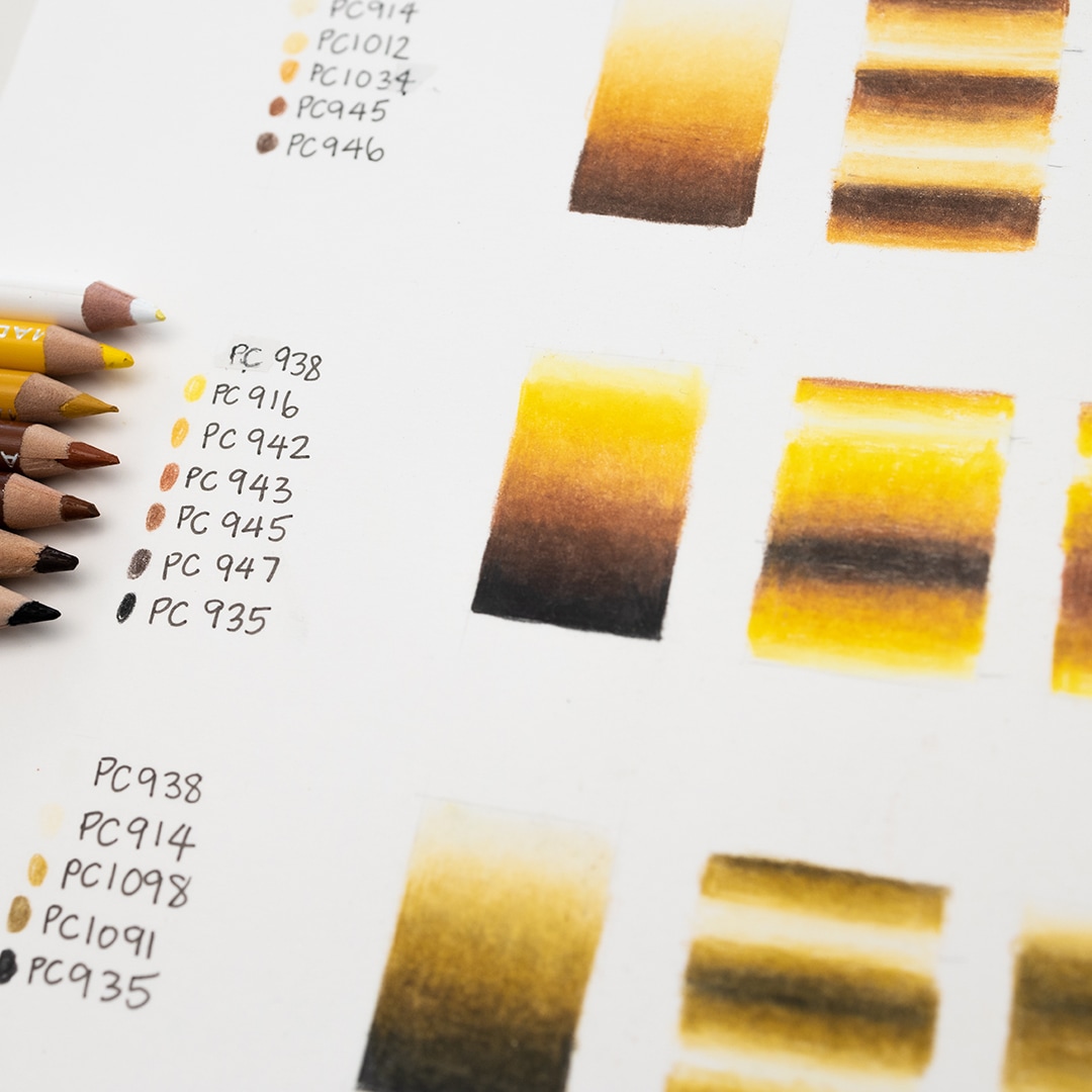
Prismacolor Premier Soft-Core Colored Pencils used:
- PC 938 White
- PC 916 Canary Yellow
- PC 942 Yellow Ochre
- PC 943 Burnt Ochre
- PC 945 – Sienna Brown
- PC 947 – Dark Umber
- PC 935 – Black
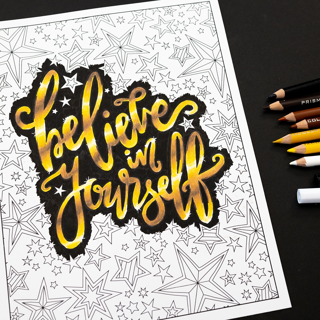
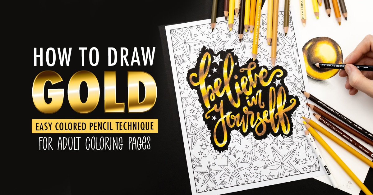
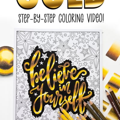
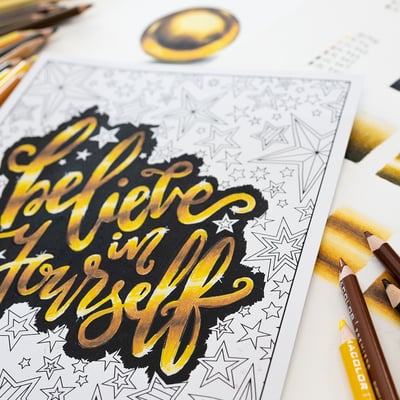
For our first example, I’m coloring the lettering on a coloring page from my Uplifting Collection.
I want my lettering to look flat on the top, with a slight bevelled edge. This is the easiest way to color gold, because I can simply draw my gradient flat. I’m going to change the angle of the lighting, but otherwise I’m following the pattern of dark to light like I showed you in our practice gradients.
How to Draw Gold Letters
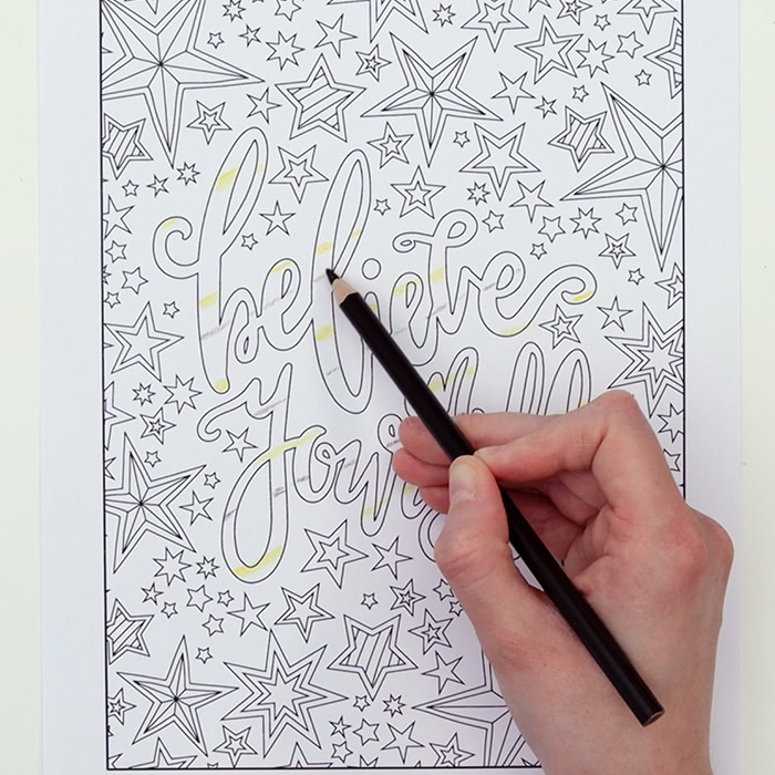
The easiest way to start is to work out where your light and shading will go and draw a basic line to represent these. Keep it light so you can easily blend this in later. I’ve used my yellow instead of my white so it’s easier to see, so I’ll do my white next to this as I fill out my other colors.
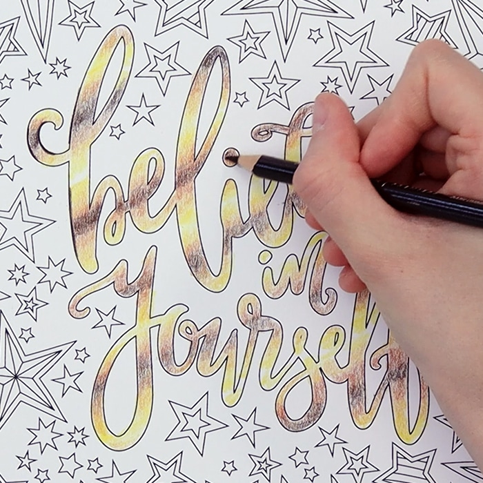
Once you’ve got your lightest and darkest colors in place, you can start lightly filling out your other colors. I recommend keeping your pressure light here so you can make adjustments and try to gently blend your colors together. It helps to keep your pencil sharp and hold it further back instead of close to the tip. These are general tips that I always recommend when coloring, as you’ll get much smoother blends without using other blending tools or solvents.
Recommended Video: My Top 10 Tips for Using Colored Pencils
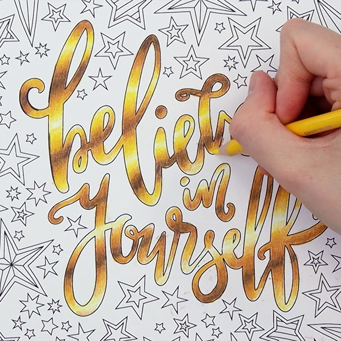
Once you’re happy with the placement of your colors, you can start to build up layers. Try to be patient here – more layers will take longer, but the results will be worth it.
You can use a bit more pressure on your final layer to start burnishing. I recommend using your lighter browns and yellow for your burnishing because this will bring a brighter gold appearance.
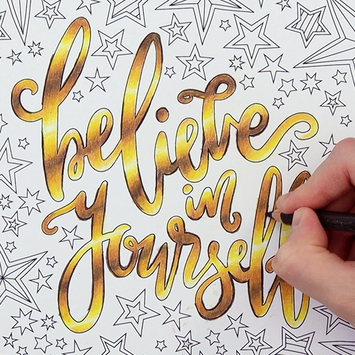
Now that I’m done with my basic gold letters, I want to create a slight edge for an extra effect. For my bevelled edge, I’m outlining the darkest sections in brown, although I’ve switched my Prismacolor pencil for my Faber-castell Polychromos because it keeps a sharper point so it’s a little better for this detail.
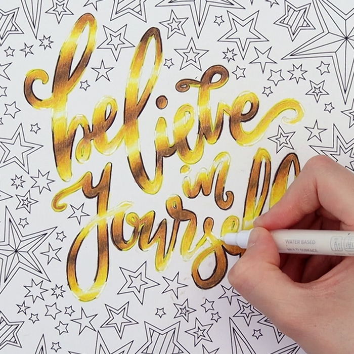
For the highlighted sections, I really want this edge to stand out, so instead of just using a white pencil, I’ve decided to use the fine-tip paint pens that I’ve been given by Artistro to try out. The bonus here is that I can cover up my black lines too.
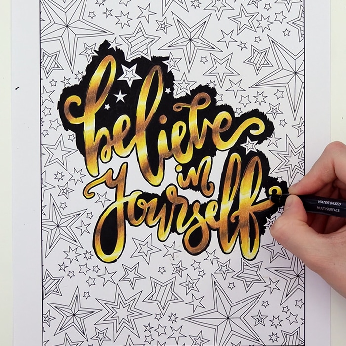
To really make this pop, and to hide some of my little mistakes aroud the edges, I’m going to use a black paint pen in my background. Gold always stands out against a dark background, so this will really make these letters shine. And for one final touch, I’m adding some tiny sparkles with my white paint pen.
How to Draw a Gold Plant Pot
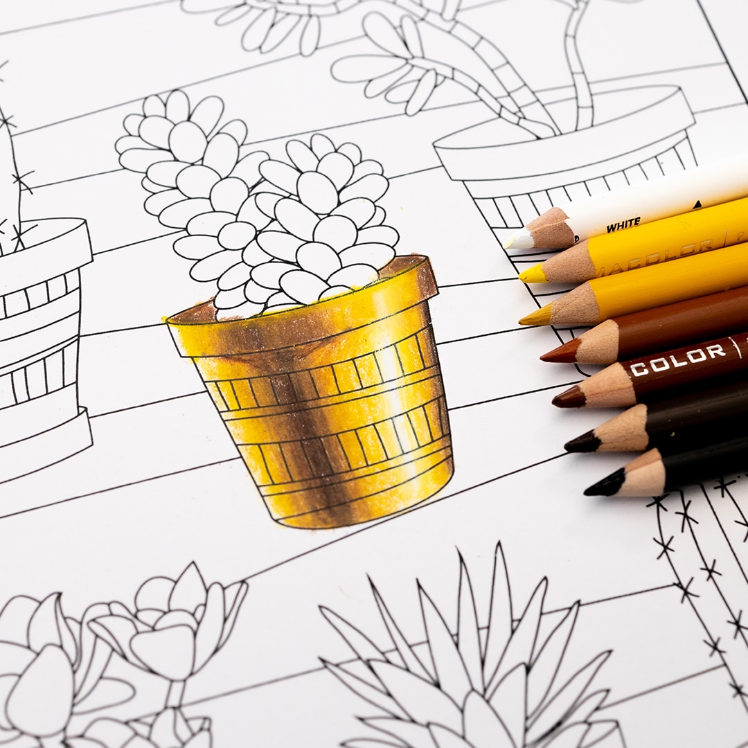
For my second example, I’m coloring this succulents page from my Nature Collection and taking a different approach. This time, I want to bend my gradient to create a 3D appearance.
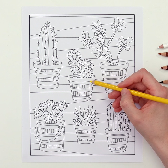
I recommend starting with a simple object until you get the hang of this. For this example, I’m using a plant pot. It’s slightly bigger at the top than the bottom, so we need to stretch out pattern slightly to fit the shape.
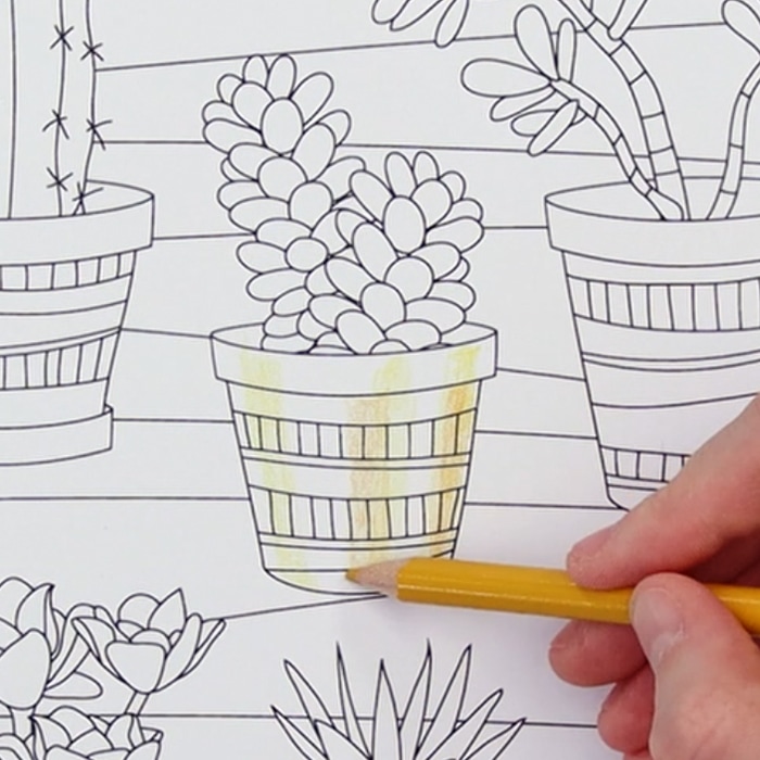
The light and dark lines in our pattern need to follow the curve of the shape – in this case, they need to stretch a bit wider at the top of the plant pot and be closer together at the bottom. Other than that, the basic process is the same. Start by lightly drawing out your darkest and lightest lines.
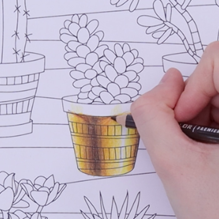
Fill in your other colors and gently blend everything together. Once you’re happy with the placement of your colors, build up the layers and use your lighter colors to burnish. If there are areas that might pick up further shadows, like the rim under the pot, you can experiment by curving your pattern slightly around this. But don’t worry too much about this when you are getting started.
If you’re finding it hard to bend your gradient to your shape, here’s a little exercise that might help you.
Grab a piece of tracing paper and a pen or marker, place it on your object and trace around the basic shape. Then identify the halfway point on each edge and draw a line. Do the same again, breaking up each edge into quarters, and connecting these – your lines don’t need to be straight – let them follow the curves of the shape you are drawing. This should give you a bit of a frame or grid of how your shape changes, and you can use these lines as guides for where to place your colors.
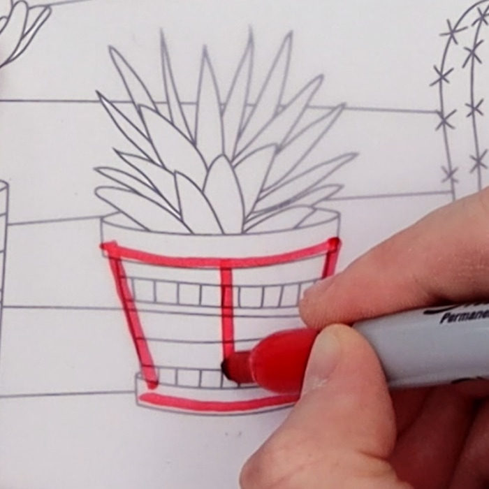
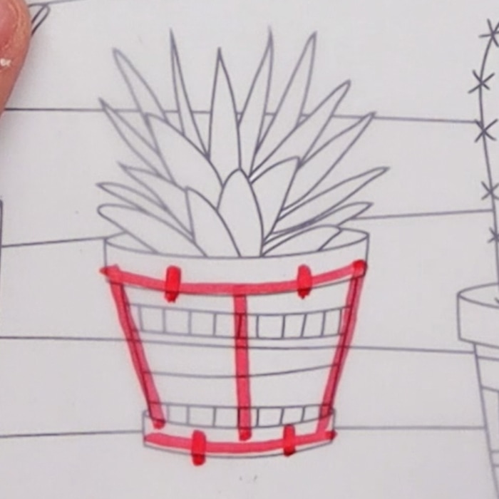
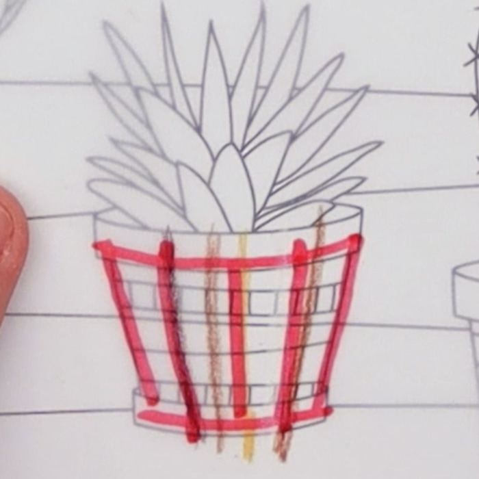
Practice this until you feel confident that you can naturally see the way your gradient needs to bend, and add as many lines as you feel you need. Then go back to your page and have a go with your colored pencils.
How to Make Your Gold Look Shinier
- change from dark to light more often and make your transitions sharper. You can even remove some of your transitional colors and jump straight from dark to light in certain reflections.
- Turn up the contrast! Use black and use white. The more contrast between your darkest and lightest color, the shinier your gold will look.
- Add lots of highlights
The opposite is also true – if you want a more subtle look, take out your darkest browns and blacks, smooth out your gradients more, and don’t use as many transitions from dark to light.
Advanced reflections
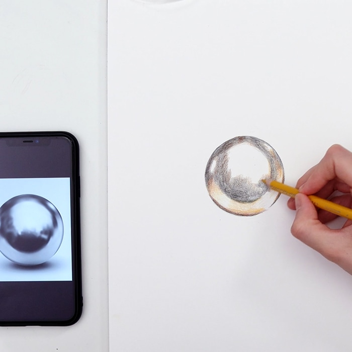
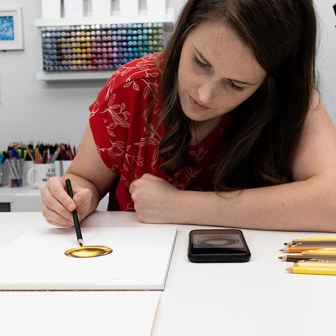
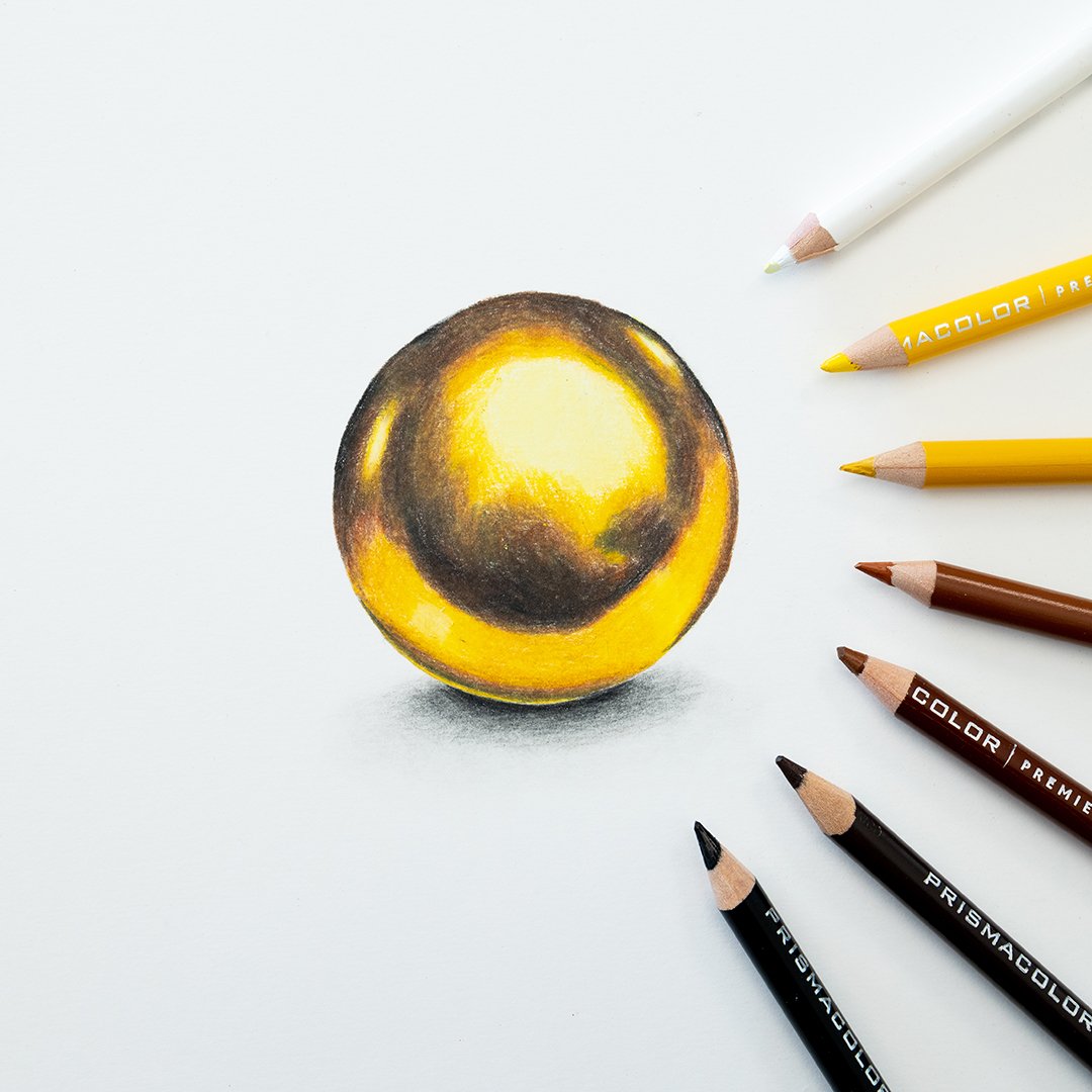
Everything we’ve covered will help you to create a semi-realistic gold effect in your coloring, but for really realistic drawing, a reference photo is the best way.
I’ve talked about lighting in my previous videos, but gold and other metallic objects reflect light differently, so really realistic drawings are much harder to achieve. It’s like trying to teach someone how to draw a mirror. What you are drawing changes so much depending on the environment.
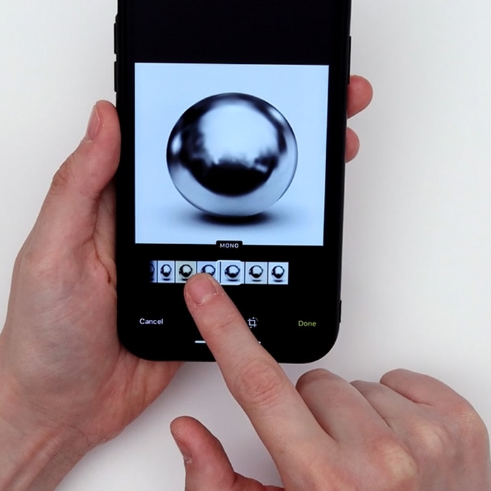
Your reference photo doesn’t even have to match your object. You can use a reference photo from any shiny surface, even if it’s not gold already. Turn it to black and white on your phone and just look at the values.
Practice Activities
If you’re up for the challenge today, I have a little homework for you:
- If you haven’t already, please subscribe to my YouTube Channel!
- Have a go at recreating the colors, gradients and patterns above for yourself and come up with your own.
- Find at least 1 reference photo and copy it for yourself to practice drawing gold. You’ll start to learn how the lighting naturally works and what to look for and include in your coloring. You don’t have to be an amazing artist – this is just practice and skill-building. You can even trace the outline of your reference photo so you can just focus on the coloring instead of worrying about your drawing skills at this point.
- If you manage to get it done, I’d love to see your results in my Facebook group!
If you found this guide helpful, please share this video and article with your friends on social media and Pinterest!











Thank you so much for sharing your knowledge of colored pencils and the techniques to create better outcomes in my own work. I absolutely love your videos!
Those are the best tricks I’ve seen yet
Hi ..do you have an app .to use the colour catalogue. We make it easy to use. At the moment I have to go to your web site to use it. Unless I’m doing something wrong. I’m using an ipad
Thank you, Sarah! I always love your color combinations. You’ve used a couple of extra colors that I had not considered, but the end results are beautiful. I appreciate your time in helping us to learn more about how colors work together.
Hi please could you share the colour combination for the polychromos?
Thank you so much, I really appreciate this tutorial. I have tried my own but never with good results! Thank you Sarah, I love your videos and tutorials!
Your tutorials are amazing! They are so helpful and inspiring. Thank you for sharing your talent!
Hi please could you share the colour combination of the luminance pencils you used to colour the gold bow.
Kind Regards Claire