
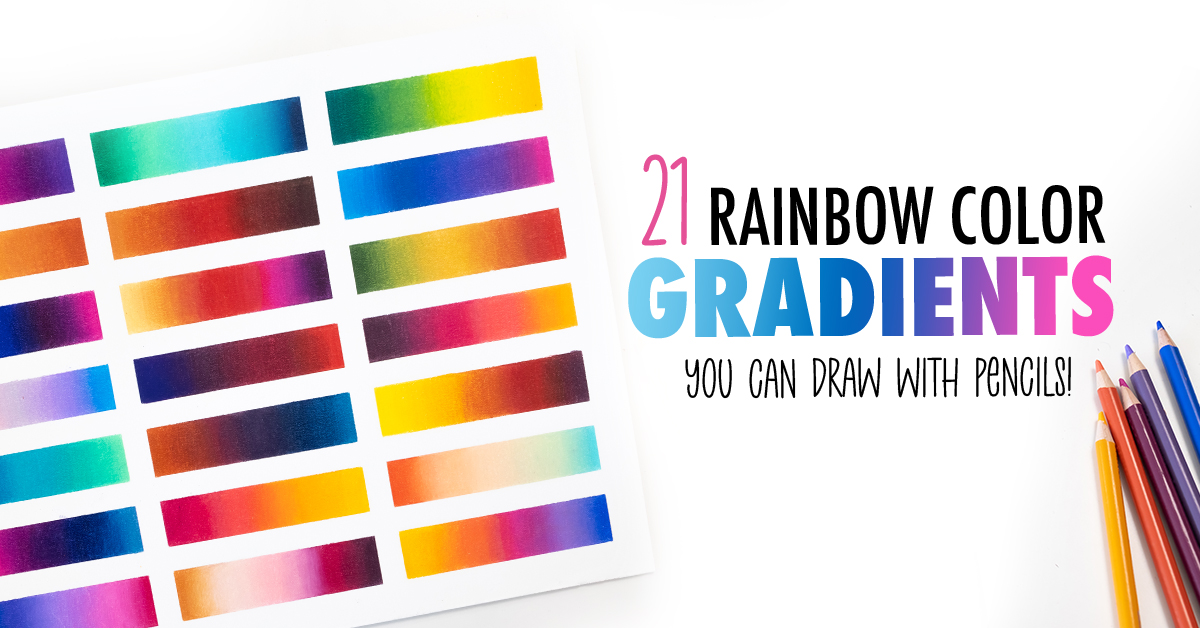
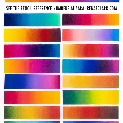
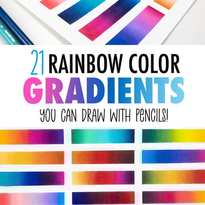
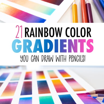
Today we’re making rainbow gradients… but not with your traditional rainbow colors. Instead, I’m showing you 20 different fun and colorful combinations you can try for yourself to create amazing patterns, gradients and interesting art. But even more, I’ll show you how to find your own colors so you can come up with your own unique combinations.
Watch the full video below, or scroll down below to see the exact colors I’ve used in each example!
Please Note: This post contains affiliate links and I may earn a commission if you click them and make a purchase (at no cost to you).
Using the Color Wheel
The easiest place to start in choosing rainbow gradients is the color wheel.
If you’re not familiar with the color wheel, I have a quick guide here that will give you a great overview of how to use it to find color combinations that work well together.
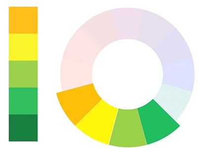
For our gradients, the best combinations are ANALAGOUS colors – that’s the colors that sit next to each other on the color wheel.
I’ve already got some examples from my Color Theory Workbook that we can use as inspiration for our first few gradients today.
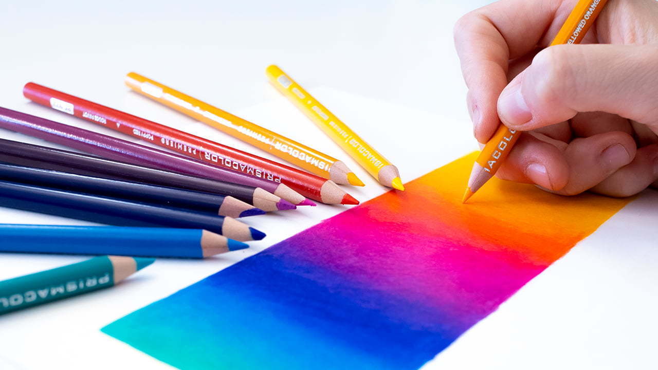
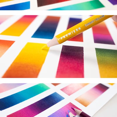
Once you’ve found your inspiration, it’s time to find your pencils. This is where swatching your pencils can help, because you can simply line your swatches up against your reference and find the closest match. It doesn’t have to be perfect.
If you can’t find an exact match, you’re better choosing a slightly different hue instead of going darker or lighter, which isn’t always the case when matching colors to a reference photo – but IS the case if we’re making a gradient with similar colors like this.
Test out your colors side by side, see how they look, and add or remove any colors that you feel would help to make a better gradient.
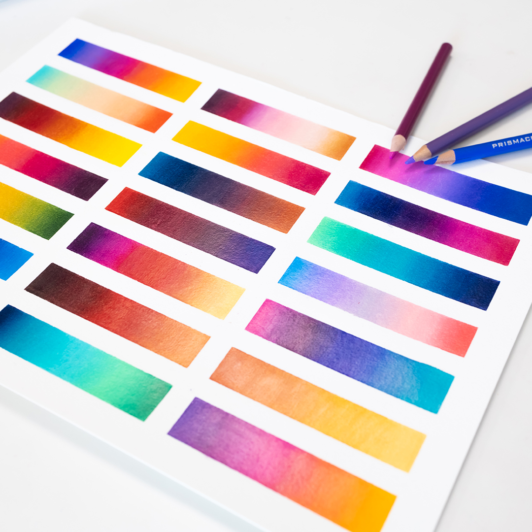
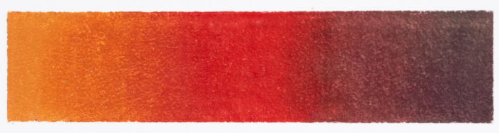
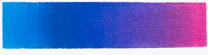
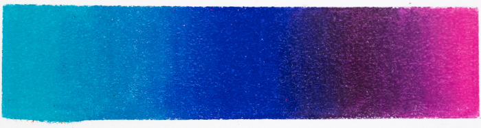
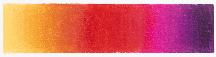
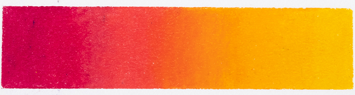
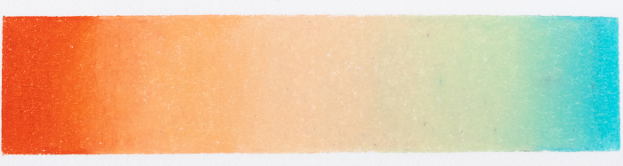
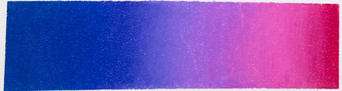
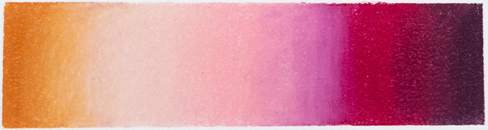
Here are the first gradients that I created in the video using the color wheel and the analogous color examples from the Color Theory Workbook.
 Prismacolor Pencil Colors:
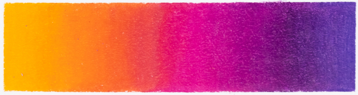
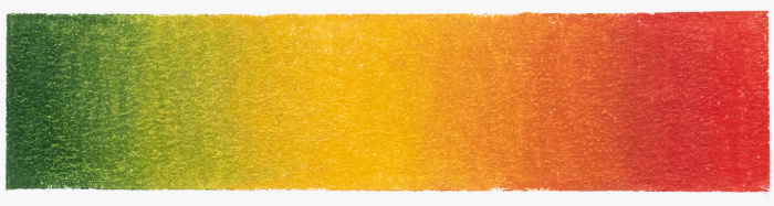
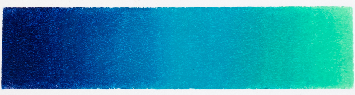
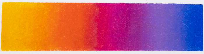
PC 1002, PC 921, PC 994, PC 1009, PC 932
 Prismacolor Pencil Colors:
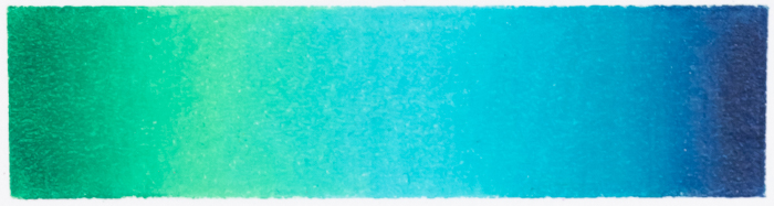
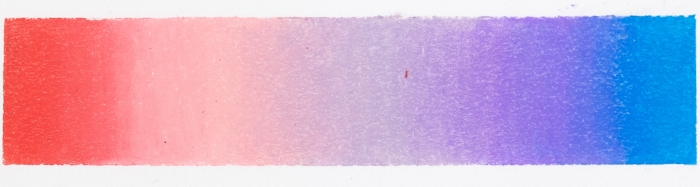
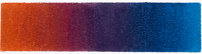
PC 909, PC 910, PC 992, PC 905, PC 901
 Prismacolor Pencil Colors:
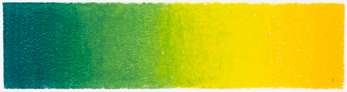
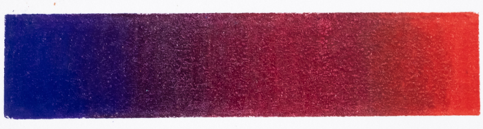
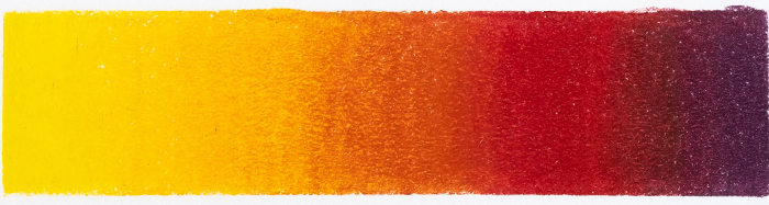
PC 907, PC 912, PC 916, PC 1003
 Prismacolor Pencil Colors:
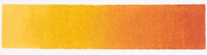
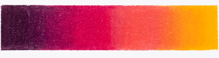
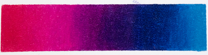
PC 940, PC 942, PC 1033, PC 1032
 Prismacolor Pencil Colors:
PC 1033, PC 1032, PC 924, PC 937, PC 1095
 Prismacolor Pencil Colors:
PC 903, PC 1101, PC 1007, PC 932, PC 995
I’m using Prismacolor pencils today, because I know these are pencils that many of you own and they do blend really nicely for projects like this. But you can do this with ANY pencils you own.
The key, whatever you use, is to keep your pencils sharp and your pressure light. Overlap each color as you go and build up layers. Only add more pressure as you get towards your final layer. The amount of layers you need will depend a lot on your pencils and the paper you choose.
If you want a more in-depth look at the process, I’ve created a whole video and blog post about how I create these smooth blends, and I talk about the color wheel and analogous colors in a bit more detail as well. You can check it out here.
Other Color Inspiration
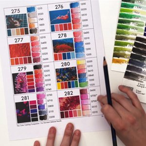
So these are pretty so far, but there’s not a whole lot of variety, and eventually you might run out of ideas if you ONLY use the Color Wheel, so I’ve also got my Color Catalog here to help get our creativity flowing.
The Color Catalog is aimed at being a point of inspiration for colors that work well together – but not all of them will necessarily work well in a GRADIENT – so we are looking for colors that still have the potential to blend together, even if we need to add a few transitionary colors inbetween.
And because I’m using Prismacolor pencils, I’ve printed off the Prismacolor Companion that gives me the closest pencil match for each of these palettes – this should save some time in trying to match these myself.
A few of these instantly work as gradients, and for the rest, I’ve added some extra colors, using the color wheel for help and just experimenting with others. And I think I’m happy with what I’ve come up with.
(The Companions are an add-on to the Color Catalog available for various popular brands. You can find out more here.)
Prismacolor Pencil Colors:
PC 905, PC 1022, PC 933, PC 931, PC 994
Prismacolor Pencil Colors:
PC 1012, PC 1033, PC 924, PC 994, PC 931
 Prismacolor Pencil Colors:
PC 911, PC 1005, PC 942, PC 1032, PC 924
 Prismacolor Pencil Colors:
PC 929, PC 928, PC 1026, PC 956, PC 903
Prismacolor Pencil Colors:
PC 132, PC 1078, PC 1030, PC 923
 Prismacolor Pencil Colors:
PC 1078, PC 930, PC 926, PC 1002
 Prismacolor Pencil Colors:
PC 208, PC 1027, PC 905, PC 1006, PC 910
 Prismacolor Pencil Colors:
PC 1032, PC 1029, PC 996, PC 901, PC 1027
 Prismacolor Pencil Colors:
PC 916, PC 917, PC 1032, PC 925, PC 1078
 Prismacolor Pencil Colors:
PC 930, PC 994, PC 1009, PC 208, PC 1022
 Prismacolor Pencil Colors:
PC 930, PC 926, PC 1002, PC 917
 Prismacolor Pencil Colors:
PC 922, PC 1089, PC 997, PC 1001, PC 992
 Prismacolor Pencil Colors:
PC 1101, PC 1007, PC 956, PC 993, PC 930
 Prismacolor Pencil Colors:
PC 1033, PC 927, PC 928, PC 195, PC 1078
 Prismacolor Pencil Colors:
PC 917, PC 921, PC 994, PC 1008, PC 133
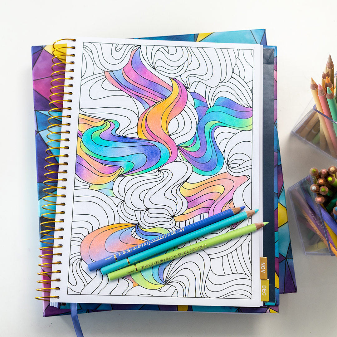
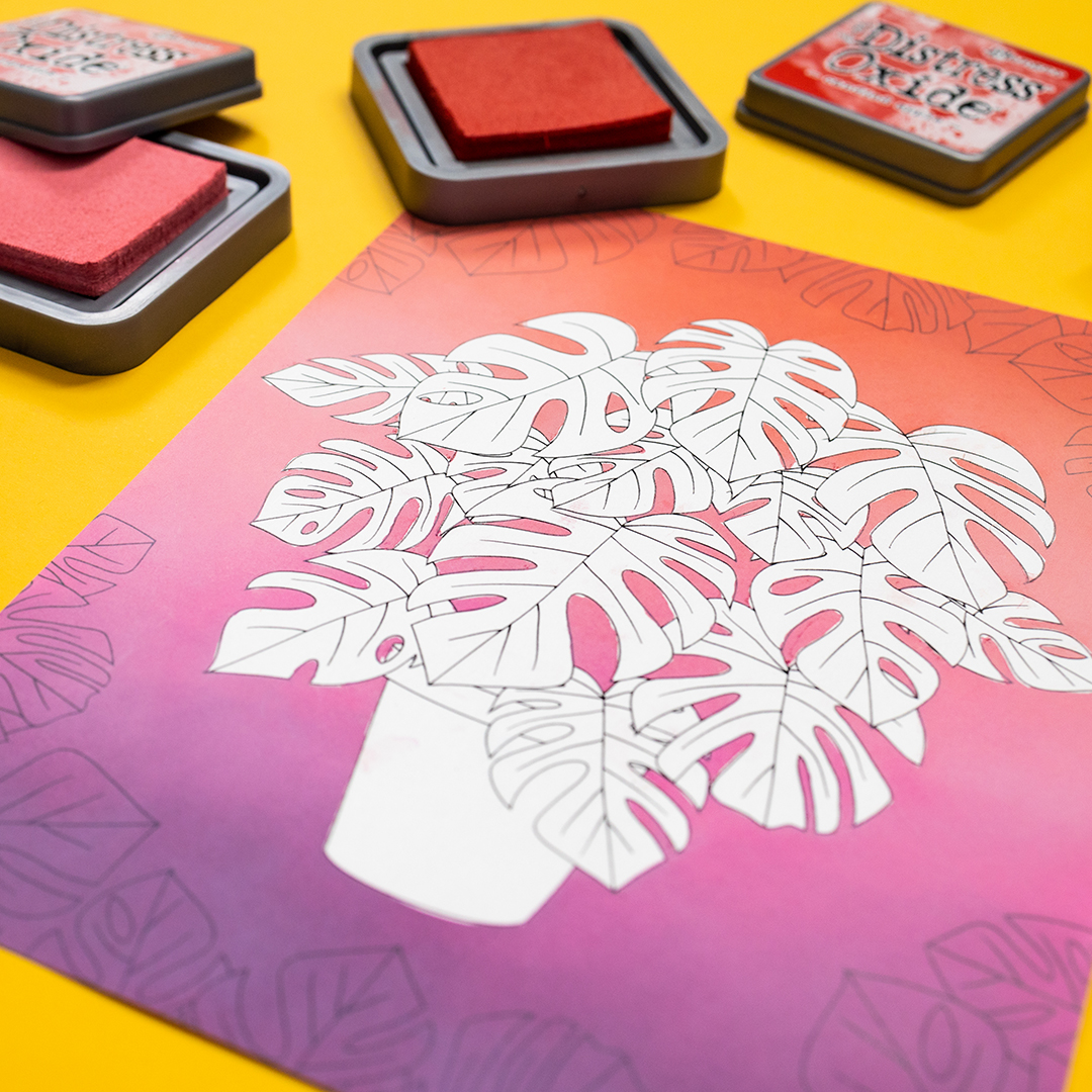
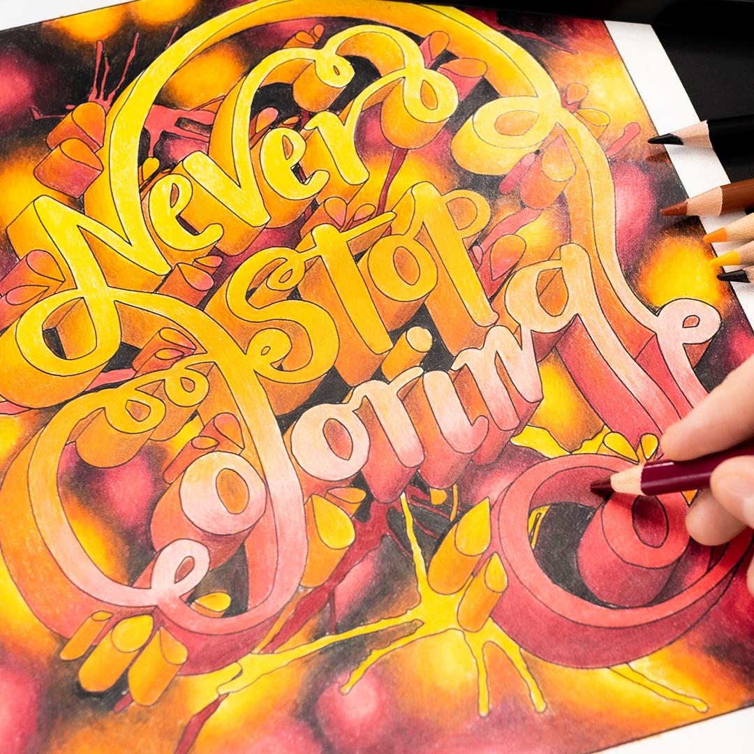
How to Use Gradients in Your Artwork
So other than making pretty blocks of rainbow color, how else do you use these gradients?
If you watched my pastel pencil video recently, I used a similar process to choose my colors from my range of Holbein, Marco pastels, and Pastelove pencils and colored those gradients along the patterns in my Coloring Planner.
Even though those colors were pastels, I still followed the color wheel to choose colors that were analogous so they followed the same basic system and the end result looked great.
Find out more about the Coloring Planner here!
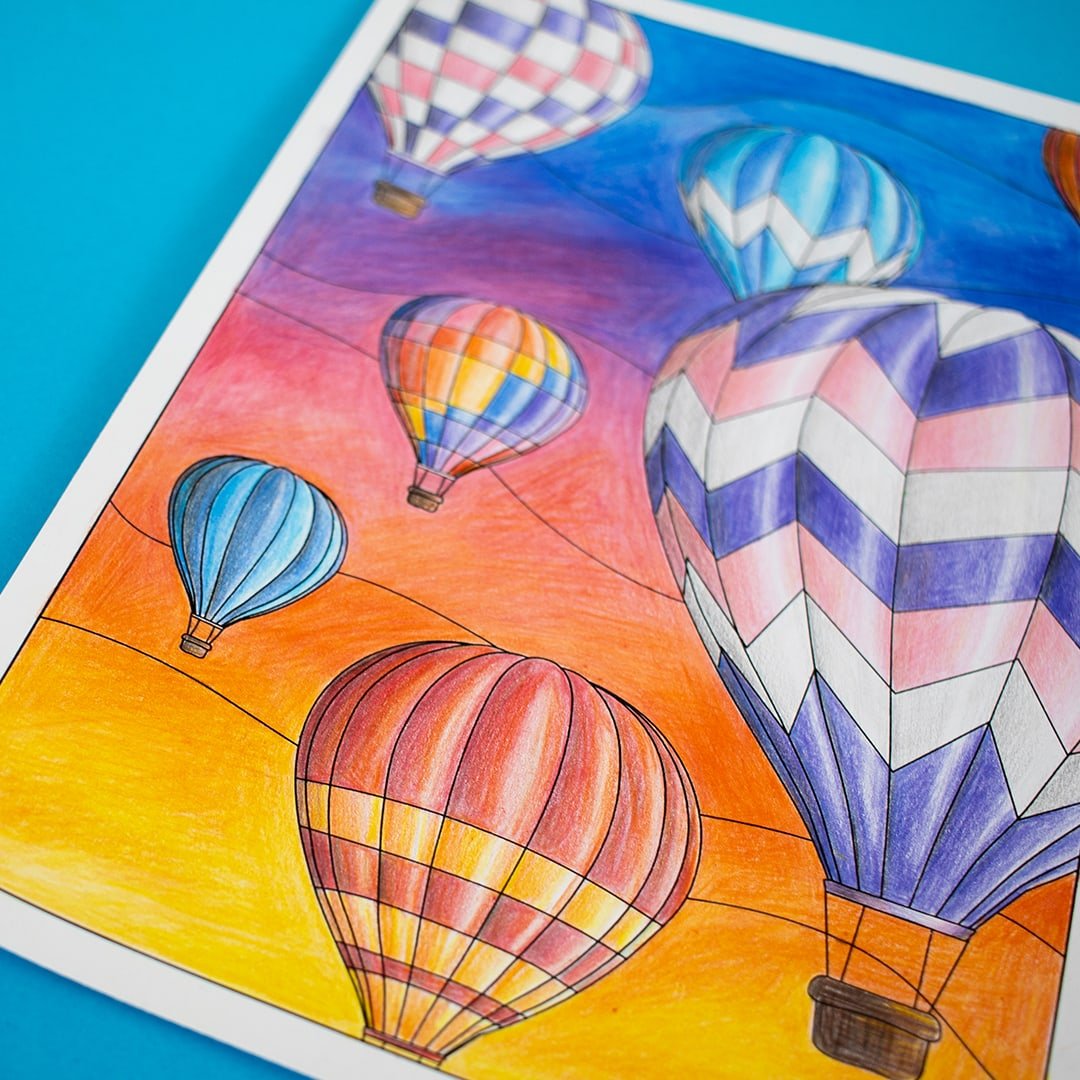
Here are some other examples where I’ve used gradients in art or coloring pages:
It’s Your Turn!
21 gradients – perfect for sunsets, rainbows, or just for pretty patterns. This video was just as much for me as for you – because I’m going to keep these as handy little cards now to remind myself to try these again when I’m coloring!
But I encourage you to give these combinations a try, or come up with your own. You can create bold colors like these with ANY set of pencils – in fact, here are a few of my cheap pencil recommendations you might enjoy:
Also, if you’d like to learn more about color, blending, and using the color wheel, here are some other resources to check out next!
- Color Theory For Beginners
- How to Blend Colored Pencils
- How to Use Colored Pencils in Adult Coloring Pages
- How to Use a Color Palette
If you have a favourite gradient from this post, please tell me in the comments here or on YouTube!

Merci, c’est génial ce que vous faites… j’espère bien progresser grace a vous.
J’adore le dernier degrade…
Hi Sara,
I’d like to see a color match of prismacolors vs castle arts. Numbers to numbers. I couldn’t afford the prismacolors and I really like your color gradients, but I want to use the closest hue possible. Do you know we’re I could get something like that?
I would also love to see something like that. I love my Castle Art, I love my Prismas!
I know this is a few months old, but your best bet would be to make a swatch of all of your pencils(just Google-blank swatch #- and insert your count of pencils) and then search for a prefilled Swatch chart for Prismas.. then you can compare them side by side .. it won’t be exact due to printer and/or monitor differences but it’ll be close enough for personal use.
Thanks thanks a lot. You are truly clear with your explanation, and I like all your videos. I learn a lot and I’m very astonish with the versatility of the coloured pencils.
I long for success in this task, it’s difficult… but I hope to get it. Sorry for my english… ='(
Hi, could I use a ‘drawing paper’ to print adult colouring pages?
P. S: My concern here is the type of paper to print
colouring pages.
Thanks
It depends on the paper and your printer. Just test it out with one page and see what happens!
This is just great – thank you so much for doing this. I pulled out my Prismas and a swatch book, so now I have 21 new ideas for backgrounds and whatnot.