
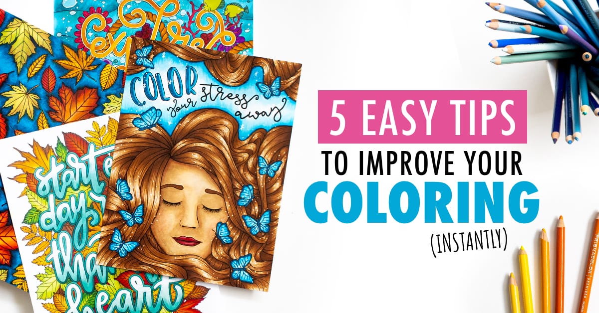
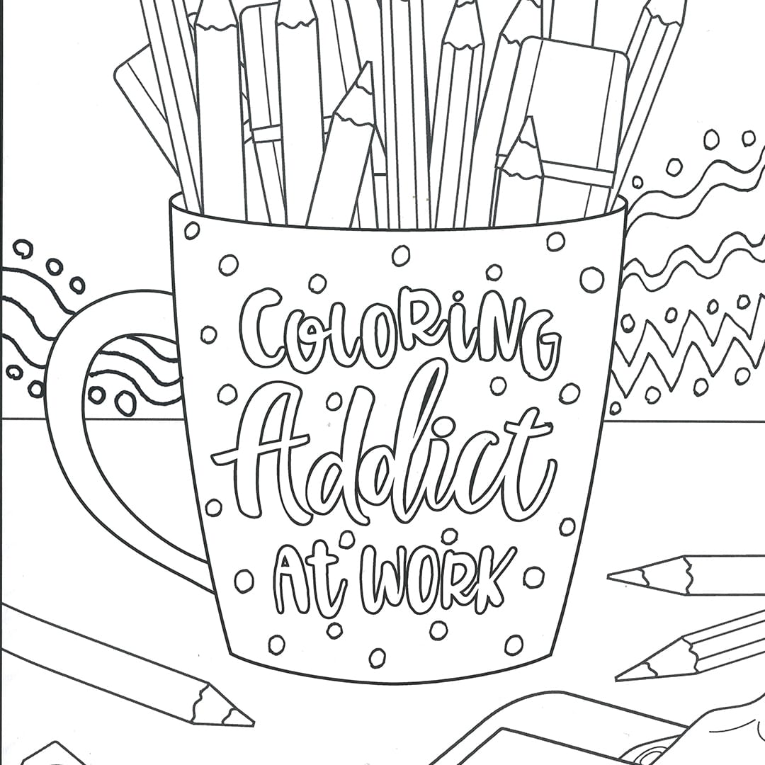
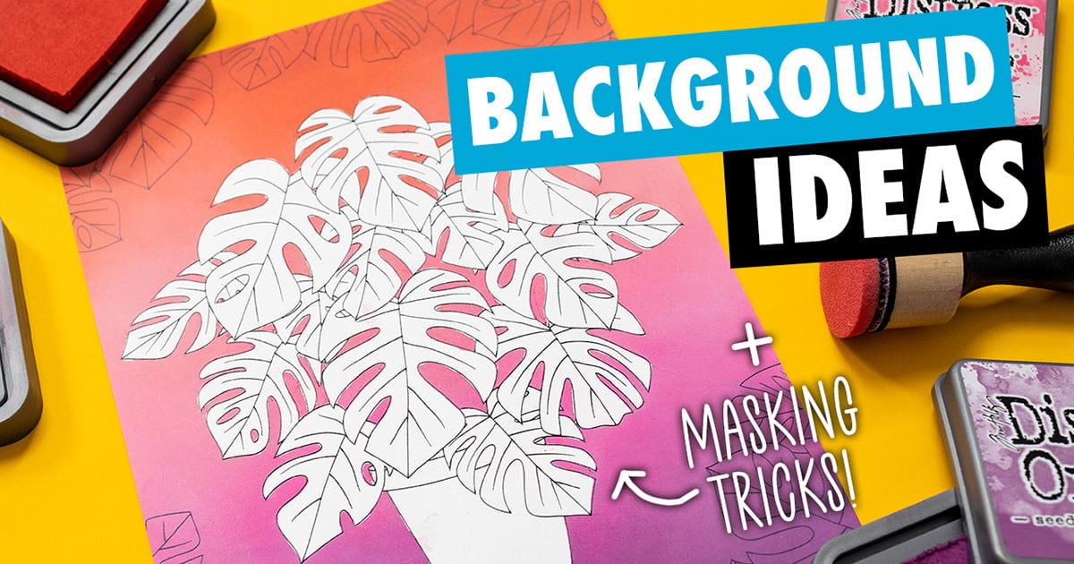
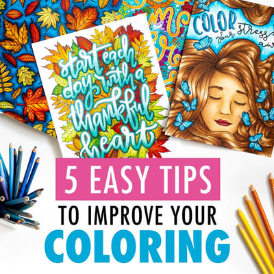
If you’ve ever found yourself wondering why your adult coloring pages just don’t look as good as the ones you see online, today’s blog post is for you.
We’re going to go through five easy tips that anyone can do that will help your coloring pages go from OK to amazing.
These are simple tips that you can do with any medium and any type of coloring page.
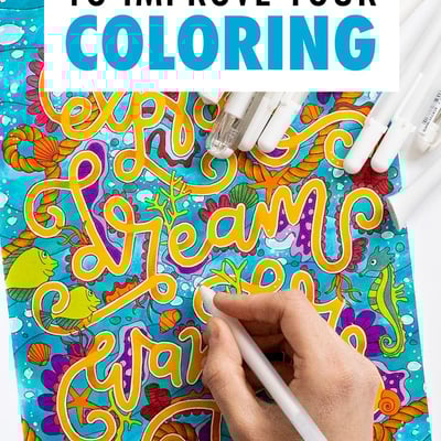
Improve your coloring skills with these easy tips!
I know that not all of us are naturally creative people.
We’re not all born with just that knowledge of what looks good and what doesn’t, or the ability to use pencils to create masterpieces, but that doesn’t mean that great art isn’t within our reach.
So in this video and article, I want to show you five tips that are very easy for anyone to use, and they can help make your coloring pages look more amazing.
Coloring Tip 1: Learn basic shading and blending techniques
The first thing is shading.
Now, when I say shading, I know some of you might freak a little bit and think “Oh no! Shading, blending light sources…” thats too hard!
But please don’t worry.
What I’m going to show you is not the full in-depth version on how to do shading. This is a very basic beginner’s version that can help make any coloring page look more interesting, without learning about light sources or how shadows work.
First, let’s look at some examples of what we’re talking about.
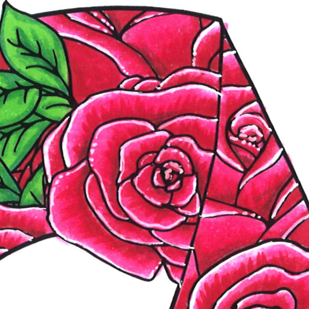
In this coloring page from Confessions of a Coloring Addict, I’ve done some slight shading on each of the colors with a darker version of each color.
When you look at this page from a distance, you don’t even notice these, but there’s just a lot more sense of depth compared to a normal coloring page. And it’s because of these shadows.
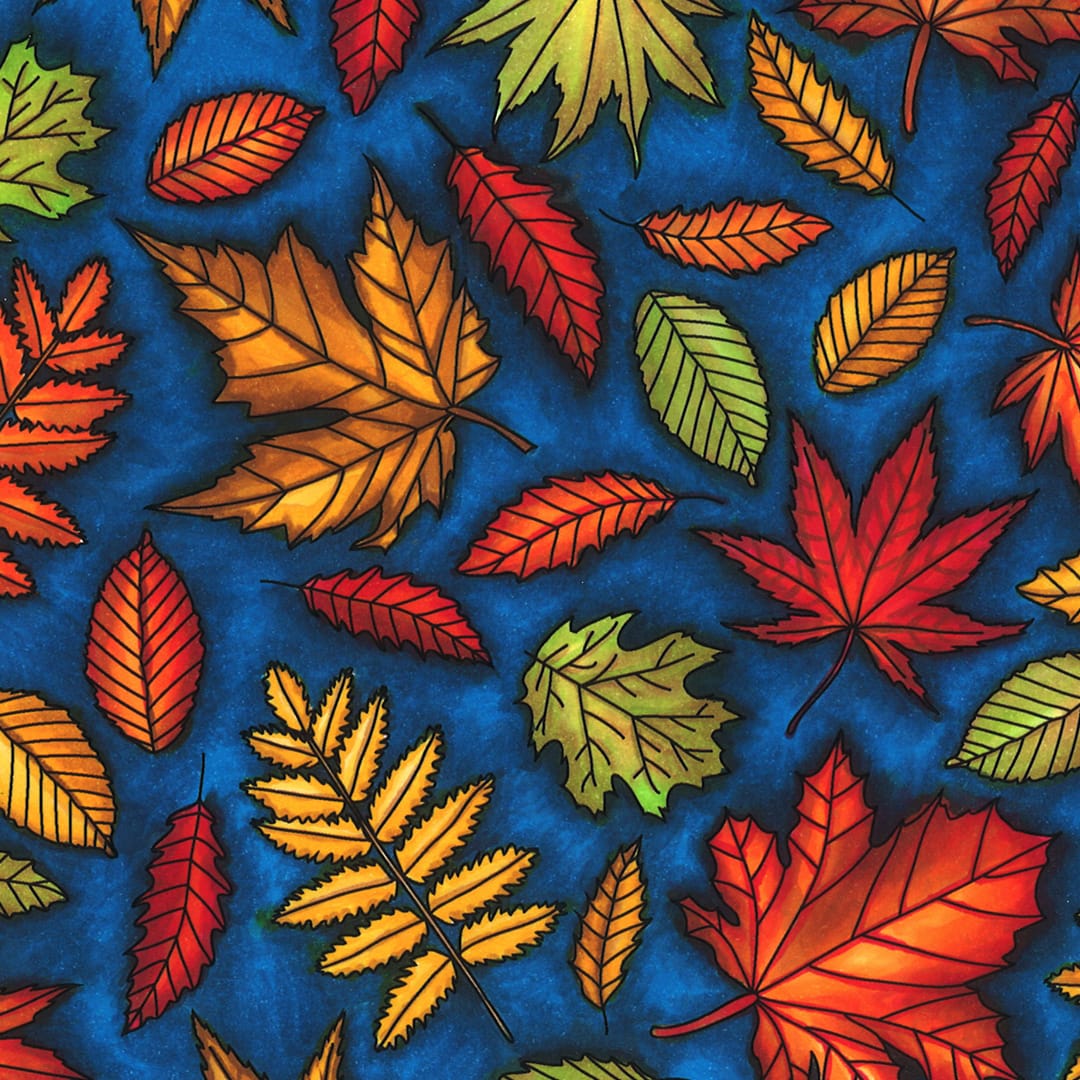
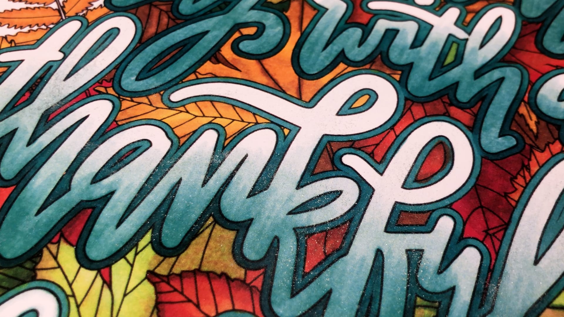
In this coloring page from the Nature Collection, I’ve colored a darker blue around all of the leaves with a lighter blue background. This isn’t a ‘perfect shadow’ but it makes the page more interesting and helps the leaves to stand out.

And in this image, I’ve used shading to create different colors within each of the leaves, and I’ve used shading to create a gradient effect on all the lettering, with a lighter color at the top that blends down into a darker color at the bottom. Much more interesting than a plain color!
How to do basic shading with colored pencils
Now, let me show you how to do this.
First, choose your colours. Try to find colors that have a similar hue (learn about hues in this post) or that look like the same color, but slightly darker or lighter than each other. You can test them on a scrap piece of paper to find the best color matches.
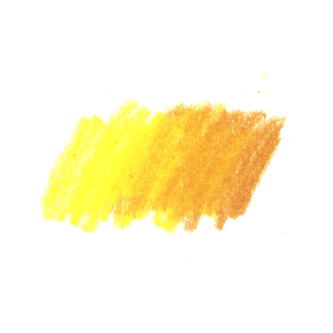
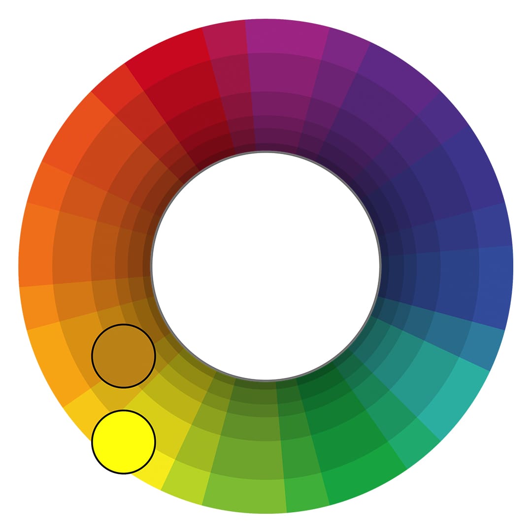
For example, if you’re using yellow, try to match it with a darker yellow (or better, an orange or brown).
If you’re using blue, match a medium blue with a dark blue, or a light blue with a medium blue.
Instead of just adding black, the best way to do shading is to actually add a darker version of the same color. When it comes to blending your colors together, we simply press a bit lighter and we overlap them.
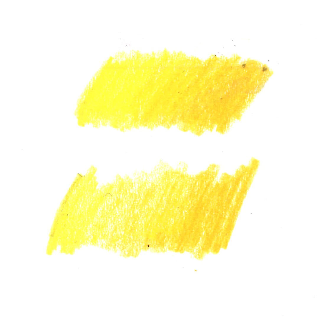
When you first start this, the best option is to go lighter and then come back and go over it again. So by working in light layers, you give yourself a lot more room to create a smooth gradient, and as you can see, that was actually quite easy to get the two colors to blend together just by doing multiple layers. (Watch me demonstrate this in the video at 04:00)
The lighter you can do this transition, the better the transition will be. You can use this trick in large or small areas.
If you’re wanting a more dramatic or more obvious look, you simply need to pick a bigger variety of colors. So you might use the same yellow, but maybe go more towards a darker orange or brown instead of the orange we’ve used and this time will use a darker brown.
Colors that are similar will create a more subtle gradient. Colors that are further apart will create a more dramatic gradient.
You CAN use black, especially if you are only working from a small set of pencils. But you’ll need to use it very lightly because it can quickly ruin a nice gradient, and doesn’t always blend well with lighter colors. Where possible, I always recommend using a darker version of the same color instead of black.
Now, you might be wondering why I’ve chosen brown when I’m working with yellow. Well, if we actually think about our color wheel and think about where yellow sits, a brown and even the orange is very, very close to the yellow. In fact, if you darken in the yellow and add black to it, other than being a bit more gray, you will get very similar to this brown, which is why I’ve used these.
Now, let me interrupt with a quick tip.
Shading and gradients are a lot easier to do with sharp pencils, so make sure you keep them nice and sharp and sharpen them regularly as you’re working. If you’re working with a blunt pencil, you won’t have as much control over the gradient.
How to do basic shading with markers
When doing this with markers, alcohol markers (e.g. Copic markers) blend really easily, especially on the right paper. But if you’ve got cheaper markers or if you’ve got some that aren’t alcohol-based, they’re probably not going to be easy to blend together.
Here’s my trick – I put down a layer of markers (as my lighter color) and then use my pencils for the shading.
The thing I love about using markers and pencils together is that you get the brightness and the vibrancy of the markers, but you still get the shading possibilities of the pencils.
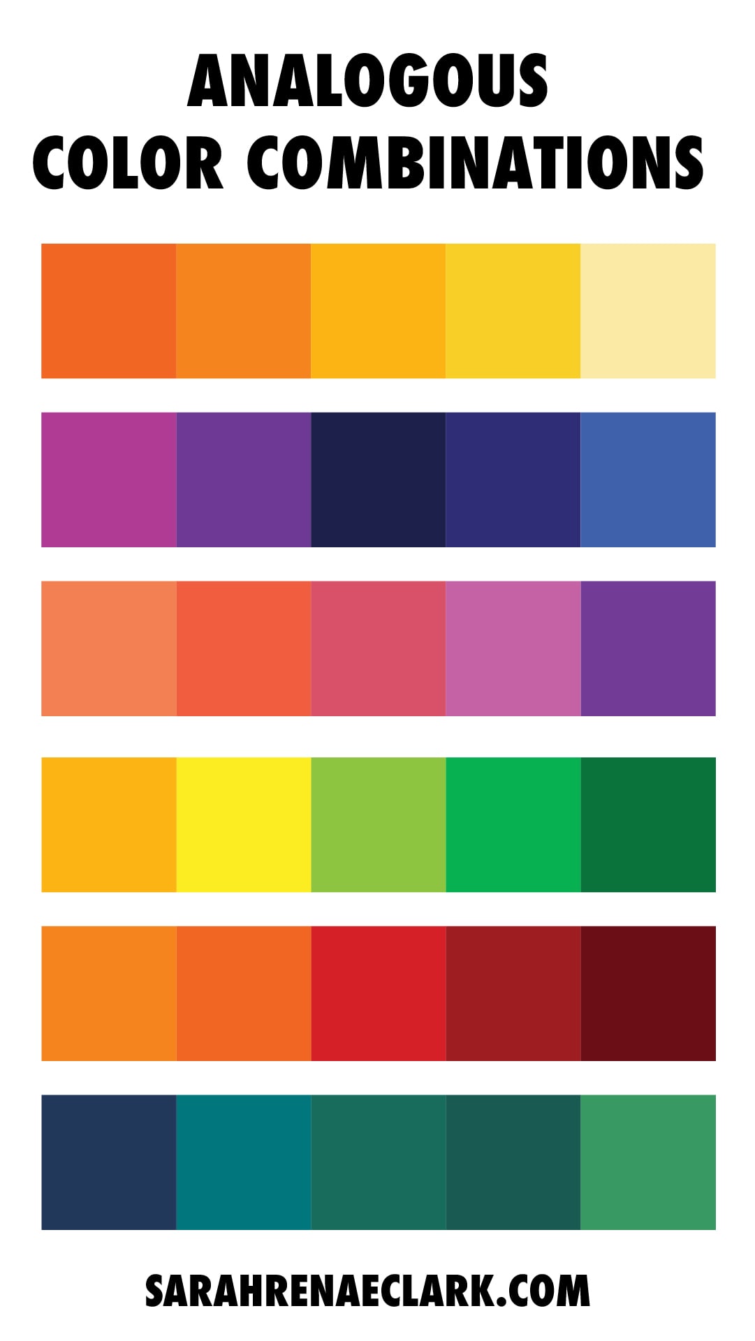
How to do create gradients with analogous colors
We don’t just have to shade with darker colors. We can also create gradients with colors that are next to each other on the color wheel, otherwise known as analogous colors.
These can great some beautiful gradients when shaded together – even in nature, like a sunset or rainbow!
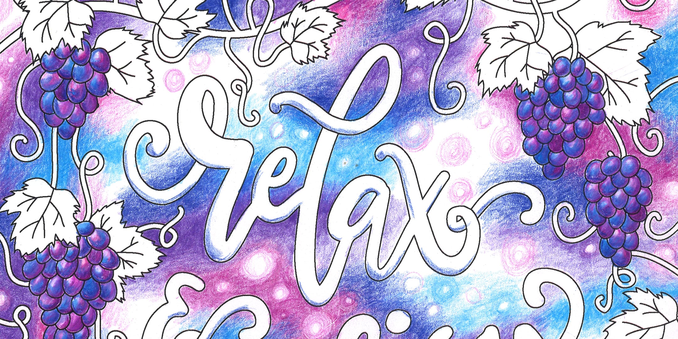
In this example, I have used blue, purple and pink together, blending each of the colors together as they overlap. This page is still in progress (I started it about 2 years ago! Whoops) and so I’ll be going over these colors again in a few more layers to make the colors more vibrant.
Coloring Tip 2: Add highlights with a white pen
It’s time for some highlights! And I love doing this with a white pen.
I’m not going to go in depth now on how to use the white pen in this post, but you can find my top tips here and see my review of all the different white pens I could find to choose one that works for you. Instead, I just want to show you some quick examples of how this can bring a page to life.
Here are some examples of different highlights you can do with a white pen:
In this first example, I’ve used the white pen around the rim of each of the roses and it just makes the colors pop and breaks up the big areas of color. This is perfect if you’re only using a few other colors or if your final coloring page is looking a bit dark. You can get this free coloring page here.
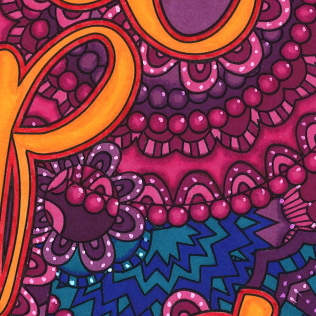
In this example from my Coloring Through Cancer coloring book, I’ve added to the patterns in the background by adding little dots just in different areas. I didn’t follow any particular light source or pattern – I just started drawing and kept adding dots until I was happy. I probably went a little overboard, but I think the final coloring page looks very interesting and lively!
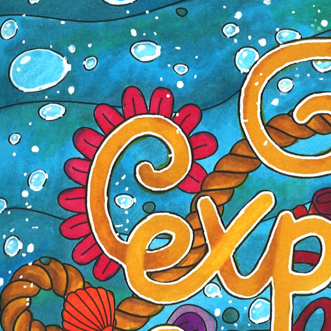
In this example from my Maritime Collection, I used a white pen to highlight the edges of the wording so it would stand out from the background. I also outlined the bubbles and added little white spots on the same section of each bubble to make it look like a light reflection.
In the video above, I go through one more example (watch it at 11:16) to show you how I choose where to add dots, how to outline sections of your patterns or mandalas, and how to add patterns to different sections with your white pen.
If you want to learn more about using a white pen, check out this post with my top tips!

Coloring Tip 3: Add details with a black pen
Using a black pen gives you an opportunity to add to the original artwork on your coloring pages. You can add your own patterns, details, or make a kid’s coloring page into coloring pages online for adults with some extra details.
The easiest version of doing this is just adding dots, like we did with the white pens. Adding some dots with a black pen can add a little bit of extra interest to an image. You can add patterns and shapes, draw more elements, etc. Just be careful that you don’t go overboard If you’ve got a coloring page like this one (from my Uplifting Collection) that’s already quite busy.
In this example from Confessions of a Coloring Addict, we have a lot more big areas that we can work with, so we can create patterns in the background, and then you can actually color those in. You can add patterns to big areas with just simple shapes, lines, circles, squares and squiggles.
Tips for drawing on your coloring pages with a black pen
Now, there are two important considerations when using a black pen.
First, choose a pen that has the same size or smaller tip than the lines on your page.
Some pens are thicker and some are thinner. Adding thick lines or patterns to a coloring page with thin lines will overpower the image. It is always better to use a pen that is the same size or smaller than the artwork already on the page.
Second, test your black pens on a blank piece of paper first, along with the medium you are using.
If you’re planning on using the black pen and then coloring with pencils, try that on a blank piece of paper first. Some pen ink lines will run or smudge when you go over them with colors, especially if you are coloring with markers.
Alternatively, you can add the black lines at the very end after you’ve done all your coloring.
Coloring Tip 4: Add textures to your coloring page
In some coloring pages there will be obvious opportunities to add textures – for example, if you’re coloring someone wearing a dress, you could draw a fabric texture on the dress.
Wood, glitter, stone, bricks, fur, skin, hair, glass, water, metal, gold… there are so many different textures that you can add to your coloring pages.
I have put together a YouTube playlist and a Pinterest board to help you with this because there are endless opportunities for different patterns and textures.
Some textures are a lot easier than others to create. Some of the tutorials you’ll find online will be too advanced for you until you’ve had a chance to practice the basics and learn new skills along the way.
But there are a lot of easy ways that we can create cool effects as well.
We can also use other mediums to create fun textures to bring our pages to life, like gel pens, metallic markers or glitter.
You can even use other mediums that aren’t traditionally made for coloring pages, like eyeshadow, coffee grounds, or watercolor paints.
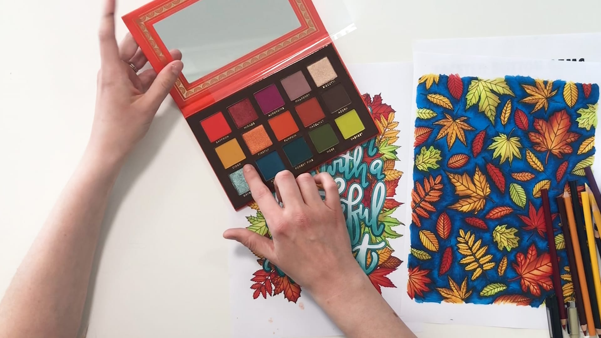
In this example, I used a glitter eyeshadow and just brushed a light layer on top of my coloring page to make the words sparkly. (I just used my fingers but probably should have used a brush!)
Here are some other texture tutorials you can try:
- Galaxy background (with pencils)
- Watercolor effect (using Crayola markers)
- Coloring hair (digital coloring with Procreate)
- Coloring skin (pencils or markers)
- Coloring fur (with pencils)
- Drawing gemstones (with pencils)
There are also plenty of tutorials on Pinterest and YouTube from beginner to advanced, so you’ll be able to find something for your skill level and give it a go. I challenge you to try something new!
And as you try more and more different textures, it will get easier and easier, and you can start trying things that are a little bit more complicated.

Coloring Tip 5: Use a color palette to choose your colors
If you know me, it’s probably no surprise that my final tip is to use a color palette!
When choosing colors that look good together, you have a few options:
First, you can learn to use the color wheel – like this video shows you!
Or you can just ‘wing it’ and pick colors and hope for the best and look. Some people just have a great eye for what looks good and what doesn’t. In my experience doing this, I end up reverting back to the same colors over and over. (And I can tell which colors I use a lot, because they on my shortest pencils!)
Finally, you can use a color palette!
Color palettes allow you to find new colors that you haven’t tried before.
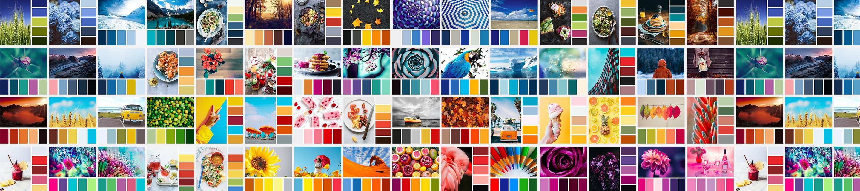 (These are some examples of color palettes from The Color Catalog)

Tip: When choosing a color palette, you don’t have to match the colors EXACTLY. Color palettes are a STARTING POINT. There are no rules that say you have to use the exact colors from the palette, or only the colors from the palette.
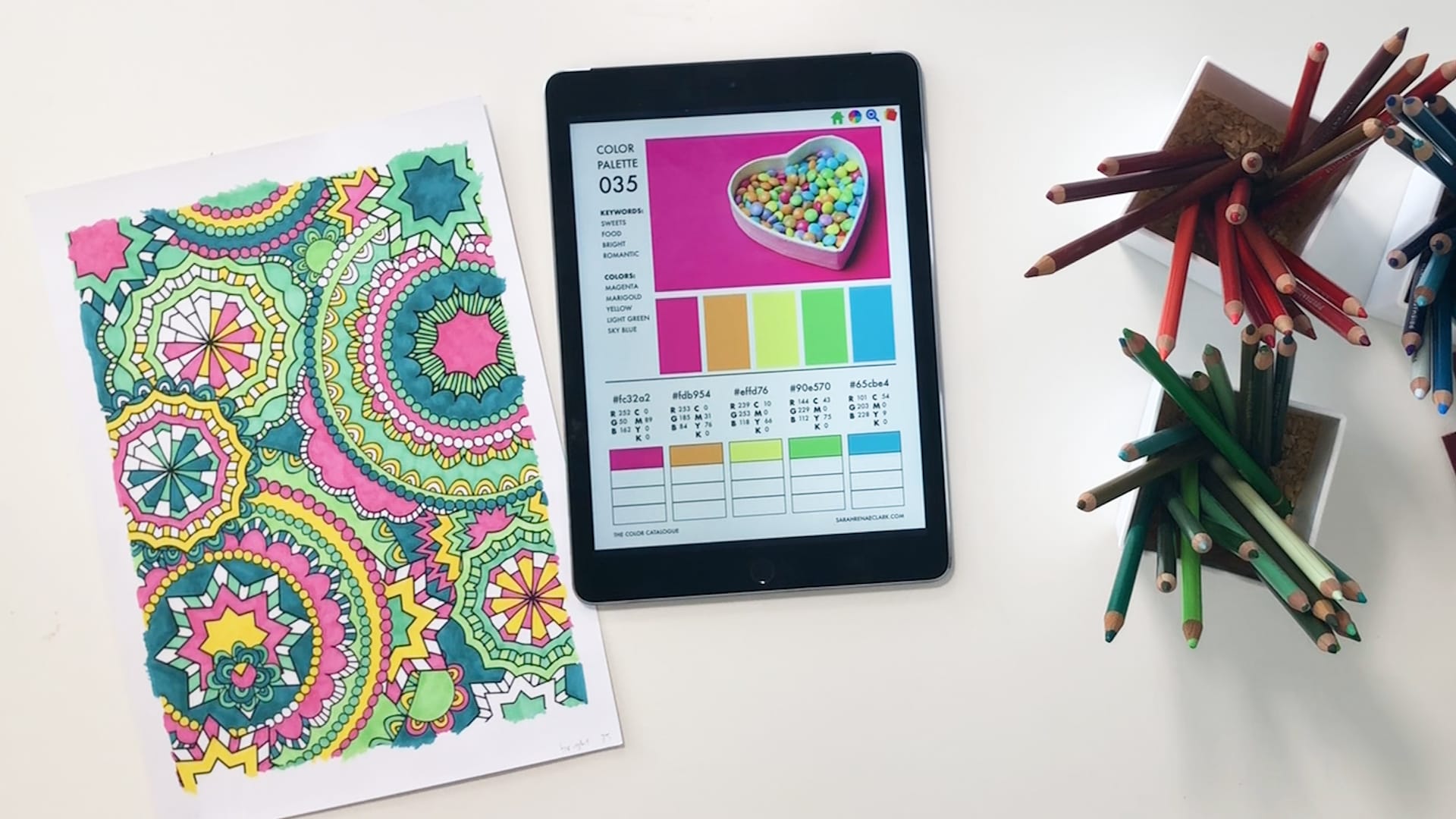
In this example, I have used the general inspiration of this palette to create this page. You can see I’ve used the pinks and yellow but I didn’t use the orange (I couldn’t find a close match so I decided to remove it). I then found the green and I decided to pick both a light and a dark green, and I chose a teal instead of the blue.
If you are using the Color Catalog, you can find a palette based on a color or keyword. For example, you can search for “forest” color combinations if you are coloring an image based in a forest. Then you can choose the palette that gives the mood or vibe you are wanting to create in your picture.
How do you use a color palette to match your pencils?
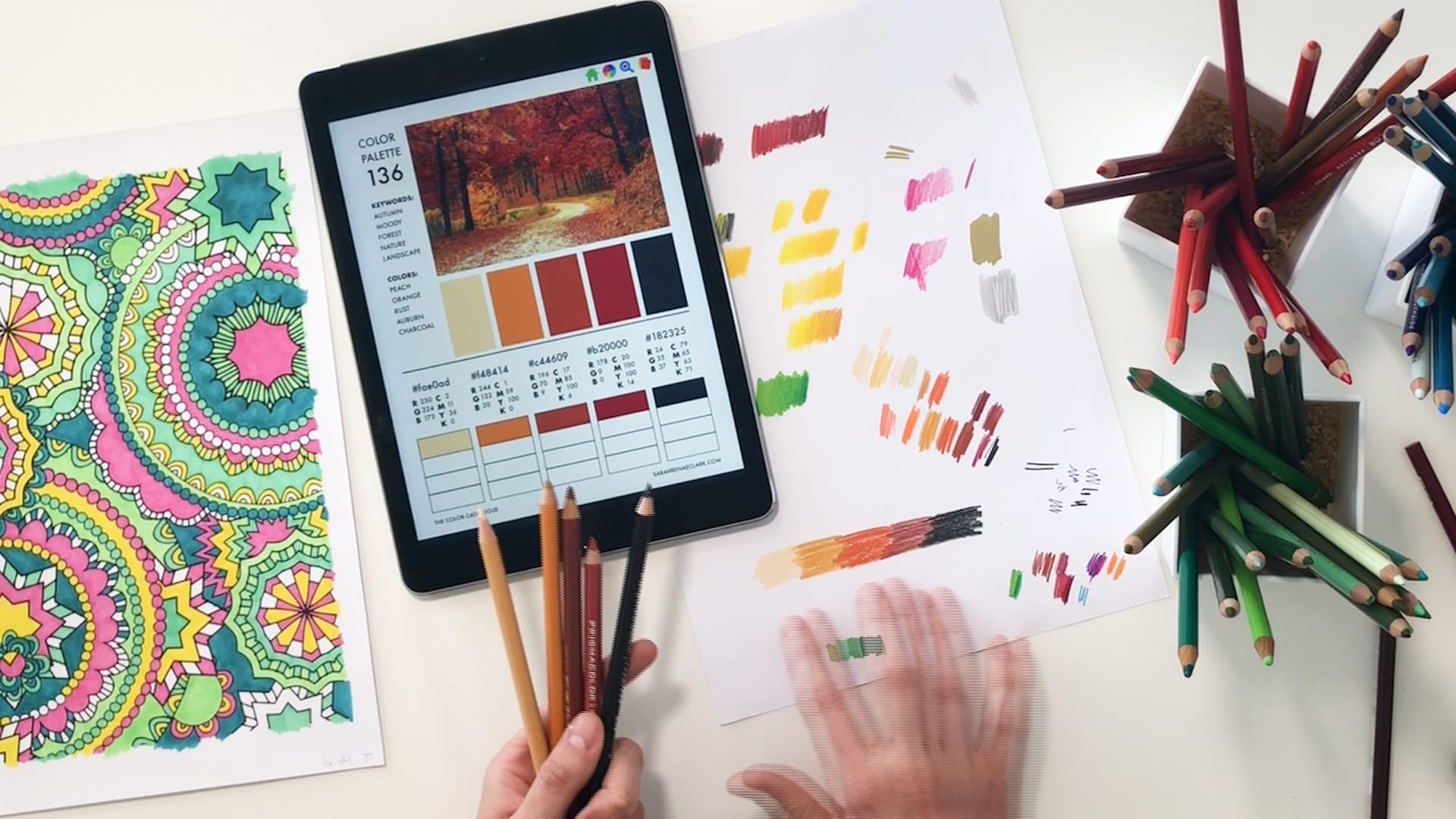
The simple way to do this is just to test your pencils on a scrap piece of paper until you find a good match. You can also print out your color palette so you can try your pencils right against it – just remember that some printers will fade the colors and they won’t be as vibrant.
In a few weeks, I’m going to be releasing an add-on to the Color Catalog called the Color Catalog Companion. It will include the best color matches for Prismacolor pencils, Faber-Castell Polychromos pencils, Copic Markers, Tombow Markers, and Spectrum Noir markers. Using this, you’ll be able to easily find the best color pencils or markers for each color palette in the Color Catalog. Subscribe to my emails to find out when it is released!
Once you’ve chosen your 5-6 main colors from your color palette, you can get a bigger variety of colors by using some of those things we talked about in our first tip – find a darker and lighter version of each color so you can create your own shades and gradients, to make your color range a little bit bigger.

How to color like a pro
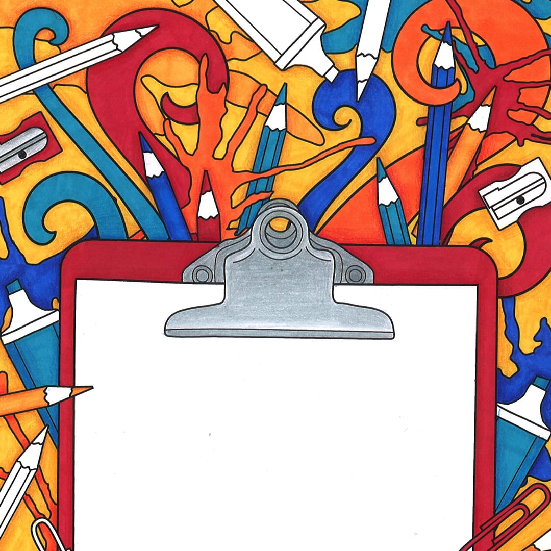
So I just wanted to show you one final picture where I have taken all of these things we’ve talked about and I put them together.
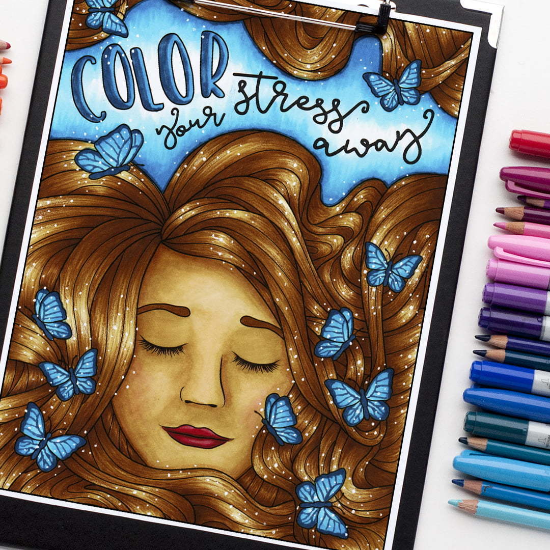
Now, you might look at this and think “that looks too advanced”, but let’s just break it down:
- I’ve used dark blue and light blue gradient / shading on the words.
- The background is simply a dark blue, blended into a medium blue, and then into white.
- I used a blue pen to add details in the butterflies wings. Then slight shading when coloring them in.
- There are a lot of white highlights. Lots of dots on the hair and background to add a “sparkly” feel. A few stars too.
- The hair has been done in 2 steps: First, I choose a dark and light color and picked areas I thought would naturally be darker (areas that are hidden from light) and areas that would stand out. This was a bit of a guessing game, because it was my first time coloring hair! I did this with Copic markers. Second, I used a pencil on top of the marker to draw lots of fine lines (very lightly!) to create the hair texture.
- The face is probably the hardest part of this picture, but essentially it involves the shading technique, with a little more guidance. Use a photo of an actual face or tutorial to work out which areas of the face should naturally be darker, and which areas are lighter.
- And finally, I used a color palette to help me decide on the blue in the background and butterflies of this photo, because they worked well with the browns and skin towns.
At first, this coloring page might look a little bit more advanced. But when you break it down into steps, it’s achievable even for a beginner.
You’ll get there if you just keep practicing, work on implementing some of these beginner coloring tips, and stretch yourself a little more each time you color.
I would love to see what you create from this guide, so please pop over to my Facebook group and show me what you’ve colored!
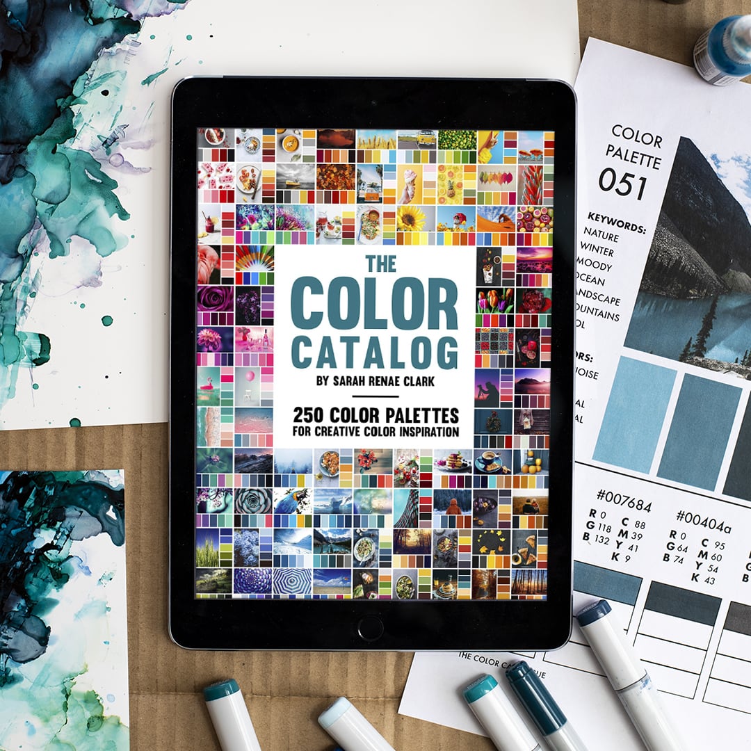
I’ve created The Color Catalog Volume 1 & 2 to bring you 500 color palettes to choose from!
Find the perfect color combo for any project and get inspired to try something new. Store the PDF on your mobile or tablet to find a color combination by color, keyword or collection in just a few taps. Or use the printable version to test out your own pencils or markers against each palette.
You’ll never be stuck for colors again.


thank you
Thanks for the helpful tips! I’ve been trying to improve my adult coloring skills, and these tips are sure to help. I especially like the tip about using a color palette to choose colors. I’ve always struggled to know which colors go well together, but a color palette will make it much easier. I’m also excited to try the tip about adding highlights and details with a white and black pen. I think that will really make my coloring pages look more polished. I can’t wait to try out all of these tips and see how my coloring improves!
Sarah, you have been a friend. for YEARS even though I have never met you in person. I am very glad so many other people appreciate you. Now I am 70 years old & officially an Artist. You set a wonderful example of a sincere, considerate business woman. You know, a real person!
Hi Sarah,
Random question but what eyeshadow palette did you use for adding the glitter to your inspirational quote page? It looked really cute!
Thanks for all the tips,
Sarah xx
It was a palette I was given by Ace Beaute
So much NEEDED Information. THANK YOU!! How you stay in a fun loving creative fun filled Doing Videos and typing is SIMPLY AMAZING!! I Will get your color catalog as soon as I can.. I am going to work on helping to support ..Donating. You buy so so much..And your Time is ALWAYS IS NEEDED TO HELP..So Valuable.. Honestly I can tell You LOVE what you do.. I will admit I don’t even want to ask for help on coloring if I am not contributing..(I seem go back to a beginner. too often, My kidney disease CKD kinda runs my life.. Which puts me down..sorry TMI) JUST..I CAN’T THANK YOU ENOUGH.. You make me smile..laugh.. that is a treasure for many to get in life..Hugs to you and your Family. Please tell them Thank You for the time you spend with us.. & I am NOT very computer literate..even doing emails..lol..