
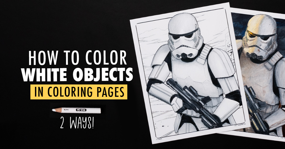
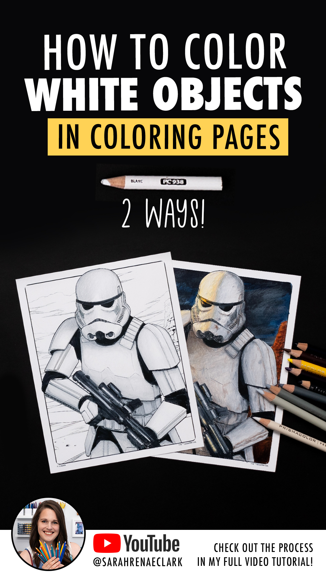
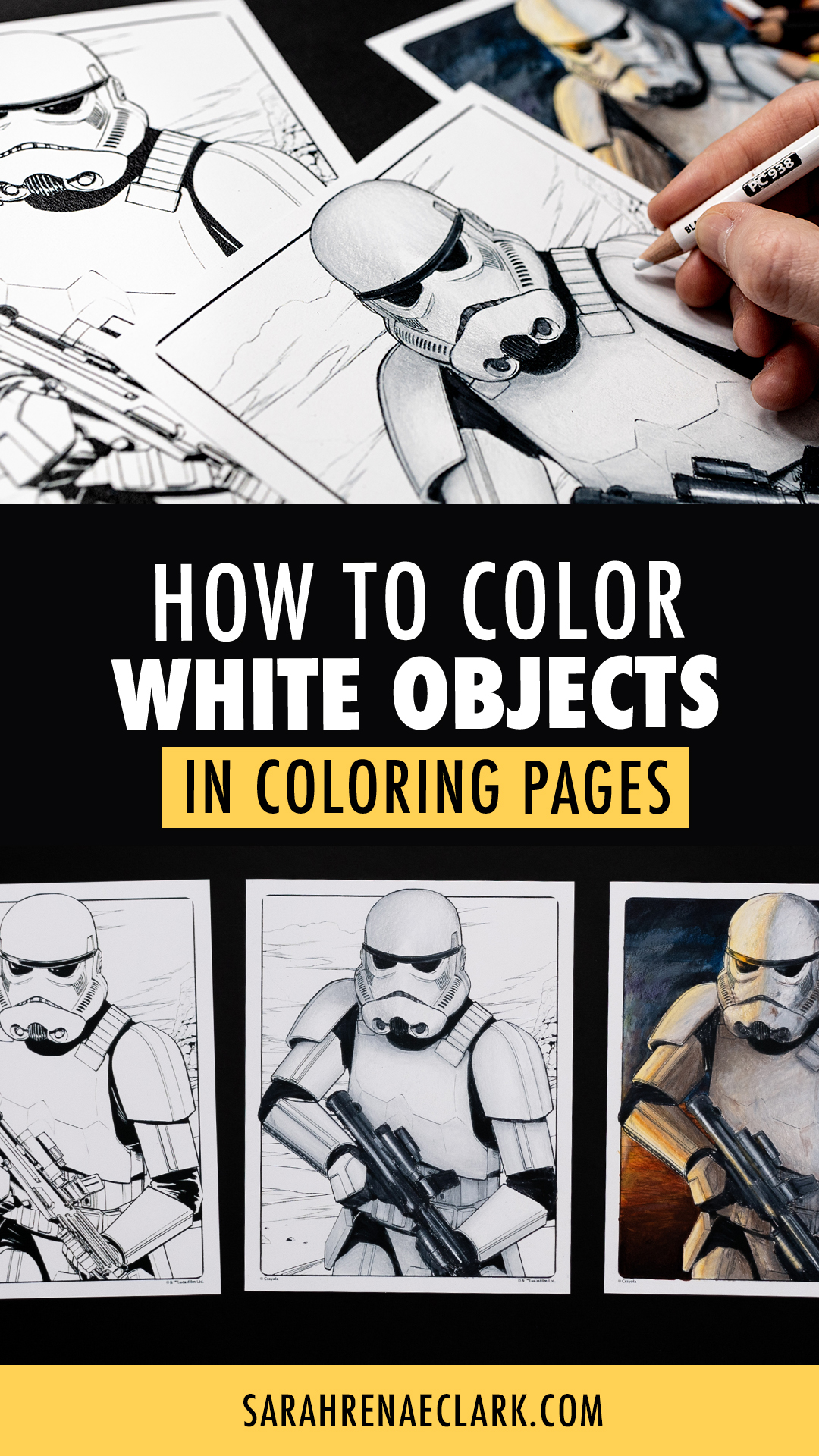
White characters and objects have been one of the most requested tutorials on my channel… because how do you color a white character on a white page?
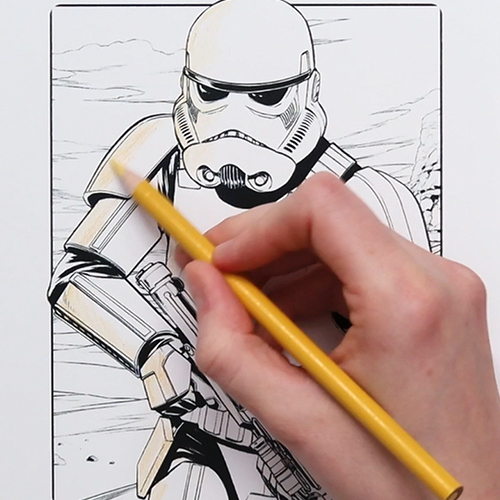
A few weeks ago I joked about coloring in a Stormtrooper coloring page because Stormtroopers are already white… and then I got so many requests to actually do a tutorial, that I decided to color it in today!
Because coloring white objects isn’t as confusing as it sounds, and the end results can be pretty cool.
Watch the full tutorial below, then scroll down for a closer look!
Disclaimer: This post contains affiliate links and I may earn a commission if you click them and make a purchase (at no cost to you).
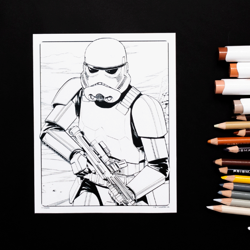
If you want to try this for yourself, you can grab a copy of this free coloring page from Crayola’s website here. I only recommend using websites like this that have a license to distribute these pages – here’s my huge list of other reputable websites where you can find free coloring pages from artists and publishers online, legitimately!
Resources I’m Using in this Tutorial
- This free coloring page from Crayola
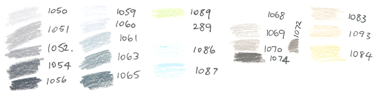
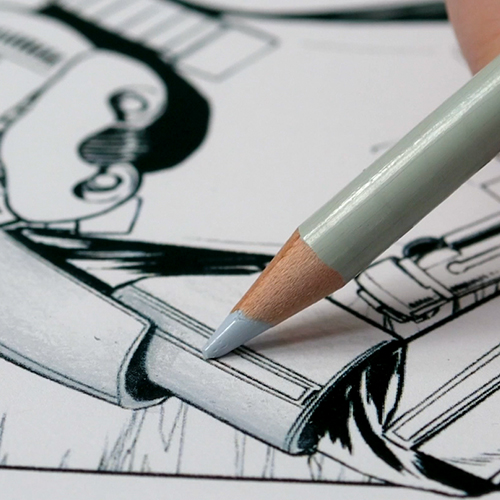
- Prismacolor Premier Soft-Core Pencils
- Ohuhu alcohol brush markers (advanced example only)
- Neenah Bristol Vellum Cardstock
Check out some of my other favorite pencils here or paper recommendations here!
How to Color White – Using Reference Images
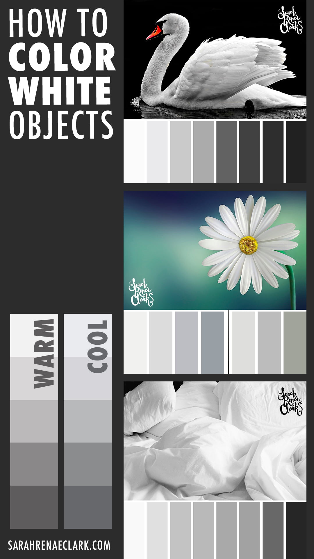
Whenever I’m unsure of how to color something, I always start by finding a reference image. Looking at other photos or images can help you see what colors make up an object and the same applies to white objects.
So before we start coloring, let’s quickly take a look at some white objects and see what colors and shading.
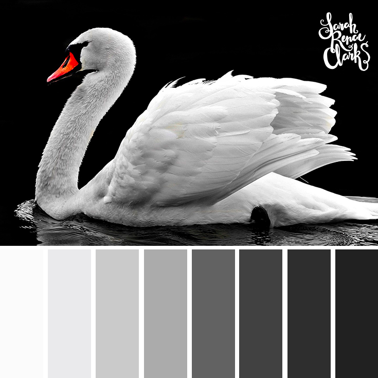
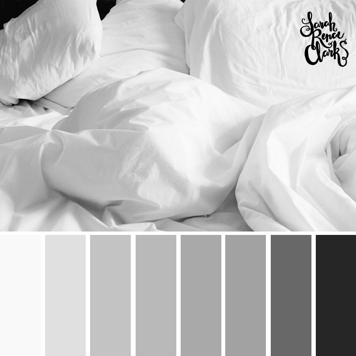
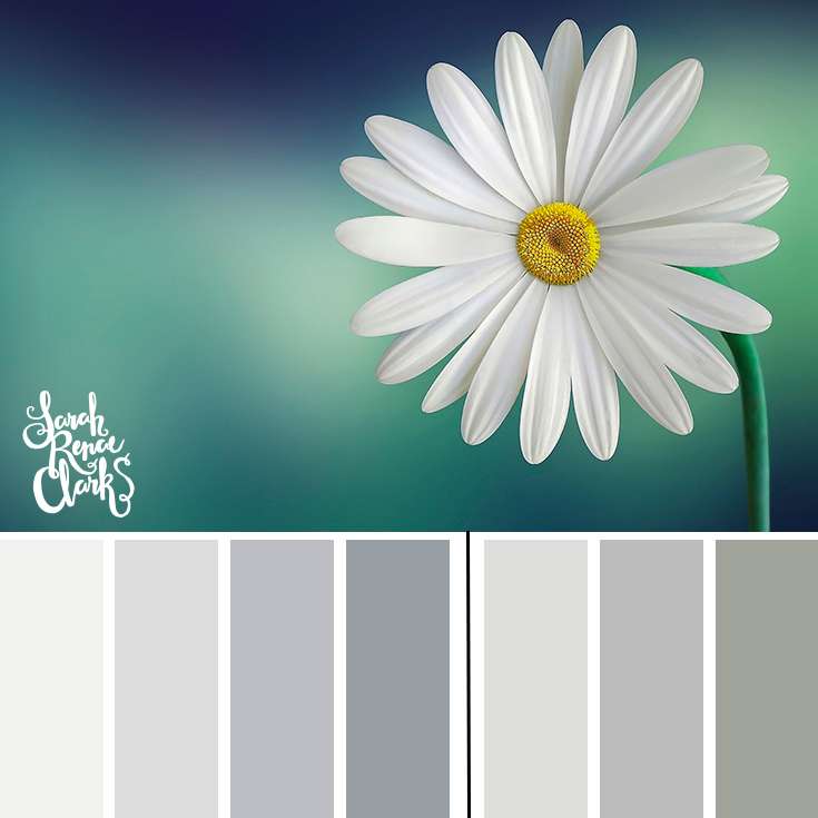
In each of these examples, you can see that the white areas are made up of a variety of grays from the same color family, determined by the lighting and environment.
The color family changes if the lighting changes, so multiple light sources can change the different grays, as you’ll see in the second example we’ll be coloring soon.
But the simplest way to color white is to choose ONE color family (i.e. warm grays or cool grays) and only use these colors to build up the highlights, midtones and shadows, like we discussed in my beginner shading tutorial.
So… to our Stormtrooper.
If Stormtroopers were actually colored white, they would look like this:
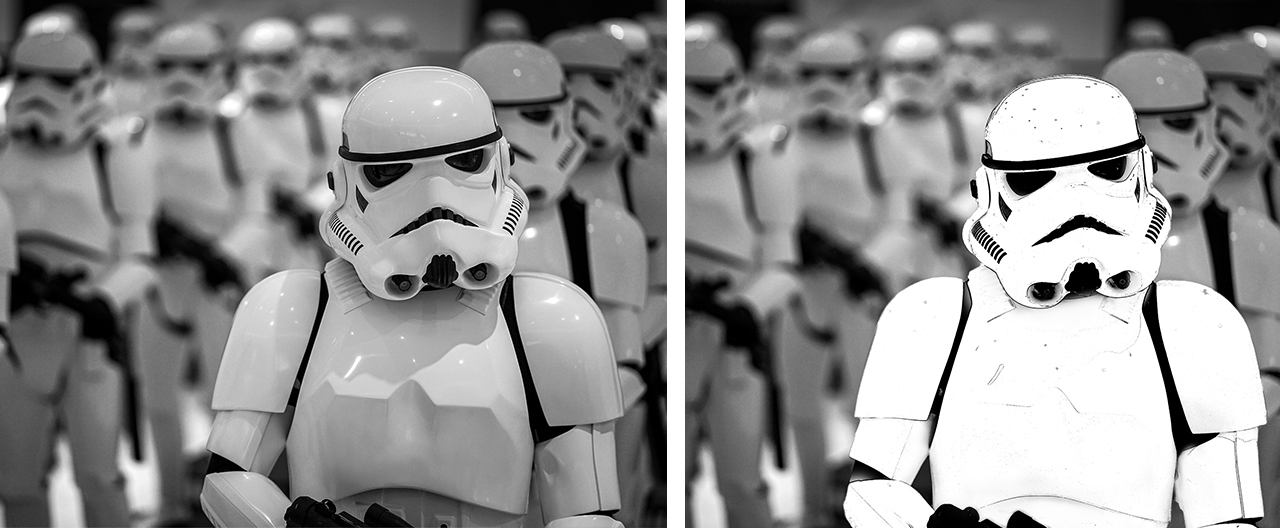
But instead, the white we perceive is actually made up of a range of other colors, determined by the environment and lighting around our character or object.
How to Color White – Choosing Colors
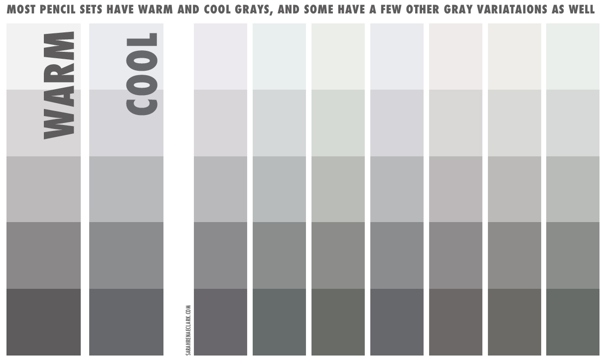
Now that we’ve seen the colors we need, take a look at your colored pencils and see what you have.
Most pencil sets have a range of grays that you can use as a starting point. They’ll usually include at least a warm gray set and a cool gray set, and often a green gray as well.
Any of these will work, depending on the colors you are using in the rest of your image and the mood or lighting you are wanting to create.
The cool gray is generally a good place to start if you are unsure.
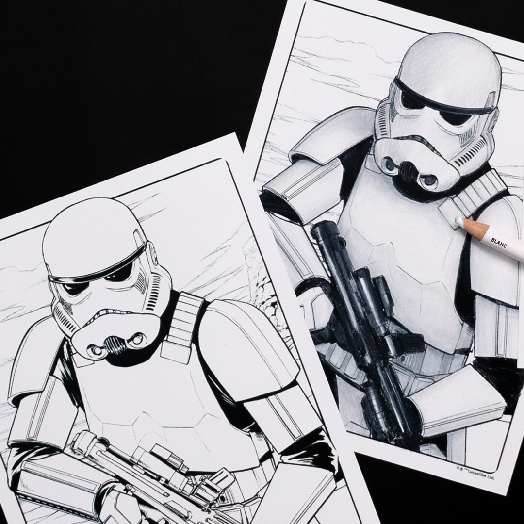
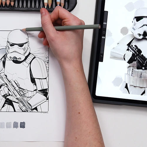
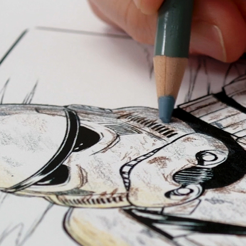
How to Color White – Basic Method
Start shading your white in the same way you would shade any other color. Your white or lightest gray will be your highlight color, your middle grays will be your midtones, and your darker grays will be your shadows.
If you need help, check out my beginner shading tutorial here or watch the above video to see me do this.
Start out light until you get the hang of it, and then bring in darker grays as you become more confident.
The easiest way to know where to add shadows is to use a reference photo if you have one. But once you’ve done this a few times, you’ll start to intuitively know where the shadows should go.
Your reference photo doesn’t have to be a perfect match to your picture – it is just a guide to help you see how light bends around certain shapes or where shadows might fall.
Keep your layers light and you’ll find that you can do a lot of your shading with a single color.
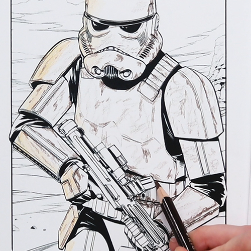
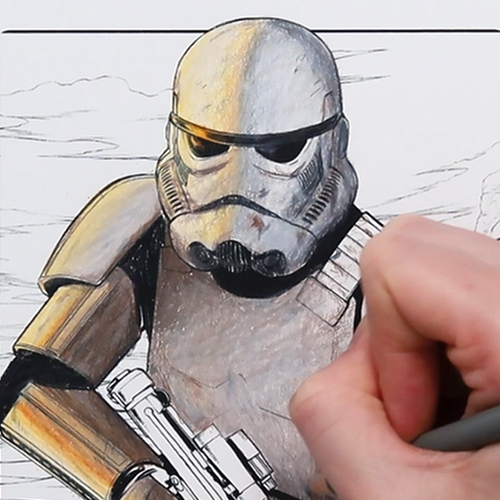
In fact, I chose 5 colors for this and I’m only really using 3 plus my white. You could do all of this with a single color and just adjust your pressure, but I do love using the extra colors available to add a little bit of volume and to make the blending easier.
As I’m moving towards to bottom of this image, I’m using more of my darker tones, because these areas won’t get as much natural light as my Stormtroopers arms and head. Although I think I’ve gone a little darker than I would have liked in a few of these areas.
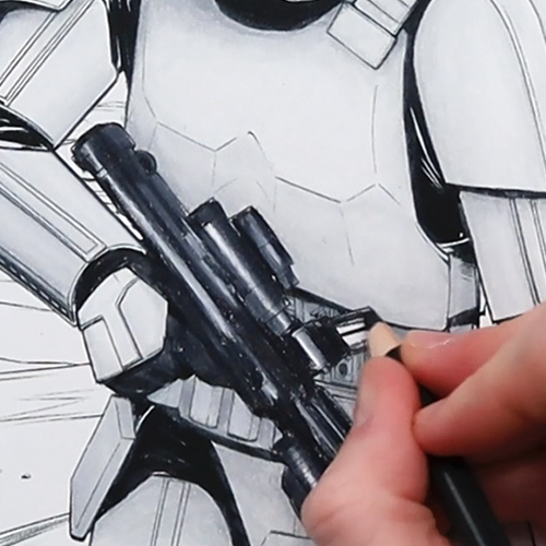
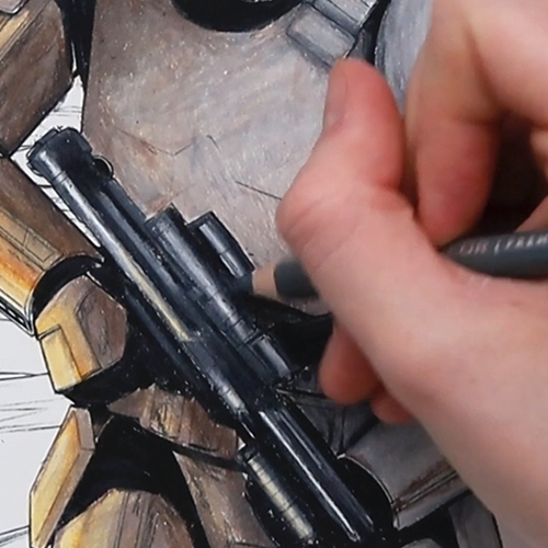
Now for the Blaster Rifle. Coloring black is a bit like coloring white, in that we don’t just want to use a black pencil – we want to use a mix of colors to create some depth. In this case, if we used just a black pencil, we’d lose all the detail and end up with a silhouette.
I’m using 2 dark grays and my white pencil to give me the shading and highlights. I’ve done the highlights first and blended them out to the darker areas.
With my Stormtrooper done, you can see the huge difference some basic shading has made from the original white drawing.
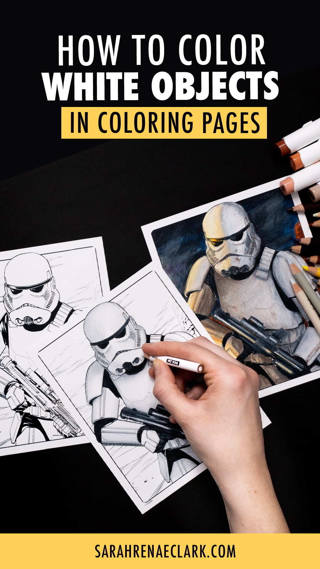
Coloring with Advanced Lighting and Textures
In my first example, I’ve used a very basic lighting technique and simple texture that you can try on most white objects.
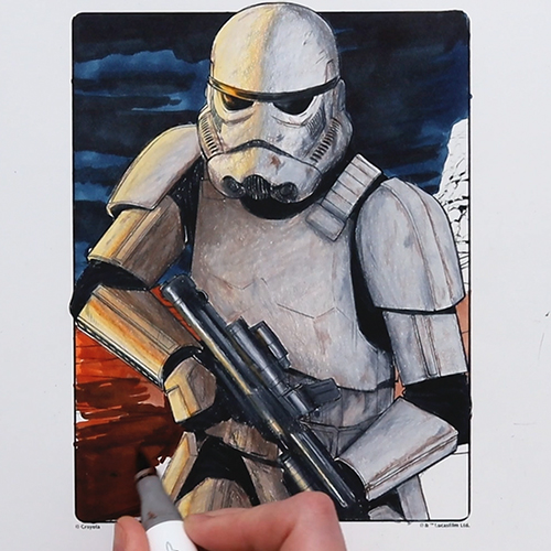
But what if our Stormtrooper finds himself in a bit of a tricky situation?
I’d love to try coloring this page again, but using some lighting from another scene from one of the Star Wars movies or games where the environment isn’t perfectly lit and our white character doesn’t look so picture perfect and clean.
I’ve chosen this picture from Star Wars Battlefront, where there are multiple light sources, a lot of texture on our character, and a much bigger range of colors in the white.
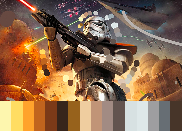
We’ve got a warm golden light coming from an explosion on the left, and a cool light coming from the environment on the right.
This is creating some interesting shadows right down the middle of our Stormtrooper’s face, and there’s a lot of texture in our Stormtrooper from the damage done through whatever he has faced up to this point.
Here are the Prismacolor colors that I’m intending to use in this image (although I may not use all of these by the end)

How to Color White – Advanced Method
When it comes to using a reference image like this that doesn’t match my image exactly, I’m focusing mostly on the colors and values of the shadows.
It helps that my Stormtrooper is the same character, although his pose is different – so we can’t just copy this image, but we can use it as a guide to create a similar scene in our coloring page.
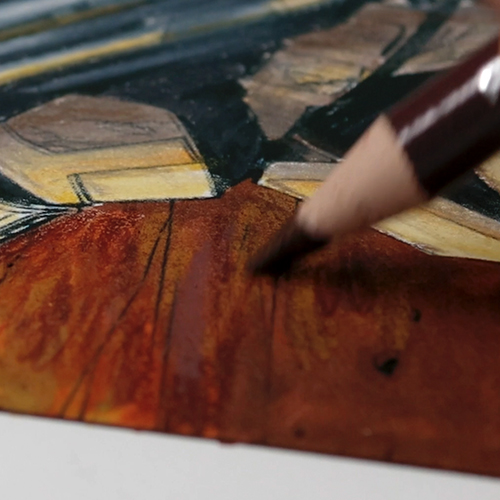
In this case, I’m looking at the colors that the golden shadow has, and I’m using the knowledge I already have about lighting and shadows to adapt this to my own image.
It might take some practice if you’ve never done this before, so that’s where it’s always good to work in light layers so you can make adjustments as you go and darken your colors if certain areas don’t look right later on.
Before I do too much lighting, let’s roughen up our Stormtrooper a bit and add some dust and scratches. By doing this in our base layer, a lot of these scratches will disappear or become less obvious when I add more color on top – so I can go a little overboard now and not worry too much about him looking too damaged. To add the scratches, I’m just using a sharp point on my pencil and just picking different areas to scribble on in small straight lines.
Back to our main coloring, I’m continuing to work in light layers and just build up the shadows. By the end of this, there will be almost no actual white left on our white character – and yet, because we know the context of our character and recognise the role that lighting plays, we can still see that this character is supposed to be white, or at least a light grey metal.
I would never think to put a shadow right down the middle of the face like this, so this is where a reference photo can be a really good way to challenge yourself to try something new. You don’t have to follow it exactly, but it can be a great way to learn light and shade in particular – in fact, I have a whole video about advanced shading techniques where I talk more about this if you want to learn more about my own process.
For the blaster rifle, I’m taking the same approach that I took for the first page – Because even though I wasn’t confident at the time, I’m really happy with how that turned out. The only difference here is that I’ll add a touch of yellow to bring in that warm lighting to match this scene.
Next, the background. Last week, I filmed a video full of ideas on coloring backgrounds – and I am very tempted to try some distress oxides or similar for this background today because I think it would work really well – the only problem is that I only have a few bright colors, and that’s just not going to work for this scene.
So instead, I’m doing a base layer of markers and I’ll use my pencils to add the texture on top. I’ll block out my main colors of the background in markers first, and I’m not too worried about perfect blending because we’ll add that kind of detail with the pencils.
My main goal with the pencils is to blend my background, add a bit of haze and texture, and to create a slight light source on the left to suggest that there’s a war scene in the distance that’s causing our warm light here on our Stormtrooper.
And with that, we’re done.
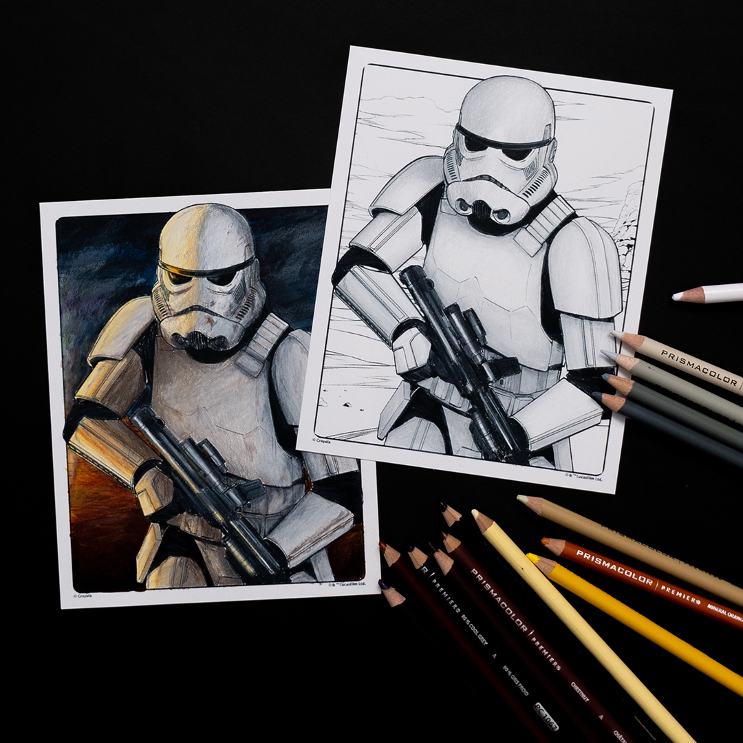
While you might not be ready for a scene like this, I definitely encourage you to give the basic version of coloring white a try. All you really need is a few greys with the same tone, and to follow the same shading techniques you would use for any other color.
I hope you found this helpful – and I recommend checking out my other tutorials on shading to further develop your skills in this area and learn how to make this work for you:


Would like to know what the tablet you used with the circle color selector?
Thanks so much for this information and demonstration of values and shadowing a white object. Ivan working on a wedding portrait using colored pencils and both the bride and groom are wearing white in the reference photograph. And while unsure initially, your guidance Chas helped me to figure out what seemed very complexed initially. My portrait is transforming into a beautiful art piece as a result. So again, thank you very much for sharing this information!