
Amazing lighting makes for amazing art. It’s time to take a deep dive into how shadows work and what makes them look realistic. By the end of today’s tutorial, my goal is that you’ll be excited and ready to create something beyond what you’ve done before, with lighting and shadows that leave your friends amazed and impressed.
This is my second article and video of this series – In the last video I showed a simple version of shading that I recommend watching first if you’re just starting out. You can check it out here.
Let’s jump right in! You can watch the video below or scroll down to keep reading!
Disclaimer: This post contains affiliate links and I may earn a commission if you click them and make a purchase (at no cost to you).

Shading can be an intimidating subject, but it can also be fun – so my goal today is to teach you the essentials, then show you some quick strategies to apply them to your work without needing to study shading for weeks or months before creating something amazing.
We’re going to start by going through the different types of shadows and I’ll show you some examples of these in photographs and illustrations so you can see how they look in different contexts, in both realistic and artistic examples.
Then I’ll show you how to start creating these shadows for yourself in your drawings, and some practice activities I recommend before you try applying these to your final coloring pages.
And at the end of this tutorial, I’ll give you 3 specific strategies you can use to create dramatic effects and increase the impact of your lighting and shadows in your artwork, every time.
The Different Types of Shadows
Let’s start with a brief lesson about shadows.
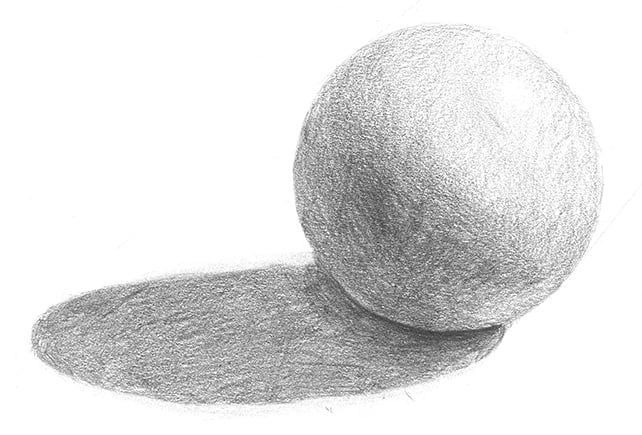
There are two main kinds of shadows – form shadow and cast shadow.
Cast Shadows
A cast shadow is what you create when you cast a shadow – that’s the shadow that appears when your object blocks the source of light from the background or other objects.
Cast shadows can be long, short, any shape, any size, any direction, with soft edges or hard edges – all depending on the light source or light sources that are casting them.
One of the best ways to learn to draw cast shadows is to use reference images and photographs to see how light acts in real life so you can recreate realistic cast shadows in your drawings – but more about that later.
Form Shadows
You can think of the word FORM as a word that describes our object’s 3D shape.
The form shadow is the shadow on the object itself – and this can be separated into a dark side and a light side, based on where out light source is.
By giving our objects a light and dark side – using form shadows – we create depth and make them appear more 3D.
But let’s take it a step further.
Both light and shade can be broken up into further categories that can help us to identify areas in our artwork that need more detail and can help bring our drawings to life.
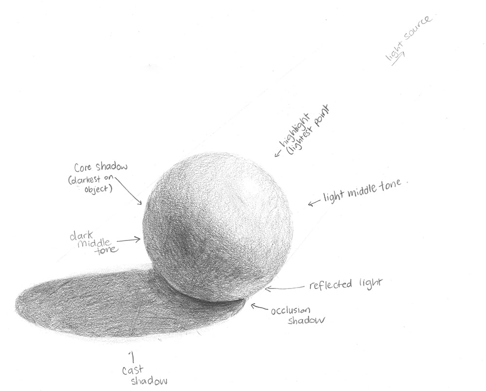
Highlight and Light Middle Tone
Our light can be broken up into highlights and light middle tones. The highlight is the brightest spot where the light source meets the object, and the middle tone is the general area that is receiving light from the light source.
Dark Middle Tone
Like we have a have a light middle tone, we can have a dark middle tone. And a quick tip – The dark middle tone is always darker than the light middle tone – even if they look the same. This is a big key to making your lighting work.
Core Shadow
We have our core shadow, which is the darkest point ON OUR OBJECT that receives the least amount of light.
Reflected Light
This is where your object might be sitting on a white or colored surface and it actually lightens some of the shadows because the light bounces back off the surroundings. Using reflected light beyond the rules of what’s normal can actually be a really creative and interesting way to make your artwork pop!
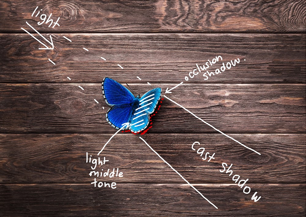
Occlusion Shadows
I explained these briefly in my last video – basically, occlusion shadows happen when two objects are so close together that it’s impossible for the light to reach in between them. These areas will almost always have shadows, no matter where the light source is.
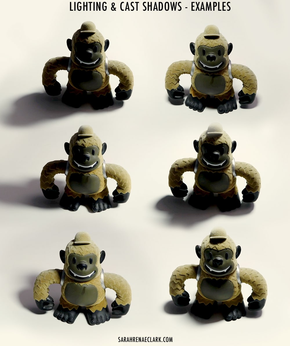
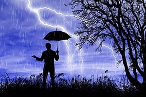
Examples of Shadows in Photography and Art
Enough talk, let’s look at some examples!
I go through each of the below images in more detail in the video, but you can see from my notes where I have identified the different types of shadows that we have just talked about.
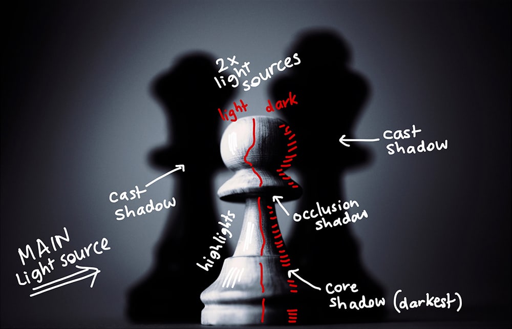
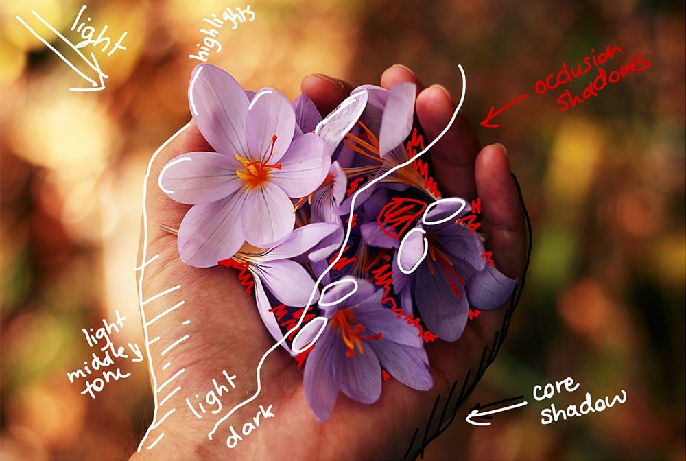
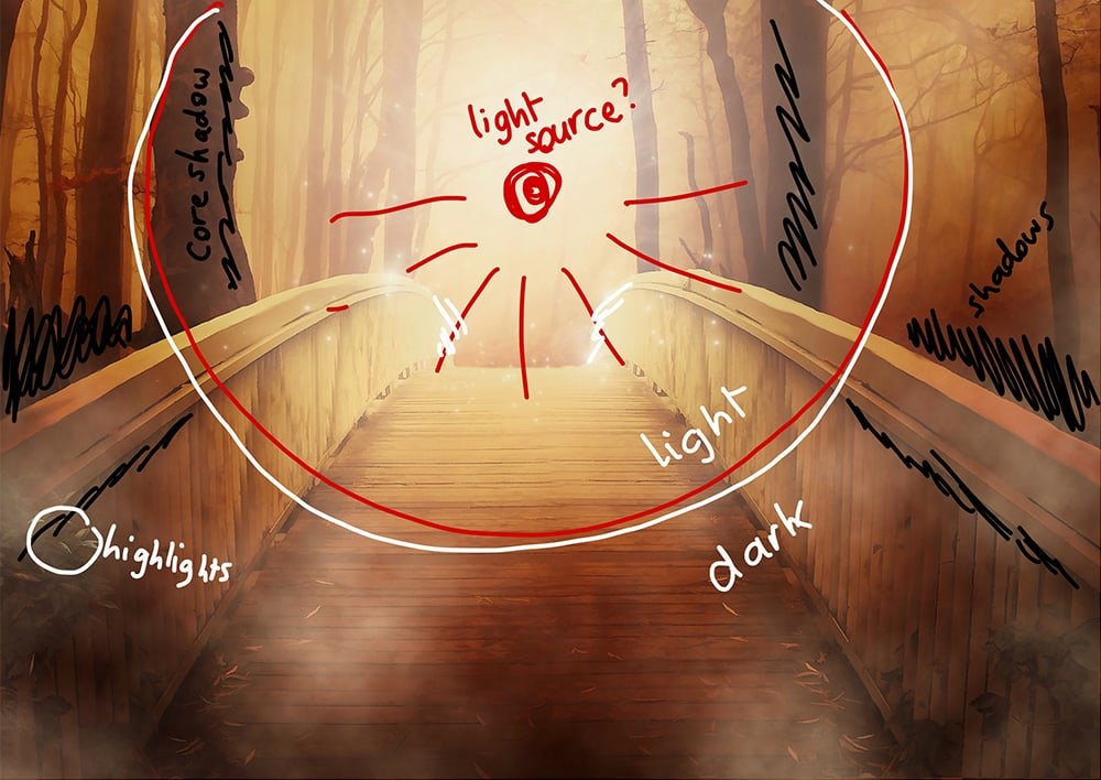
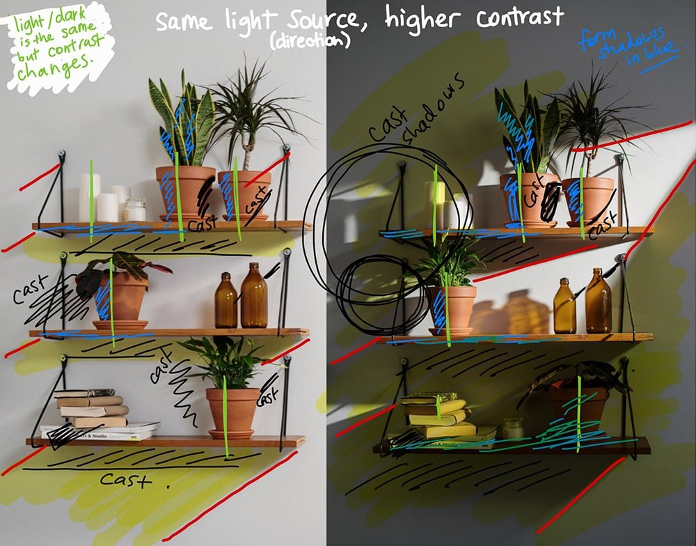
Now, by this point, you might be ready to move onto the drawing, but I highly recommend looking at a few more images for yourself first to see if you can identify the different shadow types. This exercise can help you to become more familiar with how light works so you can apply it to your own drawing.
I have found all of these reference images from websites like Pixabay, Pexels and Unsplash – where you can find an endless collection of other images that you can use for lighting references and inspiration, or as reference images you can trace to draw your own artwork and copy the shading exactly, with a full commercial license included (so you don’t have to worry about copyright).
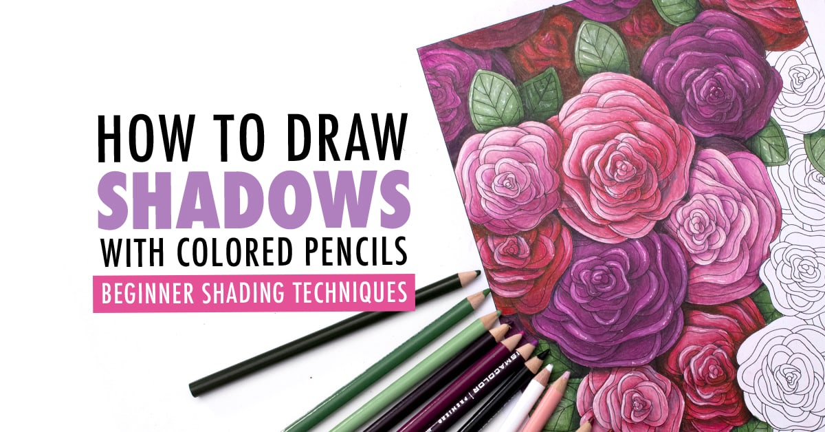
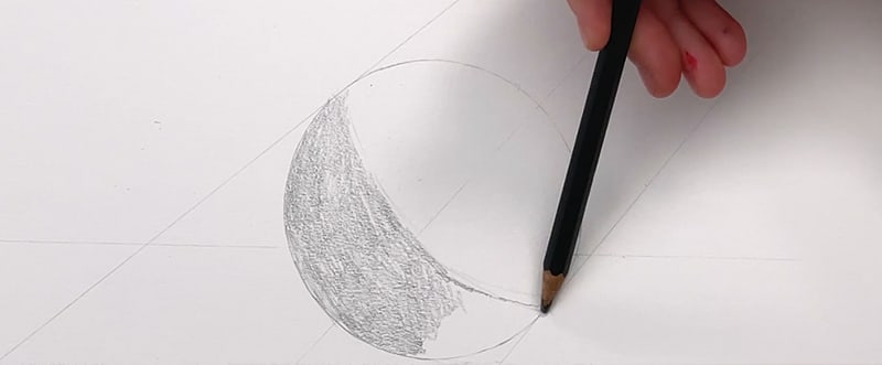
Practicing Shadows with Values
The first step in learning to draw shadows (in my opinion) is to learn to color in black and white… yep, a bit of an oxymoron!
Realistic shadows are all about using the right VALUES.
Our color values tell us how dark or light a color is – and getting this right is the key to making our shadows look realistic.
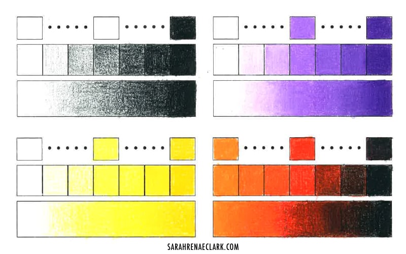
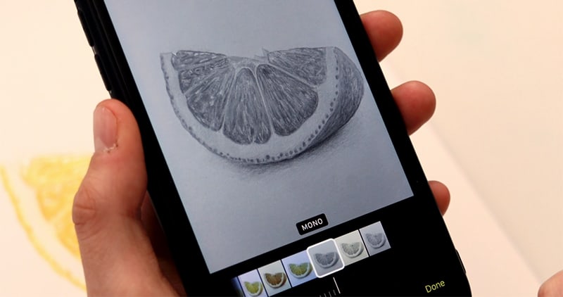
In fact, if you want to know if your color values are accurate when you are doing your final drawing, snap a photo on your phone, convert it to black and white or greyscale in any photo editing app, and see if it still looks right without the colors. This is a great little trick to identify if your lighting and shadows are right!
So before we try to draw shadows with colors, I highly recommend practicing your skills in a single color, or in black and white, FIRST.
Once you’ve mastered black and white, THEN we can convert this method to color, and I’ll show you how to do that in a few moments.
I run through the below example in full detail in the video at the top of this post, but here’s a quick look at the shadows I’ve drawn on this coloring page from my nature collection:
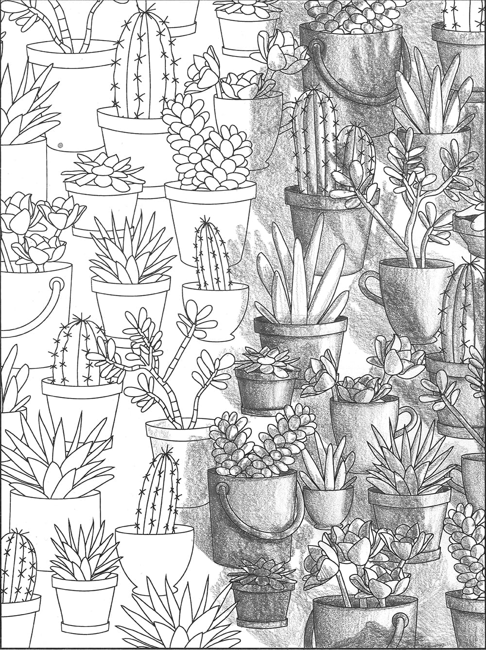
I recommend watching the above video to see me walk through each step of the above picture. The final picture looks complicated, but when broken into steps and done one shadow at a time, it’s not too hard to replicate. I chose a light source in the lower right corner of the picture and started with some form shadows, creating a gradient from dark to light (left to right) on each pot. Then I filled in the occlusion shadows in areas of the pots (like inside the pots) where the light wouldn’t reach. Then I started working on the cast shadows, and imagined where the light would fall if they were 3D.
As you’ll find in your own drawing, the process gets easier as you just start drawing. Once a few shadows are in place, the rest become easier to identify, and the overall picture starts to come to life.
From here, it became a process of filling in details, working on the individual plants, and just looking at each individual object one at a time to look out for any areas that still felt flat.
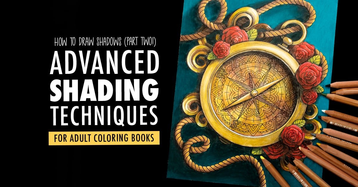
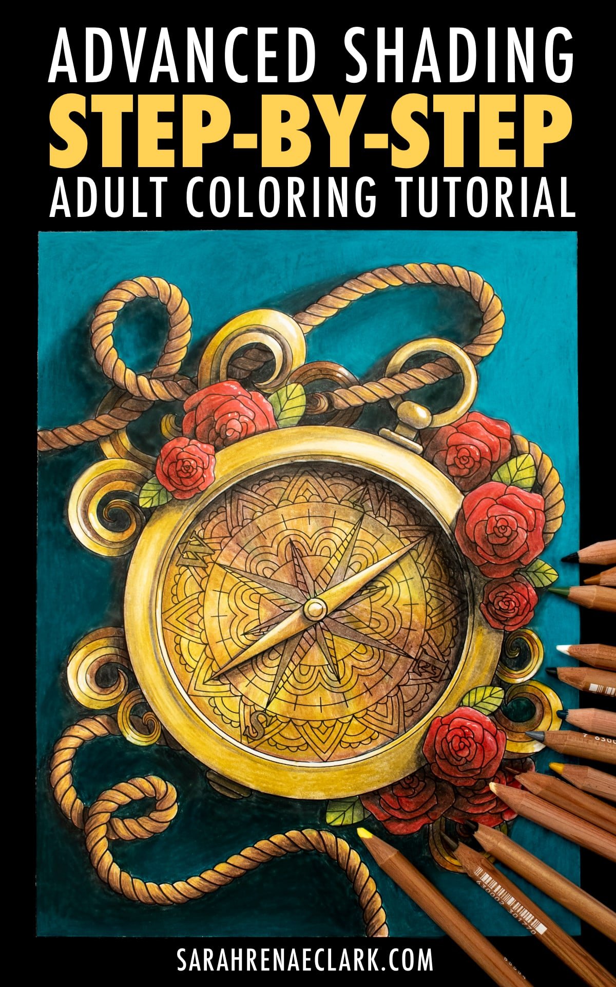
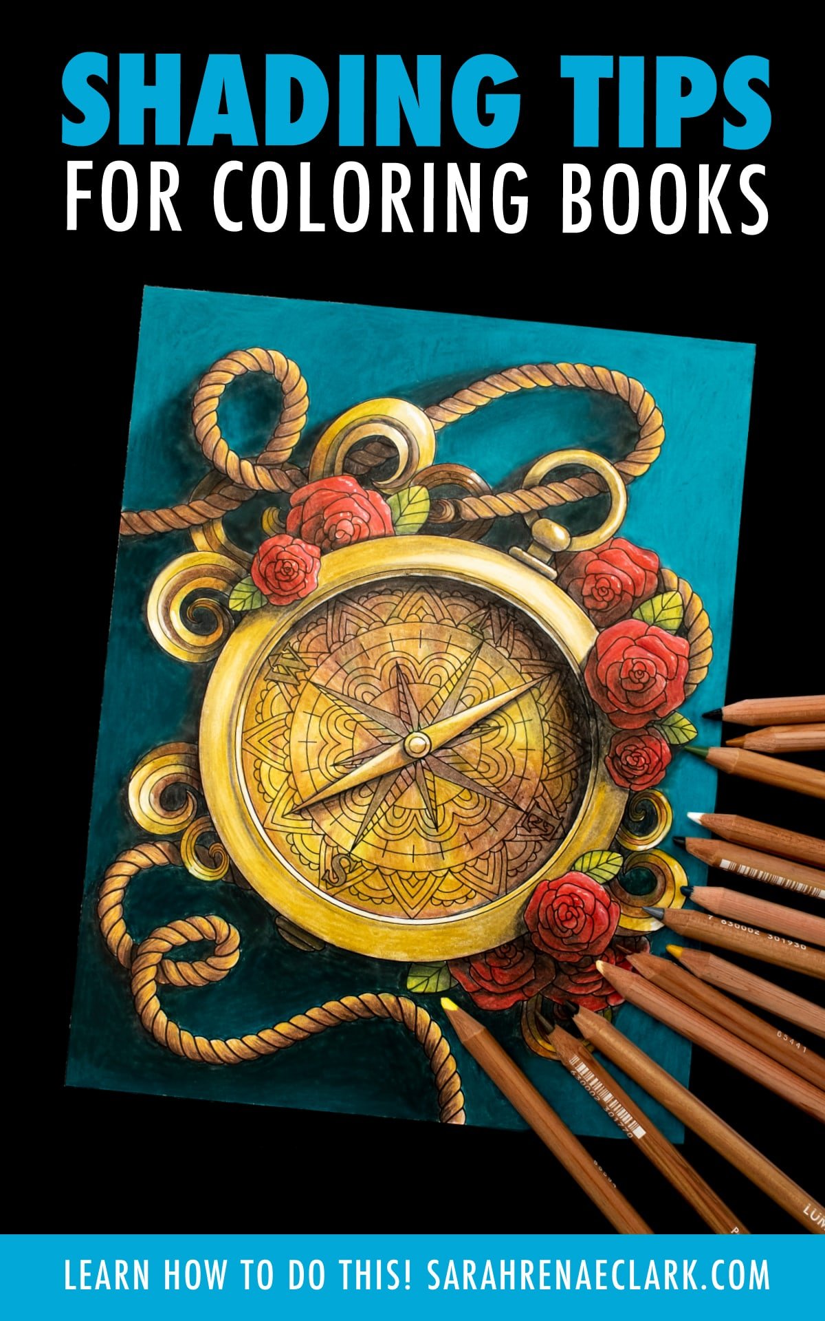
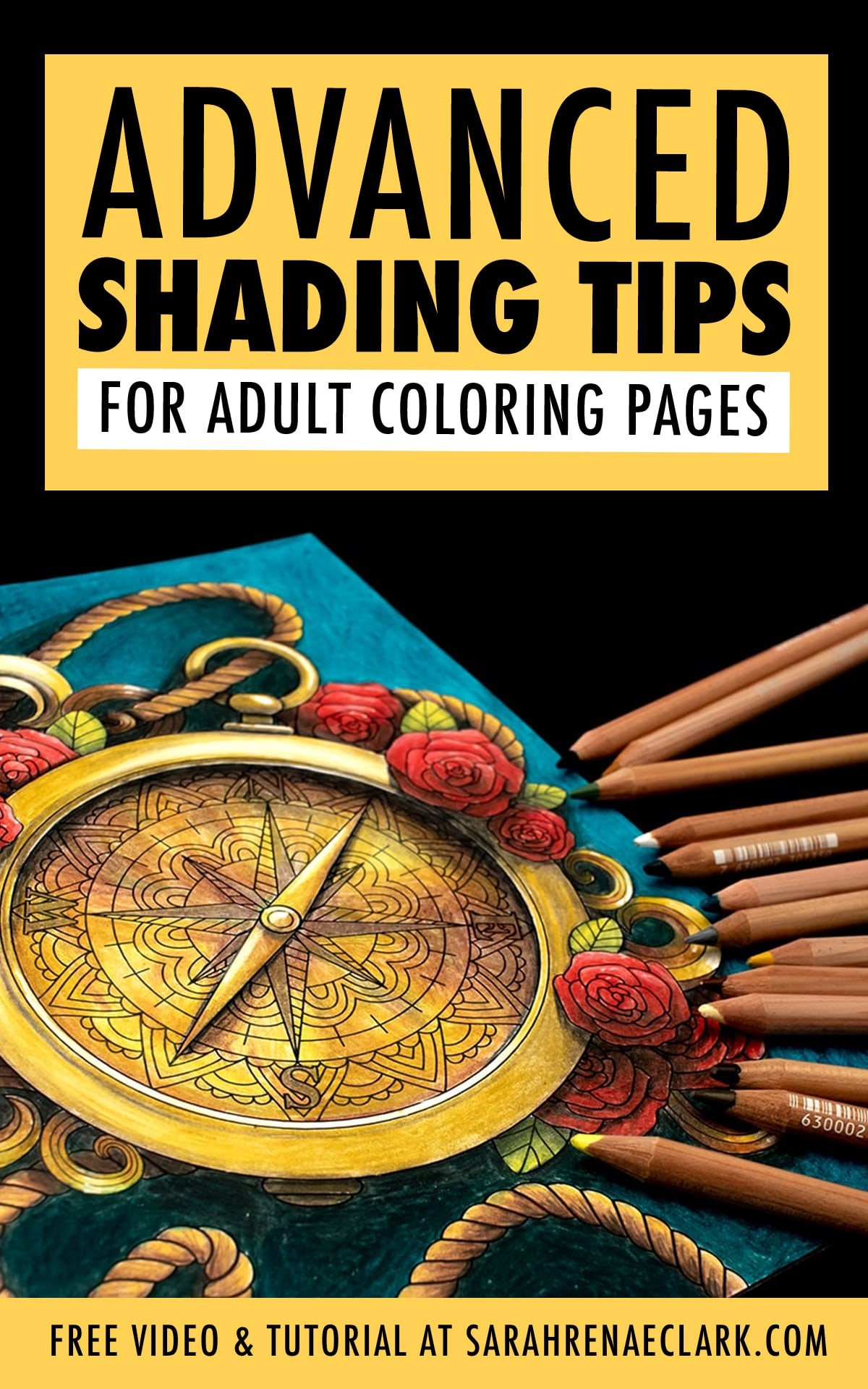
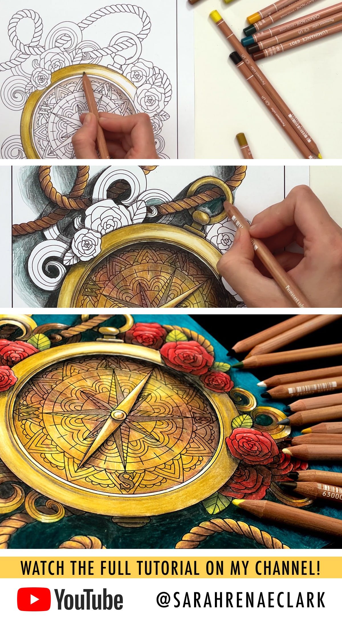
How to Draw Shadows on Adult Coloring Pages
Now, I want to take what we’ve covered and actually apply it to a coloring page!
I will briefly talk through the steps below, but the best way to see what I’m doing here is watch the full video tutorial above, because it covers a lot more detail and you’ll be able to see exactly what I’m doing in each step of this process.
Resources Used:
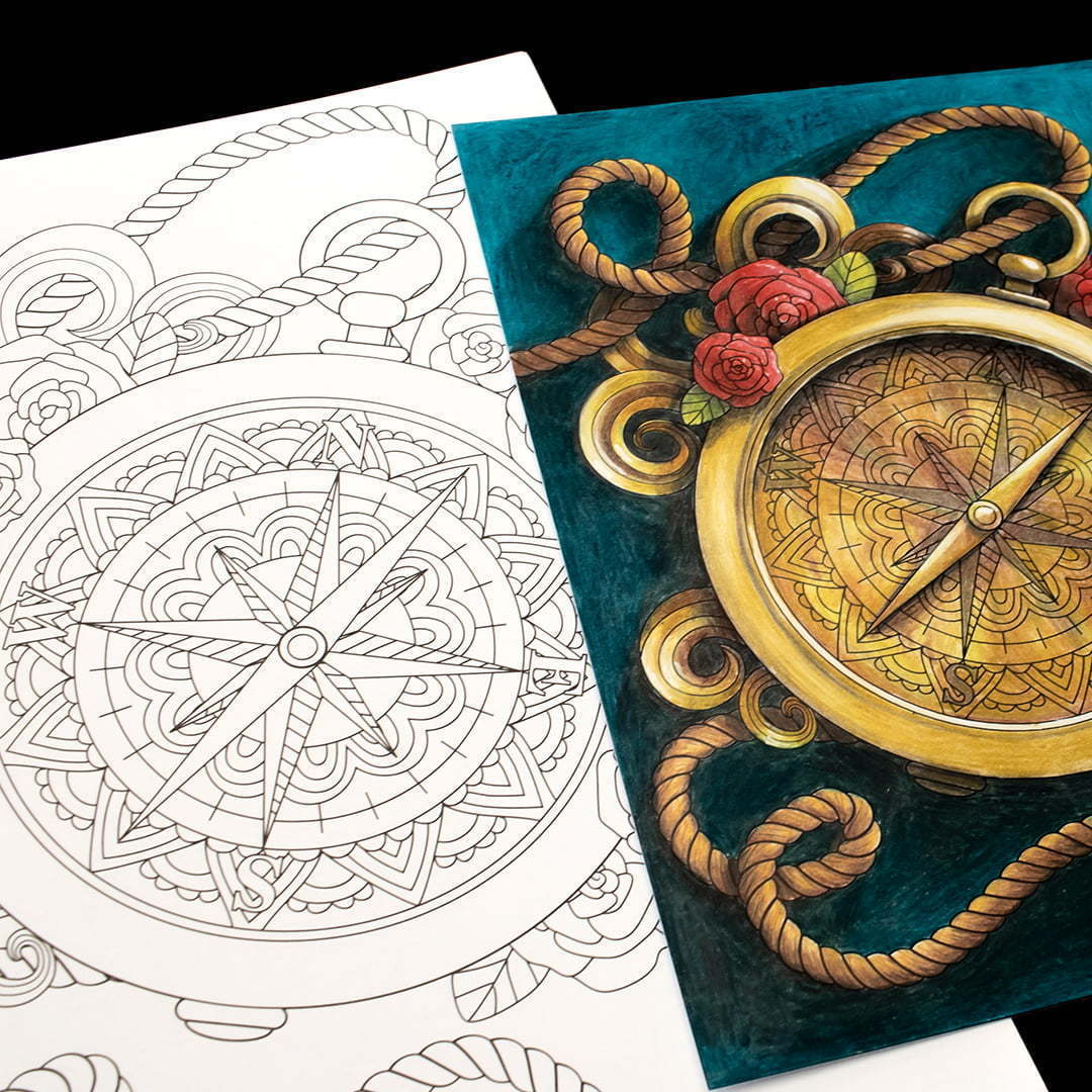
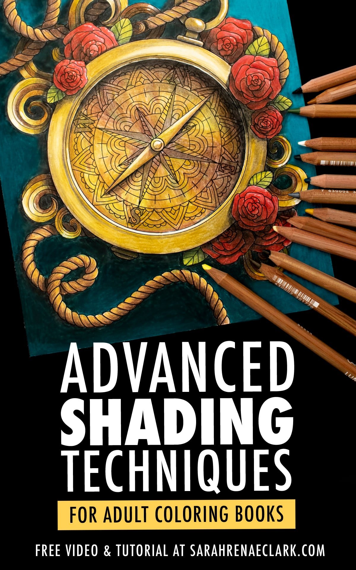
- This compass coloring page from the Maritime Coloring Collection
- Caran d’Ache Luminance colored pencils (Buy on Amazon)
- Sakura Decorese White gel pen (Buy on Amazon) – or see these alternatives
- Reference photo licenced from Depositphotos
- Color inspiration from The Color Catalog Volume 2
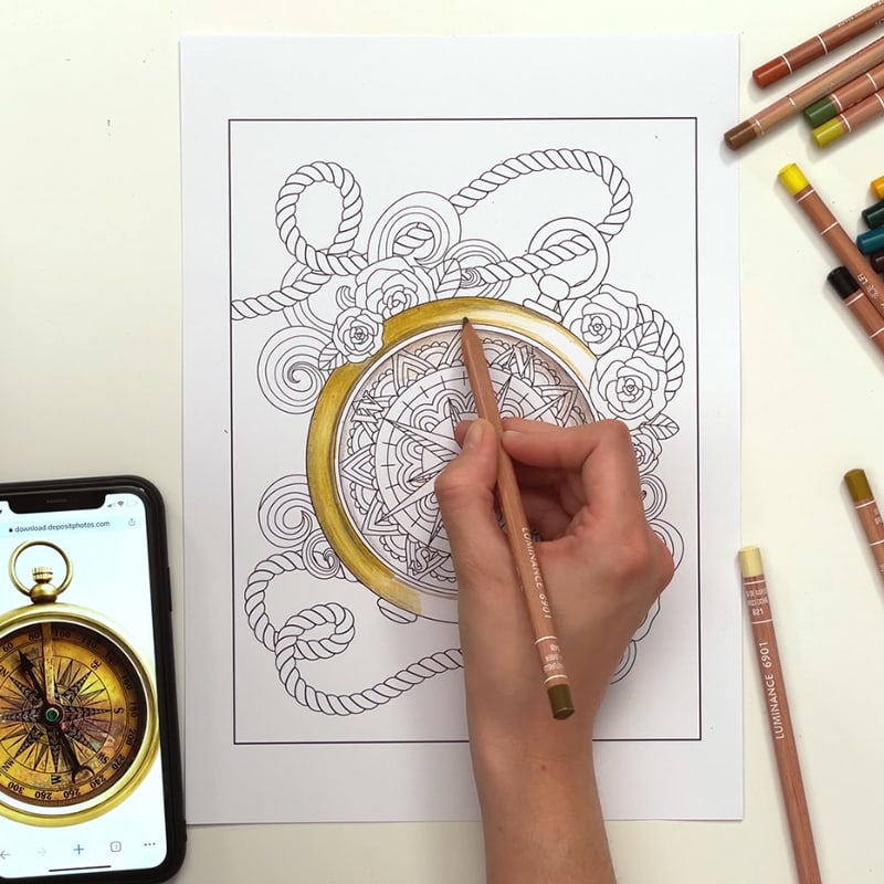
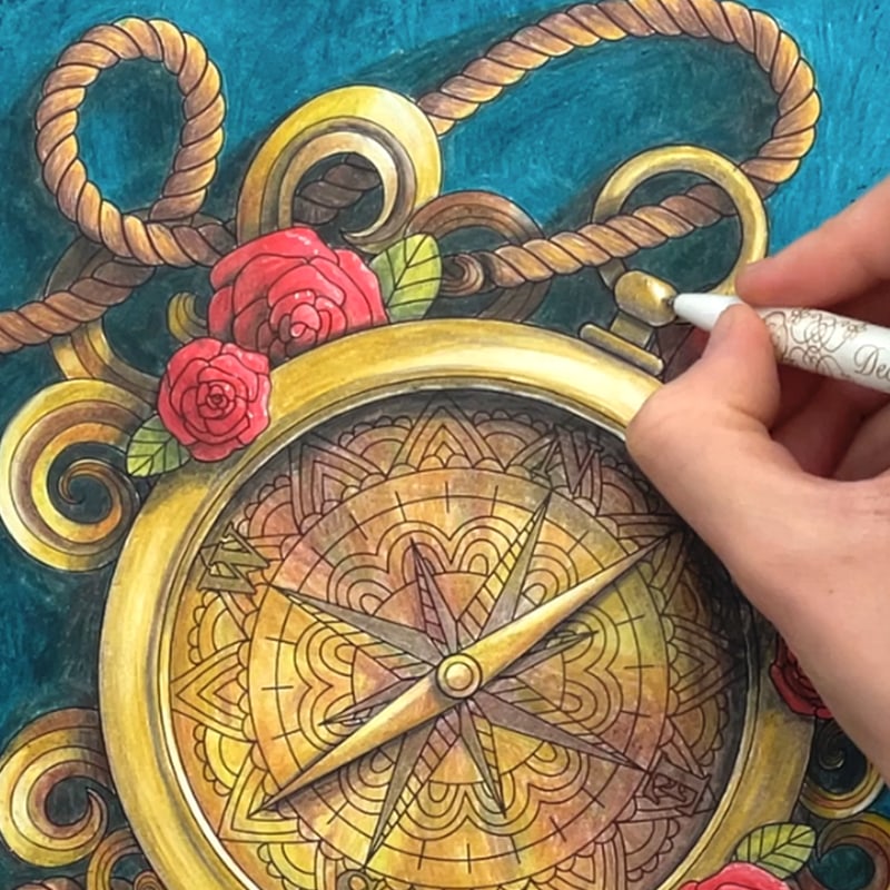
First, I have not colored many shiny objects before, so I decided to find a reference photo to help me create a more realistic compass. Luckily, the picture I found was almost the same angle, so I decided to copy the angle of the lighting as well. I chose some pencils that matched and copied the first most obvious lighting and shadows I could see in the photo onto my page, including the outside rim and the shadow on the inner top right edge.
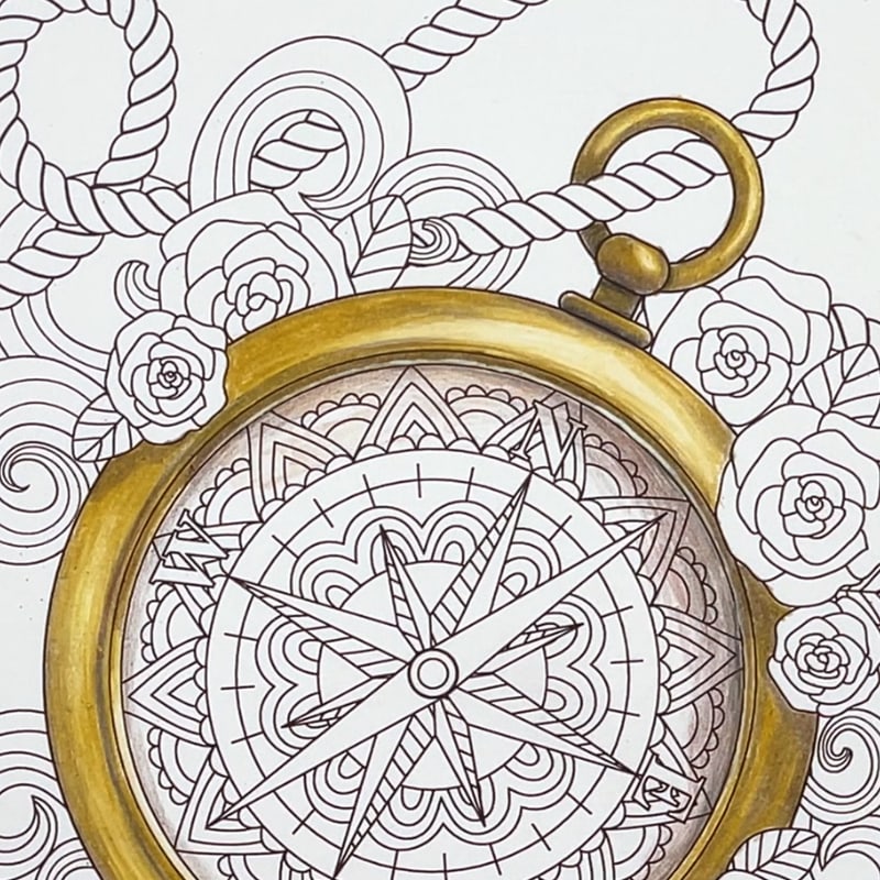
I used the same colors to finish off the other areas of my compass that didn’t match the photo, and just used my own judgement about how the light would react in these areas and where I needed to place additional shadows.
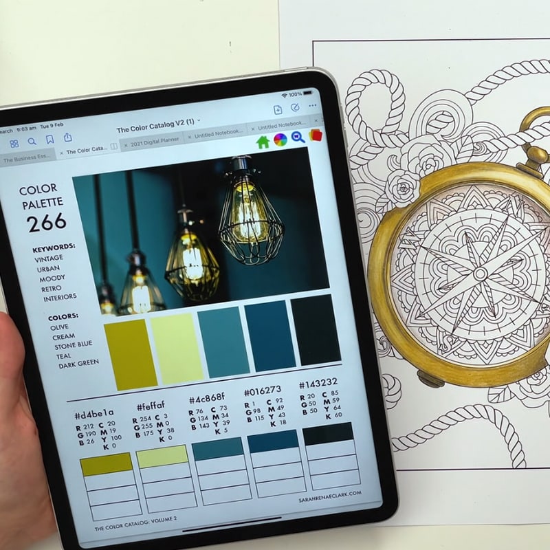
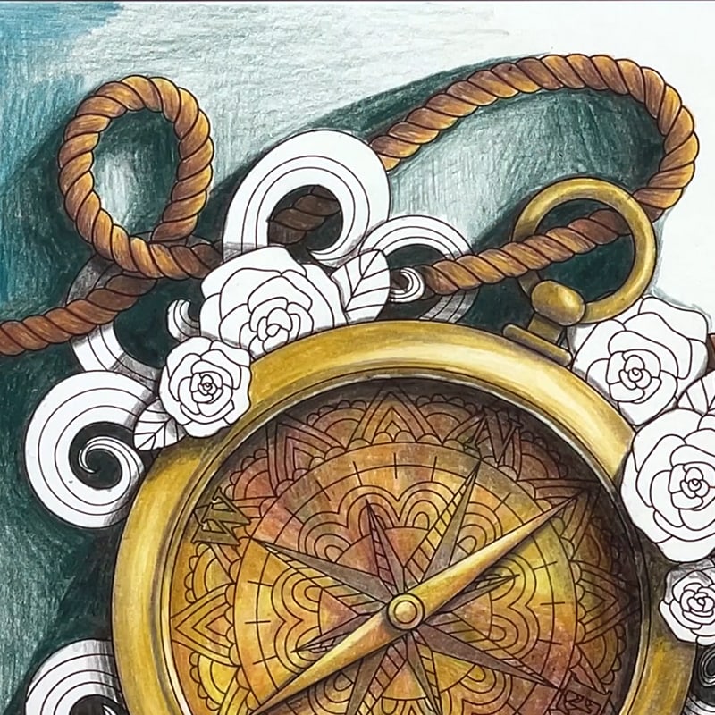
Before getting started on the background, I wanted some help in choosing a color that would look good with the steampunk theme I had in mind for this page, so I found this picture from the Color Catalog Volume 2 that included a similar feel and colors and settled on a teal background… which is a favorite color of mine!
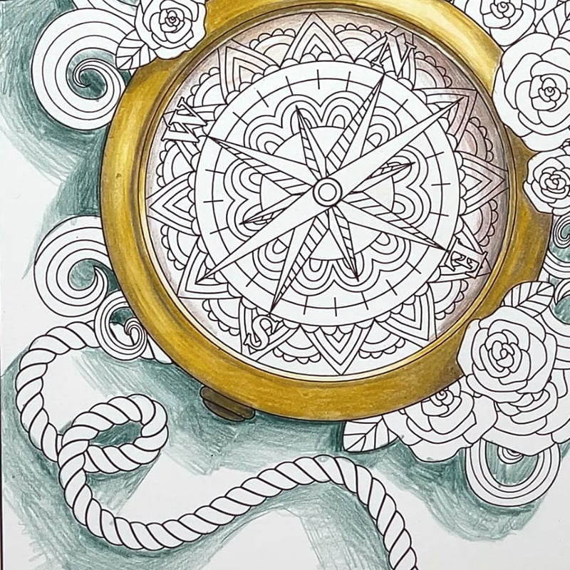
I intended for my background to be quite a strong, dark teal color. But I still wanted varying values to create shadows – so I used values ranging from teal to black by choosing a teal, a dark teal and a black pencil. I started by drawing some light shadows with the dark teal where I thought my cast shadows would go, based on the light source I was using on the compass. In this example, I am going for a strong cast shadow and a lot of contrast. If you aren’t wanting too much contrast, I would recommend avoiding black and using a darker shade of your color instead.
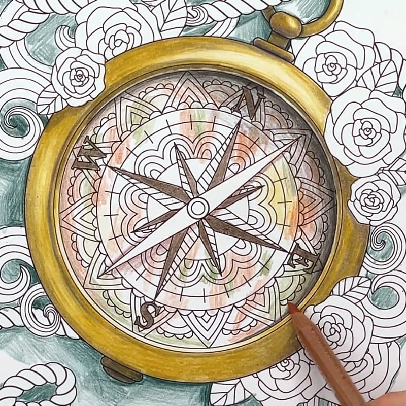
Back to the compass for a moment, I wanted the inside to look like it was quite old and vintage. So I used a mix of colors (browns, yellows, mustard and greens) and created patchy areas of each color – I did this randomly and wasn’t too worried about how it would look – it was just a bit of an experiment! I did try to keep some areas towards the shadow darker than the areas that I expected to receive more light.
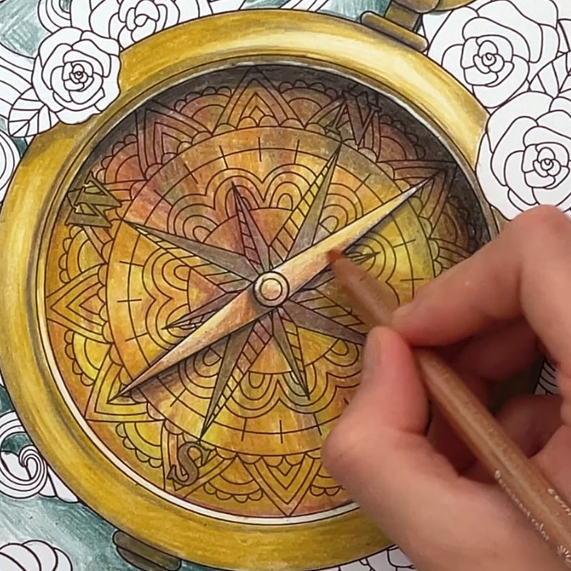
I finished the middle of the compass with a layer of different browns and yellows to burnish the colors underneath, which created the effect I was going for (yay!) and finished by drawing a small cast shadow under the needle, and some shading on top of the needle as well.
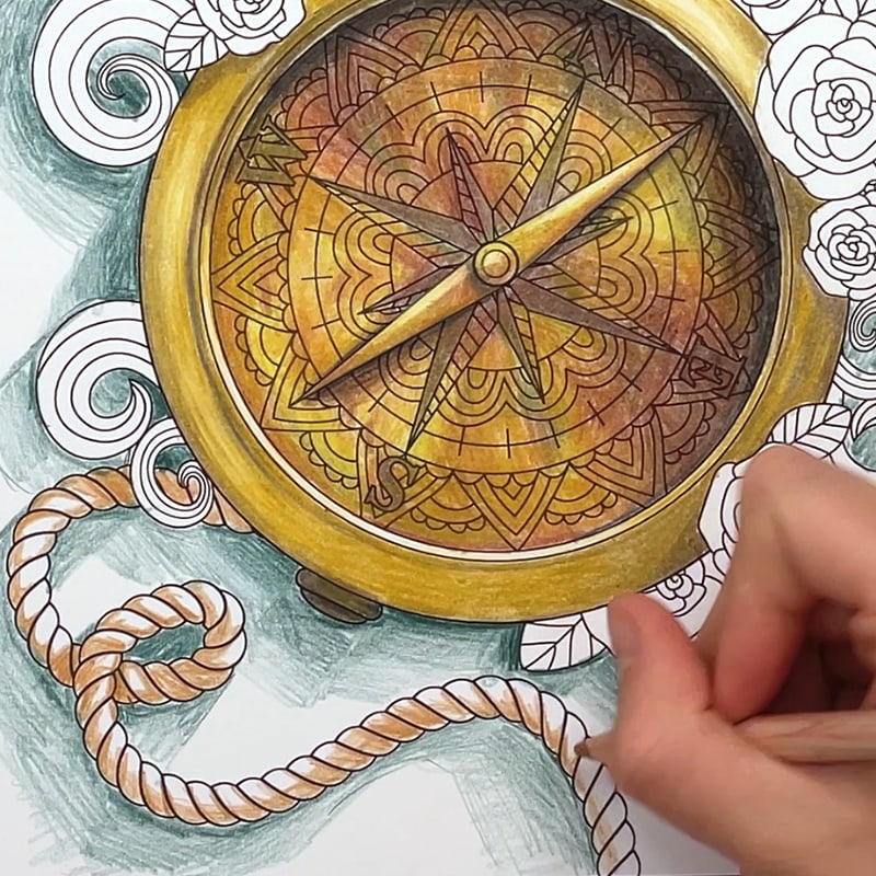
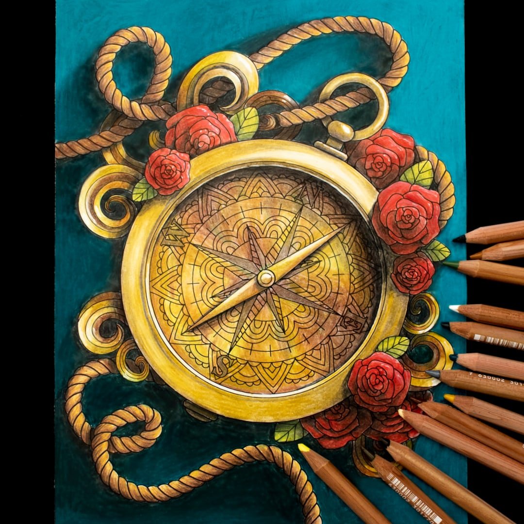
Now for the rope! I chose a range of values again, and started with my middle tone to draw my shadow areas. I was looking at each part of the rope on it’s own to think about what light it would receive and which areas would have a core shadow. I then went back closer on each individual strand and added some smaller shading along the lines because I would expect that there would be occlusion shadows where the light would struggle to reach in these gaps.
I went back over the darkest shadow areas with my darker tone – doing the lighter shade first gave me a chance to visually see if the overall 3D form was looking realistic so I could make adjustments before using the darker color.
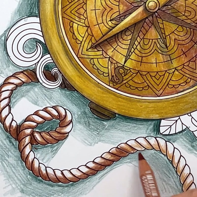
I then went over the rest of the rope with my lighter colors, and used some darker pencils to draw some extra strands on top, just to add some extra realistic details to the rope (although this step didn’t make a huge difference in my example)
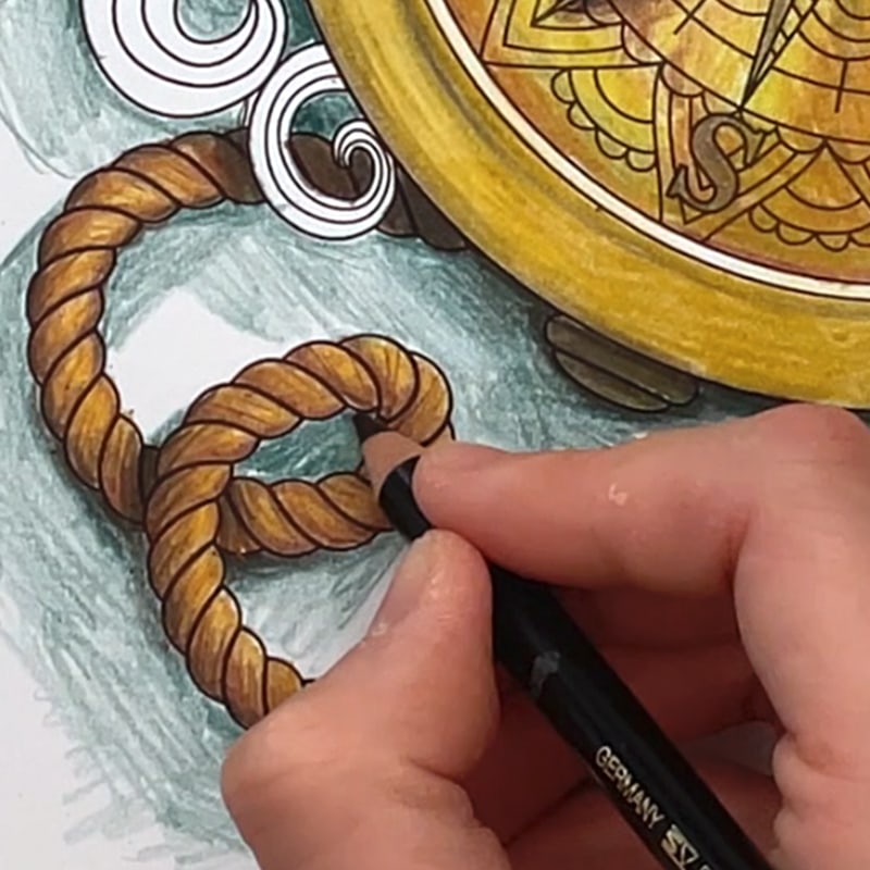
Because I’m going for a strong, dark contrast in this particular image, I decided to go back over the rope with a black pencil, working on the darkest core shadows and cast shadows. This is a step I only recommend if you really want strong constrast in your final image. Remember, you can always go darker, but it’s very hard to undo if you go too dark!
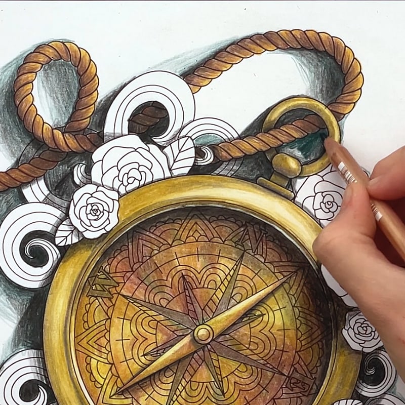
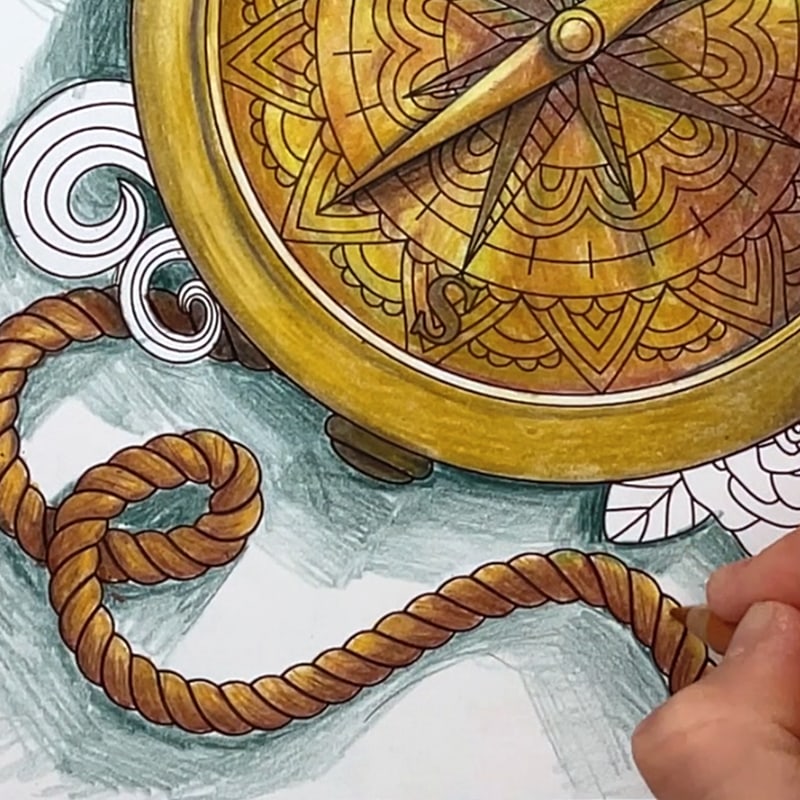
I repeated the same process for the other ropes in the picture, and used my black pencil to darken some of the other shadows around my compass and background. I often find myself adjusting and adding things as I go – as I continue to draw and color more, the depth and shading becomes more obvious and it gets easier to see what’s missing and which areas need more work.
I darkened my background shadows a LOT… bringing black into every cast shadow. This is because I’ve chosen to do quite a dark background – and while it looks like a big difference from the black to white at this point, the constrast in the shadows will reduce when I color the rest of the background soon. Before I bring in my main background color, I wanted to make sure the overall background included a dark to light gradient as it moved closer to the light source, so I used my darker teal to lightly shade on the left side and left the right side empty.
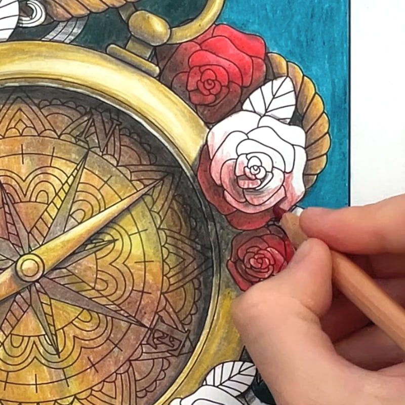
I filled in the rest of the background with my teal pencil, then moved onto the final details, coloring each of the flowers with the same process I taught in my previous video on beginner shading techniques. In each flower, I started with the shadows and tried to separate the light and dark sides of the flower, then worked on individual petals – identifying cast shadows and occlusion shadows as I went.
And finally, I finished off the swirls by copying the lighting and shading from my compass, then added some extra highlights in the brightest areas with a white gel pen. I chose to use my Sakura Decorese – but here are some of my other favorites too!

Bonus Tips to Create Dramatic Light & Shading Effects
Now let me share with you my 3 bonus tips to create even more impact in your lighting and shadows.
Tip 1: Increase the Contrast
Brighter highlights and darker shadows will always create a more dramatic effect. If you don’t want to overdo it, you can always take a photo and use the contrast settings in your photos apps to test it out first before applying the darker shadows to your final page. A white pen is a great way to really add some extra highlights, as I always love to do!
Tip 2: Move the Light Source
I’m guilty of almost always drawing my light source from the top left – because frankly, it’s familiar, it’s easy, and it doesn’t take much thought. But changing the light source can dramatically change the mood and impact of your drawing – so I challenge you (and leave a comment if you think I should take the challenge up too!) to mix up those light sources and try something unconventional! Start with some reference photos like those below to learn how the light works and go from there.


Tip 3: Use Unique Light Sources and Get Creative
Instead of just using a distant sun or ambient light, use a light within the scene, or different colored lights, or glowing objects – these INSTANTLY grab attention and create a level of interest – but they also require different techniques, so if that’s a tutorial you’d be interested in, please let me know in the comments and I’ll show you!


Final Thoughts on Lights and Shadows
While shading can be an intimidating subject, it can also be fun. And with this starting knowledge of shadows, and these techniques to help you, you can start stretching your skills and trying new techniques you’ve previously never considered.
I can’t wait to see what you create and I hope you’ve found this tutorial helpful!
Resources used in this tutorial
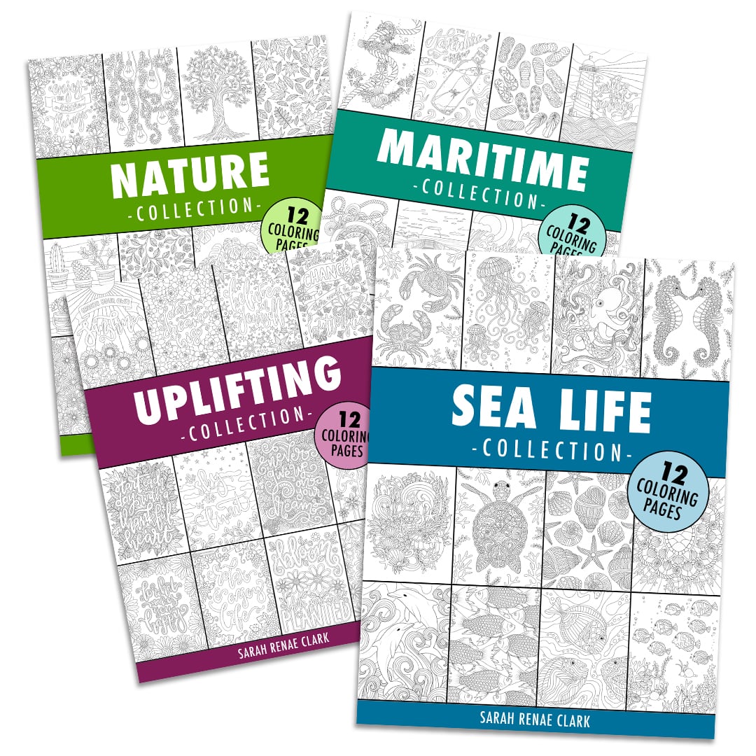
Both coloring pages used in this tutorial (the potted succulents and the steampunk compass) are included in my 4 collections coloring bundle.
The 4 collections includes 48 of my best coloring pages, with a mix of nature, maritime, uplifting and sea life pages for you to print and color. Get them here. (You can also buy individual collections separately)

The Color Catalog Volume 2
With over 7000+ downloads combined, the Color Catalogs Volumes 1 & 2 have become a go-to resource for many artists and colorists around the world. They are the perfect tool to give you the head-start and inspiration to start coloring without getting stuck at the color-selection phase, and can be a fun way to challenge yourself to try new colors you might otherwise never consider.
Find out more about the Color Catalog here or get the complete bundle (including the Companion) at a significant discount here.
If you just want the Volume 2 used in this video, you can buy it on it’s own here.
Other coloring tutorials you may enjoy:


Amazing series on Shading/Shadows, Sarah! New to coloring, I was never satisfied coloring with my children because every picture looked so flat. At 70, I have time to color and draw and and go further with my pictures. Thank you for your tips especially coloring the shadows first to see where they fall and being aware of where the light source falls. I’m excited to begin!
Yay! I’m glad it has been helpful!
This is great. Thanks so much!